Sage Green Living Room Walls Versus Olive Green Tones
Green has quietly become the defining wall color of the current design moment, replacing the long reign of pale grays and warm whites in living rooms across the country. Yet within green's enormous family, two specific tones dominate: sage, with its soft, dusty character, and olive, with its denser, earthier presence. They are not interchangeable, and choosing between them defines the personality of an entire room. Which one belongs in your living room, and what should you weigh before committing?
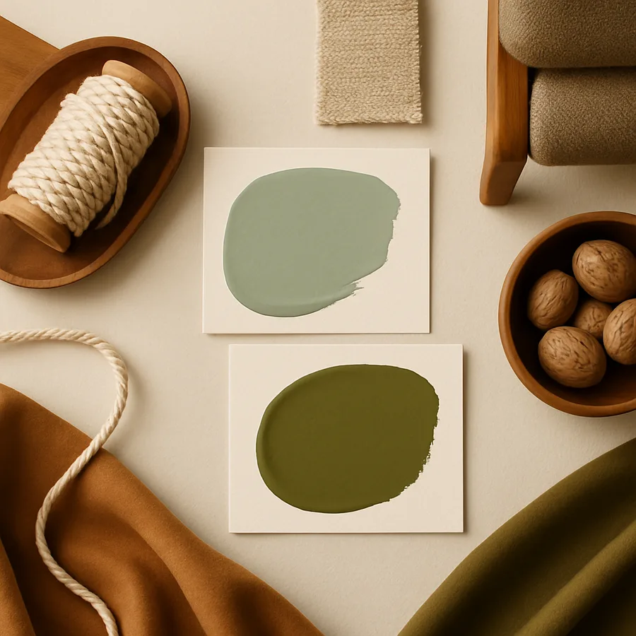
How Sage and Olive Actually Differ
The technical distinction sits in the underlying pigment composition. Sage greens contain significant amounts of gray, producing a chalky, washed-out quality that reads soft and almost neutral. Olive greens contain more yellow and brown, giving them an earthy, slightly mossy density that reads warmer and more organic. Side by side on a paint chip, the difference is obvious. On a wall, in actual light, the difference is profound.
Sage tends to recede, behaving almost like a colored neutral. It functions well as a backdrop, allowing furnishings, art, and textiles to come forward. Olive, by contrast, asserts itself. It has presence and weight, and it shapes the room rather than disappearing into it. The Better Homes & Gardens editorial team has documented a notable uptick in olive-toned living rooms over the past several seasons, with homeowners citing a desire for warmer, more atmospheric spaces after years of cool gray dominance. Sage remains the more popular choice overall, but olive is closing the gap rapidly. Why are both rising at once? Because they both deliver something gray never could: connection to the natural world.
Light: The Variable That Changes Everything
Both sage and olive shift dramatically across the day, more so than most beiges or grays. North-facing rooms tend to mute sage further, sometimes making it appear gray-blue, while warming olive into a richer, more saturated state. South-facing rooms can brighten sage into something almost pastel and push olive toward a more vivid, vegetal tone. East-facing rooms in morning light flatter both. West-facing rooms in late afternoon can deepen both into moody, glowing versions of themselves.
Always test paint samples on multiple walls and observe across at least two full days. The number of clients who paint an entire room based on a 4x4 swatch in a store fluorescent light and then regret it is enormous. According to surveys conducted by the American Society of Interior Designers, paint color is the single most common renovation regret, with more than 50 percent of homeowners reporting they would choose differently if repainting. The fix is simple but rarely followed: buy actual samples, paint generous patches, and live with them for forty-eight hours minimum.
Mood and Atmospheric Character
Sage produces a calm, gentle atmosphere. It reads almost spa-like in lighter renditions and quietly sophisticated in deeper ones. It pairs naturally with French and English country aesthetics, with Scandinavian minimalism, and with coastal styles. The mood is restful, contemplative, and somewhat understated.
Olive produces a richer, more grounded mood. It evokes Mediterranean villas, old libraries, vintage Land Rovers, and English manor houses. It feels warm and slightly masculine, though it depends entirely on what you pair with it. Olive welcomes layered, collected interiors with brass, leather, dark wood, and patterned textiles. It does not particularly want to feel minimal. If your living room is your social space, where you entertain and gather, olive can give it a deeper, more memorable character. If your living room is your retreat space, sage may serve you better.
Pairings: What Looks Right With Each
Sage thrives alongside cream, ivory, light oak, pale linen, soft black, and warm brass. It welcomes natural materials with light tones, like seagrass rugs and rattan accents. Pink works as an accent, particularly dusty rose and muted blush. Sage rejects loud colors and high-contrast modern pieces unless they are deliberately styled as focal points.
Olive thrives alongside terracotta, burnt orange, cognac leather, walnut, blackened iron, and aged brass. It welcomes warm whites with yellow undertones rather than cool whites. Burgundy, rust, mustard, and cream all sing against olive walls. Pattern works particularly well with olive: kilim rugs, vintage florals, and toile fabrics all find a home in olive rooms. The Architectural Digest AD100 designers have repeatedly used olive as the foundation for rich, layered, collected-looking interiors, often with cognac leather sofas and brass accents standing in beautiful contrast.
Specific Paint Picks Worth Considering
From Sherwin-Williams, Evergreen Fog (SW 9130) is the most-discussed sage of recent years, named Color of the Year and applied in countless living rooms. Sea Salt (SW 6204) is a paler, more neutral sage. Rosemary (SW 6187) edges into olive territory, while Garden Gate (SW 6167) and Saguaro (SW 7747) sit firmly in classic olive range.
From Benjamin Moore, Saybrook Sage (HC-114) is the canonical soft sage, while Gettysburg Gray (HC-107) leans olive despite the name. October Mist (1495) is another sage that has trended strongly. For olive, consider Bayberry (HC-117) and Sherwood Green (HC-118), which deliver true olive presence. Farrow & Ball's Card Room Green and Treron offer European-leaning olives prized by editorial designers. Whichever brand you choose, always buy small samples first and never trust the digital swatch on a website. The color reproduction varies wildly across screens and printing.
Practical Application and Common Pitfalls
Both sage and olive require careful surface preparation. Greens, perhaps more than any other color family, reveal wall imperfections in raking light. Patch and sand thoroughly, prime with a tinted primer, and apply at least two top coats. Skipping the primer is the leading cause of green walls that look flat or chalky.
Finish choice matters too. Flat or matte finishes flatter both colors but show marks. Eggshell offers a good compromise for living rooms with regular use. Avoid satin and semi-gloss on walls; the sheen tends to amplify the yellow in olive and the gray in sage, often unflatteringly. Also be cautious about pairing either color with cool LED lighting. Warm bulbs in the 2700K to 3000K range dramatically improve how both sage and olive read after dark, while cool bulbs can wash sage to gray and dull olive to mud.
Architectural Context: Where Each Color Belongs
The architectural style of your home should heavily influence whether sage or olive feels right. Sage integrates beautifully with traditional New England colonials, mid-century modern homes, transitional new builds, and coastal cottages. Its soft, slightly chalky quality complements white millwork, painted built-ins, and the kind of restrained architectural detailing common in these styles. In a living room with crown molding, paneling, or wainscoting, sage allows the architecture to remain the visual lead rather than competing with it.
Olive belongs in homes with stronger architectural character or with collected, layered interiors. Craftsman bungalows, Tudor revivals, Spanish colonial homes, Victorians, and any home with significant exposed wood tend to flatter olive walls. Olive also works beautifully in homes with limited architectural detail when the goal is to create that character through paint and furnishings alone. A spec-built suburban living room with no moldings can gain enormous personality from olive walls paired with a carefully assembled collection of vintage furniture, brass lamps, and layered textiles. Industry observers at the National Association of Home Builders have noted that homeowners increasingly use deeper paint colors precisely to compensate for builder-grade architectural simplicity, and olive is among the leading colors in that strategy.
Ceiling height also affects the decision. Tall ceilings, nine feet or above, can carry olive comfortably and the deeper tone actually pulls the eye down to a more human scale. Standard eight-foot ceilings handle sage easily and olive with care; in olive applications at standard ceiling height, consider keeping the ceiling itself a warm white rather than continuing the color upward. Drenching a low-ceiling room in olive can feel oppressive, while drenching the same room in sage often does not. The lighter chromatic load of sage makes it more forgiving of compressed vertical proportions.
Living With the Color Day to Day
Color theory and editorial photographs only carry you so far. The real test of a wall color is how it feels over months of actual use. Sage tends to age gracefully in a living room. Its low chromatic intensity means it does not become tiring or strident, and small marks tend to disappear into its slightly washed quality. Touch-ups blend easily because the color does not vary dramatically across batches or finish coats. Sage rooms photograph well in any lighting condition and tend to support seasonal redecorating, allowing throws, pillows, and art to shift the room's character without repainting.
Olive demands slightly more from its occupants. Because it has presence, it shapes the mood of the room more decisively, and that mood needs to match how you actually use the space. A formal living room used for evening gatherings flourishes in olive. A bright, family-use living room where children play and laundry sometimes piles on the sofa may feel weighed down by olive's gravity. Match the color to the rhythm of how the room is actually lived in, not how it appears in a styled photo. Pet owners should also note that olive walls show pet dander and dust more readily than sage; weekly dusting of skirting boards and picture rails keeps the color reading cleanly.
Both colors respond well to the introduction of plants, which is convenient because both sage and olive are themselves echoes of plant tones. Real foliage, particularly the silvery greens of olive trees, dusty miller, or eucalyptus, ties the room to its color story in an organic way. Fiddle leaf figs, monsteras, and snake plants all bring deeper greens that contrast pleasantly with sage walls and harmonize with olive walls. According to surveys conducted by the National Gardening Association, houseplant ownership has grown for years running, and green-walled rooms are particularly compatible with the plant-forward interior trend. The combination of painted green walls and living green plants produces a layered, biophilic atmosphere that feels both contemporary and timeless.
Finally, consider how each color holds up under the seasonal rhythms of a real household. Sage feels just as appropriate in February as in July, shifting only subtly with seasonal textiles like heavier wool throws in winter or breezy linen pillows in summer. Olive likewise transitions across seasons but tilts especially beautifully toward autumn, when its warm undertones harmonize with the fallen leaves visible through the window. A truly successful living room color is one that flatters every season of the year, not just the one in which you happened to repaint. Both sage and olive pass this test when chosen thoughtfully, which is part of why they have outlasted the cooler grays they replaced.
Conclusion
Sage and olive are not competitors so much as different expressions of green's enormous range. Sage offers calm, soft, almost-neutral presence that supports an understated and restful living room. Olive offers warmth, depth, and atmospheric character that suits collected, layered, and convivial spaces. Neither is more correct than the other, but one will be more correct for your particular room, your particular furnishings, and your particular life.
The decision should not be made from a screen or a small chip. It should be made by painting generous test patches in your actual living room, observing them in your actual light, and considering them against your actual sofa and rug. Color decisions made this way almost never disappoint. Color decisions made any other way usually do. According to the National Association of the Remodeling Industry, repainting a poorly chosen wall color is among the most common ten-dollar mistakes that turn into thousand-dollar fixes.
If your living room has felt slightly off, slightly too cool, slightly too generic, a thoughtful green wall might be exactly what closes the gap. Pick the green that matches the mood you want, test it properly, prime correctly, and commit. You will likely look back on the change as one of the most satisfying upgrades you have made. Start with samples this week, and let the room itself tell you which green belongs.
More Articles You May Like


Comments
Post a Comment