Hallway Wallpaper Bold Patterns Versus Quiet Light Walls
The hallway is the perfect testing ground for design risk. It is a space most people pass through rather than linger in, which means a bold choice does not have to be lived with for hours at a time, and yet it is also a space that connects the rest of the home, which means whatever happens on its walls sets the transitional emotional tone between rooms. This is exactly the territory where wallpaper either soars or fails, and where the choice between a confident pattern and a restrained light wall has consequences for how the entire home feels.
This guide walks through the case for both approaches, the lighting and ceiling-height factors that should influence the decision, the pattern scale and color rules that prevent confident wallpaper from becoming overwhelming, the practical considerations of wallpaper in a high-touch corridor, and the styling moves that elevate either choice into something that feels considered rather than accidental. The goal is not to push you toward one camp but to give you the framework to choose with intention.
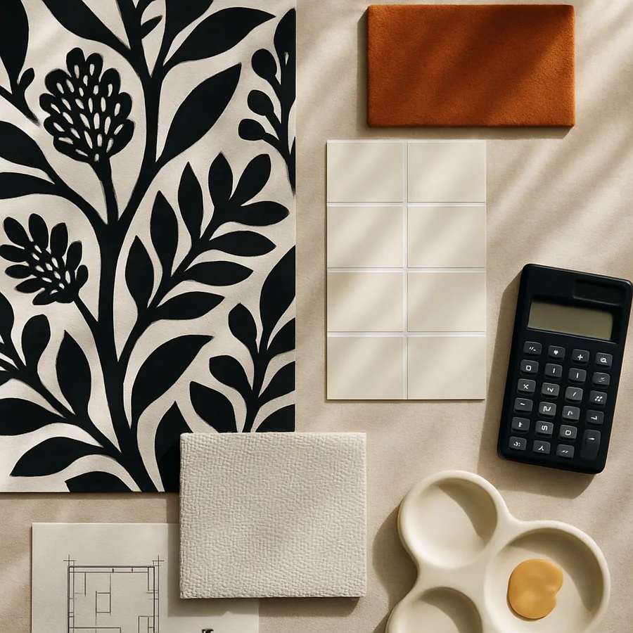
The Case for Bold Hallway Wallpaper
Hallways are short experiences. A guest walks through them in seconds, a household member passes through them dozens of times per day with minimal attention, and almost no one sits in them. This brevity is exactly why bold wallpaper works in hallways better than almost anywhere else in a home. The pattern delivers an immediate emotional jolt without overstaying its welcome, and the contrast between a saturated hallway and the calmer rooms it connects creates a sense of transition and surprise.
According to editorial coverage in House Beautiful and similar publications, the hallway is one of the most popular spaces for designers to experiment with bold pattern, dark color, or unusual texture, precisely because the risk-reward calculation favors expression over restraint. The same chinoiserie or oversized botanical that would feel relentless in a living room becomes thrilling in a hallway because the eye encounters it briefly and then moves on.
Bold wallpaper also solves the structural problem of empty hallway walls. Most hallways are too narrow for substantial art collections, too short for furniture beyond a console or bench, and too plain to carry a single piece of statement art. Wallpaper covers the entire surface and removes the need to fill it with smaller objects, which is often a more elegant solution than scattering framed prints down a long wall.
A bold hallway also functions as a memorable design moment in a home tour. When guests describe a home, they tend to mention the few spaces with strongest character, and a wallpapered hallway is often the most memorable transition between major rooms. This memorability is genuine value, both for the household's pride in their home and for the way the home reads to visitors.
The Case for Quiet Light Walls
The argument for quiet light walls is equally strong and starts with the same fact about hallway brevity. If the hallway is a short experience, why fill it with sensory information that distracts from the rooms it connects? A pale wall in a hallway acts as a visual rest, a moment of pause that primes the eye for whatever comes next. Many of the most celebrated homes treat hallways as deliberately understated to make the rooms they connect feel richer by contrast.
Light hallway walls also expand perceived space. The American Society of Interior Designers (ASID) has long noted in its educational materials that pale wall colors, particularly soft whites, warm off-whites, and very light tints of greige or stone, can make a narrow corridor feel 10 to 20 percent wider than the same corridor in a saturated color. For homes with truly tight hallways, this perceived expansion is functional rather than just aesthetic.
Light walls also reflect more light, which matters because most hallways have limited natural light. A 60-watt-equivalent fixture that delivers 800 lumens will produce dramatically more usable illumination on a pale wall than on a deep saturated one. According to lighting research summarized by the Illuminating Engineering Society (IES), a wall in a 90 percent light reflectance value (LRV) finish will return roughly four times the illumination of a wall in a 20 percent LRV finish. For a hallway that already struggles with light, this difference is the difference between cheerful and cave-like.
Quiet hallways also age better. Trends in bold pattern shift quickly, and a chinoiserie or grasscloth that feels current today may feel dated within a decade. A pale wall, by contrast, sits gracefully through changing tastes and accommodates whatever furniture, art, or accessories the household evolves through. For homeowners who do not enjoy redecorating frequently, the quiet wall is the strategically conservative choice.
How Hallway Dimensions Should Drive the Decision
The width and length of the hallway dramatically affect which approach will succeed. A hallway that is under 36 inches wide will feel claustrophobic with bold wallpaper because the eye cannot retreat far enough to see the pattern in context, and the pattern reads as overwhelming visual noise rather than designed pattern. These narrow hallways almost always do better with quiet light walls, possibly with one strong moment of pattern at the far end as a visual destination.
A hallway that is 42 inches wide or wider, particularly one with a longer length of 12 feet or more, can absolutely carry bold pattern. The eye has room to take in the wallpaper from a comfortable distance, the length gives the pattern time to develop and repeat in a way that reads intentionally, and the proportions support the visual weight of saturated color or large-scale motif.
Ceiling height matters equally. Hallways with 9-foot or taller ceilings can carry bolder pattern and darker color because the vertical proportion gives the wallpaper room to breathe. Hallways with 8-foot ceilings, particularly in narrow widths, generally feel cramped with anything beyond a quiet pattern in mid-to-light tones. If the ceiling height is below 8 feet, treat bold wallpaper with extreme caution; consider instead a paneled wall treatment with quiet color above.
Pattern Scale and Color Rules That Prevent Disaster
If you choose bold wallpaper, the scale and color choices determine whether it lands as confident or chaotic. The general rule is that pattern scale should match the wall plane: large patterns for large walls, small patterns for small walls, with a strong preference for medium-scale patterns in most residential hallway widths.
An oversized chinoiserie mural with 18-inch tall botanical motifs needs a wall plane of at least 8 feet to read correctly; on a shorter or narrower wall, the motifs get cropped awkwardly and the pattern reads as fragments rather than a complete composition. A small-scale geometric or ditsy floral with 1 to 3 inch motifs works better in narrow or short hallways because the repeat happens often enough to read as continuous texture rather than truncated pattern.
Color should consider the lighting available. A deep navy, forest green, or oxblood wallpaper in a hallway with strong artificial lighting and at least one source of natural light can feel rich and enveloping. The same colors in a windowless hallway with a single weak overhead fixture feel cave-like and unwelcoming. If you love dark wallpaper but have low light, plan to add picture lights, sconces, or upgraded ceiling fixtures with at least 2,000 combined lumens before you commit to the paper.
For quiet light walls, color choice still matters. Pure stark white reflects too cold and reads as institutional in most residential hallways. A warm off-white with subtle yellow, pink, or cream undertone, or a very soft greige or stone tone, will feel more inviting and will harmonize with whatever flooring, trim, and art the hallway connects. Always test the color in the actual hallway lighting before committing, because a swatch that looks perfect in the paint store can look entirely wrong in a dim corridor.
Practical Considerations in High-Touch Corridors
Hallways are touched constantly. Hands brush walls passing through, backpacks scrape against them, kids run their fingers along them, pets rub against them at corners. Whatever wall treatment you choose has to survive this contact for years without showing wear, which means the choice between paint and wallpaper, and the specific finish within either, has to account for cleanability and durability.
For paint, the right finish in a hallway is eggshell or satin, never flat. Flat paint shows every fingerprint and scuff and requires touch-up almost monthly. Eggshell wipes clean with a damp cloth, and satin wipes even more easily, though satin can read as slightly shiny in narrow corridors. Avoid full gloss, which highlights every wall imperfection and feels institutional in a residential setting.
For wallpaper, look for vinyl-coated or fully vinyl papers rather than uncoated paper, fabric, or grasscloth in high-touch hallways. Vinyl wallpapers can be wiped clean with a damp cloth, resist scuffing from passing shoulders and bags, and survive children and pets in ways that delicate paper or natural fiber wallcoverings cannot. Grasscloth and silk wallpapers are stunning but should be reserved for low-traffic dining rooms and powder rooms rather than family hallways.
Have you considered how often you will need to touch up or clean your hallway walls in the next five years? The honest answer affects whether you should choose paint or paper, and which version of either, more than any aesthetic preference does.
Styling Either Choice for Maximum Impact
A bold wallpaper hallway needs minimal additional decoration to land correctly. The wallpaper is doing the heavy lifting, and adding gallery walls, vivid art, or busy console styling on top of bold paper creates competing focal points that fight for attention. The right move is to choose two or three small, restrained moments: a single antique mirror, a quiet console with one sculptural object, and one or two pieces of art with simple frames that do not compete with the wallpaper pattern.
A quiet light wall hallway is the opposite. The walls are doing minimal visual work, which means the rest of the hallway has room to be expressive. Layered art collections, sculptural light fixtures, dramatic mirrors, vivid runners, and styled console vignettes all work in a quiet hallway because there is nothing else competing for the eye. Many of the most celebrated quiet hallways are paired with bold rugs, sculptural lighting, and substantial art, all of which would be lost in a wallpapered space.
Lighting elevates either choice. Picture lights mounted above art or above the wallpaper itself add dimension and intentionality. Wall sconces at consistent intervals down a longer hallway create rhythm and improve circulation safety. Recessed downlights wash the walls and emphasize either the wallpaper pattern or the texture of a quiet plaster finish. Investing in hallway lighting beyond the standard single overhead fixture is one of the most underrated upgrades in any home, a point reinforced by editorial coverage in Better Homes and Gardens.
Have you mapped where your hallway lighting currently falls and where the wall plane is darkest? That mapping should drive both the wall treatment decision and the lighting upgrades that make either treatment work.
Conclusion
The bold-versus-quiet hallway decision is not really a question of taste; it is a question of architecture, lighting, and the role you want the hallway to play in the larger story of the home. Bold wallpaper turns the hallway into a destination, a memorable transitional moment that defines the home's design personality. Quiet light walls turn the hallway into a frame, a deliberately understated pause that lets the rooms it connects shine more brightly by contrast.
Both approaches can be executed beautifully, and both can fail badly when the wrong choice is made for a given space. The keys are honest measurement of the hallway dimensions, realistic assessment of the available lighting, careful selection of pattern scale and color in proportion to the wall plane, and willingness to commit fully to whichever direction you choose rather than splitting the difference into something that reads as accidental.
Pattern scale, ceiling height, hallway width, and lighting are the four variables that should drive the decision more than personal aesthetic preference. A homeowner who loves bold wallpaper but has a 32-inch wide hallway with 7-foot 6-inch ceilings and a single weak overhead fixture is setting themselves up for an installation they will regret within a year. The same homeowner with a 48-inch wide hallway, 9-foot ceilings, and good lighting can install nearly any bold paper successfully.
Measure your hallway this weekend, count your light sources, and use the framework in this guide to make the choice with confidence. Save this article for your next renovation conversation, share it with the household members who weigh in on these decisions, and tell us which direction you chose; reader stories help everyone make better decisions about the most underestimated room in the home.
More Articles You May Like


Comments
Post a Comment