Velvet Sofa Color Choices That Don't Look Dated in Five Years
Velvet sofas have a strange relationship with time. A well-chosen velvet anchors a living room for a decade or longer, growing more confident as the rest of the decor changes around it. A poorly chosen velvet starts whispering its purchase year almost immediately, and by year three it shouts. The fabric itself has nothing to do with this divergence. The color does. Velvet's defining feature is its dimensional sheen, which amplifies whatever pigment sits inside it, and that amplification is the same property that makes a smart color choice timeless and a trendy choice rapidly obsolete.
This guide is about the second-most-important decision you will make on a velvet sofa, after silhouette: which color will still feel right in five years. The answer is not a single color, because the right answer depends on your room's light, your committed palette, and your appetite for visual energy. But the framework for getting to your answer is universal, and the colors that age out fastest are predictable enough to flag in advance. If you are about to commit to a velvet sofa, give the color decision an honest week before you click order, and use this article to structure the thinking.
Why Velvet Color Reads Differently Than Other Fabrics
Velvet is a cut-pile fabric, meaning the surface is composed of millions of short, dense fiber ends standing perpendicular to the woven backing. Light hits those fiber ends from the side and the top simultaneously, which creates the signature shimmer that makes velvet read more saturated, more luminous, and more dimensional than the same dye applied to a flat-weave fabric. A teal flat weave reads as one color from across the room. A teal velvet reads as turquoise on the highlight side, midnight on the shadow side, and a hundred shades in between depending on how anyone has just sat on it.
That dimensional behavior cuts both ways. Saturated colors are flattering in velvet because the highlights soften them and the shadows ground them, which is why deep emerald, royal blue, and burgundy have become velvet's signature colors in editorial features. But the same amplification that makes a deep jewel tone read luxurious can make a trendy mid-tone read distinctly of-its-moment. Architectural Digest coverage of post-2020 living rooms shows the cycle clearly: each year, one velvet color spikes, dominates Instagram, then fades from new interiors within thirty months. Choosing for longevity means choosing colors that fall outside that cycle.
Lighting changes everything. Velvet looks fundamentally different in north-facing rooms (cool, even, blue-shifted light) versus south-facing rooms (warm, directional, gold-shifted light) versus artificially lit rooms after sunset. A camel velvet that reads creamy and warm in a south-facing daytime room can read olive-tinged and dim under warm-white LED at night. Before committing to any color, get a memo sample large enough to drape on your existing seat, and observe it at multiple times of day across a full week. The American Society of Interior Designers consistently recommends week-long sampling before any major upholstery commitment, and with velvet that recommendation is essential rather than ideal.
Colors That Age Gracefully
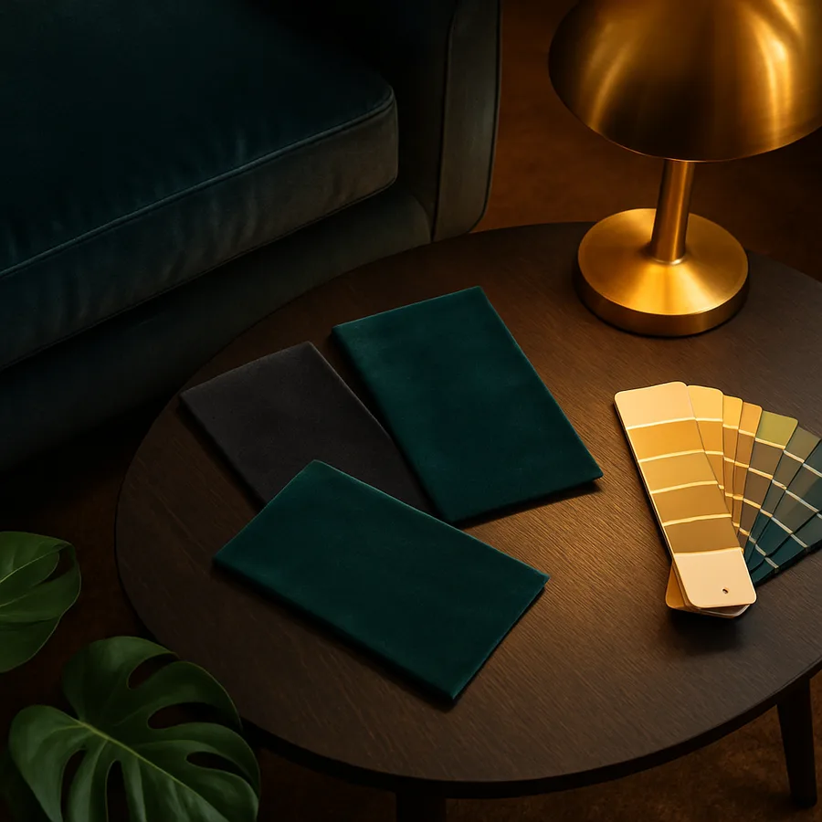
The colors that look best on velvet at year five are almost always the ones with deep tonal complexity rather than easy chromatic appeal. Three families dominate the long-aging list. The first is deep, slightly muddied jewel tones: forest green leaning toward gray rather than emerald, navy with a hint of black rather than royal blue, oxblood rather than fire-engine red, aubergine rather than violet. These colors carry historical weight, appearing in upholstery archives going back decades, and they continue to read sophisticated rather than trendy precisely because they have never had a singular peak moment.
The second family is warm neutrals with depth: caramel, walnut, mushroom brown, smoky taupe, and the increasingly popular range of softened terracottas pulled toward earth rather than sunset. These colors disappear into mid-century-leaning rooms, layer beautifully under wool throws, and read as deliberate understatement rather than absence of decision. They also photograph well, which matters if you ever sell the home or simply share it with friends and family. House Beautiful editors have noted in recent design forecasts that warm neutrals are entering a multi-year ascendency as the gray-dominant palette of the previous decade gives way to softer, more enveloping rooms.
The third family is committed darks: deep charcoal, true black, and the extremely deep greens and blues that read almost black in low light. Dark velvet absorbs the visual chaos of a busy room, reads cinematic in evening light, and pairs effortlessly with brass, walnut, leather, and natural stone. The risk with dark velvet is dust and lint visibility, which is real but manageable with weekly upholstery brushing. The reward is a piece that looks more confident every year as the room around it evolves.
Colors That Date Quickly
Some colors carry a stamp so clearly tied to a specific moment that committing to them on a major upholstery purchase is essentially planning for replacement. Millennial pink, in all its iterations from blush to dusty rose, peaked in 2018 and has been on a slow decline ever since; a millennial-pink velvet sofa now reads as a dated artifact in nearly any photographic context. Sage green followed a similar arc, peaking in 2024 and now visibly cooling in editorial coverage. The lesson is not that these colors are bad, but that they are time-stamped.
Mid-saturation pastels in general struggle on velvet because the fabric's dimensional sheen amplifies them into something that reads deliberately of-its-moment. Pale lavender, mint green, dusty peach, and powder blue all photograph beautifully in showroom photography and almost never age well in real living rooms. They tie too tightly to the season they launched in, and they fight rather than support whatever paint and wood tones you commit to over the following years. If you love a soft pastel, satisfy the craving with throw pillows you can swap for under a hundred dollars.
The riskiest category, however, is the statement-color trend velvet that arrives with editorial fanfare and a single dominant aesthetic context. The neon-saturated 1970s revival velvets of recent seasons (orange, mustard, marigold) are visually striking in maximalist rooms styled with matching textiles, and visually awkward almost everywhere else. They demand a committed maximalist context to work, and most homeowners do not maintain that context for five years. If you are honest that your aesthetic will continue to evolve, choosing a sofa color that requires a specific styling commitment is choosing a sofa color that will need replacement when your taste shifts.
Reading Your Room Before You Choose
The single highest-leverage analysis you can do before choosing a velvet color is a serious audit of your room's existing fixed elements. Wall color, flooring, window casings, fireplace surround, built-in shelving, ceiling treatment, large permanent rugs: these are the elements that will outlast most furniture decisions, and the velvet color needs to harmonize with them rather than fight them. Take phone photos of every wall and surface in the room at midday and at night, then study them as a group. Patterns will emerge: warm undertones throughout, cool gray dominance, woody-natural emphasis, or something more eclectic.
Once you have read the room, choose a velvet color that supports rather than competes with the dominant tonal direction. A room with warm oak floors and creamy walls supports caramel, mushroom, and oxblood velvets effortlessly; the same room rejects cold-toned charcoal velvet, which fights the warm undertones and looks like a misunderstanding. A room with cool gray flooring and crisp white walls hosts deep navy or charcoal velvet beautifully; the same room makes warm caramel velvet look orphaned. This kind of tonal alignment is what separates rooms that look professionally designed from rooms that have a great sofa and nothing else cooperating with it.
Have you actually mapped your fixed elements onto a single page, or have you been holding the analysis in your head while sofa shopping? The act of writing it down clarifies the decision in ways the mental version never does. List your floor, your walls, your largest rug, your window treatments, and your hardware finishes. Then ask: which two velvet color families would feel inevitable in this combination, and which two would feel like work?
The Tonal Strategy of a Confident Choice
Confident velvet color choices share a quiet pattern: they pick a tonal lane and commit, rather than splitting the difference. The undecided middle, where a color is neither warmly anchored nor coolly atmospheric nor dramatically dark, is where dated choices live. When you study velvet sofas in heritage interiors, the colors that have outlasted decades almost universally fall into one of three confident registers: rich earthy warm tones, deep moody cool tones, or true neutrals with a clear tonal cast.
One useful exercise is to identify the velvet sofa colors in interiors you genuinely admire that have aged well. Pull ten reference images from sources you trust (designer portfolios, historical archives, magazine retrospectives) and look at the velvet sofa color in each. You will almost never see mid-saturation pastels. You will rarely see colors with a single dominant trend year. You will see deep colors, complex neutrals, and committed darks, repeated across decades of editorial coverage. The pattern is not coincidence. Industry data tracked by interior trade associations consistently shows that resale of furniture in saturated trend colors lags resale of comparable pieces in classic colors by twenty to forty percent, a gap that compounds over the lifetime of the piece.
Resale matters more than most buyers admit. Even if you intend to keep the sofa for fifteen years, life changes (moves, renovations, palette shifts) often necessitate selling earlier than planned. A velvet in a confident, classic color sells in days; a velvet in a niche trend color sits for months and discounts heavily. Treating the color choice as a decision with a secondary market in mind, even if you never expect to use that market, tends to produce better outcomes than treating it as pure self-expression.
Maintenance Considerations by Color
Color and maintenance are linked more closely on velvet than on most upholstery, because the fabric's pile shows lint, dust, and pet hair more visibly in dark colors and shows water marks and stains more visibly in light colors. There is no maintenance-free option, but understanding the trade-offs lets you choose with full information. Light velvets (cream, ivory, pale taupe) require diligent stain protection and frequent professional cleaning to keep the surface presenting well. Crypton and Sunbrella now produce performance velvets engineered for households with high spill risk, and choosing one of these for a light color is essentially mandatory if you have small children or red-wine drinkers.
Dark velvets show lint and pet hair acutely, but they hide stains nearly invisibly. The maintenance ritual is different rather than easier: weekly vacuuming with a soft brush, periodic lint-rolling, and occasional fabric-shaver passes to remove pilling. Mid-tone velvets in earthy ranges hide both stains and lint reasonably well, which is part of why caramel and mushroom have become the workhorses of family-room velvet.
For all velvet colors, weekly vacuuming with a soft upholstery brush in the direction of the nap is the foundation. Spot-clean spills immediately by blotting (never rubbing) with a clean white cloth and a small amount of pH-neutral fabric cleaner. Steam gently with a handheld steamer once or twice a year to revive crushed pile in high-use areas. Avoid placing velvet in direct sunlight, which fades color predictably across all velvets and especially aggressively across deep blues and reds. The American Home Furnishings Alliance estimates fabric service life can extend by fifty percent or more when sun exposure is controlled with UV-filtering window film or curtains.
Conclusion
The velvet sofa color most likely to look right in five years is almost always the one chosen with discipline rather than with current-season excitement. That discipline takes the form of three habits: respect the dimensional behavior of velvet by sampling colors in your actual room across multiple lighting conditions, choose colors with tonal depth rather than easy chromatic appeal, and align the color with the fixed elements of your room rather than expecting the room to reorganize around the sofa. Apply those three habits and you will end up in one of the long-aging color families almost by default.
The colors most likely to feel dated, conversely, are the ones a peer enthusiastically recommended within the last twelve months because they had just bought one. That is not coincidence; trend velvet ownership concentrates inside narrow time windows, and the moment a color reaches dinner-party-recommendation status is usually within twenty-four months of feeling old. If you find yourself drawn to a strongly trending color, give the decision a deliberate ninety-day pause, then revisit. Often the appeal fades before the order arrives.
Take the next concrete step before you commit to anything: pull memo samples in your two top color candidates, place them on your existing seating in the actual room, photograph them at noon, sunset, and 9 PM, and live with the photos for a week. The right color will start to feel inevitable as you study the images, and the wrong color will start to feel like work. That weeklong process is the single best protection against the dated-velvet remorse that drives so many premature sofa replacements, and it costs nothing but patience. Are you willing to spend that week now to save five years of regret later? If yes, you are ready to choose.
More Articles You May Like


Comments
Post a Comment