Styling Open Kitchen Shelves Without Looking Cluttered or Messy
Walk through any glossy kitchen feature in the design press, then walk into the same homeowner's kitchen six months after move-in, and you will often see two completely different rooms. The shelves that read as serene and curated in the photo shoot have, by the time real life moves in, become a bottleneck of mismatched mugs, a half-finished bag of coffee beans, three vitamin bottles, and a single rogue avocado. The space did not change. The discipline did.
Styling open shelves is a craft you can actually learn. It is not about owning beautiful objects, although that helps. It is about a small set of compositional rules that designers apply almost unconsciously and that anyone can adopt in an afternoon. According to a 2026 Houzz homeowner study, 67 percent of people who installed open shelving reported that styling, not maintenance, was the skill they most wished they had developed before installation. This guide is the toolkit they wish they had.
The Rule of Thirds, Translated for Shelves
Photographers compose with the rule of thirds because the human eye finds asymmetric balance more interesting than perfect symmetry. The same principle applies to a shelf. Mentally divide each shelf into three roughly equal vertical columns. Place a tall element in one column, a medium-height grouping in another, and leave the third column either empty or hosting a single low object.
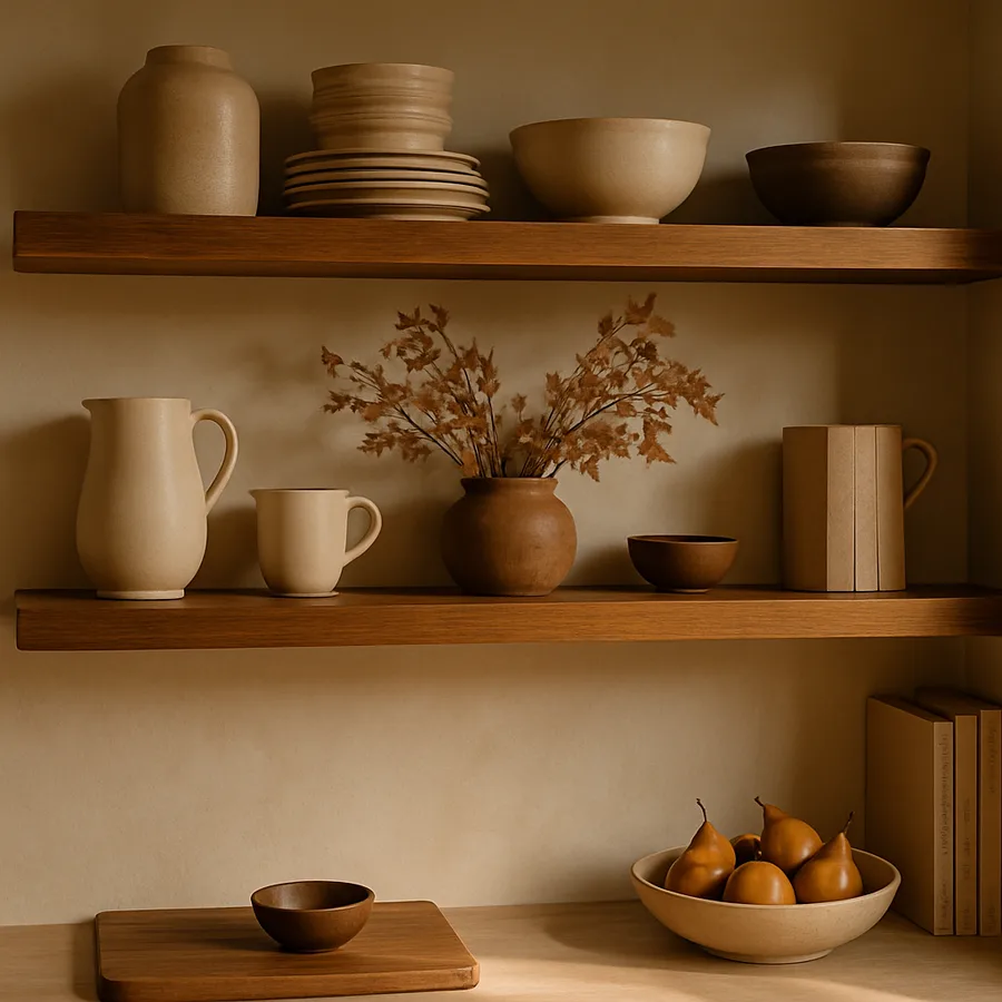
The most common styling failure is treating each shelf as a centered, symmetrical display. A vase exactly in the middle, flanked by matching candlesticks, reads as a fireplace mantel - formal, static, and distinctly not kitchen. Architectural Digest kitchen tours almost never feature centered, symmetrical shelving because professional stylists know that asymmetry implies use, life, and personality. A shelf that looks slightly off-center looks lived in; a shelf that looks perfectly centered looks staged.
Apply the rule across multiple shelves too. If your tall element is on the left side of the top shelf, put your tall element on the right side of the second shelf, and back to the left on the third. This zigzag rhythm guides the eye downward through the entire composition rather than letting it land flatly on any single shelf.
Negative Space Is the Most Underrated Tool
Beginners overfill. Professionals subtract. The single fastest way to take a cluttered shelf and make it feel intentional is to remove 30 percent of the objects on it. The empty space you create is not waste - it is the visual breathing room that lets the remaining objects read as a deliberate composition rather than as storage overflow.
The NKBA design education curriculum teaches a target of roughly 60 to 70 percent visual density for any open display surface. That means if a shelf could physically hold ten objects without overlap, you should style it with six or seven. The other 30 to 40 percent is intentional emptiness. ASID-credentialed designers often refer to this as the "exhale ratio" - the visual rest that prevents an entire wall from feeling like it is shouting at you.
In practice, negative space looks like this: a stack of three plates, eight inches of empty shelf, a small pitcher, twelve inches of empty shelf, a leaning cookbook. The eye reads each grouping as its own moment, with a pause between, rather than as a continuous wall of stuff. Have you tried photographing your current shelves on your phone and looking at the image? Photos compress depth and instantly reveal which shelves are too dense - try the test with your own kitchen tonight.
Color Editing: The Three-Color Rule
If your shelves contain more than three dominant colors, they will read as cluttered no matter how carefully you arrange them. The three-color rule is the single most powerful editing tool in styling: pick three colors maximum and quietly relocate everything else to closed storage.
The classic kitchen palette is a neutral base (white, cream, oatmeal), a wood tone (oak, walnut, or the shelf itself), and one accent (matte black, deep brown, sage green, or muted terracotta). That is three colors. Anything outside those three colors becomes visual noise. The bright red Kitchenaid box, the orange vitamin bottle, the printed cereal box - these are not bad objects, but they are not display objects, and they belong behind a door.
Designers profiled in Architectural Digest's recurring kitchen series often build entire styling schemes around a single accent color. One shelf might feature only objects in shades of cream and bone with three small black accents - a black ceramic vase, a black-bound cookbook, a small black framed botanical print. The restraint reads as expensive, regardless of how much the actual objects cost. Have you done a color audit of your shelves recently, or is your current palette whatever happens to have accumulated over the past five years of gifts and impulse buys?
Mixing Heights, Textures, and Shapes
Even within a tight color palette, you need variety in height, texture, and shape to keep a shelf from feeling monotonous. The professional formula is roughly: one tall vertical element, two or three medium objects, one horizontal element, and one organic shape (a plant, a piece of fruit, a folded linen napkin) per shelf.
Texture variety means combining smooth glazed ceramic with rough unglazed stoneware, with woven natural fiber, with raw or reclaimed wood, with brushed metal. Each texture catches light differently, which gives the entire shelf depth even at a glance. A shelf that contains only smooth glossy ceramic, no matter how beautifully arranged, will read as flat and cold under most lighting.
Shape variety follows the same logic. Combine round vessels (bowls, mugs, vases) with rectangular elements (books, cutting boards, framed prints) and one organic shape (a trailing plant, a bowl of citrus). The contrast between geometric and organic forms is what gives professional styling its sense of being alive rather than installed. Houzz editors frequently note in their seasonal trend roundups that the most-saved kitchen images consistently feature this mix of geometry and organic life.
Functional Objects That Earn Their Display Spot
Not every styled object needs to be purely decorative. In fact, the most successful kitchen shelves are roughly 70 percent functional, 30 percent decorative. The functional objects are dishes you actually use, which means they cycle through the dishwasher and stay clean. The decorative objects are the styling layer that connects them visually.
The trick is choosing functional objects that double as display. Stoneware dinner plates in a single color stack beautifully and read as intentional. Glass tumblers in a matched set look like a deliberate collection rather than a hodgepodge. Wooden cutting boards leaned vertically against the back wall do double duty as art. Linen napkins folded in a small stack add soft texture without taking up usable storage.
The objects that almost always fail as styled functional pieces are the ones with logos, branded printing, or institutional packaging. Cereal boxes, vitamin bottles, branded coffee bags - these are visual noise no matter how carefully you arrange them. The fix is either decanting them into matching neutral containers (clear glass jars, ceramic canisters) or, more honestly, putting them behind a cabinet door. The NKBA 2026 trends report specifically calls out the decanting trend as one of the most durable styling moves of the past decade.
The Quarterly Refresh Routine
Even the best-styled shelves go stale. The objects that delighted you in spring start to feel tired by autumn, and the eye stops registering them entirely. Professional designers refresh client shelves seasonally - not by replacing everything, but by rotating in two or three new elements and relocating two or three existing ones to a different room or closed storage.
Build a small styling rotation closet somewhere in your home. A single dedicated shelf in a hall closet or basement, holding maybe a dozen objects you cycle in and out, is enough to keep your kitchen feeling fresh year-round. Spring might bring in a bunch of dried branches in a tall vase; summer swaps in a bowl of lemons; autumn rotates in a small carved wood object; winter introduces a single dark ceramic candle vessel.
The other half of the refresh is editing out. Every quarter, walk through your shelves and ask of each object: did I notice this in the last month? If the answer is no, the object has stopped working. Move it to the rotation closet, and let something else step forward. Have you set a calendar reminder for a quarterly shelf walkthrough yet? It is the single highest-leverage 15 minutes you can spend on your kitchen's appearance all year. For seasonal styling inspiration, the searchable galleries at Architectural Digest and Houzz Open Shelving are organized by exactly this kind of seasonal and thematic logic. The certified-designer directory at the NKBA Find a Pro database is also useful when you want to look at one designer's portfolio across multiple seasons to understand how they handle styling continuity.
One often-overlooked refresh tactic is turning objects. Many ceramic vessels and serving pieces have one side that reads as more interesting than the other, and rotating them 90 or 180 degrees during a refresh changes their visual personality without bringing in any new objects. The same is true for stacked plates with subtle pattern variation - pulling the second plate from the bottom and putting it on top can change the entire shelf's color rhythm in 30 seconds. Designers profiled in Architectural Digest's editorial process notes mention this trick frequently, especially in long-term residential clients where introducing new objects every quarter is impractical.
Conclusion: Discipline, Not Decor, Is the Differentiator
The kitchens you save to your inspiration board are not styled with more expensive objects than yours. They are styled with fewer objects, in fewer colors, with more empty space, and with a quiet asymmetry that signals intention. Every one of those is a learnable habit, not a budget line.
Start tonight by emptying one shelf completely. Wipe it down. Then put back only the six or seven objects that pass the three filters: do they fit your three-color palette, do they vary in height and texture, and would you genuinely miss them if they were gone? Whatever does not pass goes into a box for the rotation closet or for donation. Repeat with one shelf per evening for a week, and your entire kitchen will look like a different room by Sunday.
The NKBA, ASID, and the design teams at Architectural Digest all teach essentially the same thing under different vocabularies: edit ruthlessly, leave breathing room, repeat your palette, and refresh seasonally. The objects matter far less than the discipline.
It is also worth resisting the temptation to copy any single inspiration image wholesale. The shelf you saved from a magazine was almost certainly styled for a specific kitchen with specific lighting, specific adjacent finishes, and specific architectural proportions that yours does not share. Borrow the principles - the asymmetry, the negative space, the restrained palette - but apply them to objects you actually own and to a kitchen that has its own personality. The kitchens that look most "designer" are almost never the ones that copied another room; they are the ones that applied the underlying rules with a confident original eye. Have you been borrowing principles or just borrowing images?
One closing perspective worth holding onto: a beautifully styled shelf is a tiny act of generosity to your future self. Every time you open the dishwasher and reach to put away the morning's mugs, you get a small reward for the discipline you exercised during the last styling refresh. That compounding daily reward is the actual point. The objects matter less than the moment of pleasure they produce, and that moment exists only because someone - almost always you - bothered to edit, arrange, and breathe space into the composition. Treat your shelves as a recurring small ritual rather than as a one-time decorating project, and the quiet payoff will be felt in the kitchen every single day for years.
Save our printable Open Shelf Styling Checklist from the Interior Bliss resource library - it is a one-page quick reference covering the rule of thirds, the three-color rule, the 70 percent density target, and the quarterly refresh prompts. Tape it inside your pantry door and revisit it any time your shelves start to feel chaotic.
More Articles You May Like


Comments
Post a Comment