Displaying Family Photos Without Looking Dated or Cluttered
Why Family Photo Displays Often Go Wrong
Family photographs carry enormous emotional weight, yet the way most households display them has barely changed in decades. Mismatched frames crowd mantels, refrigerator magnets hold curling prints, and oversized collage frames from big-box stores dominate hallway walls. The result is a display that feels more like an obligation than a design choice. Understanding why these arrangements fall flat is the first step toward building something you genuinely love looking at every day.
One of the primary culprits is accumulation without editing. Over the years, frames get added but rarely removed, creating a visual timeline that overwhelms rather than delights. According to the American Society of Interior Designers (ASID), nearly 68 percent of homeowners cite personal photos as the hardest category of decor to style cohesively. The emotional attachment to each image makes it difficult to step back and evaluate the collection as a whole, leading to displays that grow organically without any guiding principle.
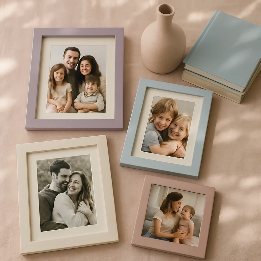
Another frequent issue is inconsistency in framing materials and sizes. A brass oval frame from the 1990s sitting next to a distressed barnwood rectangle and a glossy acrylic block sends conflicting style signals. Each frame individually might be perfectly fine, but together they compete for attention instead of complementing one another. The eye has no place to rest, and the overall impression reads as disorganized rather than charmingly eclectic. Have you ever walked into a room and felt visually exhausted without being able to pinpoint exactly why? A cluttered photo display is often the hidden cause.
Dated displays also suffer from poor placement choices. Photos crammed into dark corners, hung too high above furniture, or lined up along a narrow shelf at eye level in a tight corridor all create friction between the images and the architecture of the room. The National Kitchen and Bath Association (NKBA) emphasizes that wall decor should relate proportionally to the furniture beneath it, and that principle extends directly to photo arrangements. When placement ignores spatial relationships, even beautiful photographs look like afterthoughts.
Establishing a Cohesive Color and Frame Strategy
The simplest and most transformative step you can take is unifying your frame selection. This does not mean every frame must be identical, but they should share a common thread, whether that is material, color, or profile width. Thin matte black frames, for example, work across nearly every interior style from Scandinavian minimalism to mid-century modern. They recede visually, letting the photographs themselves become the focal point rather than the hardware surrounding them.
Color consistency within the photographs matters just as much as the frames. If you are mixing black-and-white prints with full-color snapshots, the arrangement can feel disjointed. One effective approach is to commit fully to black-and-white conversions for a formal gallery wall, reserving color prints for more casual display areas like a kitchen pinboard or a hallway ledge shelf. The Architectural Digest design team frequently recommends this separation as a way to maintain visual harmony without sacrificing variety.
Mat boards offer another layer of cohesion that many homeowners overlook. A consistent white or off-white mat around every print, regardless of the image size, creates a uniform border that ties disparate photographs together. Mats also introduce breathing room between the image edge and the frame, which reduces the feeling of density even in a tightly hung grouping. Professional framers at organizations like the Professional Picture Framers Association (PPFA) recommend mat widths between two and three inches for standard portrait and landscape prints.
When selecting frames, consider the finish of other hardware in the room. If your door handles, light fixtures, and curtain rods are brushed nickel, a set of thin silver frames will integrate seamlessly. This kind of material echo is subtle but powerful, giving the display an intentional quality that separates a designed arrangement from a haphazard collection. The goal is to make the frames feel like part of the room's vocabulary rather than foreign objects mounted on the wall.
Layout Techniques That Prevent Visual Chaos
Grid arrangements remain one of the most reliable layouts for family photo displays because they impose order on diverse content. A three-by-three or four-by-three grid of identically sized frames creates a strong geometric statement that reads as a single design element rather than nine separate pictures. The key to a successful grid is precise spacing; two inches between frames is a widely used standard that balances togetherness with breathing room. Use a level and painter's tape to map positions before driving any nails.
For homeowners who find grids too rigid, a salon-style hang offers controlled looseness. This approach groups frames of varying sizes around an invisible center line, building outward symmetrically. The trick is to start with the largest piece at the visual center and arrange smaller frames around it, maintaining consistent gaps. Laying everything out on the floor first, or tracing frame outlines onto kraft paper and taping those to the wall, lets you experiment freely before committing. Does the idea of putting thirty nail holes in your wall make you nervous? Paper templates eliminate that anxiety entirely.
Linear arrangements work exceptionally well in hallways and above long pieces of furniture like console tables or credenzas. A single horizontal row of five to seven frames at a uniform height creates rhythm and movement, drawing the eye along the wall. This layout is particularly effective when the frames are identical and the images share a common theme, such as vacation landscapes or milestone portraits. According to a survey by Houzz, linear gallery rows rank among the top three most-saved wall decor ideas on their platform, indicating broad appeal across style preferences.
Asymmetrical clusters can also succeed when they follow an underlying logic. Grouping three large frames on one side of a doorway and two smaller ones on the other, for instance, creates balance through visual weight rather than mirror symmetry. The Houzz community forums are full of examples where asymmetry feels dynamic and modern rather than messy. The difference between intentional asymmetry and chaos is simply planning; if you can explain why each frame sits where it does, the arrangement will read as deliberate.
Mixing Photos with Other Art and Objects
A display composed entirely of family photos can start to feel like a shrine rather than a design feature. Introducing non-photographic elements breaks the monotony and adds textural variety. A small abstract print, a woven textile in a frame, or a simple typographic piece interspersed among the photographs gives the eye different things to process, which paradoxically makes each individual photo stand out more. Think of these additions as punctuation marks in a visual sentence.
Three-dimensional objects also play well alongside framed photos, especially on shelving displays. A small ceramic vase, a brass geometric sculpture, or a stack of books with interesting spines can serve as anchors between clusters of frames on a picture ledge. These objects add depth, literally projecting forward from the wall plane, and they introduce materials that photographs alone cannot provide. The American Society of Interior Designers notes that layering two-dimensional and three-dimensional elements is a hallmark of professionally styled interiors.
When mixing media, maintain the color and material strategy you established for the frames themselves. If your frames are warm wood tones, your accent objects should echo that warmth, perhaps through terracotta, brass, or natural linen. Cool-toned frames pair better with concrete, glass, or matte white ceramics. This discipline prevents the mixed display from devolving into a miscellaneous collection and keeps the overall palette feeling curated. The ASID style guides consistently emphasize material harmony as a core principle of residential accessorizing.
Mirrors make surprisingly effective companions to photo groupings. A single round mirror placed among rectangular frames introduces a contrasting shape that adds energy to the arrangement. It also bounces light across the photographs, improving visibility in rooms with limited natural illumination. Position the mirror where it will reflect something pleasant, like a window view or a light fixture, rather than an opposing blank wall. This dual function of aesthetic variety and practical light enhancement makes mirrors one of the most underutilized tools in photo display design.
Digital and Alternative Display Methods
Digital photo frames have come a long way from the clunky, low-resolution screens of the early 2000s. Current models from brands like Aura and Meural offer high-definition displays with anti-glare coatings that genuinely mimic the appearance of a printed photograph. They rotate through hundreds of images, which means your display can evolve daily without any physical rearrangement. For families who take thousands of photos a year but only print a handful, a high-quality digital frame solves the curation problem entirely.
Photo display wires and minimalist clip systems offer a casual, easily changeable alternative to traditional framing. A thin steel cable strung horizontally with small bulldog clips holding unframed prints creates a studio-like aesthetic that works particularly well in creative spaces, children's rooms, and informal living areas. The advantage is immediacy: swap a print in five seconds, add new ones after any event, and remove faded or outgrown images without leaving nail holes behind. This approach works best when all prints are a consistent size, typically four-by-six or five-by-seven inches.
Acrylic block frames and frameless magnetic mounts represent another modern direction. These options eliminate the visual weight of traditional frames entirely, letting the photograph float against the wall. The effect is clean and contemporary, particularly suited to minimalist interiors where even slim frames might feel like too much visual information. According to the Professional Picture Framers Association, demand for frameless display options has grown steadily as open-concept living spaces have become the dominant residential layout, since lighter wall treatments suit the airy feel these floor plans require.
Projection and printed wall murals sit at the most dramatic end of the spectrum. A single oversized family photograph printed as a wall mural can serve as a room's primary art piece, eliminating the need for any additional display. Services like Shutterfly and Minted offer custom wall murals at accessible price points. This approach requires a high-resolution source image and a wall free from architectural interruptions like outlets and switches, but when those conditions are met, the result is striking and completely original.
Seasonal Rotation and Long-Term Maintenance
Static photo displays inevitably fade into the background of daily perception. You stop seeing images you pass a hundred times a week, which defeats the purpose of displaying them in the first place. A seasonal rotation schedule counteracts this phenomenon by introducing fresh content at regular intervals. Swap in beach vacation photos during summer, holiday gathering shots in winter, and school milestone portraits at the start of each academic year. The physical act of changing prints also reconnects you with the memories they hold.
Picture ledge shelves make rotation effortless because frames simply lean against the wall rather than hanging from fixed hardware. Lifting one frame off and replacing it with another takes seconds, no tools required. Installing two or three ledge shelves at staggered heights provides enough display area for a meaningful collection while keeping the swap process completely painless. This flexibility is one reason ledge shelves have become a designer favorite for family-oriented spaces.
Long-term maintenance includes protecting prints from environmental damage. Direct sunlight causes noticeable fading within as little as six months, so position displays on walls that receive indirect or ambient light. UV-protective glass, available as an upgrade from most framing shops, extends print life dramatically in sunlit rooms. Dust accumulation on frame surfaces and glass is another slow degrader; a monthly wipe-down with a microfiber cloth keeps everything looking crisp. These small maintenance habits preserve both the physical quality of the prints and the visual impact of the display.
Periodically auditing the collection prevents the creep back toward clutter. Once a year, evaluate every displayed photograph and ask whether it still earns its spot. Children grow, relationships evolve, and your aesthetic preferences mature. A display that accurately reflects your family as it is now, rather than as it was five or ten years ago, feels vital and current rather than dusty and sentimental. This does not mean discarding old photos; it means archiving them thoughtfully and giving your wall space to images that make you feel something immediate.
Conclusion: Building a Display That Grows With Your Family
The difference between a dated photo display and a stylish one rarely comes down to the photographs themselves. It is almost always a matter of framing consistency, intentional layout, and willingness to edit. By committing to a unified frame style, planning your arrangement before touching a hammer, and mixing photographic content with complementary art and objects, you create a display that functions as genuine interior design rather than visual noise.
The most successful family photo walls share one quality: they look like someone made deliberate choices. Every frame placement, every mat width, and every accompanying object communicates that this display was designed, not accumulated. That intentionality is what separates a gallery wall you are proud to show guests from one you instinctively apologize for. What story do you want your walls to tell about your family and your home?
Start your refresh this weekend by choosing one wall and one frame style. Remove everything currently hanging, lay your favorite recent photographs on the floor, and experiment with arrangements until something clicks. The investment of a single afternoon and a set of matching frames can transform a cluttered, dated display into a feature that anchors the entire room. Your family memories deserve a presentation that matches their significance.
If you are ready to take the next step, photograph your current display and your room's existing hardware finishes, then visit a local framing shop to discuss frame options that complement your space. A professional consultation typically costs nothing and can save you from expensive trial-and-error purchases. Bring your vision to life by starting with just five of your strongest photographs and building outward from there.
More Articles You May Like


Comments
Post a Comment