Étagère Bookcase Styling Rules for Open Back Shelving Display
The étagère is the most demanding piece of furniture a homeowner can introduce to a room. Unlike a closed cabinet or a solid-back bookcase, the étagère's open back leaves every styled object visible from multiple angles, against the wall behind it as well as against the room's negative space. Every shelf is on display. Every object competes with every other object. There is nowhere to hide a stack of paperwork or an unused candle. This is precisely why the form remains a favorite of professional interior designers and a quiet anxiety for everyone else.
According to membership data from the American Society of Interior Designers, open shelving and étagère-style display continues to rank among the most-requested visual features in residential design briefs. The piece's appeal is straightforward: when styled well, an étagère reads as gallery, library, and architecture simultaneously, layering personal objects into a composition that no closed cabinet can produce. When styled poorly, it reads as a tornado of unrelated stuff. The difference between the two outcomes is not budget. It is rule-following.
The Rule of the Empty Shelf
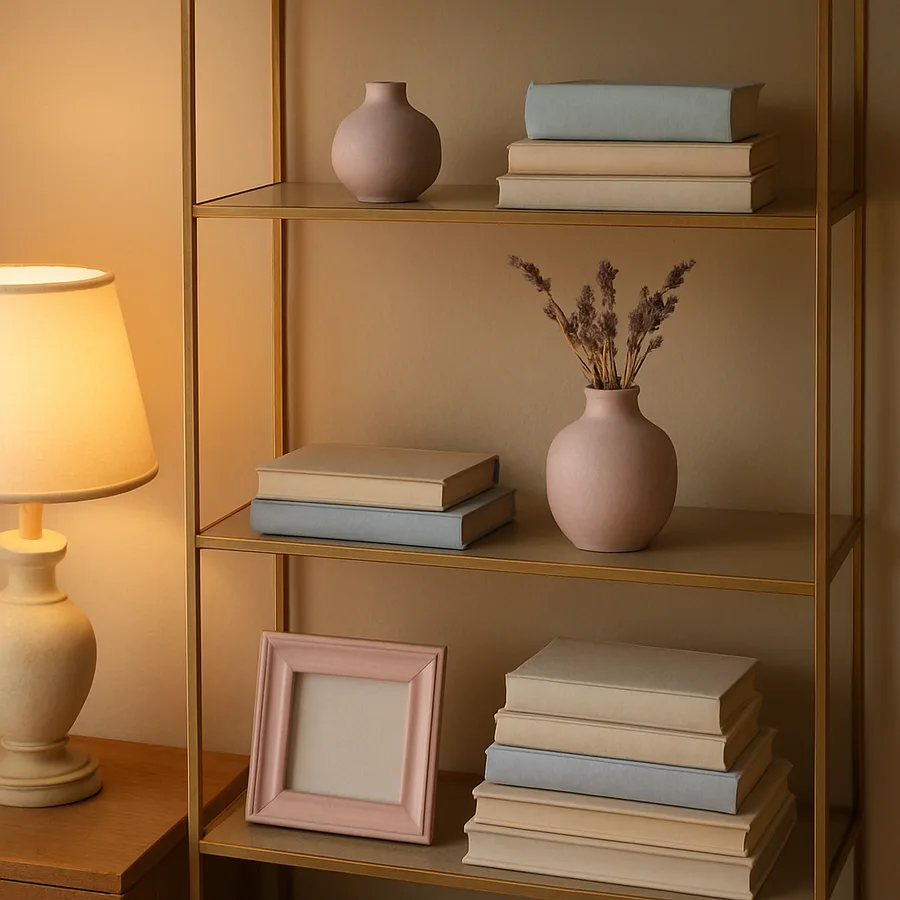
The single most important étagère rule, and the one most consistently violated by homeowners, is that at least one shelf must be visually empty. Not literally empty, in most cases, but visually negative-space dominant. A piece with five shelves should have at least one shelf, and ideally two, that read as breathing room rather than as display.
This is the rule that separates professional styling from amateur styling more reliably than any other principle. Amateurs treat each shelf as an independent display problem to be solved with three to five objects. Professionals treat the entire étagère as a single composition with object density varying dramatically from shelf to shelf. Some shelves are dense, some are sparse, some are nearly empty. The variation is what produces visual rhythm.
The publication Architectural Digest has run countless features on open shelving in residential and gallery settings, and the empty-shelf principle appears in every successful example. Look at any well-styled étagère in editorial photography and count the visually empty shelves. The number is almost never zero.
Have you ever filled a new bookcase and then felt vaguely dissatisfied with the result without knowing why? The most likely cause is uniform density. Every shelf at the same fullness reads as a hardware-store display, no matter how lovely the individual objects. The fix is to remove objects, not to add more.
Object Grouping: The Rule of Three and Its Limits
The rule of three is the most-cited principle in styling guidance, and it is genuinely useful when applied correctly. Objects grouped in odd numbers, particularly threes, read as more dynamic and considered than objects grouped in even numbers. The brain processes asymmetric groupings as more interesting than symmetric ones, and the principle holds across cultures and design traditions.
The limits of the rule of three matter as much as the rule itself. The rule applies to standalone object groupings, not to every shelf or every category of object. A row of seven matched leather-bound books does not need to be broken into a three-and-four arrangement. A pair of identical brass candlesticks flanking a central object is a classic two-plus-one arrangement that follows the rule of three at the composition level even though each candlestick is a single object.
The most reliable three-object grouping uses varied heights and varied silhouettes. One tall vertical object (a vase, a sculpture, a candlestick), one medium horizontal object (a stack of books, a small framed work, a trough-shaped vessel), and one low rounded object (a bowl, a low ceramic, a small sphere). The variation in both height and silhouette gives the eye three distinct points to register, and the brain reads the grouping as composed rather than collected.
What to avoid: groupings of identical or near-identical objects in odd numbers. Three identical vases of the same height look like a hardware display, not like a composition. The rule of three requires variation among the three objects to work.
Books: The Most Misused Object on the Étagère
Books are simultaneously the easiest and the hardest étagère objects. They are easy because nearly every household has them in quantity. They are hard because the default orientation, vertical and spine-out, almost never produces good results on an étagère.
The professional approach treats books as compositional elements rather than as stored content. This means horizontal stacking as often as vertical shelving, mixing the two orientations on the same shelf, removing dust jackets to reveal the cloth or leather binding underneath, and ruthlessly editing the book selection by visual quality rather than by content quality.
A horizontal stack of three to five books, lying on their sides, becomes a small platform on which to place another object: a small ceramic, a piece of coral, a framed photograph. This stacking move is the most useful single technique in étagère styling because it adds a layer of composition without requiring additional objects.
The publication House Beautiful has consistently advocated for what they call the "book as object" approach in styling features, and the technique appears in the work of nearly every prominent contemporary stylist. The shift in mindset is the key. Books on an étagère are not there to be retrieved and read. They are there to compose. Books for actual reading should live in a closed bookcase or a stack on a side table, where retrieval matters more than composition.
Color editing matters. A shelf of multicolored paperbacks reads as visual noise. A shelf of leather-bound antiquarian books reads as cohesion. A shelf of all-cream cloth-bound books reads as gallery. The reduction in color variation is what produces the cohesion. The most-styled étagères in editorial photography almost always show books in a tightly limited color palette, often achieved by removing dust jackets, by buying second-hand books in bulk by color, or by recovering books in custom paper.
The Color Palette Discipline
Étagère styling lives or dies on color discipline. A piece styled with twenty objects in fifteen different colors reads as cluttered no matter how well the individual groupings follow the rule of three. A piece styled with twenty objects in three to five repeating colors reads as composed even if the groupings are imperfect.
The most reliable palette structure uses a dominant neutral plus one or two accent colors. The dominant neutral might be cream, oatmeal, warm white, or a pale stone color, supplied by ceramics, books, and textiles. The accent colors might be a deep brass or bronze, plus a single saturated color used sparingly: a dusty terracotta, an aged green, an inky blue. The accent colors appear on perhaps one in five objects, never as the dominant palette.
This restriction feels constraining when you are pulling objects from your collection, but the result is what makes the difference between a styled étagère and a populated one. Have you noticed that the most photographed étagères in design publications all share a similar color discipline regardless of the individual style of the room? The discipline is not optional. It is the technique.
Better Homes and Gardens has covered this palette restriction extensively, often demonstrating before-and-after examples where the same shelves are styled first with the homeowner's existing object collection at full color variety and then with the same objects edited down to a tighter palette. The visual difference is dramatic and consistent across every demonstration.
Layering Depth: Front, Middle, and Back
The étagère's open back creates a unique styling opportunity that closed shelving cannot offer: true depth. Objects can be placed at the front, middle, and back of each shelf, with the back-most objects partially visible through and around the front objects. This produces the layered, gallery-like quality that distinguishes professionally styled open shelving from competently styled closed shelving.
The technique requires shelves deep enough to support layering, typically 10 to 12 inches deep at minimum. Shelves shallower than that force every object into a single front-to-back plane and lose the depth advantage. When buying or specifying an étagère, the shelf depth deserves more attention than it typically receives.
The layering formula that works most consistently uses a tall back-most object (a leaning piece of art, a tall vase, a panel), a medium front-most object (a low ceramic, a stack of books, a sculpture), and the implied middle plane created by the negative space between them. The back object frames the front object, and the front object frames the wall or the room visible through the étagère's open structure.
Leaning art is the single most powerful layering move. A small framed work or a pair of frames leaned against the back of the shelf, with smaller objects in front, creates depth and gives the eye a focal point per shelf. The art does not need to be expensive or significant. A small antique print, a ceramic tile, a scrap of textile in a frame, all serve the same compositional purpose.
Maintenance, Editing, and Letting the Piece Breathe
An étagère is not a styled-once-and-finished piece of furniture. It requires ongoing editing in a way that closed cabinets do not, because the visual impact of every object is constant rather than concealed. The professional practice is to reset the étagère seasonally, removing every object, dusting the entire piece, and restyling from scratch with a fresh eye.
The seasonal reset prevents the gradual accretion of objects that turns a styled étagère into a populated étagère over time. Most homeowners add objects to their étagère faster than they remove them, and over twelve months a beautifully styled piece becomes visually overloaded without any single act of overstyling. The reset breaks the accretion cycle.
The Apartment Therapy editorial team has written extensively about the editing discipline that quality open shelving requires, and the consistent observation is that subtraction is harder than addition. Removing a beloved object from the étagère because it no longer serves the composition feels like a loss. It is not a loss. It is a maintenance practice.
Dust is the practical enemy of open shelving. Every object on an open étagère collects dust at a rate roughly comparable to a tabletop. Plan for a quick wipe-down monthly and a deep clean quarterly. Glass shelves show dust most aggressively but also clean most easily. Wood shelves require slightly more care to avoid finish damage from harsh cleaners. The American Home Furnishings Alliance publishes care guidance for various shelf materials that is worth consulting before applying any cleaning product to a finished surface.
Conclusion
The étagère is the most rewarding piece of furniture to style well and the most punishing to style poorly. The rules are not complicated, but they are unforgiving. At least one shelf must be visually empty. Object groupings should follow the rule of three with variation in height and silhouette. Books should be treated as compositional elements rather than as stored content, with horizontal stacking and color editing as primary techniques. The color palette should be tightly disciplined, with a dominant neutral and one or two accent colors. Depth should be exploited through front-middle-back layering on shelves deep enough to support it. The piece should be reset seasonally to prevent accretion.
What separates the étagère from every other piece of display furniture is that the rules are visible. There is no door to close on a styling failure. The empty shelf rule, the rule of three, the color discipline, and the layering technique all show or fail to show in plain sight. This visibility is the source of both the form's difficulty and its power. When the rules are followed, the étagère reads as gallery, library, and architecture simultaneously, and the room around it borrows that character.
The mistake most homeowners make is treating the étagère like a bookcase, populating it to capacity with books and accumulated objects, and then wondering why it never looks right. The étagère is not a bookcase. It is a vertical composition that happens to use shelves and objects as its medium. Approached with that distinction in mind, the styling rules become not constraints but tools.
If you have an étagère in your home that has been quietly disappointing you for years, schedule a Saturday afternoon, remove every object from the piece, and restyle it from scratch using these rules. Take a photograph before you start and another when you finish. The difference between the two images will tell you everything you need to know about why the rules exist and what they accomplish when followed.
More Articles You May Like


Comments
Post a Comment