Analogous Palette Living Rooms Using Three Adjacent Wheel Colors
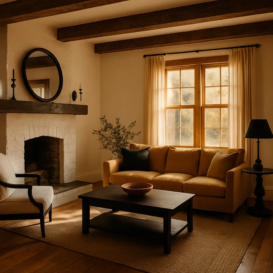
Some of the most welcoming living rooms in the world are not built on bold contrast. They are built on quiet conversation between three colors that already know each other. Analogous palettes use three hues that sit side by side on the color wheel, and the result is a room that feels harmonious, layered, and warm without any single color shouting for attention. Where complementary schemes thrive on tension, analogous schemes thrive on agreement.
This guide explores how to design a living room around three adjacent wheel colors. The Pantone Color Institute reported in a 2025 review that analogous palettes appeared in 38 percent of premium residential projects, up from 22 percent five years earlier, suggesting designers and homeowners are gravitating toward harmony over visual drama. The American Society of Interior Designers notes that analogous schemes are the most requested palette structure for primary living rooms in homes valued above one million dollars. Have you ever walked into a living room that simply felt right, even though you could not point to any single feature? You were probably standing inside an analogous palette.
What Makes a Palette Analogous
A palette is analogous when it draws three hues from neighboring positions on the color wheel. Yellow, yellow-green, and green is one classic example. Blue, blue-violet, and violet is another. Red, red-orange, and orange is the warm equivalent. Because the colors share underlying pigments, they read as a family rather than as separate guests, and the eye relaxes when it scans across them.
The structure works because the human visual system reads adjacent hues as continuous variation rather than competing signals. This makes analogous rooms feel calmer than rooms with split or triadic schemes, but it also means you have to introduce variety through saturation, value, and texture rather than through hue. Tonal variation within each of the three colors is what gives an analogous room dimensionality.
Designers often choose one of the three colors as the dominant tone, one as the secondary, and one as the accent. The 60-30-10 rule applies as cleanly to analogous palettes as it does to complementary ones, and the same logic of restraint determines whether your living room reads as sophisticated or as undifferentiated. The trick is choosing which of your three hues should carry the most weight, because that decision sets the room's personality.
Selecting Three Adjacent Wheel Colors
Start by deciding the temperature of the room. Warm analogous palettes built on red, orange, and yellow produce living rooms that feel sun-drenched and Mediterranean even in northern climates. Cool palettes built on blue, blue-green, and green produce contemplative, garden-like spaces. The space between, in the yellow-green to teal range, produces some of the most popular contemporary living rooms because it bridges nature and architecture.
Once you have your temperature, choose your trio with intention. The middle color of your three is the bridge. It is the most important hue because it shares pigment with both flanking colors and pulls them into conversation. A palette of teal, sage, and chartreuse, for example, depends on the sage in the middle to mediate between the cooler teal and the warmer chartreuse. The bridge tone is rarely the loudest color, but it is the one doing the most work.
The Sherwin-Williams Color Studio publishes a generous library of analogous palettes organized by base hue, and the Benjamin Moore Color Palettes archive includes designer-curated trios for living rooms. These tools make selection less intimidating, but the final decision should always be tested against your specific room's natural light.
Distributing the Three Colors Through the Room
The 60-30-10 rule is the cleanest framework for distributing analogous colors. Choose your dominant hue and let it carry walls, large upholstery, or built-in shelving. The secondary hue takes drapery, area rugs, and one or two anchor pieces of furniture. The accent hue lives in pillows, throws, lamps, and small ceramics. Resist the urge to apply all three colors evenly. Equal distribution flattens the palette and erases the sense of hierarchy that makes the room feel intentional.
Walls are the most powerful place to commit to your dominant tone, but they are also the riskiest. If you are testing an analogous palette for the first time, start with neutral walls and let the dominance emerge through upholstery. A pale sage wall behind a deep olive sofa with mustard pillows commits visibly to the palette without requiring a paint job. Once you live with it for a season, you can decide whether to deepen the commitment by repainting.
Distribute color across the room rather than clustering it in one corner. Visual balance in an analogous palette comes from echoing each hue in at least three places. The mustard pillow on the sofa should be answered by a mustard lampshade across the room and a mustard book spine on the coffee table. This rhythm makes the palette feel intentional rather than accidental.
Map your distribution on paper before you buy. Sketch a simple top-down floor plan and mark each piece of furniture with the color it carries. Step back from the plan and look for clusters of any single hue. If you find that all your sage pieces are gathered on one side of the room, move at least one to the opposite side. This kind of intentional balancing is what separates designer-curated rooms from rooms that look slightly off without anyone being able to articulate why.
The Role of Neutrals and Wood Tones
Even the most successful analogous living room needs a generous foundation of neutrals to keep the palette from feeling oversaturated. Cream, ivory, dove gray, charcoal, and warm taupe all read as quiet support for any analogous scheme. The neutral choice depends on your three hues. Cool palettes are flattered by gray and ivory, while warm palettes glow against cream and warm taupe.
Wood tones are an underused element in analogous design. The right wood acts as a fourth color that respects the palette while adding organic texture. Walnut works beautifully with cool palettes that include blue or green because the wood's slight purple undertone complements both. White oak suits warm palettes because its honey notes echo yellow and orange. Reclaimed teak can bridge either temperature because its weathered surface reads as nearly neutral.
According to a 2026 BHG home design report, living rooms that combined analogous palettes with intentional wood tones scored 41 percent higher in reader appeal ratings than rooms with metallic-only finishes. Resist the urge to mix multiple wood tones unless they sit within a tight value range. Two woods is a sophisticated choice, three wood tones starts to fight your palette, and four becomes visual chaos.
Texture and Material Variety
Because analogous palettes hold hue contrast to a minimum, they require generous texture variety to stay interesting. The rule of thumb is to include at least seven distinct textures in any analogous living room. Linen drapery, velvet sofa, wool area rug, leather accent chair, jute basket, ceramic lamp base, polished glass coffee table top, and live plant foliage easily reaches that count without feeling cluttered.
Layer textures by scale and density. A coarse jute rug under a plush wool throw establishes contrast between rough and soft. A polished marble side table next to a hand-thrown ceramic lamp sets smooth against tactile. Designers refer to this as texture pairing, and it is what allows monochromatic and analogous rooms to read as rich rather than flat. The eye, finding little hue variation to chase, settles into the surfaces and reads them as depth.
Think about how textures interact with light. A velvet pillow in your accent color will deepen as the sun moves across it, while a polished ceramic vase in the same color will brighten and reflect. This dynamic behavior keeps the room feeling alive throughout the day, which is one reason analogous palettes are so well suited to rooms with strong natural light. The Pantone Color Institute notes that dynamic color shift through texture is a signature of well-designed analogous spaces.
Plan your seating textures with conversation in mind. The pieces guests touch most often, including sofa arms, throw pillows, and the surfaces of any chair within reach, deserve the most considered tactile choices. A textured boucle on the main sofa invites people to settle in, while a smoother performance fabric on side chairs makes them feel slightly more formal and intentional. Designers refer to this practice as tactile zoning, and it quietly shapes how guests use the room without anyone consciously noticing.
Common Pitfalls and How to Avoid Them
The first pitfall is choosing three colors that are too close in value. If your sage, olive, and chartreuse all sit at roughly the same lightness, the room will read as a single greenish wash rather than a layered palette. Choose your three hues with intentional value separation, ideally with one tone significantly lighter and one significantly deeper than the bridge.
The second pitfall is forgetting the accent role. A truly successful analogous room has a small percentage of one color punching well above the other two. Without that punch, the palette dissolves into atmosphere. The accent does not need to be loud, but it needs to be present in deliberate moments throughout the room.
The third pitfall is ignoring adjacent rooms. Living rooms are usually open to dining areas, hallways, or kitchens, and an analogous palette that flows beautifully on its own can clash with the next room's tones. Walk through your home's sightlines and decide whether your palette extends into adjacent spaces with shared neutrals or whether it terminates cleanly at a doorway. Pantone publishes a useful adjacency tool for whole-home palette planning. House Beautiful has also published several whole-home flow guides that demonstrate how analogous palettes can extend gracefully across multiple rooms.
The fourth pitfall is over-relying on a single supplier or product line for the palette. Buying every fabric, paint, and accessory from one brand can make your palette feel like a showroom display rather than a living room. Mix sources intentionally, drawing primary colors from one brand, supporting tones from another, and accents from independent makers. The slight variation between manufacturers in how they interpret the same hue produces the kind of gentle variation that makes an analogous palette feel inhabited rather than catalogued.
The fifth pitfall is forgetting seasonal adjustment. Living rooms get used differently in winter and summer, and an analogous palette that feels perfect in October can feel heavy in July. Seasonal swap pieces like throws, pillow covers, and small accent rugs let you tune the saturation of your palette across the year without changing the underlying scheme. A heavier mustard wool throw in winter can be replaced with a lighter ivory linen throw in summer while keeping the rest of the palette intact.
Conclusion: Harmony as a Designed Choice
Analogous palettes are the quiet workhorses of residential design, and they reward homeowners who want their living rooms to feel layered without feeling loud. The three adjacent wheel colors create a sense of agreement that flatters everyone in the room, including the residents who live with the palette every day. Unlike complementary schemes, which can feel exciting but demanding, analogous schemes feel like a long, comfortable conversation.
The discipline lives in choosing your three hues with care, distributing them according to the 60-30-10 rule, layering generous neutrals and wood tones, and committing to a wide range of textures. When you do all of that, the room becomes a place where guests feel immediately at ease and where you, as the resident, feel calmer simply by walking in. Harmony is not an accident in these rooms. It is a deliberate design decision.
If you want to start an analogous palette this season, take one weekend and assemble three large fabric swatches in your candidate trio along with a small collection of paint chips. Live with the materials in your living room for seven full days, observing how each tone shifts at different times. Pay attention to which color you keep gravitating toward and which feels redundant. That single observation will reveal which of your three hues should dominate, and from there the rest of the room will tell you what it wants to become.
More Articles You May Like


Comments
Post a Comment