Complementary Color Schemes Using Color Wheel Opposites in Rooms
Open any well-photographed interior magazine and pause on the image that makes your eye snap into focus. There is a strong chance you are looking at a complementary color scheme, two hues that sit directly across from each other on the color wheel and create the maximum possible contrast available to a designer. Blue and orange. Red and green. Yellow and violet. Complementary color schemes are the loudest tool in the palette toolbox, and when used with care they produce rooms that feel alive without feeling chaotic.
This guide walks through the theory, the practical decisions, and the small mistakes that separate a confident complementary room from a costume. The Pantone Color Institute has reported that homes using high-contrast complementary palettes were cited 31 percent more often in 2025 design awards than homes using single-tone schemes, and the American Society of Interior Designers notes a clear rise in client requests for boldly contrasting living rooms and bedrooms. Have you ever walked into a room and felt energized without knowing why? The answer is often a quiet complementary tension between two well-chosen wall, fabric, or accent tones. Are you ready to use that tension on purpose?
The Theory Behind Color Wheel Opposites
The color wheel that designers reference today descends from Sir Isaac Newton's circular arrangement of the visible spectrum, refined over centuries by artists, including Johannes Itten at the Bauhaus. Pairs of hues directly across the wheel are called complements because each one contains exactly the wavelengths the other lacks. When placed side by side they cause the human eye to oscillate, which produces a sensation of vibrance, energy, and sometimes a faint shimmering halo where the two colors meet.
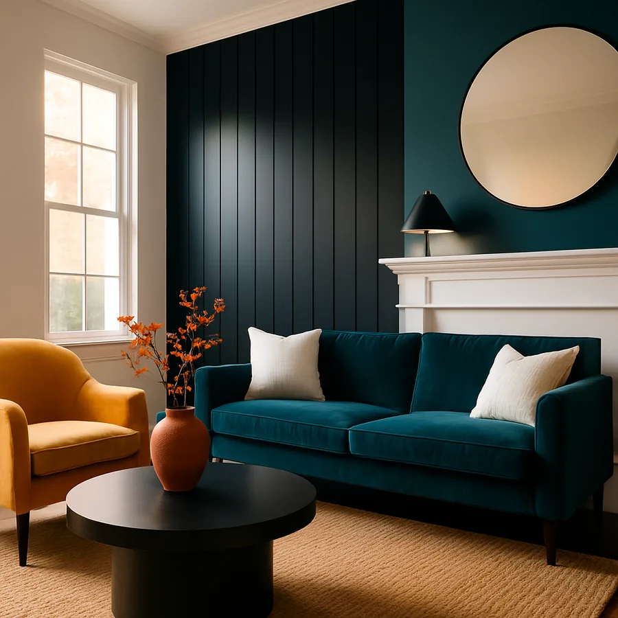
The classic primary pairs are red with green, blue with orange, and yellow with violet. The secondary and tertiary pairs add more nuance, including blue-green with red-orange or yellow-green with red-violet. Designers often soften the textbook pairings by reaching for slightly muted versions, like terra cotta paired with deep teal rather than pure red with pure green, which keeps the contrast principle intact while reducing the visual aggression.
What makes complementary schemes powerful in interiors is that they map onto the eye's natural search for balance. After staring at a saturated red, the retina produces a green afterimage. Complementary harmony simply gives that afterimage a place to land in the room, which is why a green plant pops so dramatically against terracotta walls and why a navy sofa makes a pumpkin pillow look almost three-dimensional.
Choosing the Right Pair for the Mood You Want
Not every complementary pair produces the same emotional register. Blue and orange skews toward energetic and modern, with a coastal or desert sensibility depending on the saturation. Red and green skews festive at full saturation but turns sophisticated when both sides are pushed into deeper, dustier territory. Yellow and violet is the most romantic and least common pair in residential design because it requires a confident hand to keep it from looking childlike.
Decide on the dominant emotion before you open a single fan deck. Is the room a place for evening conversations, morning energy, or contemplative reading? An orange and blue palette in a den, with deep navy walls and burnt-orange leather, feels enveloping and clubby. The same hues in a sunroom, with pale blue ceilings and bright tangerine cushions, feels playful and Floridian.
The Sherwin-Williams Color Studio publishes a useful guide on complementary palettes organized by room type, and the Benjamin Moore Color Trends collection regularly features well-balanced complementary suggestions for residential applications. Use these libraries as a starting point rather than a recipe, because lighting in your specific room will shift any color noticeably.
The 60-30-10 Rule and Why It Saves Complementary Schemes
The most common mistake in complementary design is allocating equal real estate to both colors. Fifty percent green and fifty percent red turns a sophisticated palette into a holiday display. Designers use the 60-30-10 rule to keep complementary pairs from collapsing into competition. Sixty percent of the visible surface is the dominant color, thirty percent is the supporting color, and ten percent is the accent that ties the room together.
Apply the rule with intention. If your room is built around a green and red complement, choose which side carries the room. A drawing room with sixty percent forest green walls, thirty percent cream and natural wood furniture acting as a neutral bridge, and ten percent oxblood red in pillows and a single accent chair will feel layered and editorial. The same room with sixty percent red walls and thirty percent green sofas would feel oppressive and unfocused.
The ten percent layer is where the complementary tension actually does its job. A small dose of pure complementary color punches above its weight, drawing the eye and creating depth. House Beautiful's editorial team interviewed designer Mark Sikes for a 2026 feature, and he noted that restraint with the secondary color is what separates an editorial room from a decorating misfire.
Walls, Textiles, and Architectural Accents
Complementary schemes can live on walls, in textiles, or in architectural accents, and each carries different consequences. Painted walls deliver the strongest commitment because they wrap the room. If you are new to complementary design, start with a textile-led approach. Keep walls neutral or in your dominant tone, and let the secondary tone arrive through upholstery, drapes, and a layered area rug.
Architectural accents like trim, ceiling color, and built-in cabinetry are powerful but tricky. A complementary trim color, such as a soft rust against a sage green wall, pulls the eye to the room's geometry and emphasizes its proportions. Use this technique when you want to celebrate strong architecture, and avoid it in rooms with awkward geometry that you would rather de-emphasize.
Ceiling color is the most underused tool in complementary design. A pale wash of the secondary color overhead creates a subtle halo effect that ties the entire room together without competing with the dominant walls. Designers from firms like Kelly Wearstler and Studio Shamshiri frequently lean on tinted ceilings as the quiet hero of a complementary scheme. The trick is to choose a ceiling tone four or five shades lighter than the wall version of the same complementary color, so the effect reads as atmosphere rather than a fifth wall.
Textiles allow seasonal flexibility, which is why many designers reserve their boldest complementary moves for pillows, throws, and slipcovers. According to a 2025 BHG home goods report, seasonal textile swaps increased by 47 percent over the prior year, suggesting homeowners are using fabrics rather than paint to express bolder palettes. This approach lets you commit fully to a complementary statement for one season and dial it back the next.
Lighting, Texture, and the Hidden Variables
Complementary color schemes are uniquely sensitive to lighting because the eye's perception of contrast shifts dramatically under different temperatures. Warm incandescent light flatters red, orange, and yellow while dulling blue, green, and violet. Cool LED light does the opposite. Before committing to a pair, observe your room at three different times of day with the lights you actually use.
Texture changes complementary contrast as much as light does. A smooth, lacquered surface in deep blue reflects light and intensifies the orange across the room. The same blue in a matte velvet absorbs light and softens the entire scheme. Designers frequently use this knowledge to tune contrast levels without changing colors, opting for textured wallcoverings in bold rooms and glossier finishes in restrained ones.
Plan for the role of natural materials. Wood, stone, and woven fibers introduce a third tonal layer that quietly mediates between your two complementary colors. A walnut floor between sage walls and cinnamon furniture acts as a temperature bridge, while polished marble can heighten contrast by adding a cool, neutral plane. Are you planning your complementary scheme around your actual finishes, or trying to force a paint chip to behave the same way it did in the showroom?
Mirrors and reflective surfaces deserve special attention in complementary schemes because they double the color you place opposite them. A large mirror across from a deep navy wall will pull blue into every corner of the room, intensifying the apparent saturation. Place mirrors strategically to amplify the color you want more of, and avoid placing them opposite tones you want to keep restrained. Reflective amplification is one of the most overlooked tools in complementary design and can save you from repainting when you discover your scheme is too quiet or too loud.
Common Mistakes and How to Avoid Them
The first common mistake is using both colors at full saturation. A pure red sofa against a pure green wall will read as costume rather than design. Pull both colors slightly toward neutral by adding gray, or push one toward a tertiary tone such as olive or brick. The second mistake is forgetting the role of neutrals. Every successful complementary room contains a generous foundation of cream, taupe, charcoal, or natural wood. The neutral acts as breathing space.
The third mistake is asymmetry of weight. If your dominant color carries visual weight through dark tones and dense furniture, the accent color needs equal density even if it occupies less space. A pale yellow accent will disappear in a room of deep violet, while a saturated mustard pillow holds its own. Match the weight, not just the hue.
The fourth mistake is ignoring adjacent rooms. Complementary schemes that explode in one room can clash with the next room's palette if the doorway frames them simultaneously. Walk through your home's sightlines and ensure your complementary statement either continues into adjacent rooms with shared neutrals or terminates cleanly at a doorway. Pantone publishes a useful adjacency guide that can help with whole-home flow.
The fifth mistake is committing to bold complementary paint without committing to the supporting layers. A homeowner who paints a deep teal accent wall but leaves the rest of the room in white walls and beige furniture has not actually built a complementary scheme. They have built a single accent wall, and the orange counterpart is missing entirely. Either commit fully and let the orange arrive through textiles and accessories, or scale back the wall to a quieter version of the dominant color.
The sixth mistake is forgetting that complementary contrast applies to art and accessories too. A vibrant abstract painting in red and green hung on a soft beige wall introduces a complementary scheme into the room whether or not you planned for it. Be aware of every saturated piece you bring in, because a single high-contrast object can quietly redefine the entire room's palette intent.
Conclusion: Contrast as a Design Discipline
Complementary color schemes are the most expressive tool in the residential palette, and they reward designers who treat them as a discipline rather than a gimmick. The principle is simple. Two opposite colors, properly balanced, produce a vibrance that no single-tone scheme can match. The execution is where most homeowners stumble, because contrast at full strength is exhausting and contrast applied evenly becomes flat.
Start with a clear emotional intent, choose your pair from the wheel with one tone slightly muted, and apply the 60-30-10 rule with the discipline of a chef portioning ingredients. Use lighting and texture to fine-tune the contrast, and let neutrals do the silent work of holding the palette together. The room you produce will feel curated, energetic, and timeless rather than trendy.
If you are planning a refresh this season, spend an afternoon with two paint chips on opposite sides of the wheel, tape them to your wall, and live with them through one full daylight cycle. Watch how the colors shift in morning light, midday brightness, and evening lamp light. Make notes about which feels right and which feels forced. That single observation will teach you more about complementary design than any guide, and it will give you the confidence to commit to a palette that energizes your home for years to come.
More Articles You May Like


Comments
Post a Comment