The Ultimate Guide to Choosing Color Palettes in Modern Interior Design
Color is the single most transformative tool available to anyone designing or redesigning an interior space. It can make a cramped room feel expansive, a cold room feel inviting, and a bland room feel alive with personality. Yet choosing a color palette remains one of the most anxiety-inducing decisions homeowners face. The stakes feel high because paint covers large surfaces, fabric investments are significant, and the wrong color choice is a daily reminder of a mistake. This anxiety leads many people to retreat to safe, predictable neutrals that avoid offense but also fail to inspire.
The truth is that selecting a successful color palette is far less mysterious than it seems. It is grounded in a few well-established principles of color theory, informed by the specific characteristics of your space and lighting, and guided by your personal response to different hues. When you understand these principles, the process shifts from paralysis to genuine creative enjoyment. You begin to see color not as a minefield but as a language, one that allows you to communicate mood, personality, and intention through the walls, furnishings, and objects of your home.
This guide provides a comprehensive framework for choosing interior color palettes, from the foundational theory that governs how colors interact to the practical testing methods that prevent costly mistakes. Whether you are painting a single accent wall or planning a whole-home color scheme, these strategies will help you make confident decisions that produce beautiful, cohesive results.
The Fundamentals of Color Theory for Interiors
Every effective interior color palette is built on principles that have been understood by artists and designers for centuries. The color wheel, which arranges hues in a circular format based on their relationships to one another, is the essential starting tool. Primary colors (red, blue, yellow) combine to form secondary colors (orange, green, purple), which in turn combine with primaries to form tertiary colors. Understanding this structure allows you to identify harmonious color combinations with confidence rather than relying on guesswork or imitation.
Three fundamental color relationships form the basis of most interior palettes. Complementary schemes pair colors that sit directly opposite each other on the wheel, such as blue and orange or green and red, creating maximum contrast and visual energy. Analogous schemes use colors that sit adjacent to each other, such as blue, blue-green, and green, producing a harmonious, low-contrast effect. Triadic schemes select three colors evenly spaced around the wheel, offering vibrant variety while maintaining balance. Each relationship produces a distinct mood, and understanding which mood you want is the first step toward choosing the right scheme.
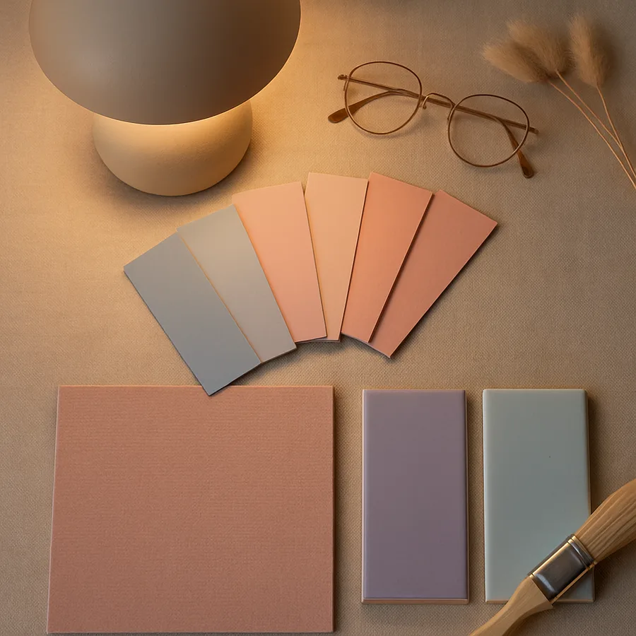
Beyond hue, two additional properties shape how a color functions in a room. Value refers to a color's lightness or darkness, from the palest tint to the deepest shade. Saturation describes a color's intensity, from vivid and pure to muted and grayed. A room painted in highly saturated colors at similar values feels intense and potentially overwhelming. The same hues desaturated and varied in value create a sophisticated, livable palette. Professional designers typically work with desaturated versions of bold hues rather than using them at full intensity, which is why professionally designed rooms often look "richer" without feeling garish.
The concept of undertones is where many homeowners encounter unexpected problems. Every color, including whites and grays, contains an underlying bias toward another hue. A white might lean pink, yellow, blue, or green. A gray might have purple, blue, or green undertones. These undertones become visible when colors are applied to large surfaces and interact with the room's lighting conditions. Mismatched undertones are the most common cause of color combinations that "should" work according to the color wheel but feel wrong in practice. Learning to identify undertones is perhaps the most practically valuable color skill you can develop.
The Problem-Solution Approach: Fixing Common Color Mistakes
Before exploring how to build successful palettes, it is worth understanding the most common color mistakes and their solutions. If you recognize your own home in any of these scenarios, the corresponding fix can produce immediate improvement. The most prevalent error is the undertone clash: a warm-toned wood floor paired with a cool-toned gray wall, for instance, creates a subtle but persistent visual discord that makes the entire room feel unsettled. The solution is to ensure that all major surfaces in a room share compatible undertones, either consistently warm or consistently cool.
The second most common mistake is insufficient contrast. A room where walls, furniture, trim, and accessories all occupy a similar value range feels flat and lifeless, regardless of how attractive the individual colors may be. The human eye needs variation in lightness and darkness to perceive depth and dimension. If your room feels dull despite having pleasant colors, try introducing elements that are significantly lighter or darker than your dominant mid-tones. A dark picture frame on a medium-toned wall, light cushions on a dark sofa, or dark hardware on light cabinetry all add the contrast that brings a palette to life.
The third common error is color isolation, placing a bold color in a single location without echoing it elsewhere in the room. A vibrant red cushion on an otherwise entirely neutral sofa in an entirely neutral room does not read as an intentional design choice. It reads as an afterthought. The fix is the "rule of three": any accent color should appear in at least three different locations within a room, varying in scale and application. That red might appear in a cushion, a book spine on the shelf, and a small detail in a piece of artwork, creating a visual rhythm that ties the room together.
Have you ever repainted a room and been disappointed by how different the color looked on the wall compared to the swatch? This is the scale illusion: colors appear more intense and more vivid when applied to large surfaces than when viewed on small samples. A color that looks perfect on a two-inch paint chip can feel overwhelming on a fifteen-foot wall. Professional designers account for this by selecting paint colors one to two shades lighter than their ideal for large wall applications, knowing the color will appear to intensify at full scale. This single adjustment prevents one of the most expensive and frustrating mistakes in home design.
Building Your Palette from Personal Inspiration
Theory provides the framework, but personal inspiration provides the content of your color palette. The most successful interior color schemes are not drawn from trend reports or designer showrooms. They are drawn from sources of color that already resonate with you emotionally: a favorite painting, a photograph from a meaningful trip, a piece of fabric you have loved for years, or a landscape that makes you feel at peace. These sources contain color relationships that your eye has already validated, making them reliable starting points for a room palette.
To extract a palette from an inspiration source, identify its dominant color (the one that occupies the most visual space), its secondary colors (supporting hues that appear in smaller quantities), and its accent colors (small pops of contrasting or complementary tone). A photograph of a Mediterranean courtyard might yield a dominant terracotta, secondary olive green and warm white, and accents of deep blue-violet in shadow areas. These five colors, translated into paint, fabric, and accessory selections, would produce a warm, cohesive, and personally meaningful palette. The American Society of Interior Designers encourages this inspiration-extraction method as a way to develop palettes that feel authentic rather than derivative.
Nature is an especially reliable source of color inspiration because natural color combinations have been refined by millions of years of evolution and consistently register as harmonious to the human eye. The Pantone Color Institute, which studies global color trends and consumer response, has consistently found that palettes derived from natural environments receive the highest approval ratings in consumer research. Forest palettes (greens, browns, mossy golds), coastal palettes (blues, sandy tans, driftwood grays), desert palettes (terracottas, sage greens, dusty pinks), and meadow palettes (soft greens, lavenders, wheat tones) all provide time-tested foundations for residential color schemes.
Once you have extracted a palette from your inspiration source, map it onto the 60-30-10 framework. Your dominant color covers approximately 60 percent of the room's visual field through walls and large furniture. Your secondary color occupies 30 percent through upholstery, curtains, and rugs. Your accent color fills the remaining 10 percent through decorative accessories, artwork, and small detail elements. This proportion ensures that your palette has clear visual hierarchy rather than competing elements of equal weight. How might your favorite piece of artwork or most-loved travel photograph translate into a room palette using this method?
Room-Specific Strategies for Color Application
Different rooms serve different purposes and occupy different positions in your daily routine, and their color palettes should reflect these distinctions. A kitchen that needs to feel energizing at six in the morning has different color requirements than a bedroom that needs to feel calming at ten at night. While whole-home color cohesion is important, it should be achieved through a consistent family of related hues rather than through identical colors applied uniformly to every space.
Living rooms benefit from palettes that balance warmth with sophistication. They are spaces for both relaxation and socializing, which means the color environment should be inviting without being sleepy. Warm neutrals, soft greens, muted blues, and gentle earth tones provide reliable foundations. Bold accents work well in living rooms because the room's typically generous proportions can absorb them, and they create conversation pieces in a space designed for gathering. The key consideration is that living rooms are usually among the largest rooms in a home and receive the most diverse lighting, from morning sun to evening artificial light, so colors must perform well across a range of conditions.
Bedrooms should prioritize colors that promote rest and calm. Research conducted by the National Sleep Foundation has found that cool, muted tones, particularly soft blues, gentle greens, and warm grays, are associated with better sleep quality and faster sleep onset compared to warm, stimulating colors. This does not mean bedrooms must be boring. Depth and richness can be achieved through tone-on-tone layering, where multiple values of a single hue create a sophisticated, enveloping atmosphere without introducing the visual stimulation that disrupts relaxation. Deep navy blue, for instance, can feel both dramatic and deeply calming.
Kitchens and bathrooms present unique color considerations because they contain fixed elements, countertops, tile, fixtures, and appliances, that cannot be easily changed. Your color palette in these rooms must work with these existing elements rather than ignoring them. Warm-toned countertops demand warm-toned wall colors. Cool-toned tile requires cool-toned cabinetry. Ignoring these fixed-element undertones is the number one source of color dissatisfaction in kitchens and bathrooms. Before selecting paint or accessories, inventory every fixed surface in the room and determine whether it reads as warm, cool, or neutral.
The Science of Testing Colors Before Committing
No amount of theoretical knowledge eliminates the need for physical testing in your actual space. Colors behave differently under different lighting conditions, next to different materials, and on different surfaces. A color that looks ideal in a south-facing showroom may look completely different in your north-facing living room. The testing phase is not optional. It is the most important step in the entire color selection process, and skipping it in the name of efficiency is a false economy that often leads to expensive do-overs.
For paint colors, purchase sample pots and apply large swatches, at least two feet by two feet, on multiple walls of the room you plan to paint. Observe these swatches at different times of day: morning, midday, evening, and under artificial light at night. Note how the color changes as light conditions shift. Some colors maintain their character across lighting conditions while others shift dramatically. The walls that receive the most natural light will show the truest representation of the color, while shaded walls will appear darker and potentially shift in undertone. Allow the samples to dry completely before evaluating, as many paints dry darker or lighter than their wet appearance suggests.
For fabric and material colors, obtain the largest samples available and position them in the room where they will ultimately live. Place fabric swatches on the furniture they are intended for. Hold tile samples against the wall they will adjoin. Set countertop samples next to the cabinets they will sit above. These contextual evaluations reveal color relationships that isolated swatches cannot. The Houzz professional community recommends maintaining a physical sample board for any room renovation, pinning all material, paint, and fabric samples to a single board that can be carried through the space and evaluated under varying conditions.
Digital tools can supplement but never replace physical testing. Screen colors vary across devices and never accurately represent the actual appearance of a paint or fabric. Use digital tools for initial exploration and narrowing your options, then always confirm with physical samples before making purchasing decisions. The Benjamin Moore color visualization tool and similar applications from other paint manufacturers are useful for getting a general sense of how a color might look in a room, but they should be treated as approximations rather than predictions. The final test is always physical, always in your space, and always under your specific lighting conditions.
Creating Whole-Home Color Flow
While individual room palettes must serve the specific needs of each space, a well-designed home also requires color continuity across rooms. Walking from one room to the next should feel like a natural progression, not a jarring shift between unrelated color worlds. Achieving this continuity does not require using the same colors everywhere. It requires establishing a unifying thread, a common element that ties different room palettes together into a cohesive whole-home experience.
The simplest approach to whole-home color flow is to maintain a consistent trim and ceiling color throughout the entire house. White or off-white trim provides a neutral frame that can accommodate a wide variety of wall colors from room to room. Similarly, a consistent floor color, whether hardwood, tile, or carpet, creates a visual baseline that grounds every room in a shared foundation. With these constants in place, individual room wall colors and furnishing palettes can vary significantly while still feeling connected. The International Interior Design Association identifies consistent trim and flooring as the two most effective unifying elements in residential color planning.
Another effective strategy is to carry at least one color from each room into its adjacent spaces, varying its role. A blue that serves as the accent color in your living room might become the dominant wall color in the adjacent hallway or the secondary color in the dining room. This color threading creates a subtle visual narrative that ties rooms together without making them identical. As you plan your whole-home palette, create a simple chart listing each room with its dominant, secondary, and accent colors, and verify that adjacent rooms share at least one hue.
Transitional spaces, hallways, stairways, and foyers, play a critical role in whole-home color flow. These areas are seen simultaneously with the rooms they connect, so their colors must harmonize with multiple adjacent palettes. This is why transitional spaces are typically painted in neutral tones that complement rather than compete with the stronger colors in the rooms they link. A warm white hallway, for example, can gracefully connect a blue living room to a green kitchen without creating a color collision at either threshold. Treating transitional spaces as the connective tissue of your color scheme rather than as afterthoughts ensures a home that feels intentionally designed as a unified whole.
Conclusion: Color as a Confidence Practice
Choosing color palettes for your home is a skill that improves with practice, like cooking or gardening. Your first attempt may feel uncertain, and that uncertainty is entirely normal. The principles outlined in this guide, understanding undertones, using the 60-30-10 ratio, drawing from personal inspiration, testing rigorously, and planning for whole-home flow, provide a reliable framework that reduces risk and increases the likelihood of a result you love. But they do not eliminate the element of personal judgment, nor should they.
The most important shift you can make in your relationship with color is from fear to curiosity. Instead of asking "What if I get it wrong?" ask "What if I get it exactly right?" The worst-case scenario with most color decisions is a repainted wall or a returned cushion. These are minor inconveniences, not permanent mistakes. The best-case scenario is a room that makes you feel exactly the way you want to feel every time you walk into it. That potential reward far outweighs the modest risk of a choice that does not quite land.
According to a survey by the Paint Quality Institute, homeowners who actively choose intentional colors for their spaces report 22 percent higher satisfaction with their homes compared to those who default to standard builder whites. Color is not a cosmetic afterthought. It is a fundamental component of how your home makes you feel, and investing time and thought in your color choices pays dividends every single day you spend in the space.
This week, identify one room in your home that feels coloristically flat or unsatisfying, gather three paint samples based on the principles in this guide, and test them on the wall. Observe how they change over the course of a day, and notice your emotional response to each option. This simple exercise will teach you more about color in your specific space than any amount of reading, and it will build the confidence you need to approach larger color decisions with enthusiasm rather than anxiety.
More Articles You May Like


Comments
Post a Comment