The Ultimate Guide to Trending Color Palettes for Stunning Interior Design
In a recent survey by Houzz, over 70% of homeowners believe that the right color palette is crucial to achieving a cohesive interior design. But with ever-evolving trends, how do you choose the perfect shades for your space? In this guide, we'll explore the trending color palettes that are redefining interior design in 2026. From foundational concepts to expert-level details, we'll provide actionable strategies to help you create a stunning environment. Whether your style leans toward quiet luxury or vibrant biophilic design, there's a palette here that will elevate your space.
Understanding the Foundations of Color Palettes
A well-chosen color palette is more than just a set of pretty hues; it's the foundation of any successful interior design project. The fundamental concept behind color palettes is the color wheel, a tool that has guided designers for centuries. The color wheel helps identify relationships between colors, such as complementary and analogous schemes, which are essential for creating visual harmony.
Designers often start with a primary color and build a palette by adding secondary and accent colors. This approach ensures balance and allows for flexibility. For example, a monochromatic scheme might use various shades of blue, while a complementary palette could combine blue with its opposite on the color wheel, orange. The choice of palette depends on the emotional tone you wish to set in a space.
Experienced professionals often note the psychological impact of colors. Warm colors like red and yellow are energizing, ideal for social spaces, while cool colors like green and blue promote calmness, perfect for bedrooms or offices. Understanding these effects can help you choose colors that not only look good but also feel right. As we delve deeper into trending palettes, keep these foundational principles in mind.
Exploring Trending Color Palettes with Data
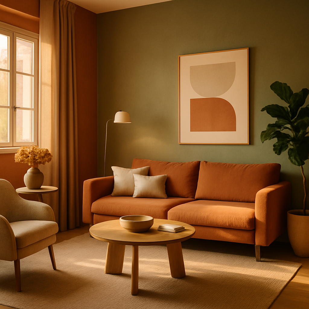
According to a recent report by the American Society of Interior Designers (ASID), color trends for 2026 are heavily influenced by the desire for tranquility and connection with nature. This has given rise to palettes that emphasize earth tones, such as muted greens, terracotta, and sandy beiges. These colors reflect a growing interest in biophilic design, which aims to bring the outdoors in.
The concept of "quiet luxury" is another significant trend, characterized by understated elegance and a focus on quality. This trend favors neutral palettes with subtle contrasts, like pairing soft grays with off-whites. Data from Architectural Digest's AD PRO network suggests that such palettes can increase the resale value of homes by up to 10%, as they appeal to a broad audience while exuding sophistication.
In contrast, some homeowners are embracing bold, vibrant colors that make a statement. The International Interior Design Association (IIDA) highlights the popularity of jewel tones, such as deep emeralds and rich sapphires, which can add drama and depth to a space. These colors are often used as accents against a neutral backdrop, creating a striking balance. When considering these trends, think about how they align with your personal style and the mood you wish to create in your home.
Actionable Strategies for Selecting Your Palette
Choosing the right color palette doesn't have to be overwhelming. Start by assessing your space and identifying its main functions. Consider how you use each room throughout the day-where do you relax, and where do you work? This will guide your color choices. For example, a home office might benefit from calming blues, while a dining area could be invigorated with warm, inviting tones.
Once you have a functional framework, look at current trends for inspiration. Use platforms like Pinterest and Instagram to explore color combinations that catch your eye. Save images that resonate with you, and look for common themes in your selections. This process helps refine your preferences and can reveal unexpected color pairings that work beautifully together.
Consider using AR/VR room visualization tools, which many designers now offer, to test different palettes in your space before committing. These tools allow you to see how colors interact with your existing décor and lighting conditions. If you're working with a certified interior designer (NCIDQ, ASID, or IIDA), leverage their expertise to ensure your chosen palette complements the architectural features of your home. Ready to start experimenting?
Expert-Level Insights on Color Application
When applying a chosen color palette, placement is key. Experts recommend starting with the 60-30-10 rule: 60% of a room should be the dominant color, 30% the secondary color, and 10% an accent hue. This formula creates a visually appealing balance and ensures that no single color overwhelms the space.
Consider the impact of lighting, both natural and artificial, on your colors. A shade that looks perfect in daylight might appear entirely different under warm evening lights. To mitigate this, test paint samples on different walls and observe them at various times of the day. This step is crucial for achieving the desired effect and avoiding costly mistakes.
Furthermore, experienced professionals often suggest incorporating texture alongside color to add depth and interest. For instance, a matte finish can provide a soft backdrop for vibrant accents, while glossy surfaces can elevate muted tones. Textiles, like rugs and curtains, also play a significant role in how colors are perceived and can be used to introduce secondary shades into a room. Transitioning from here, let's delve into additional layers of detail to refine your palette further.
Diving Deeper: Additional Layers of Detail
One way to add complexity to your color palette is through patterns. Stripes, florals, and geometric designs can introduce new colors and create visual intrigue. When working with patterns, it's essential to maintain cohesion with your overall palette. Select patterns that incorporate your chosen hues and use them sparingly to avoid overwhelming the space.
Another advanced technique is to use color zoning to define areas within a room. This is particularly useful in open-plan living spaces, where different functions coexist. You might use a bold accent wall to delineate a dining area or a soft gradient to transition from a living room to a reading nook. Color zoning not only enhances functionality but also adds an artistic element to your design.
Finally, consider the emotional journey you want to create. Colors can influence mood and energy flow throughout your home. A soothing pastel palette can promote relaxation in bedrooms, while vibrant, contrasting colors might boost creativity in a studio. As we summarize these concepts, think about how you can layer these ideas to craft a space that's not only visually stunning but also deeply personal.
Final Perspectives on Color Palettes
As you refine your design, remember that color is a dynamic element that can evolve with your style. Trends may shift, but the foundational principles we've discussed will remain relevant. Whether you lean towards biophilic design or the quiet luxury of a neutral palette, the key is to choose colors that resonate with you and reflect your personality.
Consider the long-term vision for your space. Are you designing for resale value, or is this a forever home? Your answer will influence your choices. A timeless palette can offer flexibility for future changes, while a trend-forward selection might make a more immediate impact. Whatever path you choose, the ultimate goal is to create a space that feels like home.
In conclusion, crafting a stunning interior requires more than following trends; it demands a thoughtful approach to color selection. By understanding the fundamentals, analyzing current data, and applying expert strategies, you can design a space that's both beautiful and functional. Ready to begin your transformation?
Conclusion
In summary, the journey to a stunning interior design begins with understanding and selecting the right color palette. By leveraging foundational knowledge, exploring trends, and applying expert techniques, you can create a space that truly reflects your style and meets your needs. The right colors can transform your environment, making it more inviting, functional, and aesthetically pleasing.
Now, it's time to take action. Start by browsing portfolios on Houzz or exploring color samples at your local design center. Even just 20 minutes of research this week can sharpen your eye for what you want. Don't hesitate to reach out to certified professionals for guidance. With the right tools and insights, your dream space is within reach.


Comments
Post a Comment