Nursery Color Schemes Beyond Pink and Blue for Gender-Neutral Rooms
Why Parents Are Moving Past the Pink-Blue Binary
The tradition of assigning pink to girls and blue to boys is surprisingly recent in the history of childhood. Prior to the 1940s, nursery colors in America were largely gender-neutral, with white, cream, and pale yellow dominating infant spaces regardless of the baby's sex. The pink-for-girls convention solidified through mid-century marketing campaigns and has been reinforced by retail merchandising ever since. Today, a growing number of parents are stepping outside that convention, not as a political statement but as a practical and aesthetic choice that produces more interesting rooms, accommodates multiple children over time, and avoids the visual monotony of an all-pink or all-blue space.
The American Academy of Pediatrics (AAP) has published research on infant visual development indicating that newborns respond most strongly to high-contrast patterns and saturated colors rather than the pastel pinks and blues traditionally associated with nurseries. By three to four months, infants can distinguish a full range of colors and show preference for warm, saturated tones. This developmental research suggests that the traditional pastel nursery palette is designed more for adult expectations than for infant visual stimulation, and that richer, more varied color schemes may actually provide a more engaging visual environment for a developing baby.
From a practical standpoint, a gender-neutral nursery adapts more easily to future children, room repurposing, and evolving design tastes. A room painted sage green with natural wood furniture and cream textiles serves beautifully as a nursery for any baby, transitions seamlessly into a toddler room, and eventually converts into a guest room or home office without requiring a complete color overhaul. Compare this flexibility with a heavily themed pink princess or blue sports nursery that feels dated within two years and requires repainting to serve any other purpose. The neutral-but-not-boring approach represents better long-term value for the investment of time, money, and energy that nursery design requires.
The design world has responded to this shift with enthusiasm. Architectural Digest and other shelter publications now routinely feature nurseries in earthy greens, warm terracottas, deep ochres, and soft lavenders that bear no resemblance to the pastel pink-and-blue nurseries of previous generations. These rooms look sophisticated, feel warm, and photograph beautifully, which matters in an era when nursery design has become a significant creative outlet for expectant parents. The question is no longer whether to go gender-neutral but which palette direction to explore.
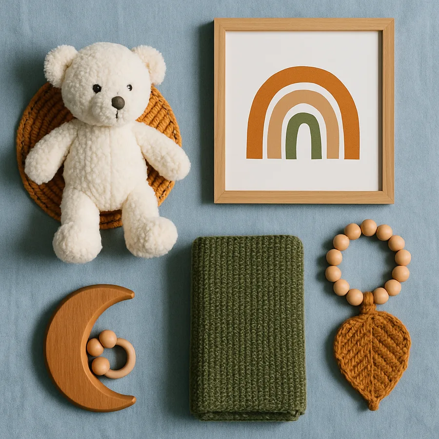
Earth Tones: Terracotta, Ochre, Sienna, and Warm Clay
Earth-toned nurseries have surged in popularity because they create spaces that feel grounded, warm, and inherently connected to the natural world. Terracotta, the warm reddish-brown of fired clay, serves as an excellent foundation color for nursery walls, providing warmth without the intensity of a true red. Applied to a single accent wall behind the crib, terracotta creates a focal point that is soothing rather than stimulating, making it appropriate for a room where sleep is the primary activity. Paired with cream or white on the remaining walls, terracotta produces a contrast that is cozy rather than dramatic.
Ochre and golden yellow tones bring warmth and optimism to a nursery without the gender associations of pink or blue. Unlike the pale butter yellows that have been a nursery staple for decades, today's ochre palettes lean toward richer, more saturated tones that have depth and sophistication. A deep golden ochre on the lower half of the wall with a warm white above, separated by a simple chair rail or painted line, creates a two-tone effect that adds architectural interest to a plain rectangular room. The Color Marketing Group, an international association of color design professionals, has identified warm earth tones as a sustained direction in residential interiors, moving beyond trend status into established preference.
The beauty of earth-toned nurseries lies in their compatibility with natural materials. A terracotta or ochre wall palette pairs effortlessly with natural wood cribs, woven rattan baskets, linen curtains, cotton muslin swaddles, and wool rugs in a way that feels organic and unforced. Every material in the room belongs to the same visual family, creating a cohesive environment without requiring strict color matching. This material compatibility makes earth-toned nurseries easier to furnish and accessorize than more unusual color choices, since natural-finish baby furniture and textiles are widely available at every price point.
For parents concerned about earth tones feeling too dark or heavy in a small nursery, the solution is in the balance rather than the palette itself. Using the deepest earth tone as an accent, no more than twenty-five to thirty percent of the wall surface, and keeping the majority of the room in warm white or cream ensures the space stays bright and airy. Light-colored flooring, whether natural wood, light carpet, or a pale area rug, reflects light upward and prevents the room from feeling bottom-heavy. Have you noticed how the warmest, most inviting rooms you have visited tend to use rich color in deliberate, measured doses rather than covering every surface? That principle applies perfectly to nursery design.
Green Palettes: From Sage to Forest and Everything Between
Green may be the single most versatile nursery color outside the traditional pink-blue spectrum. It carries associations with nature, growth, tranquility, and renewal, all meanings that feel appropriate for a room welcoming a new life. The range of available greens is enormous, from the palest sage to deep forest, and each position on that spectrum creates a distinctly different room character. Sage green, the muted gray-green that has dominated interior design in recent years, produces a calm, sophisticated nursery that feels neither childish nor overly adult, striking the balance that many parents seek.
The ASID has noted that green is the color most consistently associated with feelings of calm and restoration in environmental psychology research, making it a particularly thoughtful choice for a room where both parent and baby need to feel relaxed. This is not purely subjective: studies on color and mood conducted by environmental psychologists have found that green environments measurably reduce stress indicators compared to neutral or warm-colored environments. For a nursery, where nighttime feedings, teething episodes, and general infant unpredictability create inherent stress, a green palette provides a subtle environmental counterbalance.
Deep green accent walls, in shades like hunter, emerald, or forest green, create a bold nursery statement that reads as rich and enveloping rather than overwhelming. A single crib wall in deep green with the remaining walls in warm white provides a dramatic backdrop for the crib while keeping the room bright overall. This approach has become particularly popular in nurseries with high ceilings, where the deep color anchors the room vertically and prevents the space from feeling cavernous. White or natural wood furniture, brass or gold hardware, and cream or blush textiles all complement deep green beautifully, providing the lightness and warmth that prevents the room from feeling somber.
Two-tone green nurseries, combining a deeper green on the lower wall with a lighter shade or white above, create visual interest and a sense of groundedness that single-color treatments cannot match. The division can be a clean painted line at chair-rail height, a simple wood trim piece, or even a decorative wallpaper border that introduces pattern into an otherwise solid-color room. Better Homes and Gardens nursery features have showcased this technique extensively, demonstrating its effectiveness across room sizes from compact city apartment nurseries to spacious suburban bedrooms. The two-tone approach adds architectural depth to a room without the commitment or cost of actual trim work or wainscoting.
Warm Neutrals: Beyond Beige Into Mushroom, Taupe, and Putty
Neutral does not mean boring, and the current generation of warm neutral paint colors proves this conclusively. The beige-on-beige nurseries of past decades earned their bland reputation honestly, but today's warm neutrals have been reformulated with undertones that add depth and character without crossing into identifiable color territory. Mushroom gray, a complex neutral with warm brown and subtle violet undertones, creates a nursery that feels sophisticated and enveloping. Putty, which sits between gray and beige with pink-warm undertones, produces a softness that reads as intentional rather than default.
The advantage of warm neutrals as a nursery foundation is their extraordinary flexibility with accent colors. A mushroom-walled nursery can be styled with dusty rose textiles for a gentle warmth, with mustard yellow accents for an energetic pop, with olive green touches for an organic feel, or with black and white graphic elements for a modern edge. Each accent direction produces a noticeably different room character while using the same wall color and furniture. This flexibility means the room can evolve as the child grows and as your own design preferences shift, requiring only accessory changes rather than repainting to achieve a fresh look.
Paint selection within the warm neutral category rewards careful comparison, because the differences between similar-looking colors become significant at wall scale. A putty that looks nearly white on a paint chip may read as distinctly warm and rosy on a full wall. A taupe that appears simply gray in the store may reveal green or purple undertones in your nursery's specific lighting conditions. The Paint Quality Institute recommends testing a minimum of three finalist colors by painting large sample patches, at least two feet square, on the actual nursery walls and observing them at multiple times of day and under both natural and artificial lighting. This testing process takes a week but prevents the much more time-consuming process of repainting a color that looked different on the wall than it did on the swatch.
Texture becomes especially important in neutral nurseries because the color palette alone does not provide strong visual interest. Layered textiles in varying weights and weaves, from chunky knit blankets to smooth cotton crib sheets to nubby linen curtains, create the visual and tactile richness that keeps a neutral room from feeling flat. Woven storage baskets, a jute or wool area rug, wooden picture frames, and ceramic accessories all contribute texture without introducing competing colors. The result is a nursery that feels warm, collected, and intentionally designed, with the kind of quiet sophistication that makes guests say the room feels wonderful without being able to identify exactly why.
Accent Strategies: Adding Interest Without Committing to a Theme
The most successful gender-neutral nurseries use accent elements rather than overarching themes to create visual interest. Themes, whether jungle animals, outer space, or woodland creatures, impose a specific narrative on the room that can feel limiting and often requires wholesale replacement as the child's interests evolve. Accent strategies, by contrast, introduce color, pattern, and personality through changeable elements like textiles, wall art, and accessories that can be swapped without repainting or refurnishing.
A statement rug is one of the most effective accent tools in nursery design because it introduces color, pattern, and texture simultaneously while being entirely removable and replaceable. A Moroccan-style rug with geometric patterns in warm neutrals and terracotta adds bohemian warmth to a sage green nursery. A striped flat-weave in cream and navy brings graphic structure to a neutral mushroom room. A round jute rug with a colored border defines the play area visually while adding natural texture. Rugs are also among the most practical nursery accessories, protecting flooring from inevitable spills and providing a soft surface for tummy time and early crawling. The Carpet and Rug Institute (CRI) recommends choosing low-pile or flat-weave rugs for nurseries, as they are easier to clean and less likely to trap allergens than high-pile options.
Wall art in a gender-neutral nursery should reflect the parents' aesthetic sensibilities rather than defaulting to cartoon characters or juvenile motifs. Botanical prints, abstract watercolors, animal photography, typographic prints, and simple geometric compositions all serve as nursery art that engages an infant's developing visual system while maintaining an aesthetic standard the parents enjoy living with. Framed art can be replaced as the child grows, allowing the room's personality to evolve without structural changes. A gallery wall of mixed-size frames on one nursery wall creates a focal point that is personal and curated rather than store-bought and generic.
Textiles offer the most flexible and affordable accent opportunity. Changing out crib sheets, throw pillows on the nursing chair, curtains, and the crib skirt transforms the room's color story for a fraction of the cost of repainting or refurnishing. Many parents find that having two or three sets of nursery textiles in different accent colors allows them to refresh the room seasonally or whenever the current look feels stale. This rotation also extends the life of individual textile pieces, since none of them bear the full weight of daily use year-round. Where would you start if you could change your nursery's accent color in an afternoon for under a hundred dollars? Textiles make that scenario real and repeatable.
Practical Color Considerations: Paint Finish, Light, and Longevity
The paint finish you choose affects both the appearance and the practicality of your nursery walls. Eggshell and satin finishes are the standard recommendation for nursery walls because they balance visual softness with wipeable durability. Flat or matte finishes look beautiful but show every scuff, handprint, and wall contact mark, which becomes an issue once the child is mobile and touching walls regularly. Semi-gloss and gloss finishes are too shiny for wall surfaces, creating glare and highlighting every wall imperfection, though they are appropriate for trim, doors, and window casings where their durability and cleanability are assets.
Paint chemistry matters in a nursery more than in any other room in the home. Low-VOC and zero-VOC paints have become the standard for nursery applications, and for good reason. Volatile organic compounds released by conventional paints can affect indoor air quality for weeks or months after application, and infants, with their developing respiratory systems and higher breathing rates relative to body weight, are more vulnerable to these exposures than adults. The Environmental Protection Agency (EPA) recommends using low-VOC products in rooms occupied by infants and completing painting at least two to four weeks before the baby occupies the room to allow maximum off-gassing before the most vulnerable occupant arrives.
Lighting dramatically affects how nursery colors appear, and many parents are surprised by the difference between their chosen color in the paint store versus on the nursery wall. North-facing rooms receive cool, indirect light that can make warm colors appear muted and cool colors appear stronger. South-facing rooms get warm, direct light that amplifies warm tones and can wash out cool or muted colors. A sage green that looks perfectly balanced in a south-facing showroom may read as cold and gray in a north-facing nursery. Account for your room's specific light exposure when selecting colors, and always test paint samples on the nursery walls rather than relying on store lighting or digital screens for color evaluation.
Longevity should factor into every nursery color decision because repainting is disruptive and time-consuming, especially with a baby in the house. Choose colors you will be happy with for at least three to five years, understanding that the nursery will transition into a toddler room and potentially a young child's bedroom during that period. Colors that work across these developmental stages, those that are neither too infantile nor too mature, include the mid-tone earth tones, greens, and warm neutrals discussed throughout this guide. Avoid colors that are so pale they show every mark or so dark they make the room feel oppressive during nighttime feedings. The middle of the tonal spectrum, rich enough to have presence but light enough to keep the room bright, is the sweet spot for nursery colors that last.
Putting Your Gender-Neutral Nursery Palette Together
Building a cohesive nursery color scheme starts with selecting one dominant wall color that sets the room's overall mood. This is the color that will occupy the largest surface area and serve as the backdrop for every other element in the room. Choose this color first, test it on your walls in your lighting, and live with the samples for several days before committing. Once the wall color is confirmed, select two to three accent colors that complement it: one for textiles, one for accessories, and optionally one for furniture finish. Keeping the total palette to four or five colors prevents the room from feeling chaotic while providing enough variety for visual interest.
Consider creating a physical mood board before purchasing anything. Collect paint chips, fabric swatches, images of furniture and accessories, and samples of any special materials like wallpaper or tile and arrange them together on a board or in a box. This physical collection reveals color relationships that digital mood boards cannot replicate, because you see the actual materials interacting with each other under real light rather than through a screen's color profile. The mood board also serves as a portable reference that you can bring to stores when shopping for individual items, ensuring that every purchase coordinates with the established palette.
The nursery you create for your child will be one of the first environments they experience, and while they will not remember it consciously, the sensory experience of a thoughtfully designed room contributes to the calm, secure atmosphere that supports healthy early development. The National Association of Child Care Resource and Referral Agencies emphasizes that environmental quality, including visual calm, appropriate stimulation, and comfortable temperature, is a meaningful factor in infant well-being. A gender-neutral nursery designed with intention and care provides exactly this kind of quality environment.
Your next step is simple: visit a paint store with this article's palette suggestions in mind and pull sample cards in the earth tone, green, and warm neutral families that appeal to you. Take them home, tape them to your nursery walls, and observe them across a full day from morning through evening. The colors that make you feel calm, warm, and happy at every hour are the colors your nursery wants. Trust that response over any trend forecast or social media inspiration, because you and your baby will live in this room every day, and your instinctive reaction to the color on your walls matters more than anyone else's opinion about what a nursery should look like.
More Articles You May Like


Comments
Post a Comment