Mixing Chandelier Metals With Dining Chair Hardware Seamlessly
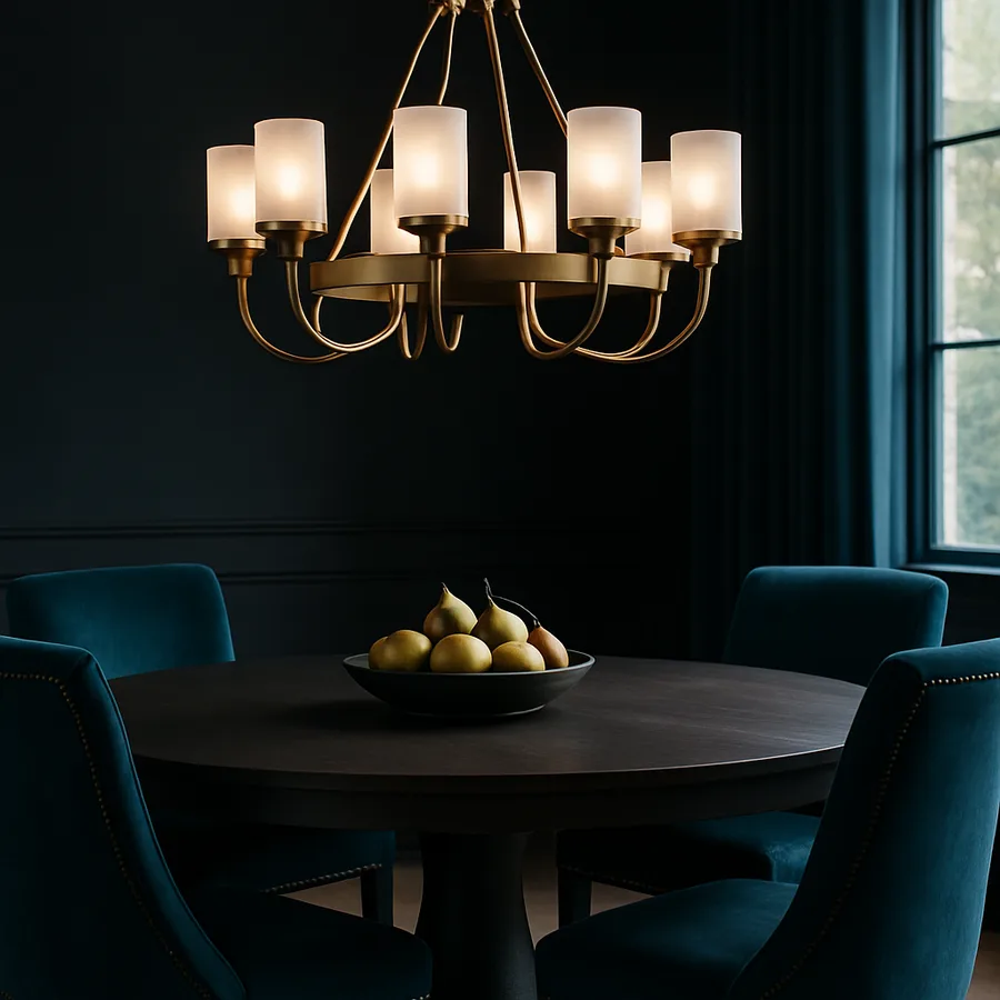
Mixing metals is one of the most requested and most mishandled design techniques in residential interiors. The request usually sounds like this: "My chandelier is antique brass, but the hardware on my dining chairs is brushed nickel. Will that look wrong?" The honest answer is nuanced. Done with intention, mixing metals elevates a room. Done without a rule set, it looks like a mistake.
A survey published by the American Lighting Association found that 71 percent of homeowners hesitate to mix metals, while ASID design professionals use mixed-metal compositions in roughly 80 percent of their recent residential projects. The gap is not about taste. It is about knowing the ratios and undertone rules that separate a curated look from a chaotic one. This article supplies those rules, specifically for the chandelier-to-chair-hardware relationship that anchors any dining room.
The Governing Rule: Dominant Plus Accent
Every successful mixed-metal scheme has a dominant metal and one or two accent metals. Dominance is established by surface area and visual weight, not number of objects. A single large brass chandelier reads dominant against a dozen small chrome drawer pulls on a distant buffet. Do not count fixtures; estimate the visual square inches of metal at eye level and above.
The working ratio is roughly 70-20-10. Seventy percent of visible metal in one finish, twenty percent in a second, and up to ten percent in a third. In dining rooms, the chandelier almost always becomes the dominant element because it sits in a position of visual honor. Chair hardware falls into the accent role.
Consider a room with an antique brass chandelier, matte black chair legs, and brushed nickel buffet pulls. The brass reads as dominant. The black reads as secondary, anchoring the lower portion of the room. The nickel reads as tertiary and adds a cool accent without disrupting the overall warmth. This is a successful three-metal composition.
The dominant-plus-accent logic extends beyond dining rooms into adjacent spaces. If your kitchen and dining room are visually connected, the metal vocabulary of one influences the perception of the other. A brass chandelier in the dining room and polished chrome fixtures in the kitchen can work, but only if both rooms contain enough brass and chrome accents to establish the mix as intentional across the whole zone.
When planning, think in sight lines rather than rooms. What metals does a guest see from the dining chair while facing the kitchen? From the front entry while walking toward the table? These sight-line inventories reveal metal relationships that room-by-room planning misses and prevent orphaned finishes.
Warm vs. Cool: The Undertone Test
Not all metals that share a name share an undertone. Brass can be warm or cool depending on lacquer and polish. Nickel ranges from silvery-cool to warm-satin. Bronze varies widely; some bronzes have red undertones while others have green. The key to mixing metals is confirming that the dominant and accent metals either share an undertone (all warm or all cool) or contrast it intentionally.
For an all-warm scheme, pair antique brass, aged gold, warm bronze, and unlacquered copper. These metals share yellow-red undertones and harmonize naturally. For an all-cool scheme, pair polished chrome, brushed nickel, stainless steel, and pewter. These share blue-gray undertones.
The interesting move is the intentional contrast: a warm brass chandelier paired with cool brushed nickel chair hardware. This works only when the accent metal is visually smaller and clearly signals that the contrast is deliberate, not accidental. A useful test: look at the room and ask, "Would a stranger think this was chosen, or assume one piece is left over from a previous homeowner?" If there is any ambiguity, the contrast needs reinforcement through repetition elsewhere in the room.
Lacquered versus unlacquered finishes also affect perceived undertone. Unlacquered brass develops a living patina that shifts warmer over years. Lacquered brass holds a stable color that may read slightly cooler. If you plan to mix a new fixture with existing older hardware, favor unlacquered for new pieces so the aging can eventually harmonize. If you want long-term color stability, lacquered is the safer choice.
Natural light exposure accelerates or slows undertone drift. A brass fixture in a sun-flooded south-facing dining room ages faster than the same fixture in a darker north-facing room. Consider your light exposure when predicting how an unlacquered fixture will age across its first five years.
Finish Textures That Play Well Together
Beyond undertone, metals vary by surface texture: polished, brushed, satin, hammered, or aged. Mixing textures within the same finish family is safer than mixing finish families themselves.
A polished brass chandelier with polished brass chair nailheads matches cleanly, but can feel formal to the point of stiffness. A polished brass chandelier with hammered brass chair nailheads reads curated and collected, because the texture variance signals intentional sourcing from multiple makers. This is the sweet spot for most residential dining rooms.
Avoid mixing polished and aged finishes of the same metal without a clear reason. A polished chrome fixture with aged chrome chair frames looks like the chairs need restoration. If you want both finishes, introduce a clear story, such as mixing old and new as a deliberate aesthetic statement, and reinforce it elsewhere in the room.
Grain direction on brushed finishes is another subtle factor. Most brushed nickel fixtures have a visible grain that runs vertically or horizontally. When two brushed nickel pieces sit adjacent with perpendicular grain directions, the mismatch is subtly jarring. Align grain directions when possible, particularly for hardware in close visual proximity.
Hammered textures introduce their own variable. A lightly hammered brass reads handmade and organic, while a heavily dimpled one reads Mediterranean or rustic. Match the weight of the hammering to the rest of the room's material story, not just the other brass pieces.
The Chair Hardware Inventory
Before you finalize a chandelier, inventory the actual hardware on your dining chairs. Most homeowners underestimate the metal visible on a chair. A typical upholstered dining chair includes leg caps, casters, nailhead trim, and screw covers on the seat frame. A side chair may add back-panel rivets or decorative corner brackets.
Do a literal walk-around of one chair and list every metal element. This is the inventory your chandelier must harmonize with. If the nailheads are the most visible element, match or contrast intentionally with the chandelier. If the leg caps are tiny and dark, they may not drive the color conversation at all.
A practical tip from Architectural Digest interior editors: photograph a chair next to a swatch of the chandelier's metal finish in the actual dining room light. The light in the room is rarely the light in the store, and undertones can shift dramatically under warm incandescent versus cool daylight LEDs.
Upholstery tacks and staples are the final inventory item. On tufted or French-style dining chairs, nailhead trim may represent the largest visible metal area on the chair, often larger than the leg caps. When nailheads total more than 100 individual tacks, they function as a continuous metal band and should be weighed accordingly in the dominant-accent calculation.
Also catalog the hinges and hardware on the dining buffet, if one sits against a dining-room wall. Cabinet hinges are often specified by the furniture maker without reference to the chandelier finish, and mismatched hinges can undermine an otherwise coordinated metal scheme. Replacing visible hinges with a finish that matches the dominant metal is a relatively inexpensive fix that professional designers often suggest during a room refresh, and it pays significant visual dividends without requiring new furniture.
Repetition Is the Secret
A mixed-metal scheme succeeds when each metal appears in at least two separate locations. A single brass object in a sea of nickel looks orphaned. Two brass objects read as a theme. Three or more establish brass as part of the room's vocabulary.
Plan the repetitions before you buy. If your chandelier is antique brass and your chair nailheads are brushed nickel, find a third brass moment: a set of brass candlesticks on the buffet, a brass-framed mirror, or brass cabinet pulls on nearby built-ins. Then find a second nickel moment: nickel sconces on the adjacent wall or nickel drawer pulls on the buffet.
The Houzz design blog documents countless dining rooms where a perfect chandelier fails because its metal appears exactly once. The fix is almost always adding a second or third occurrence, not replacing the chandelier.
Strategic repetition also extends to hardware on adjacent furniture. The drawer pulls on a buffet, the legs of a nearby console, and the frame of a mirror all contribute to the metal vocabulary of the dining area. Inventory these pieces before finalizing the chandelier. A perfectly planned chandelier-chair metal pairing can still fail if a nearby buffet introduces a third metal without the supporting repetition.
Repetition across heights also matters. If brass appears only at eye level and above, the lower half of the room feels metal-starved. Introduce at least one low-height brass element, such as a console leg cap or a decorative floor vent, to balance the vertical distribution of the dominant metal.
Black and Wood as Neutrals
Two "non-metals" serve as neutrals in any mixed-metal composition. Matte black reads as a strong graphic element that grounds warmer metals and cools overly saturated brass schemes. Natural wood reads as a palette foundation that allows almost any metal combination to feel contextualized.
In a room with a brass chandelier and brass nailheads, introducing black chair legs prevents the brass from reading as costume. In a room with mixed brass and nickel, walnut or white oak tabletops and chair frames mediate the temperature difference and make the mix feel intentional.
These neutrals count toward your 70-20-10 ratio, but they do not compete with the dominant metal. Think of them as the breathing room that allows mixed metals to work. Rooms without these neutrals, where every surface is metallic, tend to feel hard-edged regardless of the metal-mix logic.
Plaster and limewash walls serve a similar neutralizing function. A warmly plastered wall behind a brass chandelier absorbs some of the metal's intensity and mediates the visual temperature of the room. This is why so many designer dining rooms photographed by Architectural Digest feature lime-washed or Venetian plastered walls, even when the clients originally requested painted surfaces.
Finally, do not overlook the floor. A warm oak floor supports warm-metal dominance. A cool concrete or pale tile floor supports cool-metal dominance. Trying to fight the floor is almost always a losing design battle, so honor the floor's temperature when choosing the dominant chandelier finish.
Conclusion
Mixing a chandelier metal with dining chair hardware is a design problem with a clear solution set. Pick a dominant metal and stick with it at roughly 70 percent of visual weight. Pair it with one or two accent metals at 20 and 10 percent. Match undertones within each metal family, or contrast them with enough reinforcement that the contrast reads as curated.
Inventory the actual metal on your chairs before shopping. Repeat each metal in at least two visible locations in the room. Introduce matte black or natural wood as neutral mediators, and photograph your combinations under actual dining-room light before you commit. These are not elaborate rules. They are the quiet discipline that separates rooms that photograph beautifully from rooms that feel subtly off.
Designers who make mixed metals look effortless are following this logic almost unconsciously after enough projects. The same logic is available to any homeowner willing to spend 30 minutes with a notepad before buying. The payoff is a dining room that feels collected rather than shopped, curated rather than coordinated.
Take the guesswork out of your next purchase. Use the Interior Bliss metal-pairing guide to match a chandelier finish with your existing chair hardware inventory, and browse curated collections by dominant metal before you checkout.
Further authority reading: ASID, American Lighting Association, and the editorial archives at Architectural Digest.
More Articles You May Like



Comments
Post a Comment