Color Drenching a Room: Walls, Trim, and Ceiling in One Hue
What Color Drenching Means and Why It Works
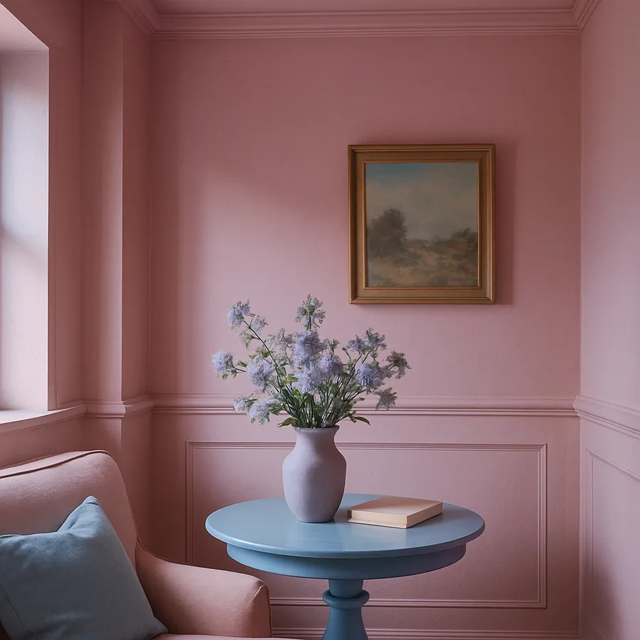
Color drenching is the practice of painting every architectural surface in a room, including the walls, ceiling, trim, baseboards, door frames, and sometimes even the doors themselves, in a single color or closely related tones of the same color. The technique eliminates the conventional contrast between white trim, colored walls, and white ceiling that has defined residential painting for the better part of a century, replacing it with an enveloping, immersive experience where the room's architecture recedes and the color itself becomes the dominant presence. The effect is simultaneously bold and calming, creating a cocooned atmosphere that feels intentional, designed, and dramatically different from the standard approach to interior painting.
The psychology behind color drenching's impact is rooted in how the human brain processes visual boundaries. When walls, trim, and ceiling are different colors, the eye registers each junction as a boundary, mentally subdividing the room into distinct planes and drawing attention to the architectural geometry of corners, moldings, and transitions. When every surface shares a single hue, those boundaries dissolve. The brain reads the space as a continuous volume of color rather than an assembly of separate surfaces, which produces a sensation of enclosure and intimacy that conventional painting cannot achieve. The American Society of Interior Designers (ASID) has documented this perceptual shift in their residential design research, noting that color-drenched rooms consistently score higher in occupant-reported feelings of comfort and restfulness compared to rooms with conventional multi-tone painting schemes.
The technique has gained substantial momentum in professional interior design over recent years, driven partly by a cultural reaction against the all-white, all-neutral interiors that dominated the previous decade. After years of gray walls, white trim, and beige everything, homeowners and designers alike began craving rooms with personality, warmth, and emotional resonance that neutral palettes inherently resist. Color drenching answered that craving with a method that is paradoxically simpler than traditional painting, since it uses fewer colors, yet produces a result that feels far more sophisticated. The Color Marketing Group, the international association for color design professionals, identified color drenching as a leading residential trend in their forecasting research, reflecting its adoption across market segments from luxury design to accessible home renovation.
Does the idea of painting your ceiling something other than white feel transgressive? For many homeowners, it does, because the white ceiling has been so universally default that departing from it feels like breaking a rule rather than making a design choice. But the white ceiling convention is relatively recent in the long history of interior decoration, and some of the most celebrated interiors in design history, from the jewel-toned drawing rooms of Georgian townhouses to the lacquered salons of mid-century Paris apartments, treat the ceiling as an integral part of the room's color story rather than a neutral plane to be ignored. Color drenching simply returns to that tradition with a contemporary perspective, using the ceiling as the element that completes the immersive effect and transforms a painted room into a color experience.
Selecting the Right Hue for Total Immersion
Not every color performs equally well at the saturation level that color drenching demands, and understanding which hues succeed in this application prevents the costly disappointment of committing an entire room to a color that overwhelms rather than envelops. Mid-tone colors in the muted and earthy range tend to produce the most livable color-drenched rooms because they are dark enough to create the cocoon effect but light enough to avoid making the space feel oppressively dark. Sage green, dusty rose, warm terracotta, slate blue, and mushroom taupe all belong to this optimal middle zone. They carry enough pigment intensity to register as a deliberate color statement while remaining soft enough to live with day after day without visual fatigue.
Deep, saturated colors like navy, forest green, burgundy, and charcoal produce the most dramatic color-drenched results but require careful consideration of the room's natural light, size, and function. A small bedroom drenched in deep navy can feel luxuriously intimate like a sleeping cabin on a fine ship, while the same color in a windowless home office might feel confining and depressive after a few hours of work. The rule of thumb is that darker colors work best in rooms used primarily during evening hours or for rest, where the enveloping quality enhances the room's intended function. The Architectural Digest color guide suggests testing deep color drenching first in a powder room or guest bedroom, spaces that are used briefly and intermittently, to evaluate your comfort with full-saturation immersion before committing larger, more frequently occupied rooms.
Light and pastel tones can be color drenched as well, though the effect is subtly different. A room drenched in pale blush, soft lavender, or warm cream produces a luminous, ethereal quality rather than the dramatic cocooning of darker hues. The monochromatic continuity still eliminates visual boundaries and creates the perception of a unified color volume, but the lightness of the hue keeps the room feeling open and airy rather than enclosed. This approach works beautifully in bedrooms, nurseries, and living rooms where the homeowner wants the sophistication of color drenching without the intensity of mid-tone or dark applications. Light color drenching is also more forgiving of limited natural light because the pale surfaces reflect rather than absorb available illumination.
The undertone of your chosen color becomes critically important in a drenched room because every surface amplifies and reflects the same hue back onto every other surface, intensifying the color's visual warmth or coolness beyond what a single accent wall would produce. A green with a strong yellow undertone will read significantly warmer when it surrounds you from all six planes than it appears on a single wall flanked by white trim and ceiling. Test your chosen color by painting large sample areas on at least two adjoining surfaces, ideally a wall section and a piece of trim, and observing the result at different times of day under both natural and artificial light. What looks perfect at noon under north-facing daylight may shift unpleasantly under warm incandescent lighting at dinner, and discovering this before you have painted the entire room saves considerable time and frustration.
The Finish Question: Matching Sheen Across Surfaces
One of the technical decisions that separates successful color drenching from amateur attempts is how to handle paint sheen across surfaces that traditionally receive different finishes. Convention dictates flat or matte paint on ceilings, eggshell or satin on walls, and semi-gloss on trim and woodwork. In a color-drenched room, these sheen differences create visible inconsistency that breaks the monochromatic illusion. Where the matte ceiling meets the satin wall, a subtle but perceptible line of sheen change appears, and the semi-gloss trim catches light differently from the surfaces it borders, reintroducing exactly the visual boundaries that color drenching seeks to erase.
The preferred professional approach is to use a single sheen across all surfaces, and the sheen that balances aesthetic effect with practical durability is eggshell or low-luster satin. These finishes have enough body to withstand cleaning on trim and door frames while remaining flat enough on walls and ceiling to avoid the reflective quality that draws attention to surface transitions. Several major paint manufacturers now offer dedicated color-drenching product lines formulated as a single paint suitable for walls, trim, and ceiling, with a durability profile that handles all three applications. These products simplify the process by eliminating the need to specify and purchase separate formulations for different surfaces.
If using a uniform sheen feels too much like a compromise, an alternative approach uses tonal variation within the same color family to create subtle depth while maintaining the monochromatic unity. The walls receive the mid-tone version of the chosen hue, the ceiling gets a version lightened by 25 to 50 percent, and the trim receives either the same mid-tone or a version darkened by one or two steps. This tonal layering preserves the single-color identity of the room while introducing gentle dimensionality that keeps the space from feeling completely flat. The Better Homes and Gardens color-drenching guide recommends this approach for rooms with significant architectural detail, where crown molding, wainscoting, and panel doors benefit from a slight tonal difference that lets their profiles register without breaking the overall color envelope.
How important is trim durability in your household? If you have children, pets, or high-traffic hallways where trim takes regular physical contact, a completely matte trim finish may show scuffs and fingerprints too readily for practical comfort. In this case, using a slightly higher sheen on trim, perhaps satin rather than eggshell, while keeping the walls and ceiling in eggshell creates a minimal sheen differential that preserves cleanability where it matters most. The slight sheen difference is far less disruptive to the drenched effect than the traditional jump from flat walls to semi-gloss trim, and the practical benefit of being able to wipe down baseboards and door frames without damaging the finish is meaningful in a home with active daily use.
Execution: Room Preparation and Painting Sequence
The painting sequence for a color-drenched room differs from standard room painting because the goal is seamless color continuity rather than clean separation between differently colored surfaces. Begin with the ceiling, cutting in at the perimeter where ceiling meets wall and then rolling the field. Because the walls will be the same color, precision at the ceiling-wall junction is less critical than in conventional painting, where a wobbly ceiling line against a white ceiling is immediately obvious. This is one of the genuinely liberating practical advantages of color drenching: the technique is more forgiving of imperfect cut-in lines because adjacent surfaces share the same color, making small inconsistencies in the boundary invisible.
After the ceiling, move to the walls, working from top to bottom in vertical sections and maintaining a wet edge across each wall plane. Apply two full coats minimum, allowing the manufacturer's recommended dry time between coats, which is typically two to four hours for latex formulations. Dark and saturated colors may require a third coat to achieve full, even coverage, particularly over light-colored existing paint. Do not be tempted to apply excessively thick coats to achieve opacity in fewer passes, because thick application causes drips, uneven texture, and extended dry times that can compromise the finish quality. Patience with multiple thin coats produces a superior result.
The trim, baseboards, and door frames are painted last, and this is where careful technique matters most. Use a quality angled sash brush for cutting in around hardware, hinges, and glass panes, and a small foam or mohair roller for flat trim surfaces and panel doors to achieve a smooth, stipple-free finish. The intersection where trim meets wall is the critical transition zone: because both surfaces are the same color, any difference in application quality, such as brush marks on the trim adjacent to a rolled wall surface, will be visible as a texture discontinuity even though the color matches. Feathering the brush strokes at the trim-wall junction and working while the wall paint in that area is still fresh minimizes this texture boundary.
Preparation of the room before any paint is applied follows the same best practices as any quality paint job, with one addition specific to color drenching. Remove all switch plates, outlet covers, and light fixtures to allow continuous painting behind and around them, because in a drenched room, a visible rectangle of unpainted wall behind a switch plate reads as a much more conspicuous interruption than it would against a standard white trim surround. Paint the wall surface beneath these elements completely, reinstall the covers after the final coat has cured, and consider replacing standard white switch plates with painted or color-matched versions that maintain the monochromatic envelope. This detail may seem minor, but it is the kind of finishing touch that separates a thoughtfully drenched room from one that feels partially committed.
Living With a Color-Drenched Space: What to Expect
The first few days in a freshly color-drenched room often produce an emotional response that is stronger than expected, because total color immersion affects mood and perception more powerfully than a single accent wall. This is normal and tends to calibrate within a week as your visual system adjusts to the new baseline. Warm colors like terracotta, ochre, and dusty rose create rooms that feel inviting and nurturing, particularly effective in bedrooms and dining rooms where comfort and social warmth are the desired emotional register. Cool colors like slate blue, sage green, and soft gray-green produce rooms that feel calming and focused, well-suited to home offices, reading rooms, and bathrooms where a restful atmosphere supports the room's function.
Furniture and decor selection in a color-drenched room follows different principles than in a conventionally painted space. Because the room's architectural envelope is already making a strong color statement, furnishings can afford to be simpler and more restrained in their own coloring. Neutral upholstery in natural linen, cream, warm white, or soft leather provides visual relief against the enveloping color and prevents the room from feeling oversaturated. Metallic accents in brass, bronze, or matte black introduce contrast through material rather than color, adding visual interest without competing with the dominant hue. The Interior Design Society (IDS) recommends limiting additional colors in a drenched room to no more than two accent tones, typically introduced through throw pillows, artwork, or a single upholstered piece, to preserve the cohesive impact of the monochromatic scheme.
Artwork selection becomes a particularly interesting challenge and opportunity in a drenched room. Framed art on a color-drenched wall creates a different visual relationship than it does on a white or neutral wall. The color of the wall becomes part of the viewing experience, influencing how the eye perceives the colors within the artwork itself. Pieces with complementary or analogous color relationships to the wall color tend to integrate beautifully, appearing as intentional extensions of the room's palette. High-contrast pieces, particularly those with significant white or black areas, become dramatic focal points that pop against the colored ground with an intensity they would not achieve on a neutral surface. Experiment with art placement before committing to hanging hardware, because the color interaction between a specific piece and a drenched wall is genuinely unpredictable until you see it in situ.
The lighting in a color-drenched room requires thoughtful reconsideration because every surface is now reflecting colored light back into the space. In a room drenched in warm tones, warm-white bulbs at 2700K to 3000K will intensify the warmth, creating a richly amber atmosphere that can be beautiful in the evening but may feel too heavy during daylight hours. Cool-toned drenching colors benefit from daylight-balanced bulbs at 4000K to 5000K that keep the space feeling fresh rather than cold. Installing dimmable fixtures gives you control over the intensity of the color reflection, allowing the room to shift from fully saturated at low light to lighter and more open at full brightness. Have you considered how your current lighting fixtures and bulb temperatures will interact with the color you are planning to surround yourself with?
Common Hesitations and How to Address Them
The most frequent objection to color drenching is the fear that it will make the room feel smaller, and this concern is understandable but largely unfounded when the technique is executed properly. Color drenching actually obscures the spatial cues that tell your brain where walls end and ceiling begins, which can make a room feel more expansive rather than more confined. The boundaries that typically define a room's dimensions become ambiguous, and the result is a space that reads as an atmosphere rather than a box. Research from the Colour Research Society of Canada supports this finding, with studies showing that monochromatic rooms are perceived as having more ambiguous and often larger-feeling dimensions than rooms with high-contrast ceiling-wall-trim color schemes that emphasize architectural boundaries.
The concern about resale value and broad appeal leads some homeowners to avoid bold decorating choices, but color drenching is among the most easily reversible design decisions you can make. Unlike removing wallpaper, refinishing floors, or replacing tile, repainting a drenched room to conventional white trim and neutral walls takes exactly the same effort as repainting any other room. Two coats of primer followed by your new colors restore the standard scheme completely, with no residual evidence of the previous treatment. Given this easy reversibility, forgoing a design choice that would bring you daily pleasure because a hypothetical future buyer might not share your taste represents a significant sacrifice for a minimal practical risk.
Choosing the wrong color is a legitimate risk, but one that is manageable with proper testing. The cost of a quart of paint and an afternoon of sampling is trivial compared to the cost of painting an entire room, discovering the color is wrong, and repainting. Apply your test color to at least two walls and a section of trim, live with it for a full 48-hour cycle that includes both daytime and nighttime lighting conditions, and make your decision based on the dried, cured result rather than the wet application. If the color feels right after two days of actual living in the space, it will feel right after two years. If it does not feel right after 48 hours, you have invested only a quart of paint and a few hours of time in discovering that before committing to the full room.
The practical question of whether to drench a room with significant architectural imperfections, such as uneven walls, visible joint compound patches, or wavy crown molding, has a nuanced answer. On one hand, color drenching conceals the boundary between different surfaces, which can minimize the visibility of imperfect transitions between wall and trim. On the other hand, a single uniform color can make surface imperfections more visible than a multi-tone scheme because there is no color break to distract the eye from bumps and waves in the wall plane. If your walls have significant texture or flatness issues, consider a matte finish that absorbs light rather than reflecting it, which will minimize the visibility of surface imperfections. A satin or semi-gloss finish in a drenched room acts like a spotlight on every undulation and patch, so matte is both the aesthetically preferred and the practically forgiving choice for less-than-perfect wall surfaces. ASID residential guidelines echo this recommendation, noting that matte finishes consistently outperform higher sheens in concealing substrate imperfections across all paint application methods.
Conclusion: One Color, One Room, One Unified Experience
Color drenching strips away the visual complexity of multi-tone painting and replaces it with something elemental: a single color defining the totality of a room's architectural envelope. The result is a space that feels more cohesive, more intentional, and more emotionally resonant than the conventional white-trim-and-colored-walls approach that most homes default to without conscious consideration. The technique works across the entire spectrum from pale pastels to deep saturated darks, adapting to bedrooms, dining rooms, libraries, powder rooms, and any space where you want the color to become the dominant experience rather than a background element.
The practical execution is straightforward for anyone who can paint a room competently: same skills, same tools, fewer decisions about where one color stops and another begins. The technical considerations around sheen consistency, tonal layering, and the interactions between color and lighting are real but manageable with the testing and planning approaches outlined above. And the reversibility of the technique means that committing to a color-drenched room carries no more permanent consequence than any other paint choice, with significantly more design impact per dollar than most alternatives.
If you have been considering a room that feels different from every other room in your home, that wraps you in a deliberate sensory experience every time you enter, start with a color that moves you emotionally and a room that would benefit from a stronger identity. Buy a quart, paint two walls and the adjoining trim and ceiling section, and live with the result for two full days. The experience of standing in that partially drenched corner, seeing the boundaries dissolve and the color become the room, will tell you whether this technique belongs in your home more convincingly than any photograph or design article ever could.
More Articles You May Like


Comments
Post a Comment