Terracotta Walls Mediterranean Style For Dining Rooms
Few wall colors transport a room the way terracotta does. A single coat of the right shade can make a suburban dining room feel like a sun-drenched trattoria in Puglia, a courtyard outside Seville, or a farmhouse kitchen in Provence. There is something about clay tones, the same tones that have lined Mediterranean buildings for thousands of years, that the eye recognizes as ancient, warm, and welcoming. Yet terracotta is also one of the most misunderstood paint colors. Done poorly it can read garish or dated. Done well it produces a dining room with extraordinary atmospheric warmth and a quiet sense of timelessness. How do you land on the right side of that line?
What Terracotta Actually Is
Terracotta literally means "baked earth" in Italian, and the color refers to the orange-brown clay used for everything from roof tiles to amphorae since antiquity. As a paint color it spans a surprising range: from soft, dusty pinks with brown undertones, through classic burnt orange, into deeper rust and umber tones bordering on brown. The most successful terracotta walls tend to sit in the middle of that range, neither too pink nor too brown, with enough warmth to feel sun-baked and enough complexity to look natural rather than candy-colored.
What separates a beautiful terracotta from a regrettable one is usually chromatic complexity. A flat, single-pigment orange will look childlike. A terracotta built from layered pigments, with hints of pink, brown, and yellow embedded in the mix, will look like aged plaster. According to research published by the National Association of Home Builders, warm earth tones have re-entered the top ten most-requested wall colors in residential renovations over the past several years, with terracotta specifically rising sharply in dining rooms and breakfast areas. The pendulum is swinging back from gray, and terracotta is one of the colors leading the swing.
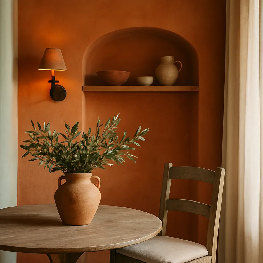
Why Dining Rooms Are the Ideal Application
Terracotta belongs in the dining room more than in almost any other space. Three reasons. First, terracotta flatters food. Warm earth tones make every dish, from a green salad to a roasted chicken, look more appetizing under candlelight. Second, terracotta flatters skin. Guests seated around your table will appear warmer, healthier, and more vibrant under terracotta walls than under cool whites or grays. This is not a small consideration when hosting matters to you. Third, terracotta evokes the food cultures of the Mediterranean, where shared meals have always been celebrated. The associative cues are powerful and immediate.
Dining rooms also receive a kind of usage that supports terracotta well. They tend to be occupied in the evenings, under warm artificial light, exactly when terracotta glows most beautifully. They are not bedrooms where you need restful neutrality, nor home offices where you need clarity, nor living rooms where furnishings dominate. A dining room is an event space, and event spaces benefit from atmospheric color. Have you ever noticed how the best restaurants almost always feature warm-toned walls? They know what they are doing.
Choosing the Right Terracotta
Start by deciding which subfamily of terracotta matches your light and your aesthetic. For rooms with significant natural light, you can choose a deeper, more saturated terracotta without it overwhelming the space. For darker dining rooms, a softer, dustier terracotta will read more sophisticated and less heavy.
From Sherwin-Williams, consider Cavern Clay (SW 7701), Etruscan (SW 7706), and Adobe (SW 6376) for varying terracotta moods. From Benjamin Moore, Audubon Russet (HC-51), Georgian Brick (HC-50), and Carrington Beige Red (1322) all sit in the terracotta family. Farrow & Ball's Red Earth and Bamboozle deliver more European, slightly pinkish takas on the family. Always test on a generous patch, ideally a full wall section, and observe at lunch, dusk, and full dark under candlelight or pendant.
Finish: Matte, Limewash, or Plaster
Standard flat or matte latex paint will deliver a perfectly acceptable terracotta wall, but the truly transporting Mediterranean look comes from finishes that mimic actual plaster. Limewash, Roman clay, and Venetian plaster all add the soft cloudy variation that makes a wall look as if it has aged in the sun. Limewash in particular has surged in popularity, with brands like Portola Paints, Bauwerk, and Pure & Original all offering authentic mineral-based limewashes in terracotta tones.
Limewash requires a different application technique than paint. It is brushed on in cross-hatched strokes and develops its character as it dries and cures over weeks. The result is unmistakable: a wall that looks as if it absorbed centuries of light. If you cannot commit to limewash, you can approximate the effect with a high-quality matte paint applied in two slightly different shades of the same family, with subtle color washing or sponging. Designers at Architectural Digest frequently use this layered approach for clients who want Mediterranean atmosphere without the cost of true Italian plaster.
Furnishing the Mediterranean Dining Room
Terracotta wants company. Specifically, it wants natural materials, warm metals, and honest craft. The classic Mediterranean dining room pairs terracotta walls with a chunky wooden table in olive, oak, or chestnut; rush-seated or ladderback chairs; an iron or aged brass chandelier; and stoneware ceramics in cream, blue, and natural clay. The palette throughout should remain in the warm earth family, with cream, butter, and warm white doing the work that cool gray or stark white would do in a more contemporary scheme.
Textiles complete the picture. Linen runners in natural or oat, faded vintage rugs with worn red and blue patterns, and a generous selection of beeswax candles all enhance the atmospheric quality. Avoid anything that reads industrial or sleek. Brushed nickel hardware, gloss-finish furniture, and high-contrast modern art will fight the terracotta walls rather than support them. The Better Homes & Gardens editorial team has documented that Mediterranean-style dining rooms increasingly include vintage and antique elements, with more than 60 percent of recently photographed examples featuring at least one piece sourced from a flea market or estate sale.
Lighting and the Magic of Evening
Lighting can make or break a terracotta dining room. Cool LEDs will turn even the most beautiful terracotta into something that looks dusty and tired. Warm bulbs in the 2200K to 2700K range bring out the depth and complexity in the color, particularly under a dimmer. A single pendant or chandelier centered over the dining table, dimmed to 30 to 40 percent, with candles as supplementary light, is the canonical Mediterranean lighting scheme.
Consider also wall sconces flanking a console or buffet, again on dimmers, for additional layered light. Avoid any overhead can lights or recessed fixtures unless they are dimmed almost to extinction. The goal is not to flood the room with light but to puddle it gently, allowing the terracotta to glow rather than glare. According to the American Society of Interior Designers, dining rooms benefit more from low, layered evening lighting than any other room in the home, and warm-walled dining rooms doubly so.
Regional Variations Within Mediterranean Style
Mediterranean style is not monolithic. The terracotta walls of a Tuscan farmhouse read differently from those of a Provencal kitchen or a Moroccan riad, and understanding these regional dialects will help you compose a more authentic-feeling room. Italian terracotta tends toward warmer, more orange-leaning tones, paired with exposed beams, travertine, and unglazed pottery. Spanish terracotta often leans deeper and dustier, paired with wrought iron, dark wood, and patterned tile. French Provencal terracotta tilts softer and pinker, paired with painted antiques, blue and yellow accents, and abundant fresh herbs in stoneware pots. Moroccan terracotta reads richer and more saturated, paired with brass lanterns, jewel-toned textiles, and patterned tile detailing.
Identifying which regional sensibility appeals to you most will sharpen every subsequent choice. A Tuscan-leaning dining room calls for olive-wood furniture, hand-thrown ceramic plates, dried herbs, and votive candles in clear glass. A Spanish-leaning room invites darker wood, wrought iron, and contrast tile or stone elements. A Provencal room wants painted hutches in soft sage or pale blue, blue and white toile fabrics, and abundant cut flowers. A Moroccan room welcomes ornate brass, low cushioned seating in addition to a table, and richly patterned textiles. The terracotta wall remains the constant; the other choices shift to create regional character. Have you ever wondered why some Mediterranean-themed rooms feel authentic while others feel costumed? The difference is usually consistency within a single regional dialect, not a mash-up of several at once.
Travel-sourced objects matter enormously in selling the atmosphere. A single hand-thrown pitcher from a market in Tuscany, a brass lantern from a Marrakech souk, or a pile of woven baskets from Provence brings authenticity that no big-box import can match. If travel sourcing is not possible, support independent makers and small importers who work directly with Mediterranean artisans. The provenance shows in the work, in the slight irregularities and asymmetries that hand production always carries.
Common Pitfalls and How to Avoid Them
The most common terracotta mistake is choosing a shade that is too saturated and applying it in a flat finish across all four walls of a small dining room. The result reads orange and overwhelming rather than warm and atmospheric. The fix is either selecting a more muted, complex terracotta or applying a richer terracotta in a more textural finish that adds visual variation. If you have already painted and dislike the result, consider a thin limewash glaze applied over the existing paint to soften and complicate the color without full repainting.
A second pitfall is pairing terracotta with the wrong woods. Yellow-toned woods such as honey oak, pine, and maple can fight terracotta walls, creating a busy, slightly cartoonish palette. Olive wood, walnut, chestnut, dark oak, and aged or limed oak all integrate beautifully. If your existing dining furniture is honey oak, consider whether refinishing or replacing the pieces would unlock the room. Sometimes the wall color is correct and the furniture needs to catch up to it.
A third pitfall is overdecorating. Terracotta walls already deliver substantial atmospheric impact, and rooms that try to layer Mediterranean cliches on top of them, strings of garlic, hand-painted murals, oversized rooster figurines, can tip into kitsch quickly. The most beautiful Mediterranean dining rooms are restrained: terracotta walls, a beautiful table, a few thoughtfully chosen ceramics, candlelight, and the food itself. Trust the wall to do its work, and resist the impulse to costume the room around it. The Color Marketing Group's analyses of warm-tone interiors consistently identify restraint as the differentiator between editorial-quality results and themed-restaurant pastiche. Apply that lesson, and your terracotta dining room will outlast every trend that follows.
Conclusion
A terracotta dining room is more than a paint choice. It is a hospitality choice, a culinary choice, and a small act of cultural homage to the long tradition of Mediterranean gathering. Done with care, it produces a room that guests remember, that flatters every meal, and that resists the tide of trend cycles. Done carelessly it produces a room that looks like a college apartment painted by someone who watched one episode of a renovation show. The difference is entirely in the details.
Test your terracotta thoroughly, considering at least three candidates across multiple shades of the family. Invest in the finish: limewash, Roman clay, or at minimum a high-quality matte paint applied with patience. Pair with natural wood, warm metals, honest ceramics, and good linens. Light the room with warm bulbs and candles, and dim those lights as the evening progresses. Skip cool finishes, gloss surfaces, and anything that reads industrial. These rules are simple, but they are the difference between a Mediterranean dining room and a Mediterranean-themed dining room.
If you have been holding back from committing to a bold dining room color, terracotta is perhaps the most rewarding place to start. The risk is modest because terracotta is fundamentally a friendly color, and the upside is enormous because the atmospheric transformation is immediate. Order samples this week, paint generous patches, dine in front of them across several evenings, and let the room speak. Make the commitment, and you may find yourself hosting dinner more often than you have in years.
More Articles You May Like


Comments
Post a Comment