Two-Tone Cabinet Painting Where Upper Meets Lower in Kitchens
The single-color kitchen had a long run. For most of the twentieth century, the assumed standard was that every cabinet box, drawer face, and door panel in a kitchen would be painted or stained in one color, top to bottom, end to end. That assumption has now thoroughly collapsed. Two-tone cabinet painting, where the upper cabinets wear one color and the lower cabinets wear another, has become one of the most popular kitchen design moves of the past decade and shows no signs of fading. The technique solves real visual problems, opens up palette possibilities a monochrome kitchen cannot reach, and creates a sense of hand-crafted intention that resonates with how contemporary homeowners actually want their kitchens to feel.
The numbers back the trend. The National Kitchen and Bath Association (NKBA) has reported in recent annual surveys that roughly 54% of designed kitchens now incorporate a two-tone or multi-tone cabinet scheme, up from under 20% a decade ago. Editors at Better Homes and Gardens (BHG) have documented hundreds of two-tone kitchens across price ranges, from modest cottage renovations to full custom millwork in major estates. The technique has become genuinely mainstream while still feeling intentional rather than trendy. The remaining question is how to do it well.
Why Two-Tone Works Visually
The split between uppers and lowers solves a perceptual problem that most homeowners feel without naming. A wall of monochrome cabinetry, especially in a saturated color, reads as a single heavy plane that can dominate a kitchen's visual field. Splitting that plane into two horizontal bands of color breaks the visual weight, creates a natural midline at countertop height, and lets the eye rest at the seam rather than scanning continuously up the entire wall. The kitchen feels less like a furniture installation and more like a designed space with intentional rhythm.
There is also a practical reason. Lower cabinets accumulate scuffs, dings, and toe-kicks at a much higher rate than upper cabinets. A darker color below disguises that wear elegantly, while a lighter color above keeps the upper field bright and reflective, bouncing daylight around the room. The two color decisions can do different jobs, one practical and one atmospheric, in a way a single color cannot.
Finally, the technique creates an opportunity for the countertop and backsplash to participate in the composition rather than merely separating two identical color fields. A counter material that reads neutral against monochrome cabinets often comes alive against contrasting uppers and lowers because it now functions as a deliberate transition zone. Have you considered how your existing or planned countertop would look with two different cabinet colors framing it from above and below?
Choosing the Color Pairing That Holds Together
The most common mistake in two-tone kitchens is treating the upper and lower color decisions as independent choices. They are not. The two colors must function as a pair, with a deliberate relationship that the eye reads as intentional rather than accidental. Three pairing strategies consistently produce coherent results: tonal contrast within a single hue family, complementary harmony using related warm or cool palettes, and neutral plus statement, where one cabinet is a calm neutral and the other carries the room's character.
Tonal contrast pairs two values of the same hue, like a soft cream upper with a deep camel lower, or a pale blue-gray upper with a navy lower. The eye reads the relationship as deliberate because the underlying hue is shared, and the resulting kitchen feels sophisticated and quiet. Complementary harmony pairs two different but related colors, like a warm white upper with a sage green lower, or a soft greige upper with a forest green lower. These schemes feel more energetic but require more careful color matching to avoid clashing undertones.
Neutral plus statement is the most popular contemporary approach. A clean white upper paired with a saturated lower in navy, deep green, charcoal, or even oxblood produces a high-contrast, high-impact kitchen that still feels grounded because half of the cabinetry remains visually quiet. Benjamin Moore (Benjamin Moore) and other major manufacturers maintain extensive curated palettes of pre-tested two-tone pairings, which can save hours of swatching and reduce the risk of finding out your two colors fight only after the cabinets are installed.
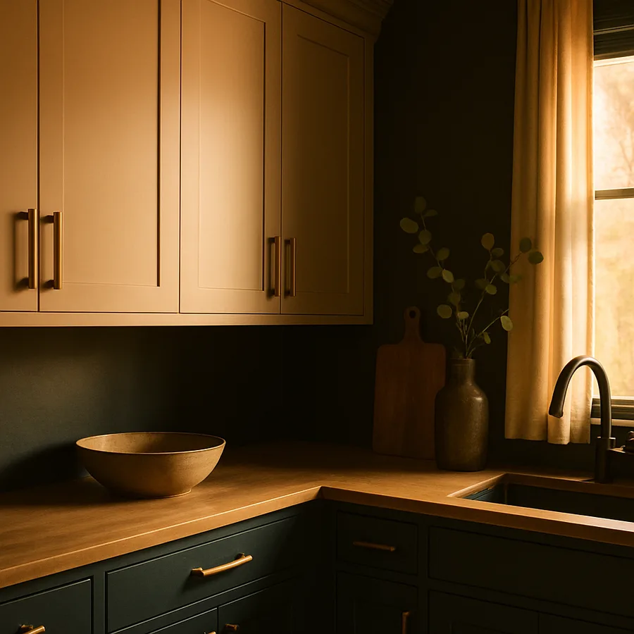
Where Exactly Should the Color Change Happen?
The choice of transition point defines the entire visual logic of a two-tone kitchen. The standard split runs along the countertop, with upper cabinets in one color and base cabinets and any island in another. This is the cleanest, most intuitive approach and works in nearly any kitchen. But it is not the only choice, and rooms with unusual cabinet configurations sometimes benefit from creative variations.
An island-only color change treats the perimeter cabinets as one tone and the island as the accent, allowing a single piece of furniture-like cabinetry to carry the room's personality while the perimeter remains calm. This works especially well in open-plan kitchens where the island is visible from adjacent living spaces. A perimeter accent reverses the logic, painting the island in a calm neutral and reserving the bold color for the perimeter base cabinets and the area below the upper cabinets.
A three-way split introduces a third color for tall cabinetry, like pantries or built-in refrigerator surrounds, treating them as a separate visual element. This advanced move requires confident color decisions and a kitchen large enough to support three distinct color zones without feeling chopped up. The American Society of Interior Designers (ASID) has profiled successful three-way kitchens that use the third color sparingly to anchor a single architectural feature, never spreading it across multiple disconnected cabinet runs.
Hardware as the Connecting Thread
In a single-color kitchen, hardware is decoration. In a two-tone kitchen, hardware becomes the visual stitching that holds the two color zones together. A consistent hardware finish across both upper and lower cabinets reads as a deliberate design choice and reassures the eye that the color split is intentional rather than the result of two separate renovation phases.
Aged brass, brushed brass, and unlacquered brass have dominated two-tone kitchens for the past several seasons because their warm tone bridges most color pairings effectively. Polished nickel and brushed nickel work well with cooler palettes. Matte black hardware can succeed but tends to compete visually with darker lower cabinets, sometimes creating a heavy bottom field that overwhelms the lighter upper. Test hardware against both cabinet colors before committing to a finish, and consider mocking up a single drawer pull on each color to see how the metal reads in actual kitchen lighting.
Hardware style matters as much as finish. Cup pulls on the lower drawers paired with knobs on the upper doors is a traditional pairing that nods to historic kitchen design. A consistent bar pull across all cabinets reads as more contemporary. Mixing hardware styles between uppers and lowers is generally a mistake unless the styles share a clear visual family, since an unintentional mix amplifies the perception that the two cabinet zones are unrelated. The National Association of Home Builders (NAHB) reports that hardware refinements often deliver outsized perceived value in kitchen renovations, particularly when they unify a two-tone scheme.
Paint Selection, Sheen, and the Realities of Cabinet Wear
Cabinets are some of the most punishing surfaces in a home for paint. They are touched constantly, cleaned with aggressive products, splashed with cooking residues, and subjected to repeated humidity cycles every time the dishwasher opens. Cabinet-grade paint formulated specifically for kitchen and millwork applications is non-negotiable for a project meant to last. Standard wall paint, even in premium lines, will not survive five years of daily kitchen use without showing wear.
The leading choices for cabinet finishes are waterborne alkyd enamels and acrylic urethane enamels. Waterborne alkyds offer the leveling and hardness of traditional oil-based paints with much faster cure times and no yellowing. Acrylic urethanes are even more durable and recoat well over time. Both are typically available in satin, semi-gloss, and gloss sheens. Most contemporary kitchens favor satin or low-luster semi-gloss, which is durable and easy to clean without producing the plastic look of high gloss. The Master Painters Institute (Master Painters Institute) provides specification sheets for cabinet-rated coatings that are worth reviewing before any major project.
Substrate preparation is again the difference between a finish that lasts a decade and one that fails in two years. Doors and drawer fronts should be removed, labeled by location, cleaned with a degreaser, lightly sanded, primed with a stain-blocking bonding primer, and painted on flat sawhorses or a paint stand for best leveling. Spraying produces the smoothest finish but requires equipment and ventilation; brushing and rolling with a high-quality foam roller produces excellent results in most kitchens with a fraction of the setup. Have you allocated enough time, typically a full week including cure days, to do the work without rushing?
Mistakes That Sink Otherwise Strong Two-Tone Kitchens
The most frequent failure is insufficient contrast. Two cabinet colors that are too close in value read as a paint mistake rather than a design decision. The eye expects deliberate visual difference, and weak contrast sends a confused signal. A reliable test is to photograph your two paint samples side by side, then convert the image to grayscale on your phone. If the two samples appear nearly identical in black and white, the value contrast is too weak for the technique to read clearly.
The second mistake is color isolation from the rest of the kitchen. Cabinet colors must coordinate with the countertop, backsplash, flooring, and any visible appliances. A bold lower cabinet color that fights the countertop, or an upper cabinet white that clashes with the backsplash, produces visual discomfort even when the cabinet pairing itself is good. Always evaluate paint chips against every adjacent finish, not just against each other.
The third mistake is over-decorating the two-tone foundation. Once the cabinets carry visible color contrast, the rest of the kitchen needs to calm down. Heavy patterned backsplashes, complex tile floors, and busy window treatments compete with the cabinet contrast and produce visual chaos. The most successful two-tone kitchens treat the cabinet colors as the dominant decorative move and let other finishes recede into supporting roles.
Conclusion: A Renovation-Worthy Move Without a Full Renovation
Two-tone cabinet painting delivers the visual impact of a full kitchen renovation at a fraction of the cost and disruption. The cabinet boxes stay. The layout stays. The appliances stay. What changes is the color logic, the hardware, and the overall character of the room, which together can completely transform how the kitchen feels to live in. Few other interior interventions offer this much return for the input.
Approach the project with patience and discipline. Choose a color pairing with deliberate logic rather than impulse. Pick a transition point that respects the architecture of your specific kitchen. Invest in cabinet-grade paint and proper substrate preparation. Coordinate the hardware as the connecting thread that unifies the two zones. And let the rest of the kitchen retreat into supporting calm so the cabinet colors can speak clearly.
If you are weighing whether to undertake a two-tone cabinet project this year, the most useful first step is a small mockup. Paint two test boards in the colors you are considering, prop them at upper and lower cabinet height in your actual kitchen, and live with them for a full week. Cook there. Eat there. See how the colors read at every time of day. Whatever still feels right at the end of that week is the right answer. Order your test paint samples this weekend, set up the mockup, and begin a project that will reset the entire personality of your kitchen.
More Articles You May Like
Comments
Post a Comment