Cabinet Paint Colors for Kitchens Beyond All-White Everything
The Quiet Retreat From the All-White Kitchen
For the better part of a decade, the dominant vision of an aspirational kitchen was a monochrome field of white cabinetry, white countertops, white subway tile, and white walls. This aesthetic, amplified by real estate staging trends and social media platforms, became so pervasive that it functioned less as a design choice and more as a default setting. Homeowners who wanted something different often struggled to articulate an alternative because the visual landscape offered so few reference points for kitchens that were not white. That landscape has shifted meaningfully, and the data confirms what showroom floors and design magazines have been suggesting: color is returning to kitchen cabinetry with serious momentum.
The National Kitchen and Bath Association (NKBA) reports that non-white cabinet finishes now account for a growing majority of new kitchen installations, a reversal from the period when white dominated specification sheets across the industry. Designers surveyed by NKBA cite client fatigue with the all-white look as the primary driver, followed closely by the desire for kitchens that reflect personal style rather than resale-market consensus. This shift does not mean white cabinets are disappearing; they remain a viable and attractive option. What it does mean is that the assumption that white is the only safe, sophisticated, or timeless cabinet color has been thoroughly dismantled by a generation of homeowners willing to commit to color.
The resistance to colored cabinets often stems from a reasonable concern about longevity. White feels safe because it feels permanent, and the fear of painting cabinets a bold color only to tire of it in three years is genuine. But this concern misunderstands what makes a cabinet color timeless. Timelessness in kitchen design does not come from choosing the most neutral option; it comes from choosing a color with enough depth and complexity to age gracefully alongside evolving trends and your own changing tastes. A well-chosen navy, sage, or warm greige has proven durability precisely because these colors draw from natural and historical palettes that predate and will outlast any social media trend cycle.
What follows is a detailed exploration of the cabinet colors that are proving themselves in real kitchens, not on mood boards or in digitally rendered showrooms but on actual painted surfaces that homeowners live with daily. Each color family has its own logic regarding what countertops, hardware, and backsplashes it pairs with, what lighting it demands, and what kitchen sizes and layouts it serves best. The goal is not to push you toward any single option but to give you the information needed to choose a color with the same confidence that the all-white default once provided.
Navy and Deep Blue: The Anchor Color for Serious Kitchens
No cabinet color has challenged white's dominance more effectively than navy blue. Its success is not accidental. Navy occupies a unique position on the color spectrum where it reads as a neutral to most eyes, carrying enough darkness to feel grounded and enough blue to feel alive, without the heaviness of black or the starkness of charcoal. In kitchen cabinetry specifically, navy creates a sense of substance and permanence that makes the room feel like it has been there for decades, even in new construction. This quality of implied history is something white cabinets, for all their brightness, rarely achieve.
The countertop pairing is where navy cabinets either succeed brilliantly or fall flat. White marble and quartz with gray veining are the most popular companions, and for good reason: the high contrast between dark blue cabinets and light stone surfaces creates a visual drama that energizes the kitchen without overwhelming it. Butcher block and warm wood countertops offer a softer, more approachable pairing that pulls the navy toward a nautical or coastal sensibility. What to avoid is pairing navy cabinets with dark countertops, particularly black granite or dark soapstone, because the combination absorbs too much light and makes the kitchen feel like a cave, especially in spaces with limited natural illumination.
Hardware selection with navy cabinets reveals the color's remarkable versatility. Brass and brushed gold hardware against navy creates a rich, slightly formal aesthetic that references traditional library and study interiors. Polished nickel and chrome provide a cooler, more contemporary contrast that sharpens the blue undertone. Matte black hardware creates a tonal, almost monochromatic look that reads as sophisticated and restrained. The Houzz kitchen trends survey found that brass hardware on navy cabinets is the single most popular non-white cabinet and hardware combination among homeowners completing kitchen renovations, outpacing every other color-hardware pairing by a significant margin.
Lighting is the practical consideration that determines whether navy cabinets make your kitchen feel elegant or oppressive. Navy absorbs significantly more light than white, which means the same kitchen that felt bright and airy with white cabinets will feel noticeably darker with navy if no lighting adjustments are made. Under-cabinet task lighting becomes essential rather than optional, and the fixtures themselves should use bulbs in the 3000 to 3500 Kelvin range to keep the blue tones true without pushing them toward purple or gray. If your kitchen has limited natural light and you are not prepared to invest in comprehensive supplemental lighting, consider applying navy only to the lower cabinets while keeping the uppers white or light, a two-tone approach that captures the color's impact without the light penalty. Have you assessed how much natural light your kitchen receives during the hours you use it most?
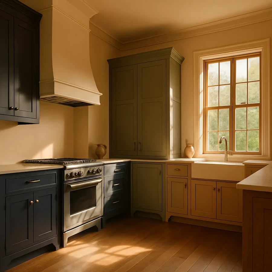
Sage Green and Muted Olive: Nature's Own Kitchen Palette
Green cabinets occupy a fascinating position in kitchen design because the color simultaneously feels fresh and ancient. Humans have been painting kitchen furniture green for centuries, from the painted hutches of Scandinavian farmhouses to the deep bottle-green cabinetry of Georgian English kitchens. This deep historical precedent gives green an authenticity that genuinely trendy colors lack, and it explains why sage and olive cabinets feel so immediately right in kitchens that aim for warmth, character, and a connection to the natural world. The American Society of Interior Designers (ASID) has tracked green as one of the most specified cabinet colors in residential kitchen projects for several consecutive years, confirming its position as a sustained preference rather than a fleeting fad.
Sage green, a muted, gray-green tone with gentle warmth, is the most versatile entry point into green cabinetry. Its grayish quality prevents it from reading as overtly colorful, which makes it comfortable for homeowners who are taking their first step away from neutral cabinets. Sage pairs exceptionally well with white countertops, creating a soft, garden-inspired contrast that feels both clean and organic. It also works beautifully with warm wood countertops, unlocked butcher block, and natural stone with warm veining like certain granites and quartzites. The color adapts to hardware in much the same way that navy does: brass warms it further, chrome cools it down, and matte black provides graphic definition.
Darker olive and forest green tones carry more visual weight and make a stronger statement, suitable for kitchens where the homeowner wants the cabinetry to be an unmistakable design feature rather than a subtle shift from neutral. Olive green cabinets with leather-wrapped drawer pulls and honed marble countertops create a moody, European-inflected kitchen that feels both modern and deeply rooted in tradition. According to kitchen designers quoted in Architectural Digest, darker greens work best in kitchens with at least one large window or a skylight, because the color needs natural light to reveal its complexity rather than collapsing into a flat dark mass.
The backsplash behind green cabinets offers an opportunity to either amplify the organic quality of the color or introduce a contrasting element that prevents the kitchen from feeling one-note. Handmade ceramic tiles in cream or off-white, particularly zellige tiles with their irregular surfaces, complement green cabinets beautifully because the imperfect texture of the tile echoes the natural, imperfect quality that green evokes. Alternatively, a white marble slab backsplash provides a clean, uninterrupted backdrop that lets the cabinet color speak without competition. What to approach cautiously is a green glass or green tile backsplash behind green cabinets, which can push the color saturation past the point of comfort and make the kitchen feel monochromatic in an oppressive rather than cohesive way.
Warm Greige and Mushroom Tones: The Sophisticated Middle Ground
Greige, the hybrid of gray and beige, has emerged as the go-to cabinet color for homeowners who want to move past white but are not ready for a definitive color statement. This is not a criticism of the choice; greige is a genuinely sophisticated color family that offers the warmth that pure gray lacks and the modernity that beige cannot provide. On kitchen cabinets, greige reads as a warm neutral that recedes visually while still giving the room more character and depth than white. The color has a quiet confidence that serves both traditional and contemporary kitchen styles without strongly affiliating with either.
The specific shade of greige matters enormously because the gray-to-beige ratio determines whether the cabinets lean warm or cool. Shades with more beige, sometimes called mushroom tones, carry a distinctly earthy warmth that pairs naturally with wood floors, stone countertops, and woven textures. They work particularly well in kitchens where the homeowner wants the space to feel like a natural extension of a warm, textured living area. Shades with more gray, sometimes called warm gray or pewter, feel more contemporary and architectural, pairing cleanly with white quartz countertops, stainless steel appliances, and concrete or industrial-inspired elements.
The Paint Quality Institute has noted that greige tones are among the most sensitive to lighting conditions of any paint color family, which means testing in your specific kitchen is non-negotiable. Under warm incandescent lighting, greige cabinets will emphasize their beige component and look distinctly warm. Under cool LED or fluorescent lighting, the gray component dominates and the cabinets can look surprisingly cool and modern. This chameleon quality is either a feature or a bug depending on your perspective: homeowners who enjoy seeing their kitchen shift character between day and night often embrace it, while those who want a single, consistent appearance may find it unsettling.
Greige cabinets excel in two-tone kitchen designs where the upper and lower cabinets are finished in different colors. Greige lowers with white uppers creates a grounded, layered look that adds visual interest without the boldness of a saturated color. The reverse, white lowers with greige uppers, is less common but can work in kitchens where the upper cabinets are the more prominent visual element, such as galley layouts where the upper cabinets line a long, visible wall. The National Kitchen and Bath Association data shows that two-tone cabinet schemes have grown from a niche preference to nearly a quarter of all kitchen renovations, with greige-and-white being the most frequently specified combination after navy-and-white.
Rich Black and Charcoal: Commanding Attention With Restraint
Black kitchen cabinets represent the furthest departure from the all-white kitchen, and they require the most careful execution to succeed. When done well, a black or deep charcoal kitchen possesses a magnetic, gallery-like quality that makes every object placed on the counter or displayed on a shelf look deliberately curated. When done poorly, it feels oppressive, claustrophobic, and impractical. The difference between these outcomes almost always comes down to three factors: how much light the kitchen receives, how the black is balanced with lighter elements, and whether the black itself has the right undertone for the space.
True, flat black with no discernible undertone is the hardest to work with in residential kitchens because it absorbs light completely and can make even a large kitchen feel smaller. Charcoal and off-black shades that carry a hint of blue, green, or brown are significantly more forgiving because the subtle undertone gives the eye something to engage with beyond pure darkness. Benjamin Moore Wrought Iron 2124-10 is one of the most popular near-black cabinet colors because its slight warm undertone prevents it from feeling sterile, while Farrow and Ball Railings No. 31 offers a blue-black character that reads as sophisticated and slightly softer than a true black. These nuanced darks achieve the dramatic impact of black while maintaining the visual complexity that prevents the kitchen from feeling like a void.
Countertop and backsplash selection becomes critical with dark cabinets because these lighter surfaces provide the contrast that keeps the kitchen from collapsing into darkness. White marble or quartz countertops with dramatic veining are the most effective companions for black cabinets because the veining creates visual movement across the light surface, preventing it from reading as a simple stripe of white between dark walls and dark base. According to the Marble Institute of America, Calacatta-style marbles and quartz that mimic their bold gray veining are the most frequently specified countertop materials for kitchens with dark cabinetry, precisely because the strong patterning provides visual energy that balances the quietness of the dark surfaces surrounding it.
The question homeowners most frequently ask about dark cabinets is whether they show dirt, fingerprints, and scratches more than lighter finishes. The honest answer is yes, particularly in matte and flat sheens where fingerprints leave visible marks on the surface. A satin or semi-gloss finish on dark cabinets helps mitigate this by reflecting enough light to mask minor smudges and by providing a more wipeable surface. Satin finishes also introduce a subtle sheen that enhances the depth of the dark color, giving the cabinets a furniture-like quality that flat finishes cannot match. If you are committed to dark cabinets but concerned about maintenance, satin is the practical sweet spot between the drama of matte and the durability of gloss. Is daily wipe-down something you are willing to incorporate into your kitchen routine, or would a more forgiving finish serve your lifestyle better?
Choosing Paint Type and Finish for Maximum Durability
The color you choose matters, but the paint formulation and sheen you apply it with determines whether your cabinets still look good after five years of daily use. Kitchen cabinets endure more physical contact, temperature variation, moisture exposure, and cleaning product contact than almost any other painted surface in a home. Standard wall paint, even high-quality wall paint, will fail on cabinets within months, chalking, chipping, and yellowing at an accelerating rate. This is not a place to economize on materials, and selecting the right product is as important as selecting the right color.
Cabinet-specific paints have been formulated to address the unique demands of kitchen surfaces. These products, marketed as cabinet and trim enamel or alkyd-modified acrylic, combine the easy cleanup of water-based paints with the hard, smooth, self-leveling finish traditionally achieved only by oil-based products. Benjamin Moore Advance, Sherwin-Williams Emerald Urethane Trim Enamel, and Farrow and Ball Modern Eggshell are among the most recommended options by professional cabinet painters. They cure to a hard film over 7 to 14 days that resists scratching, staining, and moisture far more effectively than standard latex wall paint. The extended cure time means you must handle newly painted cabinets gently for the first two weeks, but the long-term payoff in durability justifies the patience.
Surface preparation accounts for approximately 80 percent of the difference between a professional-looking cabinet paint job and an amateur one. Thorough degreasing with trisodium phosphate or a dedicated cabinet cleaner removes the cooking oils and fingerprint residue that prevent paint adhesion. Sanding with 150-grit followed by 220-grit sandpaper creates the mechanical tooth that primer needs to grip. A bonding primer formulated for glossy surfaces, such as Zinsser BIN shellac-based primer or KILZ Adhesion, provides the foundation layer that bridges the gap between the old finish and the new paint. Skipping any of these steps, and homeowners frequently skip degreasing because it is tedious, virtually guarantees adhesion failure that manifests as peeling or chipping within the first year.
Sheen selection on cabinets is more consequential than on walls because the cabinets occupy a closer viewing distance and receive direct handling. Semi-gloss has been the traditional cabinet sheen for decades because it resists moisture and cleans easily, but many homeowners find it too shiny and reflective for contemporary kitchen aesthetics. Satin provides a softer, more modern look with nearly as much durability and moisture resistance as semi-gloss. Matte and flat sheens on cabinets are increasingly popular for their elegant, furniture-like appearance, but they require the most careful maintenance and are the least forgiving of fingerprints and food splatter. The Painting and Decorating Contractors of America (PDCA) recommends satin as the optimal balance of aesthetics and performance for residential kitchen cabinets, noting that advances in paint technology have closed most of the historical durability gap between satin and semi-gloss formulations.
Conclusion: Finding Your Kitchen's Own Color Identity
Moving beyond all-white kitchen cabinets is not a rejection of white's virtues but an expansion of the possibilities available to homeowners who want their kitchens to express something more specific than generic brightness. White cabinets will continue to serve kitchens beautifully for homeowners who genuinely prefer them, and there is nothing retrograde about choosing white when it is a deliberate preference rather than a fearful default. The difference is in the choosing: selecting white because you love it and selecting white because you are afraid of color are two fundamentally different design decisions, and only one of them leads to a kitchen you will enjoy for years.
The colors explored here, navy, sage, greige, and rich darks, represent the most proven alternatives because they have demonstrated staying power in real kitchens over multiple years and across diverse design contexts. They share a common trait: sufficient complexity and depth to age gracefully alongside changing trends, evolving personal tastes, and the natural patina that a well-used kitchen develops over time. A sage green cabinet that looks slightly different after ten years of cooking, gathering, and living will look characterfully aged rather than dated, in much the same way that a well-worn leather chair gains beauty rather than losing it.
Begin your color exploration by looking at the elements in your kitchen you cannot or do not want to change: the flooring, the countertops, the window orientation, and the adjacent rooms visible from the kitchen. These fixed elements establish the constraints within which your cabinet color must work, and constraints, far from limiting creativity, actually make the selection process more manageable by eliminating options that would clash. Sample generously, test under real lighting conditions, and give yourself permission to choose something that makes you feel genuinely excited rather than merely safe. Your kitchen should reflect how you actually want to live in it, not how a staging consultant thinks it should look for someone else.
More Articles You May Like


Comments
Post a Comment