The Ultimate Guide to Choosing Color Palettes for Room Interior Design
Have you ever felt overwhelmed by the countless color options when redesigning a space? You're not alone. Studies suggest that 73% of homeowners feel paralyzed by color choices during the interior design process. Selecting the right color palette can significantly impact the ambiance and functionality of a room. This guide will equip you with the knowledge and confidence to make informed color decisions that align with your design vision. From understanding foundational concepts to learning from industry experts, you'll gain insights that transform your space into a cohesive masterpiece.
What You Need to Know First
Before diving into color selection, it's essential to understand the basics of color theory. The color wheel, which includes primary, secondary, and tertiary colors, is a fundamental tool in interior design. By using this tool, you can create harmonious color schemes that evoke specific moods and aesthetics. For instance, complementary colors, which are opposite each other on the wheel, can create vibrant looks, while analogous colors, which are next to each other, offer a more serene vibe.
Another critical aspect is understanding the psychological impact of colors. Colors can evoke emotions and influence perceptions. For example, blues and greens are known to have calming effects, making them ideal for bedrooms and bathrooms. On the other hand, reds and oranges can stimulate conversation and appetite, making them suitable for dining areas. By aligning your color choices with the intended function of the room, you can enhance both form and function.
Lastly, consider the natural light available in the space. Natural lighting can alter the perception of color throughout the day. South-facing rooms with ample sunlight can handle cooler tones, while north-facing rooms might benefit from warmer hues to offset the lack of natural warmth. Understanding these foundational concepts will set the stage for a successful interior design project.
Step-by-Step Process
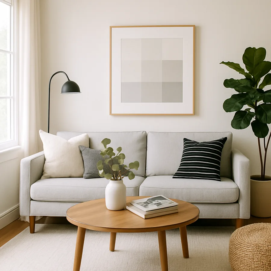
Choosing a color palette starts with defining the purpose of the room. Ask yourself: What activities will take place here? Once you have clarity, select a primary color that reflects the room's function. This color will dominate the space and set the overall tone. For example, a soft, neutral palette might suit a relaxing living room, while a bolder choice could invigorate a home office.
Next, introduce secondary and accent colors. Secondary colors should complement the primary hue and help unify the space. Accent colors, used sparingly, add dimension and visual interest. Consider using them in throw pillows, artwork, or an accent wall. This layered approach ensures a balanced yet dynamic look.
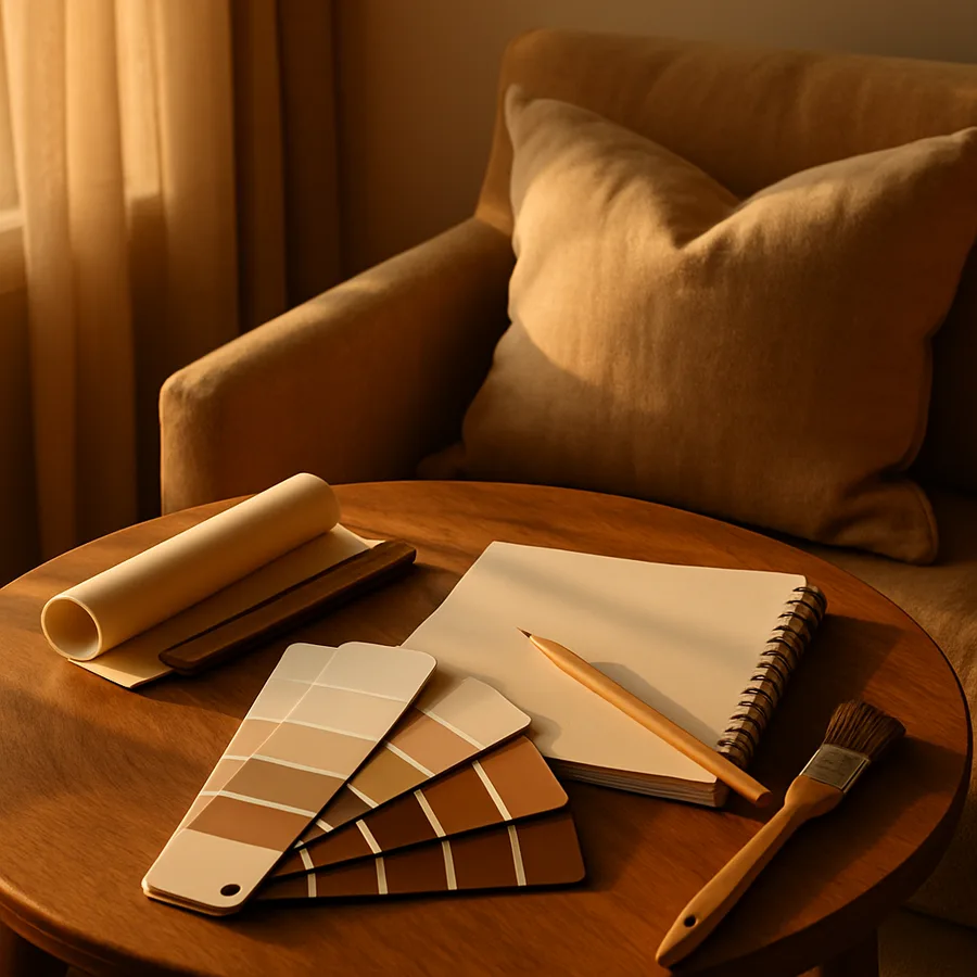
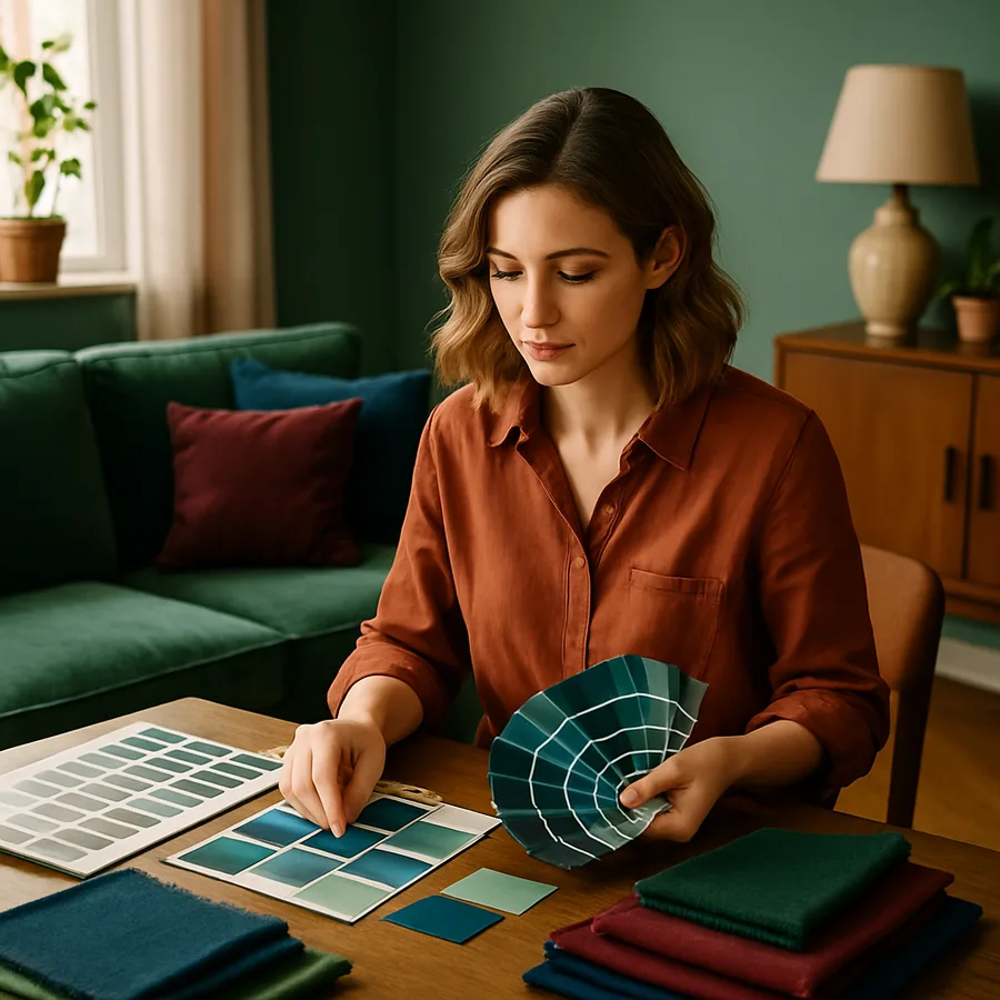
Once you have a tentative palette, test your choices with physical swatches. Paint small areas of the room or create boards with samples of your chosen colors alongside fabrics and finishes. Observing how colors interact with each other and with light at different times of the day is crucial. This step can prevent costly mistakes and ensure that the palette works harmoniously in the real-world setting.
Finally, refine your palette based on your observations. Adjust shades and tones as needed to achieve the desired effect. This iterative process may take time, but it's essential for achieving a cohesive and satisfying design. With a strategic approach, you can create a palette that enhances your space and reflects your personal style.
Common Mistakes to Avoid
One of the most common pitfalls in choosing a color palette is overwhelming the space with too many colors. While it's tempting to incorporate a wide range of hues, doing so can lead to a chaotic and disjointed look. Stick to a maximum of three to five colors, including the primary, secondary, and accent shades, to maintain harmony and cohesiveness.
Another mistake is neglecting the importance of undertones. Colors may appear similar at first glance, but their undertones can vary significantly. For instance, a beige with pink undertones will clash with a beige with yellow undertones. Pay attention to these subtle differences, as they can make or break the overall aesthetic. Testing colors in the actual space can help identify these nuances.
Lastly, don't ignore the impact of existing elements in the room, such as flooring, furniture, and fixtures. These elements should inform your color choices to ensure a seamless integration. Experienced professionals often advise creating a mood board that includes these existing features alongside your palette to visualize the complete look. By avoiding these common pitfalls, you can create a more polished and intentional design.
Pro Tips from Industry Experts
Industry experts frequently highlight the importance of considering texture and pattern when selecting a color palette. Incorporating different textures and patterns can add depth and interest to a monochromatic palette. For instance, pairing a matte wall finish with glossy accents or combining solid colors with patterned textiles can create a sophisticated look.
Another pro tip is to draw inspiration from nature. Biophilic design, which emphasizes natural elements, is a growing trend. Using colors found in nature, such as earthy greens, rich browns, and ocean blues, can create a calming and inviting atmosphere. This approach not only enhances aesthetic appeal but also promotes a sense of well-being.
Experts also recommend utilizing technology to visualize color choices. Advanced tools like AR/VR room visualization apps allow homeowners to experiment with different palettes in a virtual setting. Platforms like Houzz offer features that enable you to see how colors will look in your space, making the decision-making process more informed and less daunting.
Budget and Timeline Considerations
Budgeting for a color palette extends beyond the cost of paint. Consider expenses for professional consultations, purchasing swatches, and any new decor items needed to complement the palette. Typically, a single room redesign can range from $5,000 to $15,000, depending on complexity and scale. Allocate funds wisely to balance quality and affordability.
In terms of timeline, factor in the time required for testing colors, making necessary adjustments, and completing the painting process. Rushed decisions often lead to dissatisfaction, so allocate ample time for each step. A well-planned project timeline can range from a few weeks to several months, depending on the scope.
Prioritize areas of your home based on importance and function. For instance, start with high-traffic areas like the living room and kitchen, which have the most significant impact on daily life. This strategic approach ensures that your investment in time and resources yields the best results.
Real-World Examples and Case Studies
Consider the case of a family renovating their living room with a focus on creating a tranquil retreat. By choosing a cool, muted blue as the primary color, they set a serene tone. Complementary hues of soft gray and white were introduced as secondary and accent colors, creating a cohesive and calming environment. This thoughtful palette not only enhanced the room's aesthetic but also increased its functionality as a relaxation space.
Another example comes from a professional home office design. The designer opted for a bold, energizing palette featuring a vibrant orange accent wall. This choice was balanced with neutral tones of beige and gray, ensuring the space remained conducive to productivity without being overwhelming. The strategic use of color transformed the office from a drab room into a dynamic workspace.
Finally, a modern kitchen renovation utilized a monochromatic palette of varying shades of green. By incorporating natural textures like wooden countertops and stone backsplashes, the design achieved a harmonious blend of color and material. This case study demonstrates the power of color in unifying design elements and enhancing the overall appeal of a space.
Conclusion
Choosing the right color palette for your interior design project is both an art and a science. By understanding color theory, avoiding common pitfalls, and drawing inspiration from industry experts, you can create a space that reflects your personality and meets your needs. Remember to consider your budget and timeline carefully, and take advantage of technology to visualize your choices before committing.
Ready to transform your space? Start by browsing portfolios on Houzz this week - even 20 minutes of research will sharpen your eye for what you want. Whether you're working with a designer or tackling a DIY project, these insights will guide you toward a successful and satisfying outcome.
More Articles You May Like


Comments
Post a Comment