The Power of Color: How to Elevate Your Room Interior Design Effortlessly
Imagine walking into a room that immediately puts you at ease, where every color seems perfectly harmonious, and the atmosphere feels just right. For many, this seems like a distant dream rather than a reality. The truth is, color has the power to transform your space dramatically, yet many struggle to harness its full potential. From clashing hues to uninspired palettes, the misuse of color can turn your interior design dreams into a decorating nightmare. In this article, we'll explore how you can leverage the power of color to effortlessly elevate your room's interior design. We'll dive into why this matters, uncover the root causes behind common color mishaps, and provide actionable solutions to achieve a stunning interior.
Why This Problem Matters
Color is more than just an aesthetic choice; it significantly impacts our mood and perception of space. According to research by the American Society of Interior Designers (ASID), color can influence emotions, productivity, and even appetite. For instance, blues and greens are known to promote calmness, while reds and yellows can energize a space. If you're not considering these effects, you might inadvertently create an environment that doesn't align with your desired mood.
Furthermore, color affects the perceived size and lighting of a room. Light colors can make a space feel larger and brighter, while dark hues can create a cozy, intimate atmosphere. However, misuse of these principles can make a room feel cramped or overly sterile. Homeowners often overlook these nuances, resulting in spaces that feel either overwhelming or underwhelming.
Finally, a well-coordinated color scheme can increase the resale value of your home. According to Houzz survey data, homes with professionally designed interiors can command 5-15% higher resale values. Thus, understanding and applying color theory is not just an aesthetic endeavor but a financial investment.
Understanding the Root Causes
The primary issue many face with color in interior design is a lack of understanding of color theory. This includes concepts like the color wheel, complementary colors, and the emotional impact of different hues. Without this foundational knowledge, choosing colors becomes a guessing game rather than an informed decision.
Another common pitfall is not considering the existing elements in the room. Furniture, flooring, and even natural light affect how colors appear. For instance, a bold wall color might clash with a patterned carpet or darken a room with limited sunlight. Experienced professionals often note that successful color schemes harmonize with these fixed elements rather than work against them.
Lastly, many underestimate the influence of trends. Current trends such as biophilic design and Japandi styles emphasize natural and muted palettes, which can be difficult to integrate into existing designs. With guidance from organizations like the International Interior Design Association (IIDA), you can avoid trend traps and opt for timeless choices that suit your personal style.
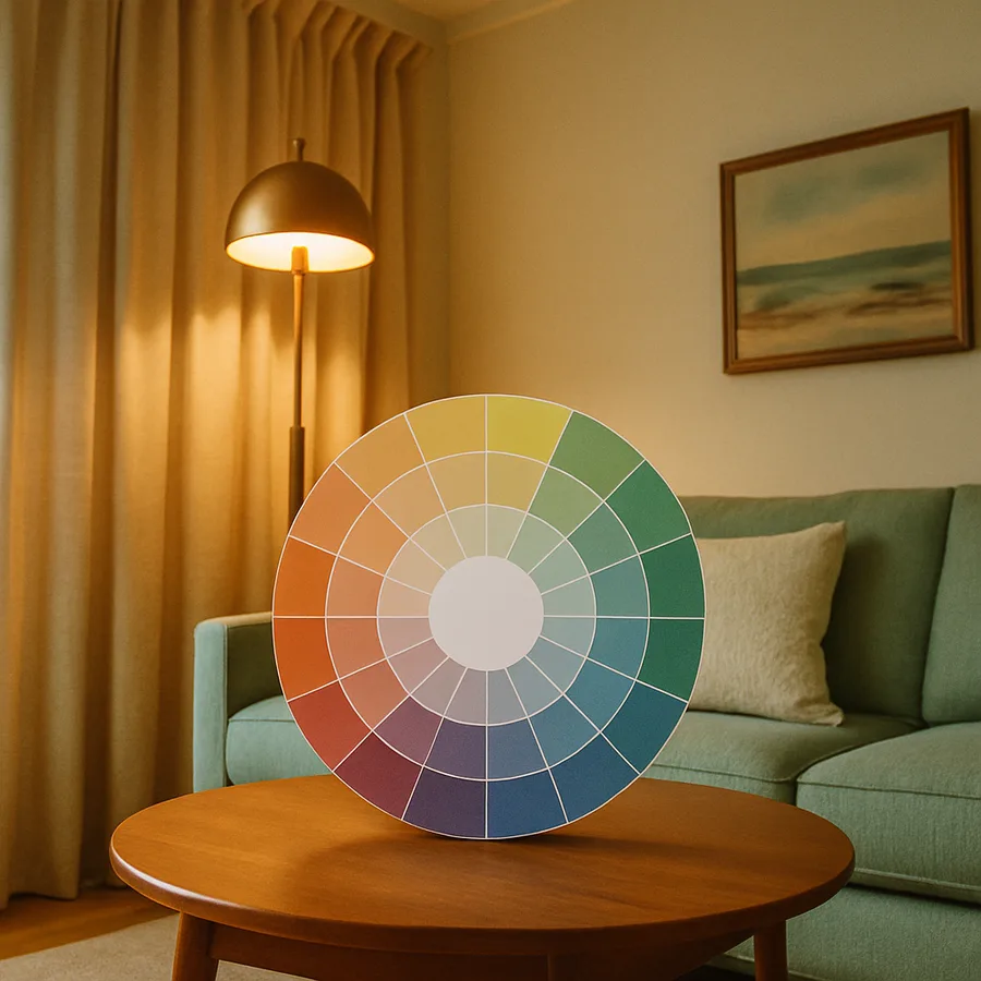
Solution #1: The Color Wheel Approach
One of the most effective ways to choose colors is by using the color wheel. This tool helps in identifying complementary, analogous, and triadic color schemes, which are fundamental to creating harmony in a room. By selecting colors that are opposite each other on the wheel, you can design a vibrant and balanced space.
For example, if you're drawn to blue, consider pairing it with its complementary orange to create a lively contrast. Alternatively, an analogous color scheme, using colors next to each other on the wheel like blue, teal, and green, can offer a more subtle and cohesive look. These approaches provide structure and guidance, reducing the guesswork involved in color selection.
To implement this, start by identifying your primary color, then use the color wheel to find complementary or analogous choices. Tools like Adobe Color or the Sherwin-Williams Color Snap Visualizer can assist in visualizing these combinations before committing to paint or decor decisions. This method ensures a professionally cohesive design without needing extensive expertise.
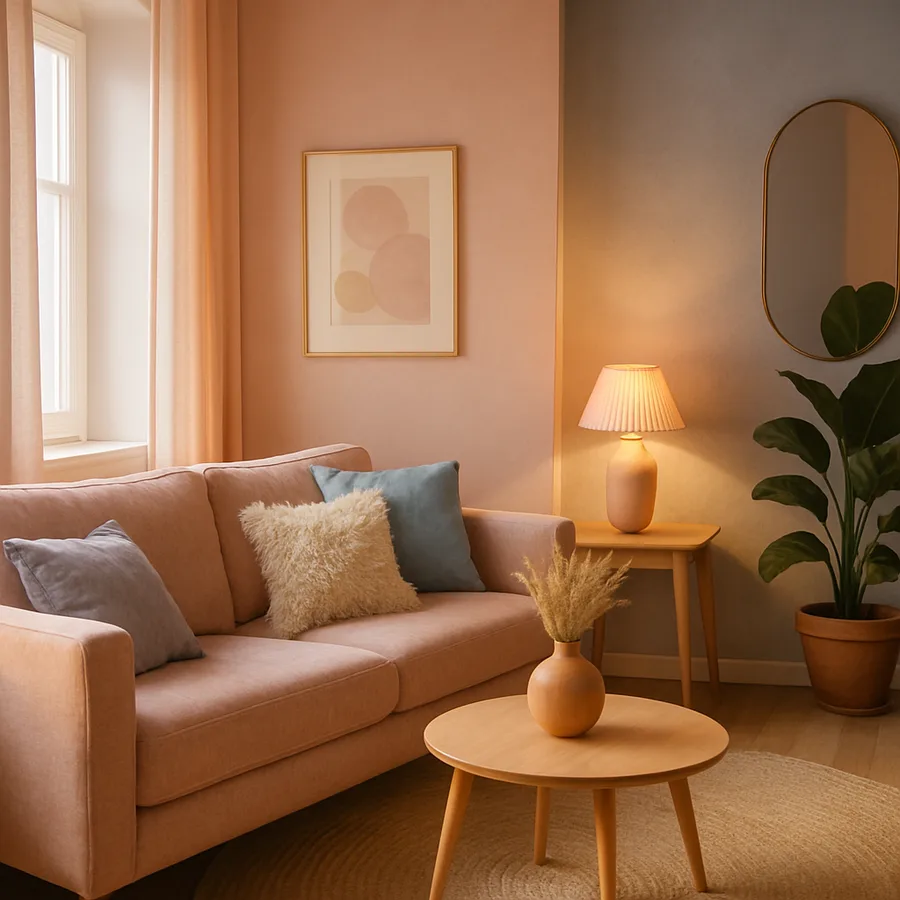
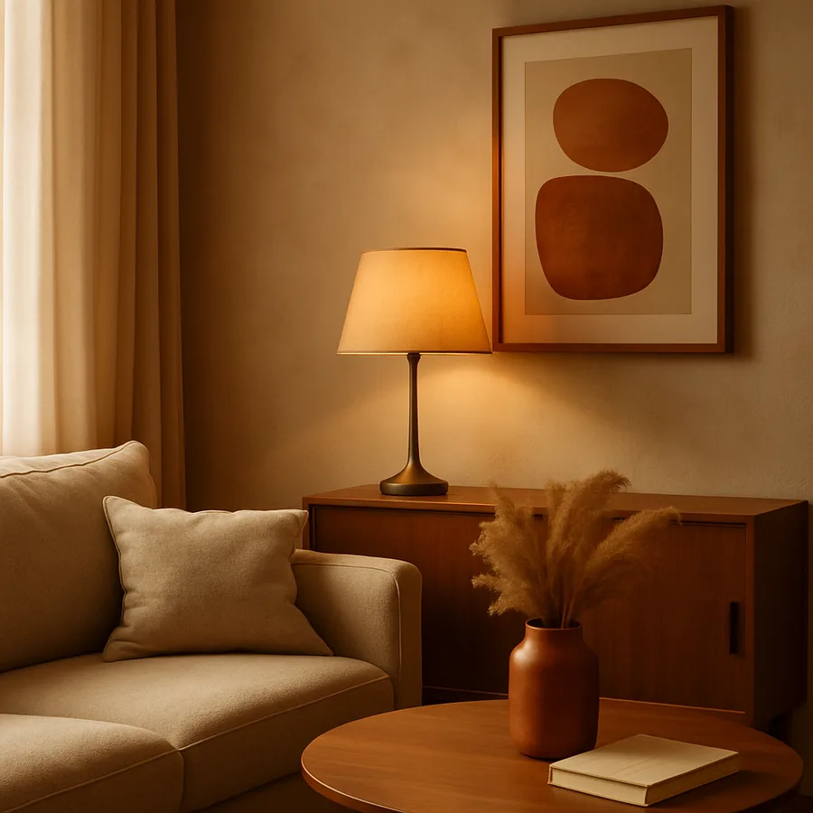
Solution #2: Neutral Foundations with Accent Colors
Another strategy is to use neutral colors as a foundation, adding vibrancy through accent colors. This technique allows for flexibility and easy updates with changing trends. Neutrals such as whites, grays, and beiges create a versatile backdrop that suits various styles and furnishings.
Accent colors can be introduced through accessories like cushions, artwork, or rugs. For example, a neutral gray sofa can be livened up with mustard yellow cushions or a turquoise throw. This approach not only adds personality but also makes it simple to refresh the space by swapping out accents for different colors when desired.
Choosing the right accents involves considering the room's function. Experienced designers often suggest using calming colors like soft blues and greens in bedrooms for relaxation, whereas living areas might benefit from energetic reds or oranges. This blend of neutrality and accents offers a dynamic yet timeless design.
Comparing Your Options
When deciding between a color wheel approach and a neutral foundation strategy, consider the desired impact and flexibility. The color wheel method offers vibrant and intentional designs, ideal for those looking to make a bold statement. However, it requires more planning and a good grasp of color theory to avoid clashing hues.
In contrast, neutral foundations provide a safer, more flexible option that can adapt over time. This method is cost-effective as it allows for seasonal changes and personal growth without significant investment. While it may seem less daring, it provides a sophisticated and enduring aesthetic.
The cost implications also vary. The color wheel approach might involve more upfront investment in paint and decor, whereas neutrals with accents could be more budget-friendly, focusing spending on accessories and small updates. Weighing these factors against your budget and personal style will help determine the best path for your design project.
Implementation Guide
Now that you understand the options, how do you start? Begin by assessing the room's existing elements and natural lighting. Take note of any fixed features like flooring and large furniture, as these will influence your color choices. Use this assessment to choose a primary color, whether it's from the color wheel or a neutral palette.
Next, create a mood board using platforms like Pinterest or Houzz. Collect images that reflect your desired color scheme and style, which will help visualize the end result. This visual guide will assist in selecting paint samples, fabrics, and decor that align with your vision.
Finally, test your colors. Purchase small sample pots to paint on the walls, observing how they look throughout the day as lighting changes. This step is crucial to ensure the colors work cohesively in your space. Once satisfied, proceed with painting and accessorizing, confident in your well-planned color scheme.
Conclusion
The power of color in interior design cannot be overstated. By understanding color theory and considering options like the color wheel or neutral foundations, you can transform your space effortlessly. Whether you're looking to make a bold statement or create a timeless haven, these strategies offer flexibility and stunning results. As you embark on your color journey, ask yourself: What mood do you wish to evoke in your space? What colors resonate with your personal style?
Start by exploring color palettes this week. Even dedicating 20 minutes to gathering inspiration will clarify your preferences and guide your decisions. With the right approach, your room can become a reflection of your personality and a place of comfort and joy.
More Articles You May Like


Comments
Post a Comment