Painted Ceiling Color Ideas Beyond Plain White for Drama
The ceiling is the largest uninterrupted surface in almost any room, and treating it as a default white plane wastes the single most generous canvas the architecture provides. A painted ceiling color, chosen with intent and applied with the right sheen, can do work that no wall color or rug can: it can cocoon a small bedroom into a jewel box, lift a flat hallway into a procession, or anchor an open-plan kitchen so it stops feeling like a void. The fear of color overhead is almost entirely cultural rather than aesthetic, and the rooms that break that fear are nearly always the ones that photograph best.
This guide moves past the safe move of white and walks through the colors, sheens, and conditions that make painted ceilings work. Each section covers a different color family with the rooms it suits, the sheen and undertone to specify, the lighting it needs, and the wall colors that complete the composition. The audience is the homeowner ready to take a creative risk and the designer building a case for clients who are still defaulting to white.
Why a Painted Ceiling Changes a Room More Than a Painted Wall
Walls are interrupted by furniture, art, doors, windows, and trim. The ceiling is almost never interrupted, which means a color applied overhead reads as a continuous, uninflected field. That continuity is what creates the cocooning effect that color overhead is famous for. A small bathroom with white walls and a deep navy ceiling feels enclosed and intimate; the same room with a navy wall feels chopped and busy.
There is also a light argument. The ceiling is what bounces ambient light back down into the room, and the color of that bounced light tints everything it touches. A warm peach ceiling under tungsten or warm LED light makes skin tones glow; a cool gray ceiling under the same lights makes skin tones sallow. A recent lighting research summary from the Illuminating Engineering Society notes that ceiling reflectance and color shift the perceived warmth of a room by a measurable margin even when the light source itself is unchanged.
The cultural caution against color overhead is mostly an inheritance from the postwar American building boom, when ceilings were sprayed with cheap flat white to hide framing imperfections and the convention stuck. Pre-war American interiors and most European interiors of any era treated the ceiling as a designed surface; the Architectural Digest archive of historic American homes shows painted ceilings in roughly 60 percent of pre-1940 published interiors and under 10 percent of post-1960 interiors. The rooms that read as most timeless today are almost always the ones that recovered the older convention.
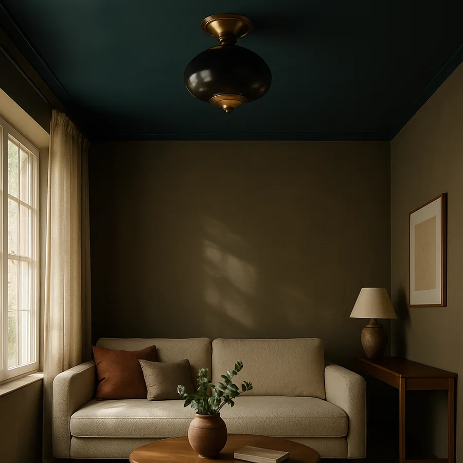
Deep Blues for Bedrooms, Studies, and Powder Rooms
Deep blue is the most forgiving and most flattering ceiling color for a first attempt. It carries enough saturation to register as a deliberate move, enough darkness to cocoon, and enough cool tone to bounce as a soft white rather than a colored light. The room reads as more sophisticated, not more colorful, which is the goal.
The right blue lives in the navy-to-ink range, with a slight green or gray undertone rather than a pure or violet undertone. Pure blues read as juvenile in adult rooms; violet blues read as theatrical. A green-leaning navy like Hague Blue or a gray-leaning ink like Railings reads as architectural. Specify eggshell or satin sheen for a flat-feeling ceiling that still bounces light, or push to high-gloss for a small powder room or library where the ceiling can act as a mirror.
Pair deep blue ceilings with off-white or warm gray walls in a flat or matte sheen. White trim should be warm-leaning, not the cool blue-white that fights the ceiling. Lighting should be warm, in the 2400K to 2700K range, ideally from sconces and table lamps rather than recessed downlights; the bounced light from a navy ceiling under a 2700K source produces a quality of warmth that no white ceiling can match.
Blush, Peach, and Soft Pinks for Bedrooms and Dining
A blush or peach ceiling is the most universally flattering color for a bedroom, full stop. The color bounces a warm rosy tint into the room that softens skin tones, makes morning light feel forgiving, and produces a quality of light that photographs as candle-like. The color is not feminine in any meaningful sense; it is simply warm, and warmth at the ceiling is what makes a bedroom feel restful rather than utilitarian.
The right pink is desaturated, leaning toward beige or terracotta rather than toward magenta. Saturated pinks read as costume; muted pinks read as architectural. Look for colors with names like Pink Ground, Calamine, Setting Plaster, or Faded Rose. The undertone should be warm, with a touch of yellow or brown rather than a touch of blue. Specify flat or matte sheen for bedrooms; the ceiling should read as a soft cloud rather than a reflective surface.
Pair blush ceilings with creamy white walls, warm wood floors, and natural linen on the bed. Avoid cool grays and stark whites in the same room; they fight the warmth of the ceiling and produce a muddy palette. The American Society of Interior Designers reports in its recent residential color trend brief that warm ceiling tones have moved into the top three most-specified categories for primary bedrooms, displacing the cool grays that dominated the previous decade.
Terracotta, Burnt Orange, and Earth Reds for Dining and Libraries
Terracotta and burnt orange ceilings are the colors that give a room weight. The earthy red bounces a warm orange-tan light into the space that turns wood floors golden, makes leather upholstery glow, and produces a candlelit register even at 100 percent dim. These are the colors of Mediterranean villas, English libraries, and the better steakhouses; they signal warmth, longevity, and conversation.
The right terracotta is muted and complex, not bright or pure. Look for colors with red, brown, and yellow all visible in the chip; pure orange will read as childish. Names to chase include Red Earth, Etruscan, Sienna, and the deeper end of the terracotta family. The undertone should be warm, with a touch of brown rather than a touch of yellow. Specify flat or eggshell sheen; high gloss in a strong warm color produces too much visible reflection of furniture and people, which becomes distracting.
Pair terracotta ceilings with warm cream or pale apricot walls, dark wood floors, and brass or aged bronze hardware. Avoid white trim; switch to a soft cream or even paint the trim the same color as the walls for a continuous envelope. Lighting should be warm and layered, with the heaviest emphasis on table lamps and sconces and the lightest on overhead recessed cans. Have you ever sat in a dining room that felt like a candlelit cave even with the lights at 70 percent? It almost certainly had a warm-toned ceiling doing the work.
Sage, Olive, and Muted Greens for Garden Rooms and Bedrooms
Sage and muted green ceilings produce one of the most quietly successful effects in residential color: a sense of being indoors and outdoors at the same time. The bounced green light reads as the kind of dappled, leaf-filtered illumination that walking under a tree produces, and the brain responds with the calm that any outdoor space provides. These colors work especially well in rooms with views to a garden, where the ceiling color extends the landscape into the architecture.
The right green is desaturated and warm, with yellow or gray rather than blue in the undertone. Pure greens read as juvenile; blue-greens read as cold. Look for colors with names like Card Room Green, French Gray, Lichen, or the muted end of the olive family. Specify flat or eggshell sheen; greens look best as a soft surface rather than a reflective one. The exception is a small green powder room, where high-gloss green produces a jewel-box effect that is hard to beat.
Pair sage ceilings with warm white or putty walls, natural oak or walnut floors, and unbleached linen at the windows. Avoid stark whites and cool grays; they make the green look dirty rather than rich. The American Institute of Architects publishes a residential color guidance document that places muted greens among the longest-lived color choices for primary living spaces, with documented average refresh cycles of 12 to 18 years versus 5 to 8 for trend-driven palettes.
High-Gloss Black for Drama in Small Spaces
A high-gloss black ceiling is the boldest color move available to a homeowner and one of the most effective in the right room. The glossy surface acts as a dark mirror, reflecting the room beneath it as a softened, depth-multiplying haze that makes the space feel both more enclosed and more infinite at the same time. The effect is theatrical, intentional, and almost impossible to ignore.
Black ceilings are appropriate in three room types: small powder rooms, intimate libraries or studies, and dining rooms with low ceilings where the existing height is not the selling point. Avoid black ceilings in bedrooms (the cocoon becomes oppressive overnight), in tall rooms (the gloss reflects too much from too far), and in any room with poor lighting (a dark ceiling under inadequate light produces a depressing rather than dramatic effect).
The right black is warm rather than blue, with a subtle brown or gray undertone that keeps the color from reading as pure pigment. Look for colors with names like Off-Black, Studio Green at full saturation, or the darker end of the inky charcoals. Specify full high-gloss sheen; eggshell black reads as flat and depressing, while gloss black reads as lacquer and produces the depth-multiplying effect that justifies the choice. Apply by spray or by a finish painter with extensive lacquer experience; brush and roller marks in a black gloss are visible from the doorway.
Pair black gloss ceilings with deep colored walls (forest green, oxblood, navy) rather than white. The contrast between a white wall and a black gloss ceiling reads as harsh and graphic; the contrast between a saturated wall and the same ceiling reads as enveloping and luxurious. Lighting should be warm and concentrated, from sconces and table lamps that create discrete pools of light rather than even ambient wash.
The Sheen Decision: Flat, Eggshell, Satin, or High-Gloss
Color choice gets all the attention, but sheen choice is what determines whether the painted ceiling reads as architectural or as amateur. Each sheen has a different role.
Flat or matte sheen is the right default for most colored ceilings. It absorbs light rather than reflecting it, which lets the color read as a soft field and hides imperfections in the underlying drywall. Use flat for bedrooms, dining rooms, and any large ceiling where the drywall finish is less than perfect. The downside is washability; flat ceilings cannot be cleaned and will need a refresh coat every five to eight years in a high-use room.
Eggshell or satin sheen produces a soft glow without true reflection. It is the right choice when the room needs the ceiling color to bounce a small amount of light back down (as in a sage or pink ceiling intended to flatter skin tones) but the drywall is good enough to accept some surface scrutiny. Eggshell is also the right sheen for small bathrooms and kitchens where the ceiling will need to be cleaned occasionally.
High-gloss sheen produces a true mirror effect that multiplies the depth of the ceiling and bounces strong light back into the room. Use only on small ceilings (under 100 square feet) and only over drywall that has been skim-coated and sanded to a Level 5 finish. Any seam, screw pop, or roller mark in the underlying drywall will telegraph through gloss as a visible defect. The cost premium for the prep alone can run $400 to $1,200 for a small bathroom, but the result is unmatched.
Conclusion: Permission to Look Up
A painted ceiling color is the highest-leverage decision available in residential design. It costs no more than the white default in materials, requires only an extra hour of paint work, and rewards the room with a transformation that no wall color or piece of furniture can match. The reason most homeowners default to white is not aesthetic preference but inherited caution, and the rooms that break that caution are almost always the ones that age best and photograph best.
The discipline is in the pairing. Choose the color first based on the room's purpose, the available light, and the existing wood and stone tones. Choose the sheen second based on the drywall quality and the role the ceiling needs to play in bouncing or absorbing light. Choose the wall and trim colors third, in service of the ceiling rather than in competition with it. Lighting is last, but lighting is what the ceiling color was always trying to flatter.
Have you ever walked into a room with a colored ceiling and felt, without naming it, that the room was somehow more grown-up than the room next door? That is the cocooning effect, the bounced warm light, and the quiet confidence of a designer who took the largest surface in the room seriously. The same effect is available in any room with a paintbrush and a weekend.
Pick one room this month and paint the ceiling something other than white. Start with a small bathroom or a guest bedroom where the stakes are low and the drama can be high. Stand in the room before and after at three different times of day. The transformation will convince you to do the next room in colored paint, and the next, until the white-ceiling default starts to feel as dated as it actually is.
More Articles You May Like


Comments
Post a Comment