Painted Crown Molding in a Contrasting Color for Visual Drama
For decades, the unspoken rule of residential painting was simple: walls in color, trim in white. That rule produced millions of identical-looking rooms and a generation of homeowners who never questioned why their crown molding had to match their baseboards which had to match their door casings which had to match the white of half the neighborhood's interior trim. A growing movement among interior designers, color consultants, and adventurous homeowners has been challenging that default. Painted contrasting crown molding, in deep greens, midnight blues, warm blacks, terracotta, and saturated jewel tones, can transform an ordinary room into something genuinely memorable. The technique is not hard to execute, but it is surprisingly easy to get wrong. This guide walks through the color theory, sampling process, sheen strategy, and detail work that separates a striking room from a cluttered one.
A 2024 color trends report from Sherwin-Williams identified "tonal drama" as one of the top three interior color movements of the year, with specification requests for contrasting trim up 38% year over year among their professional designer customer base. Independently, the American Society of Interior Designers (ASID) trends survey noted that 54% of member designers had specified contrasting trim on at least one project in the past twelve months, compared to roughly 19% five years earlier. Something clearly is happening in the trim-color space, and the shift has cleared the cultural permission required to take the plunge.
Why Contrasting Crown Works (When It Works)
The visual logic of contrasting crown is rooted in how the human eye reads architectural edges. White trim against colored walls produces a clean edge but a quiet one; the eye registers the architecture as a silhouette without lingering on it. Colored trim against colored walls turns that edge into an event. The eye reads the crown as an independent design element with its own weight, color temperature, and visual rhythm, which in turn activates the overall composition of the room.
That activation is not universally desirable. In small rooms with low ceilings, a heavily contrasted crown can make the space feel busy and claustrophobic. In rooms with already-strong architectural features (exposed beams, large windows, statement light fixtures), contrasting crown can create visual competition rather than harmony. In rooms intended as quiet refuges (bedrooms, libraries, home offices), the activation effect can undermine the room's emotional function. Contrasting crown is a tool, not a mandate, and the right question is always whether your specific room wants more visual activity or less.
Have you stood in your room at different times of day and noticed which architectural elements your eye naturally goes to? That observation is the single best guide to whether contrasting crown will enhance or overwhelm the existing composition. Rooms where the eye currently has nothing to land on often benefit dramatically from contrasted trim; rooms where the eye is already busy usually do not.
Color Selection: Working With the Whole Room
Successful contrasting crown rarely happens in isolation. The trim color needs to relate to the wall color, the ceiling color, the flooring, and the major furnishings in a way that feels deliberate rather than accidental. Three selection approaches reliably produce strong results: tonal deepening, complementary contrast, and wall-ceiling wrap.
Tonal deepening takes the wall color and specifies trim several shades darker in the same hue family. A soft sage wall with dark forest green trim; a dusty blue wall with navy trim; a warm terracotta wall with deep oxblood trim. The approach feels cohesive and sophisticated because the colors share a common undertone, and the darker trim reads as architectural shadow rather than added color. This is the safest entry point for homeowners new to the technique. The Architectural Digest archives contain numerous residential projects from designers like Kelly Wearstler and Nate Berkus using this specific strategy.
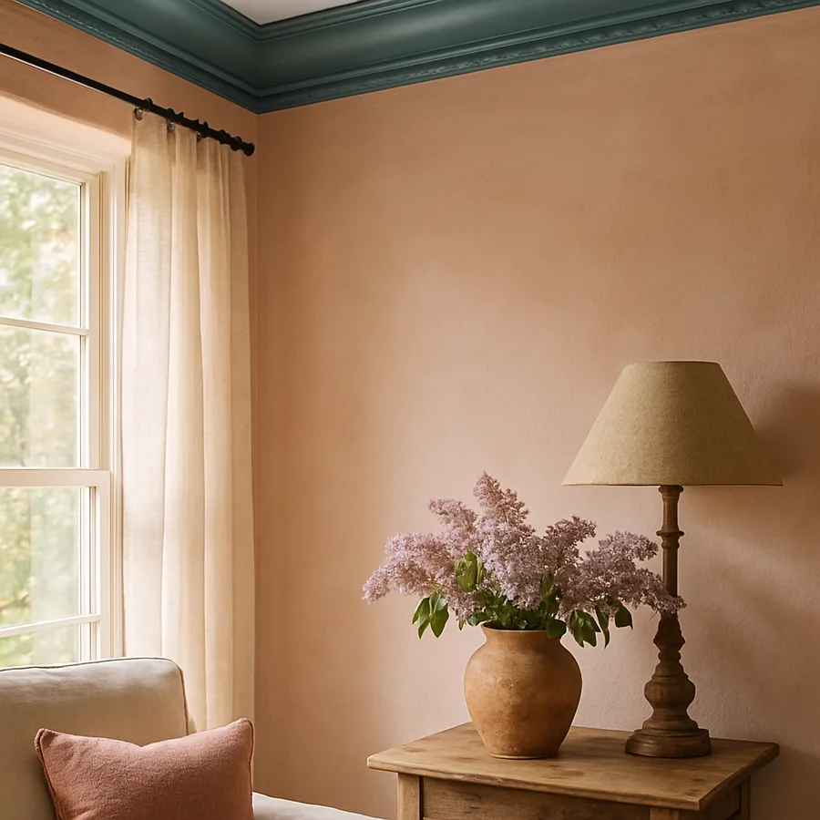
Complementary contrast takes the opposite approach, pairing wall and trim colors from opposite sides of the color wheel for maximum visual tension. A warm peach wall with deep forest green trim; a pale butter yellow wall with violet trim; a powdered pink wall with deep teal trim. This approach rewards confident execution and looks disastrous when muddled. It works best in rooms with high ceilings, strong natural light, and a clear decorative program committing to the chosen palette. Wall-ceiling wrap, the third approach, extends the trim color across the ceiling itself, producing an immersive color envelope that reads as a single bold gesture rather than a contrasted line. This is the most dramatic option and demands the most commitment.
Sheen Strategy: Gloss Is Your Friend
Color selection gets most of the attention, but sheen selection may be even more important for contrasting crown. The sheen determines how the color actually reads under different light conditions, how the crown's architectural form registers to the eye, and how forgiving the paint film is of imperfections in the underlying molding.
For contrasting crown, specify semi-gloss or high-gloss acrylic-alkyd hybrid paint in almost every case. Glossier finishes produce sharper reflections at the crown's curves and edges, which amplifies the architectural shape and makes the color itself appear richer and more saturated. Flat and matte finishes, by contrast, flatten the form visually and can make dark colors look heavy or muddy. The rule of thumb among working designers is that the darker the color, the glossier the finish should be.
The American Institute of Architects (AIA) historic-preservation guidance notes that glossy trim finishes were the norm in Colonial, Federal, and Victorian interiors, and the shift toward low-sheen trim is a twentieth-century departure rather than a historical rule. Returning to higher sheens is, in a sense, returning to the default. Modern acrylic-alkyd hybrids from manufacturers like Benjamin Moore (Advance), Sherwin-Williams (Emerald Urethane), and Farrow & Ball offer oil-like leveling with water cleanup, making high-gloss trim vastly easier to apply than it was twenty years ago.
Sampling: The Non-Negotiable Step
Do not commit to a contrasting crown color based on a paint chip. Chips lie. They lie about hue under different light conditions, they lie about saturation at room scale, and they lie about how the color will interact with the wall color next to it. The only reliable sampling method is to paint a large sample board (at least two feet by three feet) with two coats of the candidate color at the correct sheen, lean the board against the actual wall with the actual wall color behind and above it, and observe the result across a full twenty-four-hour cycle of natural and artificial light.
Better yet, paint a short section of actual crown molding in the candidate color and install it temporarily in the target location. This step costs perhaps $40 in materials and two hours of labor, and it prevents the far larger cost of completing an entire room in the wrong color. Designers who specify color professionally treat this step as mandatory, and homeowners who skip it frequently regret it.
What do you look for during the observation period? Three things. First, does the color read as intended in all light conditions, or does it shift toward unwanted undertones in evening light or under LED lamps? Second, does the contrast between trim and wall feel confident at full room scale, or does it feel shrill or muddy? Third, does the eye register the architecture in a way that enhances the room, or does the contrast fight with the existing furnishings and decor? The ASID color specification protocols recommend a minimum of 72 hours of observation before final commitment, and that guidance is worth following even for confident amateurs.
Preparation and Application: The Painter's Process
Contrasting crown rewards careful preparation more than standard white trim does, because saturated colors show every underlying imperfection. The preparation sequence: fill all nail holes with paintable wood filler, sand flush with 220-grit paper, vacuum thoroughly, caulk every joint along wall and ceiling with paintable siliconized acrylic, wipe clean with a damp cloth, prime any bare filler spots with a stain-blocking primer, and sand the entire crown lightly with 320-grit paper before the first color coat.
Application technique matters. For high-gloss and semi-gloss finishes, use a high-quality synthetic bristle brush (natural bristles absorb water from acrylic paints and lose their shape) or a microfiber mini-roller for flat sections. Work in long, continuous strokes, maintaining a wet edge to prevent lap marks. Two coats are almost always required for true color saturation, and three coats are not unusual for darker colors or when covering over white primer. The This Old House video tutorials on trim painting include detailed walkthroughs of brush technique, cut-in sequence, and drying-time management that are worth watching before starting.
Cutting in along the wall is the moment of truth. A steady hand with a quality angled sash brush can produce a clean line without tape, and that is the professional standard. For less-experienced painters, high-quality painter's tape (Frog Tape or 3M Delicate Surface) pressed firmly with a plastic putty knife gives nearly the same result. Remove tape before the second coat fully cures, while the paint film is still slightly flexible, to avoid peeling bits of the finished color off with the tape.
Coordinating With Other Trim and Architectural Details
Contrasting crown invites a question the homeowner may not want to answer: what about the baseboards, the door casings, the window trim, the wainscoting, and the other decorative millwork in the same room? Three coordination strategies work reliably.
Option one is to paint all trim in the same contrasting color as the crown, treating the room as a color envelope wrapped in saturated trim. This is the most unified approach, and it reads as an intentional design statement from the first glance. Option two is to paint only the crown in contrast while leaving other trim in a neutral (usually white or off-white). This reads as a deliberate emphasis on the ceiling line and works well when the crown is substantially larger or more elaborate than the other trim. Option three, the hardest to execute well, is to vary the trim colors by function: crown in one color, baseboards in another, door casings in a third. This can produce memorable results in the hands of a skilled designer and chaotic results otherwise.
The National Association of the Remodeling Industry (NARI) publishes case studies of well-executed multi-color trim schemes, and the pattern across successful projects is that the color palette is limited to two or at most three trim colors, and those colors are chosen from a consistent saturation level. A deep green crown, a pale gray baseboard, and a bright coral door casing will almost always fail; a deep green crown, a medium green baseboard, and a charcoal door casing can succeed because the colors share a saturation register.
Room-by-Room Recommendations
Different rooms reward different contrasting-crown strategies. In dining rooms, dark green, oxblood, and midnight blue crowns against warm neutral walls create the sense of a jewelry box, flattering candlelight and dinner conversation. In libraries and home offices, nearly any saturated color works because the room program supports visual richness; dark bookcases, leather-upholstered seating, and patterned rugs all reinforce rather than compete with contrasted trim. In primary bedrooms, subtle tonal deepening works better than strong complementary contrast, which can feel stimulating rather than restful.
In kitchens, contrasting crown can tie together upper cabinets, islands, and backsplash tile when coordinated carefully, but it requires a commitment to the overall color story; a contrasting crown in an otherwise all-white kitchen usually looks like an afterthought. In entry foyers, strong contrast makes excellent first impressions and sets the tone for the entire home. In bathrooms, contrasting crown (in the appropriate moisture-safe substrate and finish) creates boutique-hotel glamour but demands the bathroom be large enough to support the visual weight.
Living rooms are the most variable. A family living room used for television watching and casual relaxation often reads better with quieter trim, while a formal living room used for entertaining rewards more dramatic contrasted crown. The National Association of Home Builders (NAHB) homeowner-satisfaction surveys consistently show that color choices in primary living spaces are revisited more often than choices in other rooms, so a slightly cautious approach in the living room is rarely regretted.
Conclusion: The Case for Courageous Color
Painted contrasting crown molding is among the highest-impact, lowest-cost interior design moves available to a homeowner. The materials required are the same as for any trim paint job: primer, finish paint, brushes, tape, filler, caulk. The only real investment is the courage to depart from the white-trim default and the discipline to sample, observe, and commit only after careful consideration. Done well, the result transforms a room in a way that thousands of dollars of furniture cannot.
The path to doing it well is not secret. Pick a strategy (tonal deepening, complementary contrast, or wall-ceiling wrap) that matches the room's existing character. Select a color at a saturation level appropriate to the room's size and lighting. Specify a glossy finish that amplifies the architectural form. Sample generously and observe across light conditions before committing. Prepare meticulously and apply patiently. Coordinate with adjacent trim in a way that reads as intentional rather than accidental. Each of these steps is within reach of any careful homeowner willing to slow down and do the work.
Trust the process and trust your own eye. Design professionals certified by AIA, ASID, and NARI consistently report that clients initially skeptical of contrasting trim become enthusiastic advocates once they live with a well-executed example. The transformation reliably exceeds expectations, and the homes where it happens tend to become the homes that guests remember. What would your favorite room look like with a crown molding color that makes you smile every morning? That question is worth a weekend of sampling, and often worth much more.
Ready to commit to contrasting trim? Download the Interior Bliss color-strategy decision tree, our printable sampling checklist, and a curated list of designer-approved color pairings organized by room type and wall color. Share your sample photos in our reader forum and receive personalized feedback from working designers and color consultants within the week.
More Articles You May Like


Comments
Post a Comment