Bold Wallpaper in Powder Rooms: Patterns That Make a Statement
A powder room is the one place in a home where you can go big without regret. Because the space is small, visitors use it briefly, and no one sleeps or works in it, the powder room has quietly become the most experimental room in the American house. Designers often describe it as a "jewel box" because the compressed footprint rewards bold choices that would overwhelm a larger room. According to a Houzz Bathroom Trends Study, roughly 31% of homeowners renovating small bathrooms say they are willing to take stylistic risks in the powder room that they would never take in a primary bath. That appetite for drama is exactly what makes bold wallpaper such a natural fit here.
But "bold" is a slippery word. A pattern that feels thrilling in a showroom can feel exhausting in a five-by-six-foot space. How do you choose a wallpaper that makes a statement without shouting? And how do you stop a dramatic print from shrinking the room visually? Those are the questions this guide tackles, starting with scale and moving through color, installation, pairing, and long-term livability. Think of it as a structured walk through the decisions a designer would actually make, in the order they would make them.
Why Powder Rooms Reward Pattern More Than Any Other Room
Powder rooms are visual punctuation marks. Guests step inside for a minute or two, register the design, and step out. That short dwell time changes the design math. A repeating motif you might tire of in a bedroom becomes a pleasant surprise in a half bath. The American Society of Interior Designers (ASID) has observed in its residential trend reports that compact, low-use rooms are where homeowners most often try bolder wallcoverings, because the perceived risk is lower and the payoff is higher. You are not committing to living with the pattern all day; you are designing a memorable thirty-second experience.
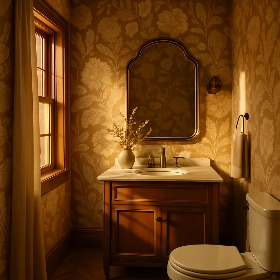
The shape of a powder room also favors wallpaper. Most half baths have few windows, limited cabinetry, and short runs of uninterrupted wall. That means a pattern repeat shows off cleanly rather than being chopped up by millwork. A powder room is essentially a wrap of four vertical planes, and wallpaper reads almost like a mural when you stand inside it. Architectural Digest has featured dozens of powder rooms where a single dramatic wallpaper choice carries the entire design, with vanity, mirror, and lighting playing quiet supporting roles.
There is also a practical case. Powder rooms do not have showers, so moisture is limited to handwashing splashes. That means you can use traditional, non-vinyl papers that would be risky in a primary bath. Grasscloth, hand-blocked prints, even delicate silk-screen patterns all become viable. The design ceiling is higher here than in any other wet space in the house.
Choosing Pattern Scale for a Small Footprint
The single biggest mistake homeowners make is assuming small rooms need small patterns. The opposite is usually true. A large-scale motif on a confined wall gives the eye something to rest on, which makes the room feel intentional rather than busy. A tiny print, repeated dozens of times on the same wall, can read as visual static. When you stand in a five-by-seven powder room papered in a small ditsy floral, the pattern can start to vibrate; when you stand in the same room papered in a three-foot-wide palm frond, the walls almost disappear behind the imagery.
Designers interviewed by House Beautiful frequently recommend choosing a pattern whose repeat is at least 18 to 24 inches for a small bath, so the eye reads the motif as art rather than wallpaper. That said, there is a second path: a very tight, regular geometric like a miniature trellis or pin dot. These patterns read almost as texture rather than print, and they let a bold color carry the drama instead of the imagery. Avoid the middle ground, where a pattern is neither big enough to feel like a mural nor small enough to feel like texture.
Ask yourself a simple reader's question here: when you picture your powder room from the doorway, do you want guests to see one striking image or one striking color? If it is the image, go big with the pattern. If it is the color, go small and saturated. That single decision will make every later choice easier.
Color Strategy: Saturated, Moody, or High-Contrast
Once scale is decided, color does most of the remaining work. Powder rooms tend to thrive in one of three color strategies. The first is fully saturated, where the background and motif share a jewel-tone family, such as emerald-on-forest or oxblood-on-rust. This approach creates what designers call a "color bath," where the walls dissolve and the room feels enveloping rather than boxed-in. The second is moody and low-contrast, think charcoal flora on ink, or deep teal parrots on midnight. These rooms feel like a hidden study, dim and atmospheric, and they pair beautifully with warm metals.
The third strategy is high-contrast, the classic black-and-white chinoiserie or a crisp navy-on-cream trellis. These patterns keep the room feeling light while still delivering graphic punch. They are the safest choice in a home where resale might happen within five years, because the contrast reads as timeless rather than trend-driven. The National Kitchen and Bath Association (NKBA) reports in its annual design trends survey that two-tone, high-contrast patterns consistently rank among the top three wallcovering preferences for powder rooms, ahead of solid colors and tone-on-tone textures.
Whichever strategy you pick, keep the ceiling in the conversation. A white ceiling in a saturated powder room can feel like a lid; painting the ceiling in the wallpaper's background color, or even continuing the paper overhead, is a small move that dramatically elevates the space. If that feels like too much, a soft color-matched ceiling paint is a safe compromise.
Material, Finish, and Durability
Powder rooms are low-moisture but high-touch. Guests lean on walls, bump handbags against them, and occasionally splash water near the sink. That argues for a wallcovering with some wipeability. Vinyl-coated papers, non-woven substrates, and modern peel-and-stick options have all improved dramatically in the last decade, and many of them now match the look of traditional paper while offering far better cleaning performance. If you want a true hand-printed or grasscloth look, reserve the delicate material for the wall opposite the vanity, where splashing is minimal, and consider a glass splash panel near the sink.
Finish matters almost as much as pattern. Matte and eggshell papers absorb light and make colors feel deeper, which suits moody powder rooms. Satin and metallic finishes bounce light and can visually enlarge a darker space, though they also reveal any imperfections in the drywall beneath. Hand-blocked papers have a slight texture that softens edges and makes a small room feel artisanal. Peel-and-stick vinyls are the easiest to install yourself, but they rarely match the depth of a paste-the-wall traditional paper. Better Homes & Gardens maintains a helpful primer on wallpaper installation types for homeowners deciding between DIY and professional hang.
Pairing Wallpaper With Vanity, Mirror, and Lighting
Once the paper is chosen, everything else should recede. A bold wallpaper wants a quiet vanity, not another statement. The safest vanity choices are a simple pedestal sink, a slim wall-mount console in polished nickel or brass, or a painted-wood floating vanity in a color pulled directly from the wallpaper's background. Avoid heavy stone vanities or ornate cabinetry, which compete with the paper for attention. A single clean rectangle of marble or quartz, two inches thick, is usually enough.
The mirror becomes the room's second major gesture. Because the wallpaper fills the walls, the mirror should be either very plain, so the paper speaks, or very sculptural, so the mirror becomes a counterpoint. A gilded sunburst mirror against a dark moody paper creates a classic high-contrast moment; a simple frameless pill-shape mirror against a busy print lets the paper dominate. Pick one lane. Architectural Digest has a long-running gallery of powder room photography that is worth studying for mirror-to-wallpaper proportions.
Lighting is where many powder rooms fall apart. Dim overhead cans make bold wallpaper look muddy, and cold LEDs flatten color depth. Aim for warm, 2700K-to-3000K bulbs, and layer a wall sconce at eye level with a low-glare overhead fixture. Sconces flanking the mirror are the gold standard, but a single sconce above the mirror works in tighter layouts. A second reader's question worth asking: at what time of day will guests most often see this room? If the answer is evening, lean warmer and dimmer; if daytime, make sure the room has enough light to read the pattern clearly.
Installation, Budget, and Common Mistakes
A powder room usually requires between two and four double rolls of wallpaper, depending on ceiling height and pattern repeat. That small quantity changes the budget conversation. Because the material cost is low, many homeowners splurge on a paper they would never afford for a larger room. Hand-blocked English papers that run $300 or more per roll become almost reasonable when only three rolls are needed. The same logic applies to installation: paying a professional paperhanger for a four-to-six-hour job in a powder room is far cheaper than paying one for an entire dining room.
Still, there are mistakes to avoid. First, skipping wall prep. Powder rooms often have older, uneven drywall, and any bumps will telegraph through bold paper. A skim coat and a quality primer are cheap insurance. Second, ignoring the toilet. The back of the toilet is the trickiest cut in any powder room, and a busy pattern can look chopped there. Designers often choose to install the paper before the toilet is reset, which makes the cut cleaner. Third, underestimating pattern match on corners. Rooms are rarely perfectly square, and a large-scale motif will show any wall that is out of plumb. A good installer plans the first drop where it matters most, usually the wall facing the door.
A survey by Zillow of recent home sales found that homes with updated, distinctive powder rooms sold, on average, 1.6 days faster than comparable homes with plain half baths, suggesting that the return on a bold wallpaper choice is not only aesthetic but financial. That is not a reason to pick a pattern you do not love, but it is a reason not to fear making a choice.
Conclusion
The powder room is the rare room where restraint is the wrong instinct. Because the space is small, the viewing time is short, and the moisture exposure is low, it can carry more visual weight per square foot than any other room in the house. A well-chosen bold wallpaper turns a forgettable half bath into the room guests talk about for weeks, and it does so at a cost that is often lower than repainting a living room. The craft is in the match between pattern scale, color strategy, and the quiet supporting cast of vanity, mirror, and light.
If you are starting from scratch, begin with the emotion you want guests to feel when they close the door behind them. Calm and cocooned calls for moody tone-on-tone florals. Playful and surprising calls for a large-scale animal or botanical print. Elegant and enduring calls for a two-tone chinoiserie or trellis. Let that emotional word drive the pattern, and let the pattern drive every later choice, including the vanity profile and the bulb temperature. Design by feeling first, technicals second.
One final practical note. Order a full double roll for a sample, not just a swatch, and tape it to the wall for forty-eight hours before committing. Light in the powder room will shift the color in ways a small sample cannot predict, and a bold pattern at full scale reads differently than the same pattern on a six-inch card. That two-day test is the single cheapest insurance policy in the entire project. Ready to start your own powder room transformation? Browse our curated gallery of bold wallpaper powder room projects at Interior Bliss for inspiration tailored to your square footage and style.
More Articles You May Like


Comments
Post a Comment