Front Door Color Psychology From Red to Black to Sage Green
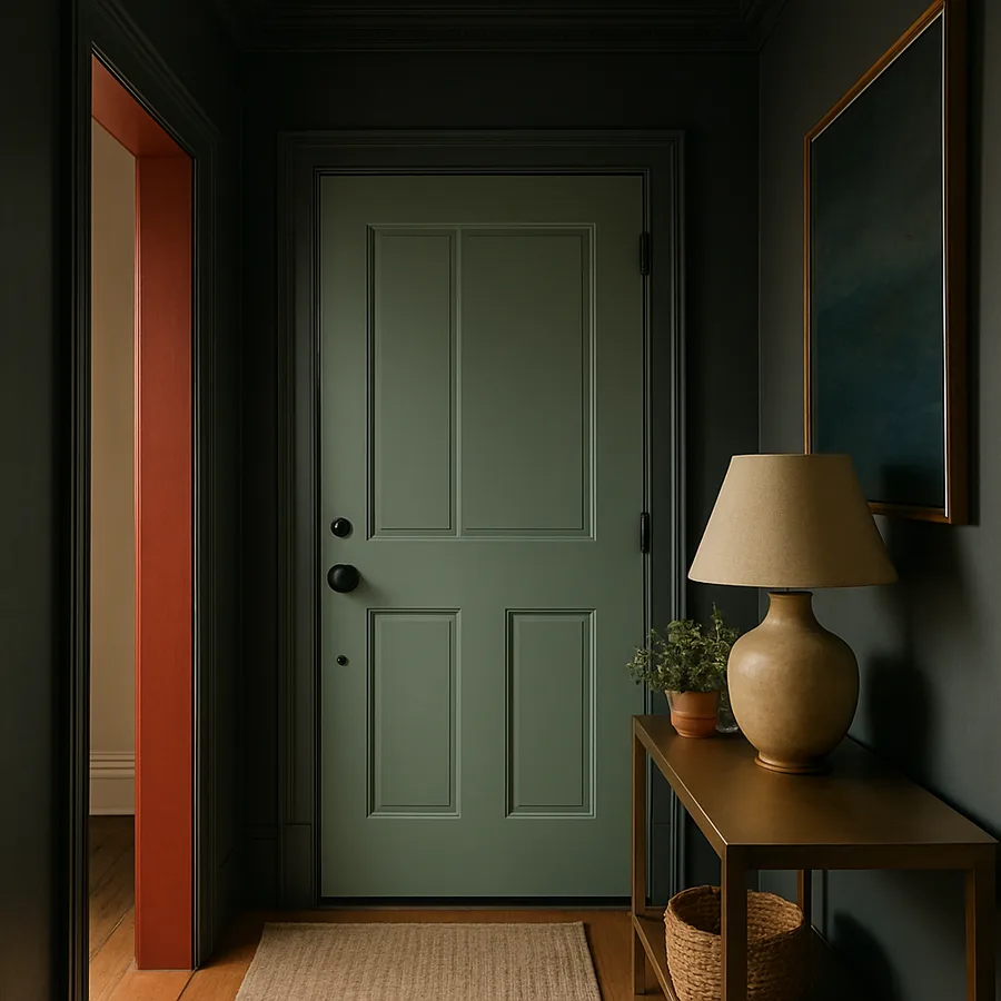
Your front door is the punctuation mark of your home's exterior, and its color whispers (or shouts) something about the people who live behind it. Long before a guest knocks, the hue you choose has already set the emotional temperature of the visit. This is why front door color psychology has become one of the most-discussed corners of residential design, blending tradition, neuroscience, and resale value into a single brushstroke. From the lacquered crimson of a Georgian rowhouse to the matte ink of a contemporary farmhouse to the dusty herbal calm of sage green, each color brings a story.
Designers at the American Society of Interior Designers (ASID) have noted for years that exterior color decisions influence perceived home value as strongly as landscaping. According to a Zillow paint analysis cited by the National Association of Realtors (NAR), homes with charcoal or jet-black front doors sold for an average of $6,271 more than expected. Meanwhile, a survey from Sherwin-Williams reported that 68% of homeowners considered changing their door color before listing. The right hue is not vanity, it is a strategy.
Why the Front Door Carries So Much Symbolic Weight
Anthropologists describe the threshold as a liminal space, the membrane between public and private life. In folk traditions across Europe, Asia, and the Americas, doors were painted, carved, or marked to announce values, lineage, or protective wishes. That symbolism never really left us. When you stand on a porch and look up, you read the door before the trim, the shutters, or the planters. It frames the human inside.
Color psychologists explain this loading by pointing to two effects: chromatic associative memory (the colors we have linked to feelings since childhood) and cultural priming (the colors a community has agreed mean something). A red door in Boston signals colonial confidence. A red door in Beijing signals luck. The pigment is the same, but the meaning travels. Editors at Better Homes & Gardens have written extensively about how door color works as architectural shorthand, telegraphing personality before the architecture itself does.
Have you ever paused outside a stranger's home and felt invited or unsettled before you could explain why? That micro-reaction is your nervous system reading the threshold. Designers harness this consciously. A door is not just a slab of millwork. It is a billboard for the household's emotional climate.
Red Doors: Confidence, Welcome, and Old-World Tradition
Red is the loudest of the classic door colors, and it has carried meaning for centuries. In Scotland, a red door once announced that a family had paid off the mortgage. In Feng Shui, red invites chi, or vital energy, into the home. In American Federal-style architecture, red doors signaled hospitality and a place of safe lodging. The pigment activates the sympathetic nervous system, which is why red signage works for fast-food chains and emergency vehicles. On a door, that same vibrancy translates into warmth, courage, and a touch of theater.
Designers tend to recommend red for homes with white, cream, or stone facades, where the contrast crystallizes the doorway as the focal point. Brick homes, especially red brick, can take a deeper oxblood or barn red without competing. Sherwin-Williams Heartthrob, Benjamin Moore Heritage Red, and Farrow & Ball Eating Room Red are reliable starting points. The finish matters as much as the hue. A semi-gloss or high-gloss lacquer reflects light and reads as deliberate, while a flat red can feel chalky and unfinished.
Red is not for the faint of heart, however. It commands attention, which means everything around it must be tidy and intentional. A red door above a chipped concrete stoop or beside an overgrown hedge magnifies neglect rather than masking it. Pair red with crisp white trim, polished brass or unlacquered brass hardware, and a single architectural planter. The result is the kind of entrance that lingers in a guest's memory for years.
Black Doors: Sophistication, Authority, and Modern Restraint
Black has quietly overtaken red as the prestige choice for the past decade. It reads as architectural punctuation: confident, urbane, and slightly mysterious. Black absorbs light, which makes it feel deeper and more dimensional than any other color, especially in late-afternoon sun. It also flatters almost every facade, from white-painted brick to weathered cedar shingle to limestone.
The Zillow paint study quoted by NAR found that black or charcoal front doors yielded the highest sale-price boost of any exterior color tested. Real-estate agents from coast to coast have echoed the finding. There is a reason: black communicates edited taste. It suggests the homeowner made a deliberate, restrained choice rather than chasing trends. Editors at House Beautiful have called black the new neutral of curb appeal, and that framing tracks with what we see across high-end portfolios.
Choosing the right black is harder than it sounds. True jet black can read flat and graphic, especially on a sunny southern exposure. Designers often reach for warm, soft blacks like Benjamin Moore Black Beauty, Sherwin-Williams Tricorn Black, or Farrow & Ball Off-Black. A satin or semi-gloss finish keeps the door looking sculpted rather than dull. Pair black with unlacquered brass, aged bronze, or matte nickel hardware. Add a brass kick plate and a single oversized planter for the kind of restraint that telegraphs intention.
Sage Green Doors: Calm, Botanical, and Quietly Confident
If red is theater and black is tailoring, sage green is meditation. Sage and other muted greens have surged across exterior portfolios because they reconcile two aesthetic urges of our moment: the desire for color and the desire for calm. Green is the color the human eye processes most easily, which is why operating rooms, school chalkboards, and reading lamps have all gravitated toward it. On a front door, sage green reads as botanical, mature, and deeply welcoming without ever raising its voice.
Sage works particularly well on homes with stone, brick, or warm wood elements because it harmonizes with the earth-tone palette already present. It also pairs beautifully with sandstone steps, terracotta planters, and oil-rubbed bronze hardware. Sherwin-Williams Evergreen Fog, Farrow & Ball Card Room Green, and Benjamin Moore Saybrook Sage are all considered reference points by designers. The National Association of Home Builders (NAHB) has noted that earth-tone exteriors have grown steadily since 2022 as homeowners look for biophilic, nature-tied palettes that feel quieter than the cool grays of the previous decade.
Are you the kind of host who serves tea instead of cocktails, or the kind whose porch is wrapped in herbs and creeping thyme? Then sage may be your color. It signals patience and care. It also ages gracefully. Black can scuff, red can fade, but sage tends to soften beautifully over years of weather, like a barn beam or a linen apron.
How to Match Your Door Color to Your Architecture
Color does not exist in isolation. It exists in a conversation with architectural style, regional climate, and the specific light of your block. A front door color that sings on a Cape Cod can feel costume-like on a midcentury ranch. Before you commit, consider the home's bones. Colonial and Georgian homes welcome saturated reds, deep blacks, and traditional navy. Craftsman bungalows favor olive, mustard, and oxblood. Midcentury homes look best with mustard, teal, or persimmon. Spanish revivals carry deep terracotta or cobalt with grace. Farmhouses and modern minimalist builds tend to prefer soft black, charcoal, or sage.
Light matters as much as style. North-facing doors receive cool, indirect light all day, which can deepen and cool any color you apply. South-facing doors get hot, full sun, which lightens and sometimes flattens a hue. Designers often recommend painting a poster-board sample and observing it on the door for a full day cycle, photographing it at 9 a.m., noon, and 6 p.m. The color you fall in love with at the paint store is not always the color you will live with on your porch.
Also consider the surrounding palette. A door color should harmonize with three fixed elements: the body of the house, the trim, and the roof. If your roof is a warm brown, cool grays and pure blues can clash; warm sages, oxbloods, and blacks tend to work. If your roof is cool gray or slate, navy, sage, and black all sit comfortably. Trim color is the third anchor: crisp white sharpens any door, while creamy off-white softens the overall effect.
Finish, Hardware, and the Details That Multiply the Effect
A beautifully chosen color is only half the equation. Finish, hardware, and porch styling carry the rest. Front doors take a beating from sun, rain, and hands, so durability matters. Most exterior designers favor a high-quality acrylic or alkyd enamel in a satin or semi-gloss sheen. Flat finishes look elegant in showroom photos but trap dust and fingerprints in real life. Gloss finishes are dramatic but reveal every imperfection in the door surface, so prep work must be meticulous.
Hardware is where personality crystallizes. Unlacquered brass, which patinates over time, has dethroned polished chrome as the designer favorite. Aged bronze offers a quieter alternative for homes leaning rustic or transitional. Matte black hardware on a sage or red door creates striking contrast, while brass on black creates warmth without breaking the dark mood. Replace builder-grade hinges, doorknobs, and kick plates as a set, since mismatched metals undermine an otherwise polished entry.
Finally, frame the door. A pair of planters, a porch light or two, a coir mat, and a clean walkway turn a painted door into a composed entrance. Even the best color cannot rescue a doorway flanked by dead pots and tangled wiring. Curb appeal is a system, and the door is its anchor. Have you walked across the street and looked at your home the way a guest would? That five-minute exercise often reveals the gaps the color alone cannot fix.
Conclusion: Choosing a Color That Reflects Who You Are
The front door is a small surface with an outsized job. It greets visitors, signals identity, and shapes the first emotional beat of every arrival home. Choosing between red, black, and sage green is not a question of trend but of temperament. Red announces, black edits, sage soothes. None is universally better. The right color is the one that aligns the architecture, the light, and the personality of the household into a single confident gesture.
Before you commit, sample generously, study the door at multiple times of day, and consider the hardware, finish, and styling around it as part of the same composition. A door painted thoughtfully is a small renovation that reads as a complete one. Real estate data from NAR and design surveys from NAHB both confirm that buyers and visitors notice these details, often subconsciously, and reward them with attention and trust.
If you are weighing a refresh this season, consider blocking off a Saturday morning to sample three colors at once. Stand back. Photograph each from the curb. Invite a neighbor's opinion. Then commit. The door you paint this weekend will greet thousands of arrivals over the next decade. Pick the color that tells your story before anyone says hello.
Ready to choose? Walk to your front porch right now, take a photo of your existing door, and start a small mood board with three contenders. The exercise takes ten minutes and changes how you read your own home for years.
One last consideration is maintenance. A red door fades faster than any other color because the pigments used to produce vibrant red are the most vulnerable to ultraviolet degradation. Plan to refresh a red door every five to seven years, particularly if it faces south or west. Black doors hold up well in shaded conditions but can chalk and fade in full sun, especially if you choose an inexpensive paint formulation. Sage green is the most forgiving of the three, holding its color for a decade or more in most exposures. Whatever color you select, the long-term cost of keeping it looking fresh should factor into your initial decision. Designers at Sherwin-Williams recommend a premium exterior enamel for any front door, since the cost difference between a contractor-grade paint and a top-tier formulation is small relative to the labor and disruption of repainting.
Finally, give yourself permission to evolve. The door color you choose this decade does not have to be the one you live with forever. Front doors are among the easiest exterior elements to refresh, and many homeowners cycle through two or three colors over a lifetime in a home. The first might be the safe choice that helped sell the home or get past a homeowners-association approval. The second might be the bolder statement that emerges once you have lived in the house for a few years and developed a stronger sense of its personality. The third might be the mature, settled choice that you keep for decades. Each iteration is a small act of authorship, and each one teaches you something about how color and architecture interact in your specific light, on your specific block.
More Articles You May Like


Comments
Post a Comment