Understanding Interior Design: Key Principles and Trends for Every Home
Interior design is often mistaken for interior decorating, but the distinction between them matters. Decorating involves selecting attractive objects and arranging them in a space. Design, by contrast, is a disciplined practice rooted in principles that govern how spaces function, how elements relate to one another, and how environments affect the people who inhabit them. Understanding these principles transforms you from someone who reacts intuitively to rooms, knowing something feels right or wrong but not why, into someone who can analyze, plan, and execute with intention. The difference between a room that merely looks nice and one that truly works is almost always a matter of principle, not budget.
The formal study of interior design has a long history, but its core principles are remarkably consistent across eras and cultures. Balance, proportion, rhythm, emphasis, harmony, and contrast appear in design education worldwide because they describe fundamental aspects of how humans perceive and respond to spatial environments. These are not arbitrary rules invented by taste-makers but observations about visual perception and psychological response that have been tested and confirmed across decades of practice and research. The American Society of Interior Designers (ASID), founded in 1975 through the merger of earlier professional organizations, has long advocated for design education that grounds creative expression in these foundational principles.
This article provides a thorough exploration of the key principles that underpin all interior design, followed by an examination of how current trends express and extend those principles. Whether you are approaching your first design project or your fiftieth, returning to fundamentals sharpens your eye and strengthens your decision-making. Each principle discussed here includes practical guidance for application, ensuring that the concepts translate directly into actionable knowledge you can use in your own home.
Balance: Creating Visual Equilibrium
Balance is the distribution of visual weight within a space such that no single area feels disproportionately heavy or light. A balanced room feels stable and comfortable, while an unbalanced one creates a subtle but persistent sense of unease that most people recognize as "something being off" without being able to articulate exactly what the problem is. Understanding the three types of balance, symmetrical, asymmetrical, and radial, provides a framework for diagnosing and resolving balance issues in any room.
Symmetrical balance is the most formal and the easiest to achieve. It involves arranging elements as mirror images on either side of a central axis, like matching nightstands flanking a bed or identical armchairs on either side of a fireplace. Symmetry communicates order, formality, and calm, making it particularly effective in bedrooms, formal living rooms, and entryways where a sense of composure is desirable. The risk of strict symmetry is rigidity. A perfectly symmetrical room can feel static and predictable, lacking the visual energy that makes a space feel alive. Softening strict symmetry with small asymmetrical touches, such as different objects on matching side tables, preserves the calm of symmetry while introducing enough variation to keep the eye engaged.
Asymmetrical balance is more dynamic and requires a more developed design eye. Instead of mirroring identical elements, asymmetrical balance achieves equilibrium through pieces of different sizes, shapes, and visual weights that offset each other. A large painting on one side of a room might be balanced by a tall plant and a small sculpture on the other, their combined visual weight equaling that of the painting. The International Interior Design Association teaches that asymmetrical balance creates rooms that feel more relaxed and organic than symmetrical arrangements, making it well-suited to casual living spaces, family rooms, and creative environments where a sense of energy and informality is appropriate.
Radial balance radiates outward from a central point, like the chairs arranged around a circular dining table or the furnishings oriented around a central coffee table in a conversation area. This type of balance is less common in overall room design but appears frequently in specific arrangements within rooms. Understanding radial balance helps you create successful furniture groupings where multiple pieces need to relate to a shared center, ensuring that each position in the arrangement feels equally included and that the overall composition reads as unified rather than scattered.
Proportion and Scale: Getting the Relationships Right
Proportion refers to the relationship between the size of individual elements and the size of the space they occupy, while scale refers to the size relationships between different elements within that space. These related concepts determine whether a room feels comfortable and cohesive or awkward and disconnected. A room with good proportion and scale feels natural, as though every element belongs exactly where it is and could not be a different size without diminishing the whole. A room with poor proportion and scale feels effortful, with elements that seem to be straining against the space or lost within it.
The Golden Ratio, approximately 1:1.618, has influenced design and architecture for centuries because it describes proportional relationships that humans consistently find pleasing. While you need not calculate exact ratios for every design decision, an awareness of the Golden Ratio's principles can guide your choices. In practical terms, it suggests that rooms and furniture groupings look best when they avoid equal divisions. A sofa that occupies roughly two-thirds of a wall's length looks more natural than one that fills exactly half. A coffee table that is approximately two-thirds the length of the sofa it faces feels properly proportioned, while one that matches the sofa's full length or falls below half its length feels wrong.
Scale errors are among the most common mistakes in amateur interior design. The most frequent is selecting furniture that is too large for the room, typically because pieces were chosen in a showroom or from photographs where they appeared proportionate to a larger space. The solution is rigorous measurement before purchase and the discipline to choose appropriately scaled pieces even when larger alternatives are available. A compact sofa that leaves adequate circulation space around it will always look and feel better than a massive sectional that forces you to squeeze between furniture and walls. The Houzz design forums are filled with posts from homeowners seeking help with rooms that feel wrong, and the answer is frequently a scale mismatch that careful measurement would have prevented.
Vertical proportion is as important as horizontal proportion. A room with a high ceiling needs elements that address the upper portion of the space, tall bookcases, floor-to-ceiling curtains, or vertically oriented artwork, to prevent the room from feeling like a deep well with all the visual activity concentrated at the bottom. Conversely, a low-ceilinged room benefits from horizontal emphasis, wide furniture, horizontal artwork, and low-hanging pendant lights that draw the eye laterally rather than upward toward the nearby ceiling. Do you notice your eye being drawn in a particular direction in your rooms, and does that direction serve the space well or expose a proportional weakness?
Rhythm: Guiding the Eye Through Space
Rhythm in interior design serves the same function as rhythm in music: it creates a pattern of movement that guides the experiencer through the composition. Visual rhythm is established through repetition, progression, transition, and contrast, techniques that control how the eye moves through a room and what it encounters along the way. A room without rhythm feels static and flat, with no invitation to explore. A room with well-designed rhythm draws you in, moves your gaze comfortably from element to element, and creates a sense of visual narrative that makes the space feel dynamic and engaging.
Repetition is the simplest form of rhythm: repeating an element, whether a color, shape, material, or pattern, at regular intervals throughout a space. Three matching throw pillows spaced along a sofa, a series of identical pendant lights above a kitchen island, or the recurring arch shape of doorways, mirror frames, and headboard all create repetitive rhythm that unifies the space. The repeated element becomes a visual refrain, providing a sense of continuity and predictability that the eye finds reassuring. However, unvaried repetition becomes monotonous, which is why more complex rhythmic strategies are necessary in sophisticated interiors.
Progression introduces change within repetition, creating a sense of movement and direction. A grouping of three vases in graduated sizes, a series of paint swatches transitioning from light to dark across adjacent walls, or a staircase where handrail details increase in complexity from bottom to top all demonstrate progressive rhythm. The eye follows the progression naturally, drawn forward by the anticipation of what comes next. Parsons School of Design, one of the world's leading design education institutions, emphasizes progression as a tool for creating spatial narrative, using changing elements to guide occupants through a space in a specific sequence.
Contrast provides rhythmic punctuation, the equivalent of a dramatic chord change in music. A room composed entirely of soft, curved forms achieves rhythmic surprise when a single angular element appears. A neutral palette gains energy from a controlled burst of saturated color. These moments of contrast create visual landmarks that anchor the eye's journey through the space and prevent the composition from feeling uniformly pleasant but unmemorable. The key is control: one or two moments of contrast within a coherent scheme create excitement, while constant contrast creates chaos. Effective rhythm balances the predictability of repetition with the energy of contrast, creating spaces that feel both composed and alive.
Emphasis and Focal Points: Directing Attention
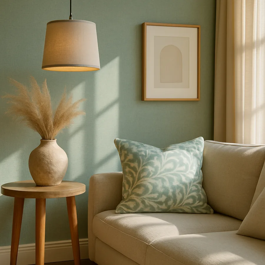
Every room needs a star, a primary element that the eye gravitates to upon entering the space and that anchors the entire visual composition. Without emphasis, a room is a collection of equally weighted elements competing for attention, resulting in a visual experience that feels busy and directionless. Creating a clear focal point, through size, color, position, or uniqueness, gives the room a center of gravity around which all other elements orbit in supporting roles. The relationship between the focal point and its supporting cast creates the visual hierarchy that makes a room feel designed rather than merely furnished.
Architectural features provide natural focal points that the design can enhance. A fireplace, a large window with a dramatic view, an exposed brick wall, or an architectural arch each commands attention through its inherent presence. The design strategy with architectural focal points is amplification rather than competition: arrange furniture to face the feature, light it effectively, and keep flanking elements supportive rather than distracting. A fireplace loses its focal power when the mantel is overcrowded with competing objects, but gains drama when it displays a single significant piece of art with clear breathing room on either side.
When no strong architectural feature exists, the designer must create a focal point through deliberate choices. A large-scale piece of artwork, a statement piece of furniture, an accent wall with distinctive color or texture, or a dramatic light fixture can all serve as manufactured focal points. The American Society of Interior Designers notes that successful created focal points typically involve at least two of the following properties: distinctive color, significant scale, unusual texture, strong pattern, or prominent placement. A piece that possesses only one of these qualities may not command sufficient attention to organize the room around itself.
Secondary emphasis creates the supporting structure that makes the focal point effective. After the eye lands on the primary focal point, it needs a path to follow through the rest of the room. Secondary elements of interest, positioned to create a visual circuit, guide the eye on a journey that eventually returns to the focal point. This circuit might move from a fireplace to a significant piece of furniture, then to a window with a garden view, then to a bookshelf with interesting objects, and back to the fireplace. Each stop on the circuit is interesting enough to hold attention briefly but clearly subordinate to the main focal point in visual weight. Have you identified what the focal point of your living room is, or does the room lack a clear visual anchor?
Color Theory: The Emotional Foundation of Design
Color is the most emotionally immediate element of interior design. Before you register the shape of the furniture or the quality of the finishes, you feel the color of a room. This emotional immediacy makes color selection one of the highest-impact decisions in the design process and one of the most anxiety-producing for homeowners. Understanding basic color theory, the relationships between colors, their psychological effects, and their behavior in different lighting conditions, transforms color selection from a guessing game into an informed, confident process.
The color wheel organizes colors into relationships that predict how they will interact in a space. Complementary colors, those directly opposite each other on the wheel like blue and orange, create vibrant, energetic combinations. Analogous colors, those adjacent on the wheel like blue, blue-green, and green, produce harmonious, restful schemes. Triadic schemes use three colors equally spaced around the wheel for balanced vibrancy. These relationships are not rigid formulas but starting points that narrow the infinite field of color possibilities to manageable, aesthetically reliable options. Professional designers use color wheel relationships as foundations, then adjust specific hues, values, and saturations to achieve the exact mood they seek.
The psychological effects of color have been extensively studied. Research from the University of British Columbia found that blue environments enhance creative thinking while red environments improve attention to detail, suggesting that color choices should respond to the intended function of each room. Warm colors like red, orange, and yellow are stimulating and social, making them effective in dining rooms, kitchens, and entertaining areas. Cool colors like blue, green, and violet are calming and contemplative, suited to bedrooms, bathrooms, and private retreats. Neutral colors provide flexibility, adapting their character to the furnishings and accessories placed within them, which is one reason neutrals dominate residential wall color choices.
Light fundamentally changes color, and this is perhaps the most underappreciated aspect of color theory in practice. A paint swatch that looks perfect under the fluorescent lights of a hardware store may appear entirely different in the warm afternoon sun of your living room or under the cool LED lights of your kitchen. Always test colors in the actual space where they will be used, observing them at different times of day and under both natural and artificial lighting. Paint large sample areas, at least two feet square, on the wall rather than relying on small swatches, and live with them for several days before committing. The American Society of Interior Designers recommends testing a minimum of three colors in situ before making a final selection, a discipline that prevents the costly and frustrating cycle of painting, disliking, and repainting.
Current Trends Through the Lens of Principles
Understanding design principles gives you a powerful framework for evaluating trends, distinguishing between those that express enduring principles in fresh ways and those that are merely novel. The best current trends are not breaks from tradition but creative reinterpretations of the same principles that have guided good design for centuries. Examining a few prominent trends through the lens of the principles discussed above reveals why they work and how to implement them effectively.
The warm minimalism trend, which favors reduced object counts paired with natural materials and earth tones, is fundamentally an expression of the emphasis principle. By reducing the number of elements competing for attention, warm minimalism makes each remaining element a potential focal point, creating rooms where the eye can rest and where individual objects receive the appreciation their quality deserves. The warmth of natural materials and earthy colors adds the emotional dimension that pure minimalism often lacked, resolving the tension between simplicity and comfort that made earlier minimalist interiors feel inhospitable to many people.
Biophilic design, the incorporation of natural elements into interior spaces, operates through multiple principles simultaneously. The visual rhythm of a living wall, the textural contrast between natural stone and smooth plaster, the proportional drama of a large indoor tree, and the color harmony of green foliage against warm wood tones all contribute to biophilic design's appeal. The International Living Future Institute, through its Biophilic Design framework, identifies specific patterns that align remarkably closely with classical design principles, suggesting that biophilic design's effectiveness is rooted not only in our evolutionary connection to nature but in its natural expression of fundamental visual principles.
The mixed-metals trend reflects a sophisticated understanding of both rhythm and balance. Combining warm and cool metals, or metals with different finishes and levels of patina, creates the kind of controlled contrast that generates visual interest within a unified composition. A room with only one metal finish is rhythmically monotonous in its metallic element, while a room with five different metals is chaotic. Two or three carefully chosen metals, distributed intentionally throughout the space, create a metallic rhythm that adds richness and depth without undermining overall harmony.
The resurgence of bold color, whether through color drenching, accent walls, or saturated furnishings, demonstrates renewed confidence in color as a primary design tool. After a decade dominated by neutral palettes, homeowners are rediscovering the emotional power of color and applying it with the disciplined understanding of color theory that prevents bold choices from becoming overwhelming ones. The most successful implementations use the principles of proportion and emphasis: a drenched room works because the single color provides emphasis through saturation while maintaining proportional balance through its universal application to all surfaces.
Applying Principles to Your Home
The principles explored in this article are not abstract concepts reserved for professionals but practical tools available to anyone willing to observe, analyze, and act with intention. You do not need a design degree to assess whether your living room has a clear focal point, whether the scale of your furniture suits your room, or whether your color choices create the mood you desire. You need only the willingness to look at your spaces critically and the foundational knowledge to understand what you are seeing.
Begin with observation. Walk through your home and evaluate each room against the principles discussed here. Does the room feel balanced? Is there a clear focal point? Do elements repeat to create rhythm? Are proportions comfortable? Does the color palette support the room's function? Most rooms will be strong in some areas and weak in others, and identifying the specific weaknesses tells you exactly where to focus your improvement efforts. This diagnostic approach is far more productive than the common strategy of browsing inspiration images and trying to replicate specific looks without understanding why they work.
Prioritize the principles that will deliver the greatest impact in your specific situation. If your room lacks a focal point, creating one will transform the entire space more dramatically than any other single change. If the furniture scale is wrong, correcting it will resolve multiple symptoms simultaneously, improving both aesthetics and functionality. If the color palette is incoherent, establishing a disciplined scheme will unify elements that currently feel disconnected. Work on one principle at a time, assessing the result before moving to the next, and you will find that each improvement creates a better foundation for subsequent changes.
Commit to one diagnostic exercise this week: stand in the doorway of your most-used room and identify its focal point. If you cannot identify one within three seconds, the room lacks adequate emphasis, and creating a focal point should be your first design priority. Use the principles of scale, color, and contrast to establish that focal point, and watch how the entire room organizes itself around it. That single application of a single principle will demonstrate, more convincingly than any article can, the transformative power of understanding the foundations of interior design.
More Articles You May Like


Comments
Post a Comment