Understanding Interior Design: Key Principles for Creating a Harmonious Home
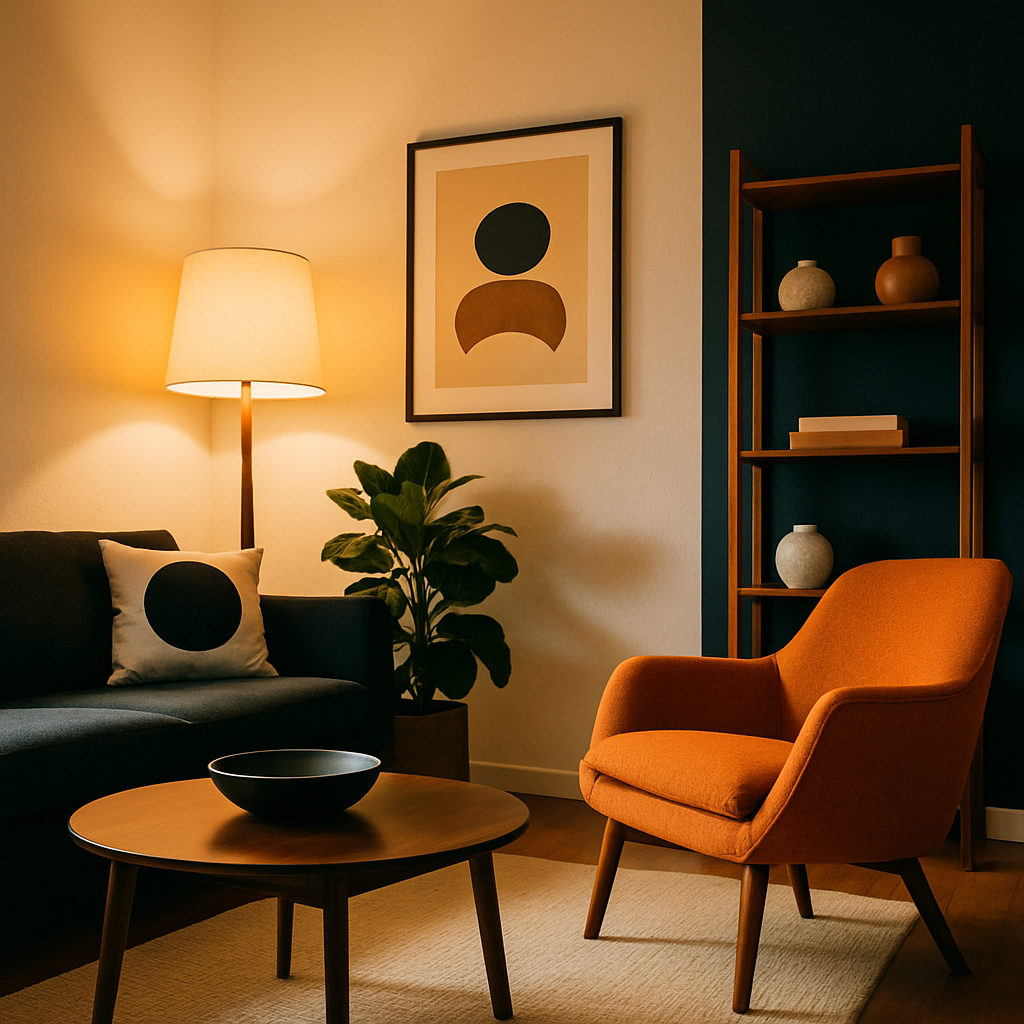
A harmonious home is not the result of expensive purchases or lucky aesthetic intuition; it is the product of fundamental design principles applied with consistency and care. These principles, developed and refined over centuries of architectural and artistic practice, provide a reliable framework for making decisions about color, furniture placement, material selection, and spatial organization that produce environments where everything feels intentionally composed yet effortlessly natural. The National Council for Interior Design Qualification (NCIDQ) tests aspiring professionals on these principles precisely because they form the foundation upon which all successful interior design is built, regardless of style, budget, or personal taste. Whether you are arranging furniture in your first apartment or planning a comprehensive renovation of a family home, understanding balance, proportion, rhythm, emphasis, unity, and contrast will transform your approach from guesswork to informed decision-making. This guide breaks down each principle with practical applications that you can implement immediately, giving you the conceptual tools that professional designers rely on to create spaces that look and feel harmonious.
Balance: Creating Visual Equilibrium in Every Room
Balance is the principle that ensures no single part of a room feels heavier or more dominant than another, creating a sense of visual equilibrium that the eye perceives as calm and orderly. In interior design, balance operates in three primary modes: symmetrical, asymmetrical, and radial. Symmetrical balance, the most traditional form, arranges identical or mirrored elements on either side of a central axis. Matching table lamps flanking a sofa, identical nightstands on either side of a bed, or twin armchairs facing each other across a coffee table all create the formal, composed feeling that symmetry naturally produces. This approach works particularly well in traditional and transitional interiors where a sense of order and ceremony is desired.
Asymmetrical balance achieves equilibrium through visual weight rather than mirrored placement, and it is the mode most commonly employed in contemporary interior design. A large, dark-toned bookshelf on one side of a room might be balanced by a grouping of three lighter-framed artworks on the opposite wall; their combined visual weight matches the bookshelf despite their different forms and materials. A substantial floor lamp can counterbalance a window on the opposite side of a seating arrangement. The key to successful asymmetrical balance lies in understanding that visual weight is influenced by color (darker tones feel heavier), size (larger objects carry more weight), texture (rough surfaces feel heavier than smooth), and position (objects placed higher in a room feel lighter than those placed low). Mastering this intuitive calculation allows designers to create rooms that feel balanced and composed without the formality that strict symmetry demands.
Radial balance, the least common but most dynamic mode, arranges elements around a central focal point, radiating outward like spokes of a wheel. A round dining table with chairs positioned equidistantly around it represents the clearest example of radial balance in residential design. A circular chandelier hanging above a round area rug creates concentric rings of radial symmetry that draw the eye inward. Spiral staircases, circular foyers, and rooms with central fireplaces all lend themselves to radial arrangements. The IIDA notes that radial balance creates a natural sense of gathering and focus that makes it particularly effective in spaces designed for social interaction. Consider which type of balance currently characterizes your living room and whether shifting toward a different mode might improve how the space feels and functions.
Proportion and Scale: The Mathematics of Comfortable Spaces
Proportion and scale govern the relationship between objects and the spaces they occupy, determining whether a room feels comfortably furnished or awkwardly arranged. Scale refers to the size of an object in relation to the room itself: a massive sectional sofa that fills an entire wall may be perfectly scaled for a large open-plan living area but overwhelmingly oversized in a compact apartment. Proportion refers to the relationships between objects within the room: a delicate side table next to a bulky armchair creates a proportional mismatch that feels unstable, while a substantial side table of appropriate height and visual weight creates a proportional harmony that feels right even before you can articulate why.
Professional designers often reference historical proportional systems when planning interiors, and while the mathematics behind these systems is sophisticated, the practical applications are accessible to anyone willing to observe carefully. The general guideline that a coffee table should be approximately two-thirds the length of the sofa it serves, that pendant lights should hang roughly twelve to twenty inches above a dining table surface, and that area rugs should extend at least eighteen inches beyond the edges of the furniture they anchor all derive from proportional relationships that have been tested and validated across countless residential projects. Houzz design guides frequently emphasize these proportional standards as starting points, noting that they produce reliable results across a wide range of room sizes and furniture styles.
The consequences of ignoring proportion and scale are immediately felt, even by occupants with no design training. A chandelier too small for its dining room creates a sense of insufficiency. Artwork hung too high on a wall appears disconnected from the furniture below. A rug too small for a seating arrangement makes the furniture grouping feel like an island floating in a sea of bare floor. These proportional errors are among the most common mistakes in self-directed interior design, and they are also among the easiest to correct once you develop an eye for the relationships between objects. Begin by evaluating the largest piece of furniture in each room: does it feel appropriately scaled to the room's dimensions, or does it dominate or diminish the space? This single observation can reveal proportional issues that, once addressed, dramatically improve the overall harmony of the room.
Rhythm and Repetition: Guiding the Eye Through Space
Rhythm in interior design operates on the same principle as rhythm in music: the strategic repetition and variation of elements creates a pattern that guides the observer's experience through space in a controlled, pleasurable sequence. Just as a musical composition uses recurring motifs to create coherence while introducing variations to maintain interest, a well-designed interior repeats certain elements, whether colors, shapes, materials, or patterns, at intervals that establish continuity while introducing enough variety to prevent monotony. This rhythmic quality is what makes a professionally designed home feel cohesive when you move from room to room, as if each space is a different movement in a unified composition.
The simplest form of design rhythm is direct repetition: the same element appearing multiple times within a space or across connected spaces. A series of identical pendant lights above a kitchen island, a row of matching dining chairs, or the same hardware finish appearing on every cabinet and door throughout a floor plan all create rhythmic continuity through straightforward repetition. More sophisticated rhythm introduces progression, where an element changes gradually across iterations. A color that deepens as it moves from the lightest shade in the entryway to medium tones in the living area to its richest saturation in the dining room creates a progressive rhythm that draws inhabitants deeper into the home. The ASID educational resources describe this progressive technique as one of the most effective tools for creating spatial narrative, turning a sequence of rooms into a journey with direction and momentum.
Alternating rhythm, where two or more elements trade places in a regular pattern, adds complexity and visual interest that keeps the eye engaged without becoming chaotic. Black and white floor tiles in a checkerboard pattern represent the most literal example, but alternating rhythm can be far more subtle: open shelving that alternates between books and decorative objects, a gallery wall that alternates between large and small frames, or a living room that alternates between soft upholstered pieces and hard-edged wood and metal furniture. The key is consistency within the alternation; once a pattern is established, deviations should be intentional design moments rather than accidental inconsistencies. Do you notice any rhythmic patterns in your own home, either intentional or accidental, that contribute to or detract from the sense of visual flow between spaces?
Emphasis and Focal Points: Directing Attention with Purpose
Every successful room has a focal point: a single element or area that immediately draws the eye upon entry and anchors the entire composition around its presence. Without a clear focal point, a room feels directionless, with the eye wandering restlessly across surfaces without finding a satisfying place to rest. Common architectural focal points include fireplaces, large windows with compelling views, and built-in feature walls. When no architectural focal point exists, designers create one through furniture placement, artwork, lighting, or bold color application. A large-scale painting above a sofa, a dramatic chandelier above a dining table, or an accent wall in a saturated color all serve to establish the visual hierarchy that gives a room purpose and direction.
The principle of emphasis extends beyond the primary focal point to include secondary and tertiary points of interest that create a visual circuit through the room. After the eye registers the focal point, it should be naturally guided to a secondary element, perhaps an interesting texture on a nearby chair or a curated display on a side table, and then to a third, creating a triangulated path that ensures the entire room receives visual attention. AD PRO design features frequently analyze this hierarchy in photographs of completed interiors, noting how leading designers choreograph the viewer's gaze through deliberate placement of color, light, and form to ensure that every area of the room participates in the overall visual experience.
Creating effective emphasis requires restraint as much as boldness. A room where every element competes for attention fails to establish emphasis at all; the result is visual chaos that feels exhausting rather than stimulating. The most impactful focal points derive their power from the relative quietness of their surroundings. A vibrant piece of art commands attention most effectively when hung against a neutral wall, surrounded by furnishings that support rather than compete with its presence. A stunning light fixture makes its greatest impact in a room where the ceiling is otherwise clean and unadorned. This relationship between focal point and supporting context is fundamental to the principle of emphasis: one must yield for another to lead. Review each room in your home and identify what your eye is drawn to first. If the answer is uncertain or if multiple elements compete equally for attention, the room likely needs a clearer focal point hierarchy.
Unity and Harmony: Connecting Elements into a Cohesive Whole
Unity is the principle that binds all other design elements into a coherent whole, ensuring that a room reads as a single, intentional composition rather than a collection of unrelated objects. Achieving unity does not require matching everything, a common misconception that produces bland, catalog-like interiors, but rather establishing enough common threads between elements that their relationships feel purposeful. These threads can take many forms: a shared color appearing in varying intensities across furniture, textiles, and accessories; a consistent material, such as brass, linking hardware, light fixtures, and decorative objects; or a unifying design language, such as curved organic forms or crisp geometric lines, that creates a visual family out of diverse individual pieces.
The concept of harmony, closely related to unity, adds the dimension of pleasantness to coherence. A room can be unified around a concept that is nonetheless jarring or uncomfortable; harmony requires that the unified elements also relate to each other in a way that feels agreeable and restful. Interior designers certified through NCIDQ learn to evaluate harmony through the lens of similarity and contrast: elements that are too similar produce boredom, while elements that are too different create tension. The sweet spot, where objects share enough common qualities to feel related but differ enough to maintain individual interest, is where harmony lives. A room full of identical gray objects is unified but not harmonious; a room with thoughtfully varied grays, complemented by an accent of warm bronze and softened by natural wood tones, achieves both unity and harmony.
Practical strategies for achieving unity include establishing a color palette before any purchasing decisions, selecting a maximum of two to three material families that will appear throughout the space, and choosing a proportional scale that remains consistent across furnishings. A small-scale room benefits from consistently scaled furniture; introducing one oversized piece into a room of delicate furniture disrupts unity even if the piece is beautiful in isolation. Similarly, maintaining a consistent level of formality prevents the jarring contrast between overly casual and overly refined elements within the same space. The ASID practice guidelines describe unity as the test that every design element must pass: does this addition strengthen the overall composition, or does it introduce a note that conflicts with the established visual language of the room?
Contrast: The Essential Tension That Brings Spaces to Life
If unity provides coherence and harmony provides comfort, contrast provides vitality. Without contrast, even the most beautifully unified room risks feeling flat, monotonous, and visually unstimulating. Contrast is the principle that introduces deliberate differences between elements, creating the visual tension that keeps the eye engaged and gives a space its dynamic quality. Light against dark, rough against smooth, curved against angular, warm against cool, large against small: these pairings generate the visual energy that transforms a pleasant room into a memorable one. The most skilled designers understand that contrast and unity exist in productive tension, each requiring the other to function effectively.
Color contrast is the most immediately impactful form, and contemporary design offers a full spectrum of approaches from subtle to dramatic. A predominantly white room with a single piece of furniture upholstered in deep indigo demonstrates high contrast that creates a powerful focal point through color alone. A room in varying shades of warm gray, accented with brass hardware and natural wood tones, demonstrates low contrast that creates sophistication through subtlety. The appropriate level of color contrast depends on the room's purpose and the homeowner's temperament: high-contrast spaces feel energizing and bold, while low-contrast spaces feel soothing and refined. Neither approach is inherently superior; the choice should reflect how you want to feel in the space and what activities it will support.
Material and textural contrast offers a more nuanced form of visual tension that operates even within a monochromatic color scheme. Pairing polished marble with raw linen, smooth leather with nubby wool, reflective glass with matte concrete, or warm wood with cool steel creates layers of tactile interest that reward close attention without overwhelming at a distance. This type of contrast is particularly valued in the quiet luxury movement, where the visual palette may be restrained but the material experience is extraordinarily rich. According to research featured by the IIDA, rooms with varied textural contrast score consistently higher in occupant satisfaction surveys than rooms with uniform textures, regardless of the specific materials used. The human sensory system craves variety, and providing that variety through thoughtful textural contrast is one of the most reliable ways to create interiors that feel satisfying and complete over the long term.
Conclusion
The six principles explored in this guide, balance, proportion, rhythm, emphasis, unity, and contrast, are not abstract theoretical concepts but practical tools that produce measurable improvements in how a room looks, feels, and functions. Every interior design decision you make, from the color of a wall to the placement of a lamp, either supports or undermines these principles. Understanding them does not require formal training or innate talent; it requires observation, willingness to experiment, and the patience to evaluate results honestly. Professional designers at firms accredited by ASID and IIDA apply these same principles to every project, whether designing a single room or an entire residence, and their consistent success demonstrates that the principles work reliably across every style, scale, and budget.
Begin applying these principles today by selecting one room in your home and evaluating it through each lens in sequence. Is the room balanced, or does one side feel heavier than the other? Are the furnishings proportionate to the space and to each other? Does a rhythmic element connect the objects in the room into a coherent sequence? Is there a clear focal point that anchors the composition? Do the elements feel unified and harmonious? And does sufficient contrast exist to keep the space visually engaging? Answering these questions honestly will reveal specific opportunities for improvement, often achievable through rearrangement or small additions rather than major expenditure. If the scope of your aspirations exceeds what you feel confident executing independently, engage a qualified interior designer to translate your vision into a plan grounded in these timeless principles. The investment in professional guidance pays for itself through results that are not only beautiful but fundamentally, structurally harmonious.
More Articles You May Like

Comments
Post a Comment