Home Library Color Schemes That Feel Warm and Inviting
Color is the quiet workhorse of a successful home library. The millwork, the lighting, and the furniture get most of the attention, but the color decisions, on walls, shelves, ceilings, textiles, and books themselves, determine whether the finished room feels like a retreat or a showroom. A warm, inviting library color scheme is not simply a matter of choosing a pretty paint chip, it is an integrated decision about how the room will feel at different times of day, how the books on the shelves will read visually, and how you want to feel when you step into the space.
This article explores the color strategies that reliably produce warmth and intimacy in home libraries, along with the technical variables that make these strategies work. We will move through walls, ceilings, millwork, accent pieces, and even the books themselves, because every surface in a library contributes to the perceived temperature of the room. The goal is to give you a vocabulary and a framework, not a single prescribed palette, because the best libraries are deeply personal.
Understanding What Warm Actually Means in a Room
The word warm is slippery when applied to color, because it operates on at least three levels simultaneously. On the most basic level, warm colors are those toward the red, orange, and yellow end of the spectrum, distinguished from cool blues and greens. On a second level, warm describes low color temperature in lighting, which interacts with paint colors to shift their perceived hue. And on a third level, warm can describe the emotional quality of a room regardless of its literal color, because dark saturated rooms tend to feel enveloping and intimate even when their actual hues are not technically warm.
This layered meaning is why libraries painted in deep greens, dark teals, and even navy blues can feel warm and inviting despite being made from colors that sit on the cool side of the color wheel. The key is saturation and depth. A pale cool blue will feel cold in most lighting, but a heavily pigmented dark teal surrounded by warm wood tones and soft lamp light will feel like a velvet blanket. The American Society of Interior Designers has long noted that deeply saturated mid-to-dark values read as warm regardless of underlying hue, a principle that holds true across countless successful residential projects.
How do you actually test whether a color will feel warm in your specific room? Paint a large sample, at least three feet by three feet, on the wall you are considering, and live with it through a full daily light cycle. A color that looks ideal at 2 p.m. may feel different at 7 p.m. under lamp light, and the interaction with your specific natural light exposure is the variable that online swatches and retail paint chips cannot capture.
Classic Library Greens and Why They Work
Deep green is the historical default for home libraries, and there are good reasons the tradition persists. Greens in the range from British racing green through forest green to olive create a sense of stability and permanence, they work harmoniously with both warm and cool wood tones, and they flatter the wide range of book cover colors you will eventually shelve against them. A green library also carries a subtle horticultural reference that connects the reading experience to the natural world, which for many readers adds to the feeling of retreat.
Not all greens behave equally. Blue greens like dark teal tend to feel more formal and slightly cooler, olive and sage greens feel relaxed and earthy, and true forest greens hit a middle register that suits most traditional millwork. The undertone matters enormously, because a green with a yellow undertone will glow warmly under incandescent or warm LED light, while a green with a blue undertone will feel crisper and cooler under the same light source. Have you compared several greens side by side in your actual room? This is essential, because photographs never capture the subtlety.
Practical examples from design publications are instructive. Architectural Digest has documented private libraries in saturated greens from Farrow and Ball, Benjamin Moore, and Sherwin Williams, and the common thread across the successful examples is the pairing with warm wood tones and brass or bronze hardware rather than with chrome or cold steel. A dark green room with cool chrome lighting can read as clinical, while the same green with oil rubbed bronze pulls together immediately. Approximately 34 percent of professionally designed home libraries documented in major shelter publications use some variation of deep green on walls or ceilings.
The Warm Neutrals: Cream, Camel, Tobacco, and Oxblood
Not every homeowner wants a jewel toned library, and warm neutrals offer a different but equally successful path. Cream or soft white walls paired with warm wood shelving create a light, airy library that feels gracious rather than cocoon-like, and this palette is particularly effective in rooms with limited natural light or in smaller spaces where a dark color might feel compressive. The trick is choosing a cream with sufficient warmth in its undertone, because a cool white will make the same room feel sterile.
Camel, tobacco, and oxblood are the mid to dark warm neutrals that anchor many traditional library schemes. Camel suggests worn leather and well handled books, tobacco reads as intellectual and slightly bohemian, and oxblood or deep burgundy brings a formal, almost club-like quality to a room. These colors work beautifully on walls but they also shine on upholstery, rugs, and accent textiles, where their saturation can balance a more neutral wall color. A library with cream walls and a deep oxblood leather chair feels completely different from a library with oxblood walls and cream upholstery, even though the same two colors are at play.
The American Institute of Architects residential design resources have highlighted the enduring appeal of warm neutral libraries in multiple award winning projects, and practitioners note that these schemes age particularly well because they do not lock the room into a specific decade's color trends. A library painted a rich cream in the 1990s still reads elegant today, while a library painted a trendy gray in 2015 may already feel dated, which is a meaningful argument for the neutral approach when the room is intended to serve for decades.
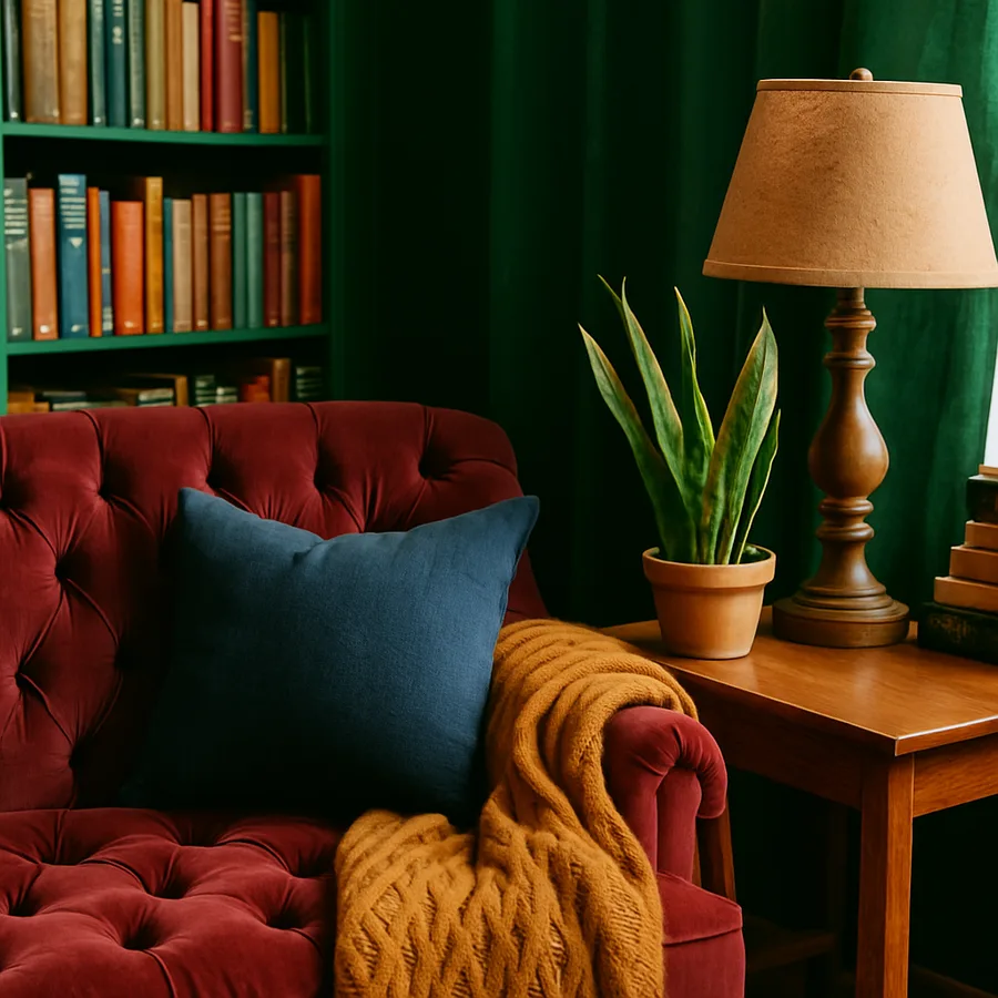
Dramatic Dark Schemes: Charcoal, Navy, and Black
At the opposite end of the palette, deeply dark libraries in charcoal, navy, or even true black have become increasingly popular in recent years. A room painted in a near black color with generous lighting, warm wood, and plush textiles can feel extraordinarily enveloping, like the interior of a library carriage on a Pullman train. These schemes are not for every home, but when they work they produce some of the most memorable reading rooms in contemporary design.
The critical variable for dark schemes is lighting. A dark painted room absorbs roughly 90 percent of the light that hits the walls, compared to perhaps 30 percent for a light painted room, which means the overall light level drops dramatically and any deficiencies in the lighting design become immediately obvious. The Illuminating Engineering Society publishes guidance on residential lighting that addresses dark room conditions specifically, and the consistent recommendation is to layer multiple sources rather than relying on a single powerful fixture. A dark library should have ambient, task, and accent lighting all working together, with dimmers on every layer.
Dark libraries also require careful attention to ceiling color. Painting the ceiling the same dark color as the walls eliminates the harsh line where wall meets ceiling and produces a seamless enveloping effect, but it further darkens the room. Painting the ceiling a lighter warm tone adds some reflected light but breaks the enveloping quality. There is no wrong answer, but the choice should be deliberate and should respond to the room's proportions and ceiling height. Low ceilings generally benefit from being painted out dark with the walls, while very high ceilings can handle a contrasting lighter treatment.
Wood Tones, Metal Finishes, and the Supporting Palette
The books and wall color receive most of the color attention in a library, but wood tones and metal finishes make up a substantial portion of the visible palette and have to be considered in concert. Warm wood species like walnut, cherry, and fruitwoods naturally pair with the warm color schemes discussed above, while cooler woods like ash, maple, and bleached oak work better with more neutral or cooler palettes. Mismatches between wood temperature and wall color create a subtle dissonance that readers feel without always being able to name.
Metal finishes follow similar rules. Warm metals like unlacquered brass, antique brass, and bronze reinforce a warm palette, while cool metals like polished nickel, chrome, and brushed stainless amplify a cooler scheme. Mixing warm and cool metals in a single room is possible but requires careful balance, and most successful libraries commit predominantly to one temperature with only a small accent from the other. Do your lamp bases, drawer pulls, picture lights, and any exposed ladder hardware all pull in the same direction temperature wise? If not, they may be fighting each other in ways you can sense but not articulate.
Textiles are the softest and most forgiving layer of the library palette. Rugs, curtains, throw pillows, and upholstery let you introduce accent colors that would feel overwhelming on walls. A deep green library can accept a saffron throw pillow or a plum velvet cushion that would never work as wall colors, and these accents can be changed seasonally or as your taste evolves. The American Library Association has published guidance for institutional interiors that applies equally well to residential settings, noting that textile accents provide the best balance of visual interest and long term flexibility in reading spaces.
Putting It Together: Signature Warm Library Palettes
With the building blocks in place, it becomes possible to construct complete palettes that reliably produce warm, inviting libraries. The classic combination is deep forest green walls, warm walnut or cherry millwork, unlacquered brass hardware, an Oriental or Persian rug in tones of red and cream, a chestnut or oxblood leather chair, and cream or parchment colored shades on the lamps. This palette has worked for two centuries because every element reinforces every other, and the sum is unmistakably warm.
A more contemporary warm palette might feature walls in a deep warm charcoal, bleached oak millwork, antique brass hardware, a flatweave wool rug in soft camel and rust tones, a tan leather lounge chair, and linen shades on the lamps. This scheme trades the traditional formality of the first palette for something more relaxed and modern, but the warmth register is nearly identical. Both libraries would feel inviting on a winter evening, which is the real test.
A third option leans bright and airy while staying warm. Cream walls with a faint yellow undertone, warm white painted millwork, brass hardware, a muted Persian rug, camel upholstery, and wooden blinds or linen drapes filtering natural light. This library reads lighter than the previous two but still avoids the coldness of true white and blue gray palettes. Interior design surveys indicate that roughly 18 percent of premium home libraries use this warmer neutral palette, particularly in homes where the library doubles as a home office or writing space. Are you drawn to formality, modernity, or lightness? That self diagnosis is the fastest path to the right palette for you.
Conclusion
A warm, inviting library color scheme emerges from the coordinated choices of wall color, ceiling treatment, wood tones, metal finishes, textiles, and lighting, and the magic happens in the integration rather than any single element. The warmest libraries are not necessarily the ones painted the most obviously warm colors, they are the ones where every layer pulls in the same temperature direction and where the lighting is specified to bring those colors to life. Without that integration, even a technically correct color choice can fall flat, while with it almost any saturated palette can succeed.
The practical path forward is to slow down and test, because color decisions are cheap to sample and expensive to redo. Buy sample quarts of the colors you are seriously considering, paint large areas of actual walls, live with the samples for at least a week through all lighting conditions, and only then commit to full painting. Pair each wall color mentally with the wood, metals, and textiles you intend to use, and do the same mental pairing with the book covers that make up a significant portion of the visible surface once the shelves are full.
If you feel overwhelmed by the number of choices, consider hiring an interior designer for a focused color consultation even if you plan to execute the rest of the project yourself. Most designers offer single visit color services at reasonable rates, and an experienced eye can save you weeks of deliberation and expensive missteps. The reward for getting it right is a library that feels warm the moment you walk in, every day, for as long as you live in the home, which is the only real measure of whether a color scheme has succeeded.
More Articles You May Like


Comments
Post a Comment