Dark Green Paint in Bedrooms: Shades That Actually Work
Why Dark Green Belongs in the Bedroom
There is a reason hospitals, therapy offices, and meditation spaces so frequently incorporate green into their interiors. The color sits at the center of the visible spectrum, requiring the least amount of physiological adjustment from the human eye, which means the brain processes green with less effort than any other hue. In its darker, more muted forms, green triggers associations with forests, shade, shelter, and evening stillness, precisely the psychological states you want a bedroom to evoke. Painting bedroom walls a dark green is not a bold decorating gamble; it is an alignment of color science with the room's fundamental purpose of rest and recovery.
Research published by the Scandinavian Journal of Psychology has demonstrated that exposure to green environments, even simulated ones like painted walls, correlates with reduced heart rate and lower self-reported anxiety compared to exposure to white, gray, or blue environments of equivalent brightness. While these studies examined broader green exposure rather than bedroom paint specifically, the implication for sleep spaces is direct: a room that lowers your physiological stress response before you close your eyes is a room that supports better sleep onset. The American Society of Interior Designers (ASID) has recognized this connection in its guidance on residential color, noting that muted greens and nature-derived palettes consistently rank among the top color recommendations for primary bedrooms.
The cultural momentum behind dark green bedrooms is also significant. Design publications, hospitality interiors, and high-end residential projects have embraced dark green walls with a consistency that distinguishes the color from fleeting trend-driven choices. Boutique hotels across Europe and North America have used dark green bedrooms as signature design elements for years, and the guest satisfaction data from these properties suggests that occupants find green rooms more restful and memorable than neutral alternatives. When a color performs well both in controlled research settings and in the unforgiving test of commercial hospitality, where guests evaluate every detail against their expectations, its suitability for residential bedrooms becomes difficult to dispute.
The challenge with dark green in bedrooms is not whether the color works conceptually but which specific shade works practically in your particular room. Dark green is not a single color; it is a family of dozens of distinct shades that range from blue-tinged evergreen to yellow-warmed olive, from gray-muted sage to saturated emerald. The wrong shade in the wrong light can look muddy, oppressive, or jarringly artificial. The right shade in the right conditions creates a room that feels like stepping into a protected clearing in a mature forest. The difference between these outcomes is entirely navigable once you understand what separates the greens that succeed from those that disappoint.
Understanding Green Undertones and Their Bedroom Behavior
Every dark green paint carries a secondary undertone that profoundly influences how the color reads on bedroom walls. Blue-based greens like hunter green, evergreen, and teal-green lean toward the cool end of the spectrum and create bedrooms that feel serene, slightly formal, and refreshingly cool in temperature. These shades work exceptionally well in south-facing and west-facing bedrooms where warm natural light tempers the blue undertone, producing a balanced richness that neither overheats nor over-cools the visual atmosphere. In north-facing bedrooms, however, blue-based greens can push past serene into cold, making the room feel unwelcoming rather than restful, particularly during winter months when natural light is scarce and low-angled.
Yellow-based greens like olive, moss, and avocado carry warmth within the green itself, creating bedrooms that feel earthy, grounded, and naturally inviting. These shades are the safer choice for north-facing and east-facing bedrooms because the inherent warmth in the yellow undertone compensates for the cool quality of the light those orientations receive. Olive green in particular has proven itself as one of the most adaptable dark greens for bedrooms because its warmth prevents it from ever feeling clinical, while its grayish quality keeps it from veering into the aggressively retro territory that pure avocado or harvest gold-green can evoke. The Architectural Digest color authority recommends olive and moss tones as the most universally successful dark greens for bedrooms, specifically because their yellow undertone provides built-in warmth that the room's lighting does not need to supply.
A third category, gray-based greens, occupies the most muted and sophisticated position in the dark green spectrum. These shades, sometimes described as eucalyptus, lichen, or deep sage, have enough gray content to read almost as a colored neutral, making them the least risky option for homeowners who want the psychological benefits of green without a strongly chromatic wall. Gray-based greens adapt to lighting conditions more gracefully than their blue-based or yellow-based counterparts because the gray content absorbs rather than amplifies the color cast of the ambient light. In rooms with mixed or unpredictable lighting, this adaptability is a genuine practical advantage.
Testing undertones in your specific bedroom is not optional; it is the step that separates successful dark green bedrooms from disappointing ones. Purchase at least three sample pots spanning the blue, yellow, and gray undertone families and paint 12-by-12-inch swatches on the wall that will receive the most attention, typically the wall behind the headboard. Observe each sample in morning light, afternoon light, and evening artificial light over at least 48 hours. The sample that looks consistently appealing across all three conditions is your winner, regardless of which one looked best on the paint chip or in someone else's photograph. What looks gorgeous in a south-facing bedroom photographed at golden hour may look entirely different in your east-facing room at 10 PM under lamp light. Do you know which direction your bedroom windows face?
Specific Shades With Proven Bedroom Performance
Naming specific paint colors is inherently subjective, and brand availability varies by region, but certain dark greens have accumulated enough real-world track record in bedroom applications to warrant individual discussion. Benjamin Moore Essex Green HC-188 is a deep, stately green with a balanced undertone that sits between blue and yellow, making it one of the most versatile darks in the green family. It reads as a proper forest green, neither olive nor teal, and its moderate darkness allows it to envelop a room without swallowing all the light. Essex Green has become something of a modern classic, specified frequently by interior designers for bedrooms that aim for traditional richness without feeling dated.
Farrow and Ball Studio Green No. 93 represents the deeper, more dramatic end of the spectrum, a green so dark it approaches black in low light while revealing a complex, warm-leaning green character when illuminated. This shade is not for the faint-hearted or the poorly lit bedroom; it demands either generous natural light or well-planned artificial lighting to show its true quality. In the right conditions, Studio Green creates a bedroom that feels like a velvet-lined jewel box, intensely cocooning and unmistakably luxurious. The Royal Institute of British Architects has featured projects using this shade as examples of how dark color, applied with conviction, can make modestly sized bedrooms feel more intimate and purposeful rather than smaller.
For homeowners seeking a dark green with more gray content and less chromatic intensity, Sherwin-Williams Pewter Green SW 6208 offers a sophisticated compromise between color and neutral. This shade reads as green in direct light and as a warm dark gray in shadow, giving the bedroom a chameleon quality that shifts subtly throughout the day. Pewter Green works in nearly every lighting condition because its gray backbone prevents it from skewing dramatically warm or cool as the light changes. It is an excellent choice for bedrooms with limited or inconsistent natural light, and for homeowners who want the depth of a dark wall without committing to an overtly green room that might overwhelm their existing furnishings.
Benjamin Moore Backwoods 469 occupies the olive-green territory with enough brown undertone to feel distinctly earthy and warm. This shade avoids the jewel-toned intensity of emerald and the coolness of hunter green, instead offering a color that feels like it was mixed from forest floor materials rather than laboratory pigments. Backwoods pairs exceptionally well with natural linen bedding, rattan or cane furniture, and warm-toned wood floors, creating a bedroom that feels organically composed rather than decoratively styled. According to color consultants at Benjamin Moore, Backwoods has shown strong and sustained popularity in bedroom applications specifically because its warmth makes it comfortable to wake up in, addressing the common concern that dark bedrooms feel gloomy in the morning.
Balancing Dark Walls With Bedding, Furniture, and Textiles
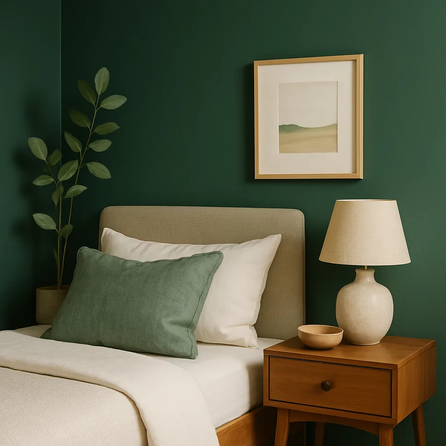
Dark green walls create a dramatic backdrop that changes the visual rules for everything placed in front of them. Furnishings and textiles that might look bold or colorful against white walls will read differently against green, and understanding this shift is essential to building a bedroom that feels balanced rather than heavy. The first principle is value contrast: dark walls need lighter elements in the foreground to prevent the room from collapsing into a monochromatic cave. White, cream, and soft blush bedding against dark green walls creates the contrast that gives the room visual breathing space and keeps the darkness feeling intentional rather than oppressive.
Warm metals serve as critical accent elements in dark green bedrooms because they provide the reflective sparkle that breaks up the matte absorption of the painted walls. Brass and brushed gold are the most natural companions for green, a pairing rooted in the natural world's own color relationships, think autumn leaves against evergreen boughs. Brass bedside lamps, picture frames, and hardware on dressers introduce warm light points that animate the green surface and prevent it from feeling flat. The Houzz bedroom design surveys consistently identify brass accents in dark green bedrooms as one of the highest-rated color-material combinations, with homeowners reporting that the metallic warmth is what prevents the dark walls from feeling cold or somber.
Wood furniture selection requires attention to tone and species. Warm-toned woods like walnut, oak, and teak complement dark green walls because both the wood and the paint draw from the same warm, natural color family. A walnut bed frame against forest green walls creates a tonal harmony that feels inevitable and unforced. Cool-toned or painted furniture in white, gray, or black can also work, but it establishes a more designed, contemporary contrast that emphasizes the green as a deliberate style choice rather than a natural backdrop. Light-colored woods like maple, birch, and ash provide a middle ground that keeps the room feeling bright without introducing a warm-cool conflict.
Textiles offer the most flexible opportunity to calibrate the bedroom's overall warmth and texture. A linen duvet cover in natural flax, ivory, or soft white is the most reliable foundation because linen's natural texture and slight irregularity echo the organic character of the green walls. Layering with a knit throw in cream or terracotta, velvet cushions in a complementary tone like dusty pink or warm gold, and a natural fiber rug in jute or wool creates depth and dimension that prevents the room from reading as a flat color exercise. Each textile layer softens the visual impact of the dark walls while adding the tactile richness that makes a bedroom feel genuinely comforting rather than merely attractive. How many textile layers does your current bedroom have, and do they provide enough visual weight to balance darker walls?
Lighting Strategies That Make or Break the Dark Green Bedroom
No discussion of dark green bedrooms is complete without confronting the lighting question directly, because lighting is the single factor most likely to determine whether you love or regret your color choice. Dark colors absorb between 50 and 80 percent of the light that hits them, depending on the specific shade and sheen, which means a dark green bedroom reflects dramatically less light back into the room than a white or light-colored one. This does not make the room dark in the pejorative sense, but it does mean that you must be intentional about providing the light sources that the walls will not provide for you.
Layered lighting is the professional approach to dark-walled rooms, and it involves three categories of light working together. Ambient lighting from overhead fixtures, recessed cans, or a central pendant provides the general illumination that makes the room functional. In a dark green bedroom, dimmer switches on ambient fixtures are essential because the optimal brightness level will shift between morning, when you need more light to compensate for dark walls, and evening, when lower light levels enhance the cocooning quality that drew you to the color in the first place. The American Lighting Association recommends a minimum of three independently controlled light sources in bedrooms with dark walls, compared to the two that suffice in lighter rooms, to provide adequate flexibility across different activities and times of day.
Task lighting from bedside lamps and reading lights provides the focused illumination needed for specific activities without requiring the entire room to be brightly lit. In dark green bedrooms, bedside lamps serve a dual aesthetic function: the pools of warm light they cast on the green wall create a glowing effect that reveals the paint's depth and undertone in the most flattering way possible. Choose lamp shades in cream or natural linen rather than opaque dark shades, as lighter shades allow more light to diffuse into the room while the warm tone of the fabric enhances the green rather than competing with it. Wall-mounted swing-arm sconces in brass are particularly effective because they position the light source at the optimal height for both reading and wall illumination without occupying nightstand space.
Accent lighting is the often-overlooked third layer that elevates a dark green bedroom from well-lit to atmospheric. LED strip lights installed behind headboards, beneath floating nightstands, or along the top of crown molding create indirect illumination that washes the green walls with soft, even light, revealing subtle color variations across the surface that direct light sources can miss. This indirect light mimics the dappled quality of light filtering through a forest canopy, reinforcing the natural association that makes green walls psychologically effective in the first place. Candles, while technically an accent light source, deserve specific mention because their warm, flickering light against dark green walls produces an ambiance that no electric source fully replicates. According to a consumer survey by the National Candle Association, over 75 percent of candle users identify the bedroom as their primary location for candle use, and dark-colored rooms amplify the visual impact of candlelight by providing a non-reflective backdrop that makes the flame the brightest point in the field of vision.
Approaches Beyond Four Full Walls of Green
Painting all four bedroom walls in a dark green is the most immersive approach, but it is not the only way to bring this color into the room. For bedrooms with limited natural light, low ceilings, or compact square footage, a single accent wall behind the headboard delivers the color's visual and psychological impact without the light absorption penalty of a fully green room. The headboard wall is the natural choice because it is the wall you face when you enter the bedroom and the wall you see when you wake up, making it the dominant surface in the room's visual hierarchy. The remaining three walls in a complementary warm white or soft cream provide the reflected light that keeps the room feeling spacious.
The two-thirds rule is another partial application strategy that has gained popularity among designers working with dark bedroom colors. This technique involves painting the walls from the floor up to approximately two-thirds of their height in dark green, with the upper third and the ceiling painted in white or a very pale tint of the same green. The resulting effect is of walls that embrace the lower, inhabited zone of the room while the upper portion remains light and airy. A thin wooden molding or a painted stripe at the color break provides a clean transition line. This approach retains approximately 70 percent of the immersive quality of full-room green while preserving the sense of height and openness at the ceiling, making it ideal for bedrooms with standard eight-foot ceilings where four dark walls might feel compressed.
Painting the ceiling in dark green while keeping walls in a lighter tone inverts the conventional approach and creates a distinctly different experience. A dark green ceiling lowers the perceived height of the room, which in bedrooms is often desirable rather than problematic because it enhances the sense of enclosure and intimacy. Lying in bed and looking up at a deep green surface evokes the experience of resting beneath a canopy of trees, a sensation that many people find profoundly calming. This approach works best in bedrooms with ceilings of nine feet or higher, where the visual lowering is welcome, and in rooms where the walls already have enough interest from art, textiles, or architectural detail that they do not need the added drama of a full color treatment.
A fourth strategy involves painting the bedroom's built-in elements, such as closet doors, window frames, baseboards, and the main door, in dark green while keeping the walls in a lighter shade. This dispersed approach introduces the color at a more moderate intensity, distributed across multiple surfaces rather than concentrated on the walls. The effect is of green woven through the room's architecture, present everywhere but dominant nowhere. This technique suits homeowners who are drawn to dark green but prefer a bedroom that feels touched by color rather than enveloped in it, and it has the practical advantage of being significantly easier to reverse if your preferences change, since repainting trim and doors is a smaller project than repainting four walls.
Conclusion: Committing to Color That Serves How You Sleep
Dark green in the bedroom is one of those design decisions that sounds risky in the abstract and feels entirely natural in practice. The color's deep roots in the natural world, its documented psychological effects on relaxation and stress reduction, and its proven performance in both residential and hospitality settings all point toward the same conclusion: this is a color that belongs where people sleep. The shades that work best are those with enough complexity in their undertones to respond gracefully to changing light, enough depth to create genuine enclosure without oppression, and enough warmth to feel inviting at the moment you walk through the door at the end of a long day.
The practical path to a successful dark green bedroom runs through careful shade selection, honest assessment of your room's lighting conditions, and thoughtful layering of textiles, metals, and light sources that balance the darkness with warmth and dimension. None of these steps are difficult individually, but skipping any of them increases the risk of a result that feels heavy rather than restful. Take the time to test samples under real conditions, plan your lighting before the painter arrives, and choose bedding and furniture that provide the value contrast your dark walls will need to breathe.
If you have been considering dark green for your bedroom but hesitating because the leap from white or gray feels too dramatic, consider the partial application strategies that let you experience the color without fully committing. A single headboard wall, a two-thirds application, or even a green ceiling can give you the lived experience of sleeping in a green room before you decide whether to go further. Most people who start with a partial application end up painting the remaining walls within a year, not because the partial approach failed but because the color proved itself so thoroughly that the desire for more became irresistible.
More Articles You May Like


Comments
Post a Comment