Composite Decking Colors That Complement Brick or Stone Homes
Choosing the right composite decking color for a brick or stone home can feel like navigating a paint swatch labyrinth. The exterior materials on your home already carry strong visual weight through their natural textures and tones, so the decking needs to work in harmony rather than compete for attention. According to the National Association of Home Builders, outdoor living spaces rank among the most requested features in residential construction, and the deck surface sets the tone for the entire area. Getting the color pairing right means your outdoor space will feel like a natural extension of your home rather than an afterthought. In this guide, we walk through color theory principles, specific pairings for different brick and stone types, and practical strategies for making a confident final selection. Whether you are building from scratch or replacing a weathered wood deck, these insights will help you land on a choice that elevates your entire facade.
Understanding the Color Undertones in Brick and Stone
Before you even look at a decking sample, spend time studying the undertones in your brick or stone. Most people describe their brick as simply "red" or "brown," but every masonry surface contains a blend of warm and cool undertones that shift throughout the day as sunlight changes angle. A classic red brick, for instance, often carries orange and amber undertones, while a whitewashed brick leans toward cool gray with hints of cream. Recognizing these subtleties is the foundation for choosing a deck color that feels cohesive rather than clashing. Pull a loose brick or chip a small stone sample and examine it under morning light, midday sun, and evening shade to see the full range of tones present in the material.
Stone exteriors introduce even more complexity because they frequently contain multiple colors within a single surface. A fieldstone facade might include grays, tans, rust, and charcoal all within one wall, which actually gives you more flexibility in decking selection since you can pick up any of those tones. Limestone and sandstone tend toward warm beiges and creams, making them highly compatible with a broad spectrum of composite colors. Slate and bluestone, on the other hand, lean heavily into cool gray and blue-gray territory, which narrows your best options but also makes the pairing more dramatic when done well. The Houzz design community frequently highlights the importance of pulling a secondary or accent color from your stone rather than matching the dominant hue, which prevents the overall look from appearing flat or monotonous.
Temperature contrast is another concept worth understanding before you commit. Pairing a warm-toned deck with warm-toned brick creates a monochromatic, enveloping feel that works beautifully in traditional and cottage-style homes. Introducing a cool-toned deck against warm brick, however, creates visual separation that can make modern and transitional homes feel crisp and intentional. Neither approach is inherently better, but understanding which effect you want helps eliminate half the color options right away. Ask yourself whether your goal is seamless blending or deliberate contrast, and let that answer guide every subsequent decision in the process.
Do not forget to account for your mortar color as well. The mortar joints between bricks occupy a surprising amount of visual real estate, and their tone can shift the overall impression of your exterior. A buff or cream mortar paired with red brick pushes the facade warmer, while a gray mortar pulls it cooler. When you hold decking samples against your home, stand far enough back that you see the brick and mortar together as a unified surface rather than focusing on individual bricks. That blended impression is what visitors perceive from the street, and it is the reference point your decking color needs to complement.
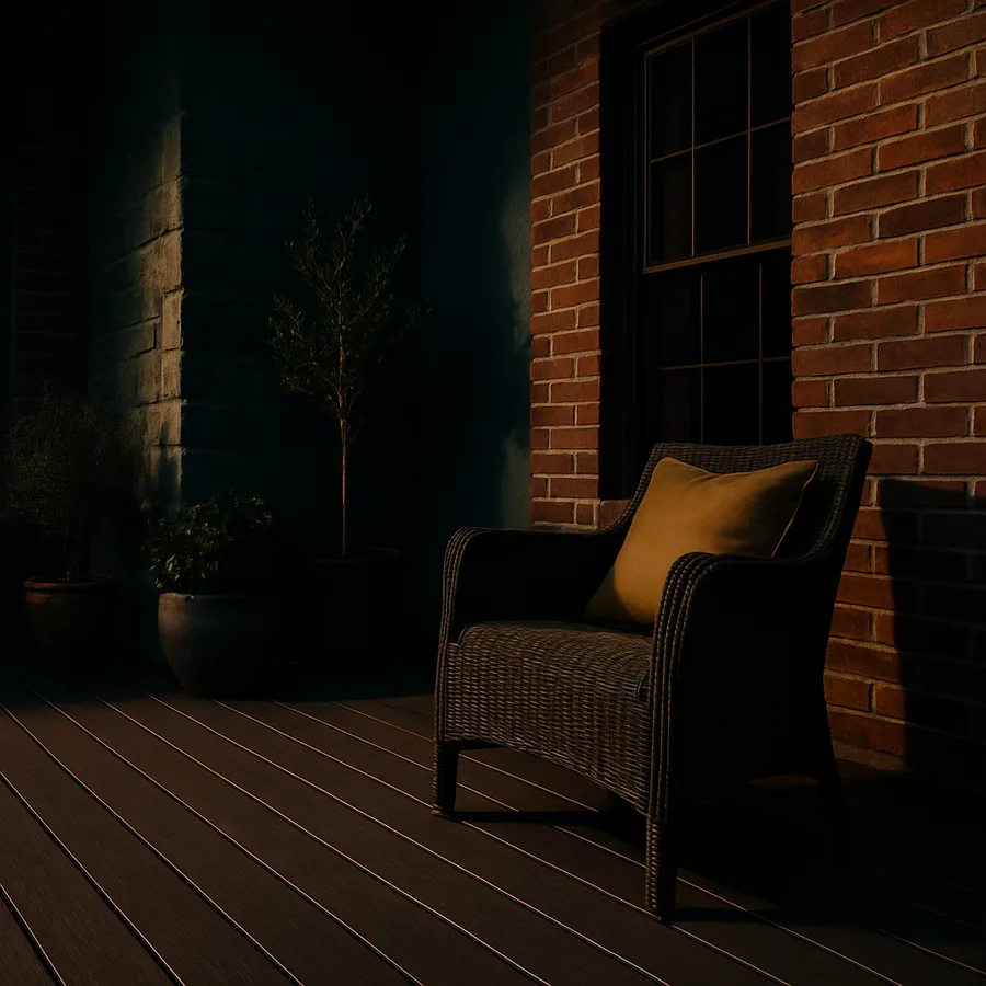
Best Composite Decking Colors for Red and Orange Brick
Red and orange brick homes are among the most common in North America, and they pair exceptionally well with composite decking in the warm brown family. Medium-toned browns with subtle reddish or amber undertones create a harmonious connection without mimicking the brick too closely. Think of colors marketed as "saddle," "toasted sand," or "autumn chestnut" in major composite lines. These shades echo the warmth in the brick while introducing enough variation to keep the eye moving. A survey by the National Association of Realtors found that cohesive exterior color schemes can increase perceived home value by up to seven percent, which makes this decision both aesthetic and financial.
If you prefer a more contemporary look with your red brick, consider a dark charcoal or slate gray composite. The cool darkness of charcoal creates a striking contrast against the warm brick, and the effect is especially powerful when paired with black or dark bronze railing hardware. This pairing has gained significant popularity in urban renovation projects where homeowners want to honor the character of older brickwork while signaling a modern design sensibility. The key is to avoid mid-tone grays, which can look dingy against vibrant red brick. Go dark enough that the contrast reads as intentional and confident.
One combination to approach with caution is matching red brick with red-toned decking. While it might seem logical to echo the dominant color, the result often feels overwhelming and draws attention to the slight differences between the two reds rather than creating unity. Have you noticed how a room painted the same color as the curtains can feel oddly unsettling? The same principle applies outdoors. Instead, treat the brick as your primary color and select a decking tone that serves as a complementary or analogous partner. Warm tans, rich browns, and deep grays all allow red brick to remain the star while the deck plays a supportive role that anchors the outdoor living space.
For orange-toned brick, which tends to appear in mid-century and ranch-style homes, look toward composite colors in the weathered teak or driftwood range. These muted, slightly gray-washed browns bridge the gap between the warmth of the brick and the cooler tones often found in mid-century landscaping materials like exposed aggregate and river rock. The result is an outdoor space that feels intentionally curated rather than haphazardly assembled. Pair this with brushed nickel or stainless hardware for a refined mid-century modern vibe that respects the architecture while updating the outdoor experience.
Pairing Composite Decking With Gray and Tan Stone
Gray stone homes, whether natural fieldstone, manufactured stone veneer, or stacked slate, offer a sophisticated backdrop that pairs beautifully with composite decking in the warm wood-tone spectrum. The contrast between cool gray stone and a rich walnut or teak-colored deck creates a balanced palette that feels both grounded and inviting. This pairing works because the warmth of the deck softens the sometimes austere appearance of gray stone, making the outdoor space feel more approachable. Designers affiliated with the American Society of Interior Designers often recommend this warm-cool balance as a reliable strategy for exterior spaces just as it works indoors.
Tan and buff stone homes present a different opportunity because they already occupy a warm neutral position on the color wheel. With these facades, you have the freedom to go either direction. A deep espresso or dark walnut composite creates elegant contrast and grounds the lighter stone, particularly effective on homes with significant stone coverage. Alternatively, a lighter composite in the honey or cedar range can blend seamlessly with tan stone for a monochromatic warmth that feels like a desert retreat. The deciding factor often comes down to the amount of direct sunlight your deck receives. Darker composites absorb more heat and can become uncomfortably warm underfoot in full sun, so lighter tones may be the practical choice for south-facing decks in hot climates.
What if your stone contains multiple colors, as natural fieldstone often does? In that case, photograph your facade and identify the three most prominent tones present. Then select a composite color that matches your second or third most common stone tone rather than the dominant one. This technique, often called accent pulling, creates a connection between deck and facade that feels sophisticated rather than obvious. It gives the eye a reason to travel between the two surfaces, discovering the shared tones along the way. The result is a composition that looks professionally designed even if you chose the color yourself at a home improvement store.
Consider also the role of grout or mortar in stone facades. Thin stone veneer with visible gray grout lines reads differently than dry-stacked stone with no visible joints. The grout adds a secondary color layer that influences the overall temperature of the facade. If your grout is significantly darker or lighter than the stone, hold your decking sample at a distance where the grout and stone blend visually, and evaluate the pairing from that perspective. This holistic view will serve you far better than focusing only on the stone color in isolation.
How Lighting Conditions and Surroundings Affect Your Choice
A composite decking color that looks perfect under the fluorescent lights of a showroom can tell a completely different story once installed in your backyard. Natural light shifts in color temperature from the warm gold of sunrise through the neutral white of midday to the amber hues of sunset, and each shift changes how your deck and your masonry interact visually. According to the American Lighting Association, exterior color perception changes by as much as thirty percent between morning and afternoon light conditions. This is why every decking manufacturer recommends taking samples home and viewing them against your actual exterior at multiple times of day before committing.
Surrounding landscape elements also influence color perception more than most homeowners realize. A deck bordered by lush green foliage will appear warmer and richer than the same deck surrounded by concrete and gravel. Large mature trees that cast dappled shade can mute the vibrancy of lighter composite colors, making them appear more gray than they are. Conversely, a deck in full sun with a light-colored stone backdrop can make medium brown composites look surprisingly warm and almost orange. Walk the perimeter of your deck footprint at the times of day you use the space most, and use those lighting conditions as your primary evaluation environment.
Artificial lighting deserves consideration as well, especially if you plan to use your deck for evening entertaining. Warm LED deck lights and string lights will amplify the golden tones in brown and tan composites while making gray composites look softer and more inviting. Cool white lighting, on the other hand, can make warm-toned composites appear slightly muddy while enhancing the crispness of gray and charcoal options. Think about your planned lighting scheme before finalizing your decking color, because the evening appearance of your deck may matter just as much as the daytime look. Have you considered how your deck will look during the hours you actually spend the most time on it?
Regional climate plays a subtle but real role as well. In the Pacific Northwest, where overcast skies dominate much of the year, lighter and warmer composite tones prevent decks from appearing dark and dreary. In the sun-drenched Southwest, darker composites maintain their visual richness without looking washed out. Southern coastal environments with high humidity and salt air tend to highlight the streaking and variation in multi-tonal composites, which can be either a feature or a distraction depending on your preference. Factor your typical sky conditions into your decision alongside the immediate surroundings of your deck.
Sampling and Testing Strategies That Prevent Regret
The single most important step you can take before ordering hundreds of square feet of composite decking is to invest in full-size samples. Color chips and small swatches are useful for initial narrowing, but they cannot replicate the visual impact of a full board laid against your home. Most major manufacturers, including Trex, TimberTech, and Fiberon, offer sample boards at little or no cost. Order your top three candidates and live with them outdoors for at least a week, moving them to different positions around your home's exterior. This extended evaluation catches subtleties that a five-minute showroom visit never will.
Create a mock-up zone by leaning sample boards against your brick or stone at the base of the wall where the deck will actually connect to the house. Photograph this setup at sunrise, midday, and sunset, then review the photos side by side on a large screen. Photographs are valuable because they flatten the three-dimensional scene into the same two-dimensional format that guests see in their first impression as they approach your home. What looks acceptable in person sometimes reveals an obvious mismatch in a photograph, and catching that mismatch before installation saves thousands of dollars and significant frustration.
Ask for references from your decking supplier or contractor and, if possible, visit completed installations that use the color you are considering. Seeing a full deck in context, complete with furniture, planters, and the normal wear of daily use, provides information that no sample board can. Pay attention to how the color looks in shaded areas versus sunny spots on the same deck, and notice whether the multi-tonal variation in the composite reads as natural wood grain or as inconsistent coloring. A study published by the Remodeling Contractors Association found that homeowners who visited at least one completed installation before selecting their decking color reported significantly higher satisfaction with their final result.
Finally, consider the long-term appearance of your selection. Composite decking undergoes a weathering period during the first few months after installation where the color may lighten or shift slightly as the surface adjusts to UV exposure. Most manufacturers provide weathered color samples that show what the board will look like after this initial period. If your brick or stone has a muted, aged patina, you may actually prefer the post-weathering version of a composite color over its fresh-from-the-factory appearance. Matching the aged character of your masonry with the settled tone of your decking creates a timeless look that only improves as the years pass.
Railing and Accent Colors That Complete the Look
Selecting the right decking color is only half the equation. The railing system, fascia boards, and accent elements you choose can either elevate your deck-and-masonry pairing or undermine it entirely. For brick homes, black aluminum or wrought-iron-style railings are nearly universal in their appeal because they create clean lines without introducing another competing color. Black recedes visually, allowing the relationship between your brick and decking to remain the focal point. The Better Homes and Gardens design team consistently recommends black railings as the safest choice for traditional and transitional brick homes, and the trend shows no signs of fading.
For stone homes, particularly those with cooler gray tones, consider bronze or dark pewter railing hardware as an alternative to black. These metallic tones add warmth without the heaviness that black can bring to an already cool palette. Cable railings in stainless steel are another excellent option for contemporary stone homes because they virtually disappear, leaving the stone and decking as the only visible surface materials. White railings, while popular on painted homes, should be approached carefully with brick or stone because they can create an overly stark contrast that makes the natural materials feel heavy by comparison.
Fascia and trim boards offer an opportunity to introduce a secondary composite color that ties the entire composition together. Many homeowners choose a fascia color one or two shades darker than their deck surface, which creates a subtle frame that defines the deck edge and adds visual depth. On a red brick home with a medium brown deck, a dark walnut fascia provides a grounding border that transitions gracefully between the deck surface and the landscape below. On a gray stone home with a warm teak deck, a charcoal fascia bridges the temperature gap between the cool stone and warm deck, creating a cohesive three-tone palette.
Do not overlook the impact of stair treads, border inlays, and picture framing as accent opportunities. A contrasting border around the perimeter of your deck can echo your stone or brick color in composite form, creating a visual callback that frames the main deck field. This technique is especially effective on larger decks where a single color might feel expansive and monotonous. The border acts as a design element that breaks up the surface area while reinforcing the connection to your home's exterior. Treat your deck design the way you would an interior room, with a primary color, a secondary accent, and hardware that serves as jewelry.
Conclusion
Selecting composite decking colors for a brick or stone home is fundamentally about understanding the relationship between materials. Your masonry carries undertones, textures, and visual weight that have already established a strong design direction, and the deck's job is to complement that direction rather than compete with it. By studying the specific undertones in your brick or stone, considering how light and surroundings shift color perception, and investing time in proper sampling, you position yourself to make a choice that feels right for years to come.
The practical steps are straightforward even when the color science feels complex. Order full-size samples, evaluate them against your home at multiple times of day, photograph the pairings, and if possible visit a completed installation. Remember that railing, fascia, and accent choices complete the composition and deserve just as much attention as the primary deck color. Every element works together to create a unified outdoor space that enhances your home's architecture.
Whether you lean toward the warmth of rich browns against red brick or the striking contrast of charcoal against limestone, the guiding principle remains the same: let your home's existing materials lead the conversation. The best composite decking color for your home is not the one that looks best on its own but the one that makes your brick or stone look its best. Take the time, trust the process, and you will end up with an outdoor space that feels as permanent and considered as the masonry it sits beside.
Ready to start your decking project? Gather samples from at least two manufacturers, tape them to your exterior wall, and live with them for a full week before making your final decision. Your future self, relaxing on a perfectly coordinated deck, will thank you for the patience.
More Articles You May Like


Comments
Post a Comment