Neutral Paint Colors That Help Sell Your Home Faster
The Science Behind Why Neutral Colors Sell
Color is not merely decorative; it is a psychological force that shapes how people perceive and respond to physical environments. When a prospective buyer steps into a home painted in neutral tones, something happens at a neurological level that bold or saturated colors cannot replicate: the brain relaxes. Neutral colors, specifically the range of warm whites, soft grays, gentle taupes, and blended greiges, register as visually quiet, allowing the viewer's attention to move freely through the space without snagging on any single surface. This perceptual freedom is precisely what allows buyers to begin the mental process of imagining their own furniture, artwork, and daily life within the rooms they are touring. The American Society of Interior Designers (ASID) has long advocated for neutral palettes in environments where broad appeal is the objective, noting that neutrals function as a visual foundation that accommodates virtually any personal style layered on top.
The data supporting neutral paint in home sales is substantial and consistent across markets. A widely cited analysis by Houzz found that homes painted in neutral tones photographed better, generated more online engagement, and sold faster than comparable homes with bold or dated color schemes. The National Association of Realtors (NAR) consistently identifies fresh, neutral paint as one of the top five most cost-effective pre-sale improvements, with an estimated return on investment exceeding two hundred percent in many markets. These findings reflect a basic market reality: when you are selling a product to an unknown audience with diverse tastes, the safest and most profitable strategy is to remove barriers to broad appeal rather than betting on a specific aesthetic that will resonate with some buyers and repel others.
It is worth understanding what neutral does not mean. Neutral does not mean white. It does not mean boring. It does not mean institutional or clinical. The modern neutral palette is rich, varied, and sophisticated, encompassing hundreds of carefully calibrated shades that carry warmth, depth, and subtle character while remaining universally inoffensive. A well-chosen neutral has undertones, warm or cool or balanced, that interact with the home's lighting, flooring, and fixed finishes to create a specific atmosphere. The difference between a flat builder-grade white and a layered warm white with a touch of cream undertone is the difference between a room that feels unfinished and one that feels intentionally designed. Selecting the right neutral requires the same care and attention as selecting any other design element.
Why do some sellers resist neutral paint despite overwhelming evidence of its effectiveness? The answer is emotional attachment. After choosing colors carefully, living with them for years, and associating them with memories and personal identity, the suggestion to paint over everything in neutral tones can feel like an erasure of self. This resistance is understandable but ultimately counterproductive. The home is transitioning from a personal living space to a market commodity, and the paint choices that served the homeowner's self-expression now need to serve the buyer's imagination. Have you ever noticed how model homes in new developments are almost universally painted in neutrals, and how effortlessly you can picture yourself living in them?
Warm Whites: The Foundation of Every Neutral Palette
If one category of neutral paint could be called universally safe for home sales, it would be warm whites. These are whites that have been softened with small amounts of yellow, cream, or pink undertone, pulling them away from the stark, blue-tinged brightness of pure white toward something that reads as clean but also welcoming. Warm whites work in every room of the house, complement virtually every flooring material and countertop surface, and photograph with the bright, airy quality that drives online engagement with real estate listings. Benjamin Moore's White Dove (OC-17) and Sherwin-Williams' Alabaster (SW 7008) are two of the most frequently recommended warm whites among staging professionals, and their enduring popularity reflects their remarkable versatility across different lighting conditions and architectural styles.
The key to using warm whites effectively is understanding how undertones interact with light. A warm white with yellow undertones will look clean and fresh in a north-facing room that receives cool, indirect light, because the warm undertone counterbalances the blue cast of northern light. That same color in a south-facing room bathed in warm direct sunlight may read as slightly yellow or buttery, which can be either charming or cloying depending on the intensity. Painting large sample swatches on multiple walls and observing them at different times of day is essential before committing to a specific warm white, because the wrong undertone in the wrong light can undermine the very freshness you are trying to achieve.
For sellers who find pure warm whites too plain, consider the slightly richer whites that paint companies sometimes categorize as off-whites or light neutrals. These colors, such as Benjamin Moore's Swiss Coffee (OC-45) or Farrow and Ball's Pointing (No. 2003), carry enough pigment to register as a definite color rather than simply white, while remaining light and neutral enough to function as a universal backdrop. They add a whisper of warmth and sophistication that flat white cannot achieve, and they are particularly effective in homes with crisp white trim, where the slight contrast between wall and trim creates visual definition and architectural interest that an all-white scheme lacks.
One common mistake with warm whites is using too many different shades throughout the house. While some variation can be appropriate, particularly between living spaces and bathrooms, using four or five different whites in adjacent rooms creates a patchwork effect that reads as indecisive rather than designed. For maximum selling impact, choose one warm white for all main living areas, one potentially cooler or brighter white for bathrooms, and use the same trim color throughout. This consistency creates visual flow from room to room, making the home feel larger and more cohesive, qualities that buyers consistently rate among their highest priorities.
Greige: The Best of Both Worlds
Greige, the blend of gray and beige that has dominated interior paint trends for over a decade, remains the single most recommended neutral category for home sales, and its staying power is no accident. Greige occupies a unique position on the color spectrum that allows it to bridge the gap between the warmth of traditional beige tones and the contemporary sophistication of gray. In a market where some buyers prefer warm, traditional interiors and others prefer cool, modern aesthetics, greige speaks credibly to both groups without alienating either. The color functions as a chameleon, reading warmer or cooler depending on the surrounding finishes, light conditions, and furnishings, which is precisely the adaptability that a home for sale needs.
Among the hundreds of greige options available, several have earned near-legendary status among real estate and staging professionals. Sherwin-Williams' Agreeable Gray (SW 7029) is frequently cited as the single most popular paint color for home resales in the United States, and its name is almost too fitting: it is genuinely agreeable to nearly everyone who encounters it. Benjamin Moore's Revere Pewter (HC-172) occupies a similar position, offering a slightly warmer, more substantial greige that works exceptionally well in homes with warm wood flooring and traditional architectural details. Behr's Silver Drop is a more accessible option available at home improvement stores, offering reliable greige performance at a lower price point. All three share the essential greige quality of feeling neither too warm nor too cool, neither too dark nor too light.
The practical advantage of greige for sellers is that it coordinates effortlessly with the fixed finishes that are most expensive and difficult to change: countertops, flooring, tile, and cabinetry. A greige wall flatters warm-toned hardwood floors, cool-toned gray tile, white marble countertops, and dark wood cabinetry with equal ease, because its balanced undertone does not clash with either warm or cool elements. This versatility means that a seller can repaint in greige without worrying about whether the color will fight with the existing kitchen backsplash or bathroom tile, concerns that make pure gray or pure beige riskier choices in homes with mixed-temperature finishes. The Better Homes and Gardens editorial team has consistently ranked greige among the top paint colors for resale value, noting its unique ability to make almost any room feel updated and intentional.
When applying greige, pay attention to the specific rooms where it will have the most impact. The living room and primary bedroom are the two spaces where greige earns its greatest return, because these are the rooms where buyers spend the most time during a showing and form their strongest emotional impressions. Hallways and connecting spaces also benefit greatly from greige because it creates a smooth visual transition between rooms. Kitchens and bathrooms can work in greige but may benefit from a lighter, brighter neutral to maximize the sense of cleanliness that buyers expect in these functional spaces. Consider using a lighter value of the same greige family rather than switching to a completely different color to maintain the whole-house cohesion that makes a home feel thoughtfully designed.
Soft Grays: Contemporary Appeal Without the Cold
For homes with contemporary architecture, modern finishes, or cool-toned fixed elements like gray countertops and white cabinetry, soft gray may be the ideal neutral choice. Gray has been the dominant trend in interior design for much of the past fifteen years, and while its peak cultural moment may have passed, its suitability for home sales remains strong, particularly in markets where buyers skew younger and more design-conscious. The critical distinction is between the soft, warm grays that work for resale and the dark, dramatic grays that work for editorial photography but can make rooms feel small, cold, and cave-like during a showing. For selling purposes, gray should be light enough that it reads as bright in photographs and warm enough that it does not create an institutional or unwelcoming atmosphere.
Benjamin Moore's Classic Gray (OC-23) is a perennial favorite among staging professionals because it achieves the seemingly impossible: it is clearly gray rather than white, giving rooms a contemporary polish, while remaining light and warm enough to feel inviting rather than austere. Sherwin-Williams' Repose Gray (SW 7015) offers a slightly more definitive gray with a balanced undertone that avoids the purple and blue casts that plague many gray paints in certain lighting conditions. Both colors have been used successfully in thousands of home sales across diverse markets, and their reliability is well-established among professionals who stake their commissions on color choices.
The most important consideration with gray paint for resale is undertone management. Gray paint is notoriously prone to unexpected undertone shifts depending on lighting conditions and surrounding colors. A gray that looks perfectly neutral on the sample chip in the store may reveal strong blue, purple, or green undertones when applied to a large wall surface, particularly in rooms with limited natural light. Testing is not optional with gray; it is essential. Paint two-foot-square samples on at least two walls in each room you plan to paint, observe them in morning light, afternoon light, and artificial light, and make your decision only after seeing the color in all conditions. A gray with unintended blue undertones in a room with warm wood floors will create a visual discord that buyers feel even if they cannot articulate its source.
Gray works best in homes where other finishes support a cool or transitional color story. Homes with gray or white countertops, white or gray cabinetry, cool-toned tile, and stainless steel appliances provide a natural context for gray walls that reads as intentional and cohesive. In contrast, a home with warm honey oak floors, copper fixtures, and earth-toned tile may feel conflicted when painted in gray, because the cool walls compete with the warm finishes rather than complementing them. In these situations, greige or warm white is usually the better choice. The goal is always coordination between walls and fixed finishes, creating a sense that every element in the room was chosen to work together, even when the reality is that the paint was chosen to accommodate everything else.
Room-by-Room Color Strategy for Maximum Impact
While whole-house consistency in paint color is generally the strongest strategy for resale, certain rooms benefit from strategic adjustments within the neutral palette that can enhance their specific appeal to buyers. The kitchen is the most scrutinized room in any home showing, and buyers expect it to feel clean, bright, and functional above all else. A bright warm white on kitchen walls, particularly in kitchens with darker cabinetry or limited natural light, creates the sense of spacious cleanliness that buyers associate with a well-maintained home. If the rest of the house is painted in greige, consider going one or two shades lighter in the kitchen to maximize brightness without creating a jarring color shift. The National Kitchen and Bath Association (NKBA) recommends light, reflective wall colors in kitchens to maximize the effectiveness of both natural and task lighting, which directly supports the bright, functional kitchen experience buyers are looking for.
Bathrooms follow a similar logic to kitchens but with an even stronger emphasis on crispness and cleanliness. A slightly cooler, brighter version of your whole-house neutral, or even a clean true white, can make a bathroom feel more spa-like and sanitary. Bathrooms are small spaces where color choices have an outsized visual impact, and a warm or dark neutral that feels sophisticated in a large living room can feel murky and confining in a five-by-eight bathroom. If your main-area neutral is Agreeable Gray, consider painting bathrooms in a lighter gray-white like Sherwin-Williams' Pure White (SW 7005) or Benjamin Moore's Chantilly Lace (OC-65) for maximum freshness. Ensure the paint finish in bathrooms is satin or semi-gloss rather than flat or eggshell, as the slight sheen is both practically superior in a moisture-prone room and visually associated with cleanliness.
The primary bedroom is where emotional response matters most, because buyers evaluate this room not just as a space but as a sanctuary. Here, the goal is warmth and calm rather than brightness, and a neutral one shade deeper or warmer than the main living areas can create a sense of cozy retreat that buyers find irresistible. If your living areas are in a light greige, consider using a slightly warmer or richer version of the same greige family in the primary bedroom. Avoid going too dark, as the room still needs to feel spacious and light, but a subtle step toward warmth signals relaxation and comfort in a room whose primary function is rest. This slight differentiation also adds depth and interest to the home's overall palette without sacrificing the cohesion that makes the whole house feel designed.
Exterior paint deserves its own strategic consideration because it operates under different rules than interior color. Exterior neutrals must contend with natural sunlight, which washes out color significantly, meaning that a shade that looks appropriately neutral on an interior swatch may appear nearly white on an exterior wall in direct sun. Choose exterior neutrals one to two shades darker than you think you need, and always test them in direct sunlight before committing. Warm exterior whites with cream undertones, medium-toned greige, and historically appropriate palette choices tend to perform best for resale. What colors dominate the most attractive and highest-valued homes in your neighborhood, and how might aligning with that established palette support your own home's perceived value?
How to Choose and Apply the Right Neutral
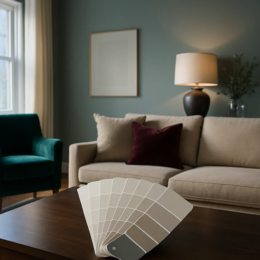
Selecting the right neutral for your home is not a process of picking the most popular color from an internet list and painting every surface. It is a deliberate evaluation that accounts for your home's specific characteristics: its natural light exposure, its fixed finishes, its architectural style, and the preferences of buyers in your local market. Start by gathering the elements you cannot change. Collect samples of your countertops, flooring, cabinet fronts, and any tile or stone that will remain in place during the sale. Bring these samples to the paint store and evaluate potential neutrals against them under the store's lighting, understanding that this is only a preliminary screening and that the real test happens on your walls.
Purchase sample pots, which most major paint brands offer in small sizes specifically for testing, and apply large swatches on the actual walls where the color will be used. Paint at least two coats to achieve the true color, and let the samples dry completely before evaluating, as wet paint can look significantly different from its dried version. Observe the swatches at multiple times of day, noting how the color changes as natural light shifts from cool morning tones to warm afternoon tones to the yellow cast of evening artificial light. Take photographs of the samples in each lighting condition, as the camera will reveal undertone shifts that your adapted eye may miss. This process takes two to three days but prevents the costly mistake of painting an entire house in a color that does not work.
When applying the final paint, preparation determines the result at least as much as color selection. Walls must be clean, patched, sanded, and primed before painting, particularly if you are covering a dark or bold color that may bleed through lighter neutral paint. Use a high-quality primer like Kilz or Zinsser for full coverage over dark colors, and apply two coats of your chosen neutral with a roller for walls and a brush for cutting in at edges and trim. The paint finish matters: flat or matte finishes hide imperfections and create a sophisticated look in living areas and bedrooms, while eggshell or satin finishes are more practical in kitchens, bathrooms, and high-traffic areas where walls need occasional wiping. Avoid high-gloss finishes on walls, which highlight every imperfection and create an institutional feel inappropriate for residential spaces.
The total cost of repainting a home's interior in neutral paint is remarkably modest compared to its impact on sale price and time on market. A typical three-bedroom home requires fifteen to twenty-five gallons of paint at thirty to sixty dollars per gallon for premium brands, plus supplies including rollers, brushes, tape, drop cloths, and primer, bringing the total material cost to approximately five hundred to fifteen hundred dollars for a complete interior repaint. If you do the work yourself over a weekend or two, the only additional cost is your time. If you hire a professional painter, expect to pay between three thousand and six thousand dollars for a typical home, an investment that staging professionals consistently identify as delivering the highest return of any pre-sale improvement. The Real Estate Staging Association (RESA) reports that neutral paint is the single most frequently recommended improvement in professional staging consultations, outranking decluttering, cleaning, and even landscaping in terms of cost-effectiveness.
Conclusion: Let Neutral Colors Do the Selling
The purpose of painting your home in neutral colors before selling is not to make it bland or forgettable. The purpose is to remove the visual noise that prevents buyers from seeing the home itself: its space, its light, its flow, its potential. Bold colors demand attention and provoke reactions, and when you are selling to strangers whose tastes you cannot predict, provoked reactions are as likely to be negative as positive. Neutral colors step back and let the home's inherent qualities step forward, creating the calm, clean, bright environment that consistently generates the fastest sales and the highest offers across every market in the country.
The investment of time and money in neutral paint is among the most reliable returns available in the pre-sale preparation process. Whether you choose a warm white, a versatile greige, or a contemporary soft gray, the key principles remain the same: test before committing, coordinate with fixed finishes, maintain consistency throughout the house, and choose quality paint that covers well and lasts through the showing period. The right neutral palette transforms a home from a personal expression into a universally appealing product, and in real estate, broad appeal translates directly to competitive offers and favorable terms.
If you are unsure which neutral palette is right for your specific home, consult with your listing agent or hire a color consultant for a one-time session. Many paint stores offer free or low-cost color consultation services, and the expertise of someone who evaluates color against fixed finishes and lighting conditions every day can save you from a costly misstep. Choose your neutral palette this week, test your samples over the weekend, and give your home the fresh, universally appealing foundation it needs to attract the best possible offers.
More Articles You May Like


Comments
Post a Comment