Navy Bedroom Walls For A Calming Sleep Environment
Navy Bedroom Walls For A Calming Sleep Environment
Few color decisions transform a bedroom as decisively as painting the walls navy. Where pale blues whisper, navy commits. It absorbs light rather than bouncing it, wraps the room in a sense of enclosure, and produces the same psychological cue that nightfall produces: it is time to wind down. For decades the conventional wisdom held that bedrooms should be light to feel restful, but contemporary color psychology research and a wave of editorial bedroom projects have flipped that assumption. A well-executed navy bedroom can be the most peaceful room in a home. Why does navy work so well, and what does it take to get it right?
The Science Behind Dark Bedroom Walls
Light exposure directly affects melatonin production, and ambient color shifts how much reflected light reaches the eye even when fixtures are off. A bedroom painted brilliant white reflects approximately 80 percent of available light back into the room, while a navy wall reflects closer to 8 to 12 percent. That dramatic reduction in reflected luminance can support the body's natural transition into sleep, particularly for sensitive sleepers who find bright bedrooms agitating. A study published by the National Association of Home Builders found that more than 40 percent of recent bedroom renovations involved a shift toward deeper wall tones, citing both aesthetic and sleep-quality motivations.
The psychological response to navy is equally important. Blue is the most universally preferred color across cultures and demographics, and dark blues in particular evoke associations with sky, deep water, and twilight. Color theorists at the Pantone Color Institute have noted that navy ranks among the most consistently calming tones in their consumer preference research, alongside specific dusty greens and soft taupes. The effect compounds in a bedroom because the eye spends time at rest on the wall, not just glancing across it.
Choosing the Right Navy
Not all navies behave the same way. Some lean toward black and feel architectural and weighty. Others contain enough red to read aubergine in low light, or enough green to appear teal under warm bulbs. The most reliably restful navies for bedrooms tend to sit in the true blue with a slight gray undercurrent category. Consider these classic choices:
From Sherwin-Williams, Naval (SW 6244) and Anchors Aweigh (SW 9179) are widely used in bedroom projects for their depth and chromatic stability across light conditions. From Benjamin Moore, Hale Navy (HC-154) is perhaps the most photographed navy of the past decade, balanced enough to read sophisticated rather than nautical. Farrow & Ball's Stiffkey Blue and Hague Blue both offer a moodier, more enveloping atmosphere preferred by editorial designers. The single most important step is testing the actual paint on at least three walls of the bedroom and observing it at sunrise, midday, evening, and lamp-lit night. A navy that looks elegant at noon can look black or gloomy at 9 p.m. without warm lighting to support it.
Light Strategy: The Make-or-Break Factor
Dark walls require deliberate lighting. The default ceiling fixture that came with the house will almost certainly fail you. Without ambient warmth and a few well-placed lamps, a navy bedroom can feel cavernous or oppressive. The fix is layered light: a soft overhead source, two bedside lamps, and at least one accent light such as a picture light, sconce, or floor lamp.
Color temperature matters as much as fixture count. Bulbs in the 2400K to 2700K range produce the warm amber tone that flatters navy and reinforces the room's calming intent. Cooler bulbs, around 3500K or higher, can make navy walls look industrial or chilly. Dimmers are essential. As evening progresses, dimming the lights from full brightness to about 30 percent allows the walls to softly recede and the eyes to relax. The American Society of Interior Designers consistently recommends layered, dimmable lighting in any bedroom with walls darker than mid-tone, and the rule applies with extra force to navy.
Pairings That Sing
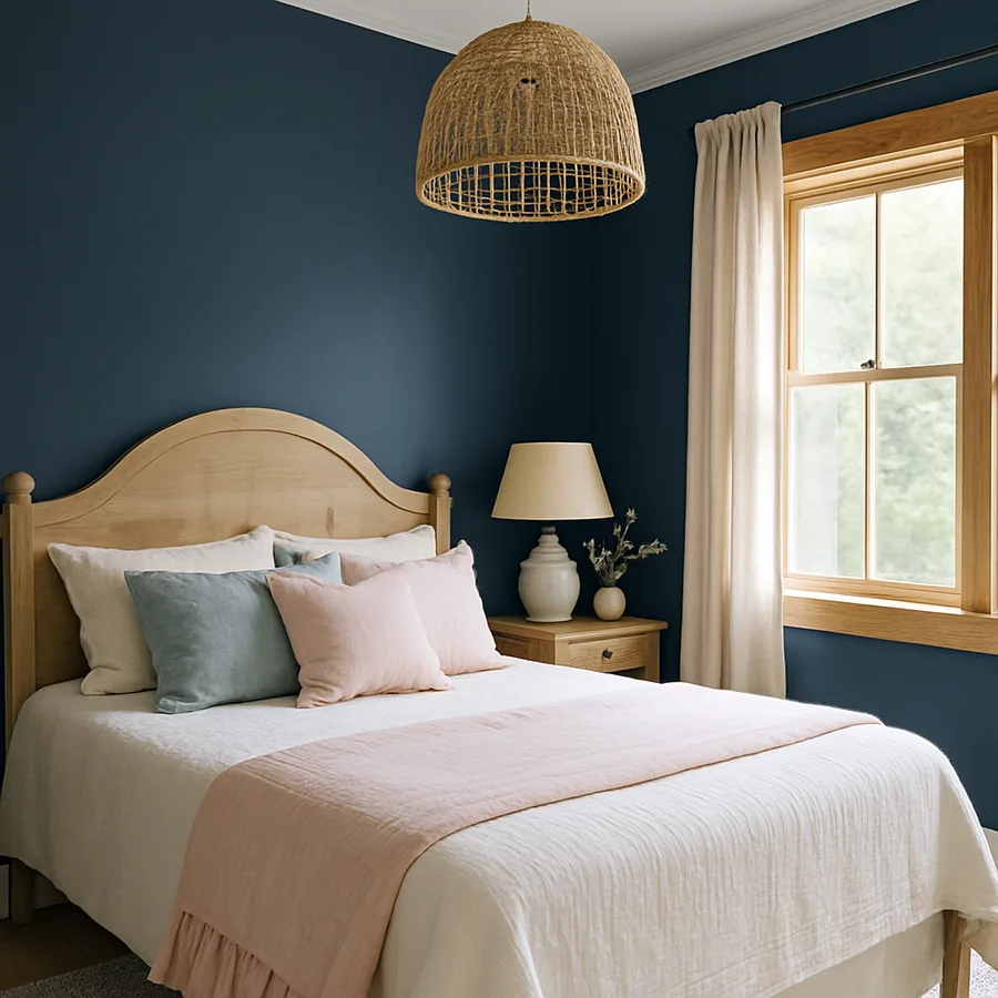
Navy is remarkably generous with its pairings. The classics work because they create necessary visual relief: crisp white linens, natural oak floors, brass or aged-gold hardware, and the warm cream of unbleached linen curtains. These combinations have appeared in countless editorial bedrooms because they balance navy's density with brightness and warmth.
For something less expected, consider blush pink as an accent. Soft, dusty pinks pulled from the same gray-leaning family as the wall color create a sophisticated palette that feels grown-up rather than romantic. Terracotta, ochre, and burnt orange also pair beautifully with navy, evoking the contrast of warm earth against cool sky. Designers at Architectural Digest have repeatedly featured navy bedrooms with rust-colored throws or amber glass lamps as the warming counterpoint. Have you noticed how navy never fights with natural materials? That generosity is one of its great gifts.
Trim, Ceiling, and the Question of Containment
A common mistake is painting only the walls navy while leaving white trim and a white ceiling. The contrast can chop up the room visually and undermine the enveloping effect. A more sophisticated approach is to either continue the navy onto trim and ceiling, creating a true color-drench, or to pair navy walls with a warm off-white trim that reads creamy rather than stark. Painting the ceiling a soft warm white (rather than pure white) significantly softens the transition.
If you are bold, drench the entire room: walls, trim, ceiling, and even doors in the same navy. This is the technique editorial designers use most often, and it produces an extraordinary sense of cocoon and continuity. The eye stops registering boundaries and instead absorbs the room as a single tonal field. The Better Homes & Gardens design team has documented that color-drenched bedrooms have grown sharply in popularity, particularly among homeowners seeking spa-like or hotel-room atmospheres in master suites.
Practical Considerations Before You Commit
Navy is a forgiving color in some respects and demanding in others. It hides small marks and scuffs far better than light walls, and it photographs beautifully. However, it shows dust more readily on flat finishes, and it requires more coats and better primer than light shades to achieve full color depth. Plan for a tinted primer plus two or three top coats for proper coverage. Skipping the primer is the most common reason a navy paint job looks streaky or patchy in raking light.
Room size matters less than you might think. Small bedrooms painted navy do not feel smaller; they feel intentionally enveloping, which is often exactly what a small bedroom should feel like. Large bedrooms in navy can feel grand and hotel-like, particularly with the right ceiling treatment. The factor that does matter is natural light. A bedroom with very little natural light may struggle to support navy walls unless you invest in particularly thoughtful artificial lighting. Conversely, a bedroom with abundant natural light can handle even the deepest, moodiest navies without feeling dark during the day.
Textiles and Layered Bedding That Complete the Scheme
Navy walls demand layered textiles to feel complete. A single white duvet against deep navy can read stark and hospital-like; multiple layers of varied texture in complementary tones produce the cocoon-like atmosphere that makes the room feel finished. Start with a base of crisp white or warm cream linen sheets, then add a textured cotton or linen coverlet in oat or putty, then a chunky knit throw in a warm accent color, and finally a small selection of pillows in mixed materials. The mix of linen, velvet, wool, and slubby cotton creates the kind of inviting visual weight that navy walls were designed to support.
Window treatments matter enormously in a navy bedroom because they control how much daylight reaches the walls. Heavy floor-pooling linen drapes in a warm cream or oat tone bracket the windows and soften the transition between bright daylight and the moody wall color. Avoid white sheers; they often look cold against navy. Instead consider warm-toned linen sheers layered behind heavier drapes, or move directly to lined linen panels that block light effectively at night. Light blocking is itself a sleep-quality intervention; the American Academy of Sleep Medicine has repeatedly noted that excess ambient light reduces sleep depth, and navy walls invite the heavier draperies that genuinely darken a room at night.
Rugs in a navy bedroom can either echo the wall color or contrast warmly. A large wool rug in cream or oat creates a beautiful pool of warmth beneath the bed and softens the floor's contrast with the walls. Alternatively, a vintage Persian or kilim with navy as one of its colors anchors the bed visually and adds pattern complexity. Pattern within a navy room is far more welcome than first-time decorators expect. Florals, paisleys, and geometric motifs all integrate beautifully when their base tones harmonize with the wall.
Common Mistakes That Undermine the Calm
Several recurring errors prevent navy bedrooms from delivering on their promise. The first is choosing a navy that is too blue or too green for the room's actual light. Always test multiple shades on actual walls. The second is pairing navy with bright pure white trim, which creates a harsh contrast that fights against the enveloping quality of the dark walls. A warm off-white or cream trim integrates far better. The third is using only one source of overhead light at full brightness, which flattens the wall and makes the room feel like an office at midnight rather than a bedroom at evening.
The fourth and most damaging mistake is matching everything in cool tones. Navy walls plus gray bedding plus chrome lamp bases plus a white-painted bed produces a room that feels chilly rather than restful. Navy needs warmth to balance it: brass, warm wood, cream, terracotta, cognac leather, or amber glass. A single warm element can rescue an otherwise cold scheme, and three or four warm elements create the layered atmospheric depth that defines a successful navy bedroom. Many homeowners report that adding warm-toned elements after the initial paint was the single intervention that turned a disappointing dark bedroom into a beloved one.
A fifth subtle mistake is neglecting the doors and closet fronts. If you have committed to navy walls, painting interior doors a stark white can interrupt the room's continuity. Painting them the same navy as the walls, or a deep complementary tone such as charcoal or aged brass, maintains the cocooning effect. Closet doors in particular often dominate a wall by area; treating them as part of the wall plane rather than as separate elements helps the room feel resolved. Have you ever walked into a dark-painted room and felt that something was slightly off, without being able to identify what? It is almost always the bright doors fighting the wall color.
Conclusion
Painting a bedroom navy is a commitment, and that commitment is precisely what makes the result so transformative. The color delivers a degree of atmospheric depth that no pale neutral can match, and it does so in service of the room's actual purpose, which is rest. When supported with the right lighting, layered textiles, and balancing pairings, a navy bedroom becomes the kind of space that quietly invites you to stop scrolling and put your head down earlier than you would otherwise.
The decision deserves real consideration of how your specific bedroom receives light, which navy lands correctly in that light, and how you plan to layer lamps and textiles to complete the scheme. None of this is hard, but skipping any of it produces the disappointed results that fuel the persistent myth that dark bedrooms feel oppressive. The truth is that dark bedrooms feel oppressive only when the navy was chosen carelessly, applied thinly, and left without adequate warm light to balance it.
If you have been considering navy for your bedroom but hesitating, pick three swatches this weekend, paint generous test patches, and observe them across a full day and evening. You will know within forty-eight hours whether your room wants to be navy. Commit to the test, and you will likely discover a more restful bedroom than any version of beige ever offered you.


Comments
Post a Comment