Teen Bedroom Color Schemes That Aren't Babyish and Will Age Well
The decade between ages eleven and twenty-one moves faster than any paint can keep up with. A color scheme chosen at twelve, when butterflies and rainbow accents felt right, becomes embarrassing wallpaper at fourteen, an outright source of conflict at sixteen, and a punishment at eighteen. The smart move is to design the room as if your teen is already a college sophomore, because in functional terms they will be one within a few years and the room will need to grow up alongside them. Color is the single biggest signal of mental age in a bedroom, more than the bed frame, the rug, or the artwork.
The good news is that mature, livable palettes are not boring or corporate. They simply lean on tone and contrast rather than on saturated primaries and cartoon brights. A teen room can be soulful, expressive, and unmistakably the work of a young adult without resorting to the cliches of either the nursery aisle or the dorm-room poster shop. This guide walks through the logic of color choice for a room that needs to survive a turbulent decade, photograph well on social media without dating overnight, and still feel like home when a college student returns for winter break.
Why Babyish Palettes Backfire Within Two Years
Pastel pink, primary yellow, and the bright lavender of toddler bedding all share a common visual property. They sit at high lightness and high saturation, which signals childhood to the visual cortex. Adult and adolescent eyes read those values as immature within seconds, even when the rest of the room is sophisticated. This is why a freshly painted lavender room feels charming on a six-year-old and stifling on a fifteen-year-old. The teen will not be able to articulate why the room feels wrong, but they will know, and they will withdraw from the space.
Saturated character colors carry a similar problem. A wall painted in the exact red of a favorite character or a sports team locks the room into a single phase of identity. Phases shift quickly during adolescence, and a wall that took an entire weekend to paint becomes a daily reminder of who your teen used to be. Neutral foundations with swappable accents avoid this trap entirely, because they let the personality of the room rotate with the personality of its occupant. The walls stay constant, the personality changes through art, textiles, and small accessories.
The American Academy of Pediatrics (AAP) has noted that bedroom environment plays a measurable role in adolescent mood regulation, and overly stimulating wall color is one of the easiest variables to fix. Have you noticed your teen prefers to do homework anywhere but in their own room? The wall color may be quietly working against them. A calmer baseline, paradoxically, gives a teen permission to be louder in their personal expression, because the room provides a steady visual stage rather than competing for attention.
The Three-Layer Color Strategy That Ages Gracefully
Think of teen bedroom color as three concentric layers. The outermost and most permanent layer is the wall and ceiling. The middle layer is the major furniture and the bedding. The innermost and most expressive layer is the artwork, throw pillows, and small accessories that get swapped every six to twelve months. The trick is to keep the outer layer extremely flexible so the inner layer can do all the talking. This is the same logic gallerists use when painting an exhibition space, and it works because the eye reads the small bright object against the calm field with maximum clarity.
For the wall layer, choose warm whites, soft greiges, smoky blues, deep forest greens, or charcoal. These five families have stayed in continuous fashion for over a decade and will continue to feel current well into the late 2020s. They also flatter skin tones in mirror selfies and photograph predictably under both warm bulb light and overcast daylight, which matters more to a teenager than most parents realize. Avoid trendy specialty colors like Millennial pink or Gen Z yellow that carry a year stamped into their cultural memory.
For furniture, lean on natural wood tones, matte black, off-white, and brushed metal finishes. These read as adult immediately and pair with anything the third layer throws at them. The Architectural Digest editorial team has covered teen bedroom design extensively, and the throughline of their successful case studies is always a quiet, grown-up base layer that lets the teen go bold in textiles. A black metal bed frame with white linens reads as a sophisticated foundation that can host neon throw pillows one season and earthy linen ones the next without ever feeling jarring.
Five Palettes That Survive the Decade
The following five palettes have proven longevity across multiple Better Homes and Gardens (BHG) feature rooms and resale-friendly remodel guides. Each starts with a wall color and proposes complementary furniture and accent guidance. None of them require the room to be repainted before college, which is the entire point.
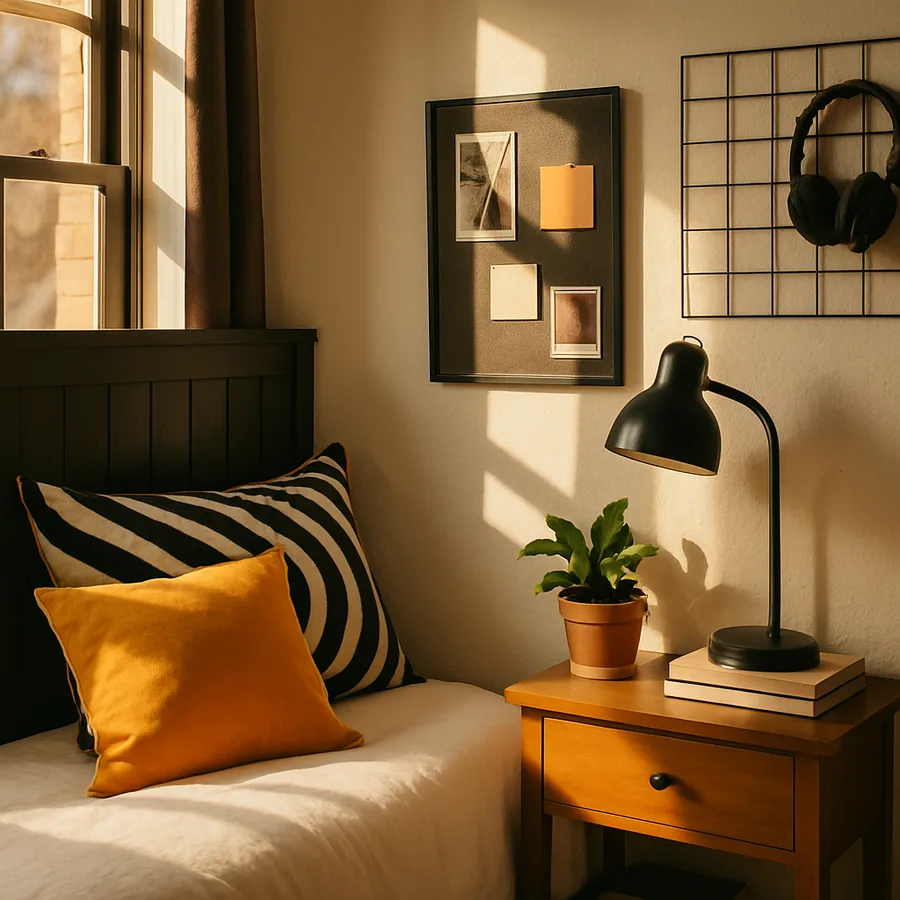
The first palette is warm white walls with charcoal trim and natural oak furniture. Layer in soft terracotta and forest green textiles for a grounded, gallery-feeling room. The second palette is deep teal walls with brass hardware and walnut furniture. Add cream linens and one statement piece of moody art. The third is soft sage green walls with white furniture and natural rattan accents. Layer in mushroom and clay textiles for a calm, plant-friendly room that suits both a quiet reader and a social butterfly.
The fourth palette is warm greige walls with black furniture and a single accent wall in deep burgundy. This one looks dramatic on a moodboard and lives easily in real life because the burgundy reads as wine rather than red. The fifth is soft clay walls with cream furniture and aged brass details, layered with cocoa brown and forest green. Each of these can be tilted feminine, masculine, or neutral through the third accessory layer, and each will photograph cleanly on social media without screaming a particular trend year.
Finish Matters as Much as Color
The same paint color in three different finishes will look like three different colors. A flat finish absorbs light and reads as the truest version of a hue but shows every fingerprint. An eggshell finish bounces just enough light to feel alive without becoming shiny, and is the right default for almost every teen wall. A satin or semigloss finish on trim and doors gives definition and survives the constant scuffs that teen life inflicts on baseboards. A high-gloss accent on a single piece of millwork or built-in can read as luxurious if used sparingly.
Ceilings deserve their own conversation. A pure white ceiling above a colored wall creates a sharp top line that can make a small room feel boxy. Consider painting the ceiling in a tone that is roughly two shades lighter than the wall color, which softens the transition and visually raises the ceiling. In rooms with low ceilings under eight feet, a wall color that wraps onto the ceiling entirely creates a cocooning, intentional effect that flatters the room rather than shrinking it. Color drenching is a technique design editors have championed for several years, and it works particularly well in teen rooms because it commits to a mood rather than apologizing for it.
Texture interacts with color too. The same charcoal paint reads as moody on smooth drywall and as fabric-like on a textured plaster wall. If your teen wants drama without a saturated hue, consider a limewash or a clay paint application on a single wall. The depth of the finish does the visual heavy lifting that a cartoon color used to do, but it ages with the dignity of a gallery wall rather than the embarrassment of a phase. The American Society of Interior Designers (ASID) has tracked the rise of mineral-based finishes in residential applications, and the price has dropped enough that a single accent wall is within reach for most households.
Accent Strategy: Where Personality Lives
Once the walls and furniture are dialed in, the accent layer becomes the playground. This is where a teen gets to express the current obsession, whether it is a particular band, a sport, a streamer, an aesthetic subculture, or a niche fandom. The discipline is to keep these expressions removable. Posters in identical thin black frames look intentional even when the contents are wildly different. Throw pillows in three coordinating colors on the bed can rotate seasonally without disrupting the room. A single statement rug grounds the room and can shift the entire mood with one swap.
Limit the number of accent colors to three at any one time. More than that and the room reads as cluttered rather than curated. The classic interior design rule of a sixty thirty ten ratio holds even in a teen room. Sixty percent neutral foundation, thirty percent secondary tone in major textiles, and ten percent loud accent in pillows, art, or accessories. Have you ever walked into a teen room and felt visually exhausted within a minute? The accent layer was almost certainly carrying more than ten percent of the visual weight.
Consider creating a dedicated gallery wall above the bed or the desk where personality can change frequently without commitment. A single picture rail or a tight grid of identical frames lets your teen rotate art without making new nail holes. This solution scales from middle school enthusiasm to college sophistication and is the kind of architectural commitment that pays dividends across the entire decade. Ask your teen to choose six pieces this season, then six different pieces next season, and you have built a self-curating room.
Light Sources Will Shift the Color You Chose
Every paint chip lies, because every paint chip is shown under fluorescent store lighting that bears no resemblance to a teen bedroom at 9 p.m. on a Tuesday. The single most important step before committing to a color is to paint a two-foot-by-two-foot test patch on at least two walls in the room and observe it across a full 24-hour cycle. Watch how it shifts under morning light, afternoon glare, overcast gloom, and evening lamp light. A soft sage that looks calming at noon can read as institutional green under cheap warm bulbs at night.
The bulb temperature in your teen's lamps and overhead fixtures will dramatically alter the perceived color of the walls. Warm white bulbs at 2700K push everything toward yellow and amber, which makes greiges look creamy and blues look muddy. Neutral white bulbs at 3500K to 4000K render colors closer to their true daylight values and are usually the right choice for bedrooms where homework happens. Mixing bulb temperatures within a single room creates visual noise that no paint color can recover from, so commit to one temperature across all fixtures.
Window orientation matters too. North-facing rooms receive cool, indirect light that pushes everything toward gray, so the walls need a touch more warmth in the base color to compensate. South-facing rooms get warm, direct light that intensifies any color, so a wall that looks pleasantly muted on a chip will be much louder on the actual wall. East-facing rooms get bright morning light and dim evenings, while west-facing rooms get the opposite, which can make a single color feel like two different rooms across the day. The Illuminating Engineering Society has published useful guidance on color rendering across orientations, and the takeaway is to always test with a real sample before committing to gallons of paint.
Conclusion: Choose Calm Walls and Loud Personality
The teen bedroom that ages well is not the one that tries to predict your teen's future taste. It is the one that gives their evolving taste a calm stage to perform on. Mature, neutral wall colors paired with grown-up furniture finishes create a baseline that can host a parade of personality phases without a single repaint. The accent layer carries all the expression and changes as fluidly as your teen does, which is exactly how a healthy, expressive bedroom should function across a turbulent decade.
The five palettes outlined here have been documented across enough professional design portfolios that you can trust them to remain readable through the late 2020s. Pair any of them with a finish strategy that respects the way light moves through the room, and you have built a foundation that will still feel intentional when your teen returns from college for the first holiday break. The National Association of Home Builders has consistently noted that bedrooms designed with longevity in mind are also among the easiest rooms to refresh quickly when life changes, and the same logic applies to teen rooms.
This weekend, do not pick a paint color. Instead, pull three large fabric swatches in your candidate accent palette and pin them to the wall above the bed. Live with them for one week and watch what your teen gravitates toward. The choice will reveal itself, and the room you build around that choice will outlast every trend cycle of the decade. Trust the foundation, let the personality breathe, and the bedroom will love your teen back for years.
More Articles You May Like


Comments
Post a Comment