Furniture Float Placement vs Wall Hugging Layout Comparison
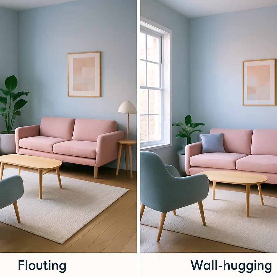
Few decisions reshape a living room more dramatically than the choice between floating furniture away from the perimeter and pushing every piece against the walls. The first arrangement creates an interior island that organizes the room around conversation; the second maximizes the open floor plate but often leaves the middle hollow and acoustically dead. Walk into any model home staged by a builder and you will see the wall-hugging instinct in action. Step into a project featured in Architectural Digest and you will almost always see the floating approach instead, because designers understand that negative space behind a sofa is not wasted space.
This guide compares the two strategies across the variables that actually matter when you live in the room every day: traffic flow, conversational distance, scale relative to the rug, lighting placement, electrical access, and the resale-friendly versatility that real estate agents quietly prize. According to a 2024 industry survey by the American Society of Interior Designers, roughly 68 percent of residential clients initially request a wall-hugging layout and roughly 72 percent change their minds after seeing a floated alternative on a scaled floor plan. The data tells the story, but the reasons behind it are worth understanding before you slide a single sofa.
What Each Layout Actually Means
A wall-hugging layout pushes every major upholstered piece, console, and bookcase against the perimeter of the room. The center of the floor is left bare or occupied only by a coffee table. Sightlines are uninterrupted, which is why this approach feels intuitive when you first move into a new space. It also tends to be the default in apartment listings because it makes a small room photograph as if it has more square footage than it does.
A floating layout, by contrast, intentionally pulls seating away from the walls and arranges it around a focal point such as a fireplace, media wall, or large window. The back of the sofa becomes a soft architectural divider, not a wall accessory. Designers refer to the gap between the sofa back and the wall as a circulation zone, and it usually measures between 18 and 36 inches depending on whether anyone needs to walk through it. This approach is the dominant recommendation in continuing-education materials published by the National Association of Home Builders for open-plan layouts where one large room must serve multiple functions.
Neither label is absolute. A hybrid is common in long, narrow rooms: the sofa floats while the media console hugs the wall opposite. The point is to recognize which strategy is doing the work in any given zone, rather than defaulting to one because it feels safer.
Traffic Flow and the 30-Inch Rule
The most overlooked variable in any furniture plan is the path people walk through the room. Industry guidance, including standards published by the American Home Furnishings Alliance, recommends a primary walkway of at least 30 to 36 inches and a secondary walkway of at least 24 inches. In a wall-hugging plan, the walkway is whatever is left in the middle, which sounds generous but often funnels foot traffic directly between the sofa and television. Anyone who has tried to watch a movie while a family member crosses to the kitchen knows how frustrating this becomes.
A floated layout deliberately routes traffic behind the sofa, turning the back of the seating into a soft wall that shields the conversation zone. Have you ever wondered why hotel lobbies almost always float their seating clusters? The answer is traffic management. Guests can cross the lobby without ever passing through the heart of a conversation, and the seating itself feels protected rather than exposed. The same logic scales down to a 14-by-18-foot family room.
Conversation Distance and Acoustic Comfort
Interior designers frequently cite a conversational sweet spot of eight feet or less between the seats of facing chairs and sofas. Beyond eight feet, voices have to project, body language softens, and the room starts to feel like a waiting area rather than a living room. Wall-hugging layouts in any room larger than about 13 feet wide almost always violate this rule, because the seating is forced apart by the dimensions of the perimeter.
Floating the furniture lets you choose the conversation distance independently of the room dimensions. In a 20-foot-wide great room, you might float two facing sofas seven feet apart with a coffee table between them, then leave a four-foot circulation band around the entire cluster. The room still reads as generous, but every conversation happens within easy speaking range. Acoustically, the soft fabric of the sofa backs also absorbs reflections that would otherwise bounce off bare drywall, which is why floated layouts tend to feel quieter even though nothing has been added to the walls.
Rug Scale, Anchoring, and Visual Weight
Rug placement is where wall-hugging layouts most often fall apart. A common mistake is choosing a rug that fits inside the seating cluster but leaves a wide moat of bare floor between the rug edge and the perimeter sofas. The seating then looks marooned, and the rug looks undersized even when it is technically large. The fix in a wall-hugging plan is to size the rug so that at least the front legs of every upholstered piece sit on it, which often requires a 9-by-12-foot rug in a room many homeowners assumed needed an 8-by-10.
Floating layouts solve the rug problem almost automatically. Because the seating is pulled inward, a properly sized rug can extend a foot or two beyond the outer edge of every piece, anchoring the entire conversation zone as a unified island. The visual weight is concentrated where the eye wants it, and the surrounding hardwood, tile, or carpet reads as a frame rather than a leftover. Houzz consistently reports rug-sizing questions among the top five searches in its living-room category, and the underlying confusion almost always traces back to whether the room is wall-hugged or floated.
Lighting, Outlets, and the Hidden Wiring Problem
Floated furniture creates one practical headache that wall-hugging plans avoid: power. A floor lamp behind a floated sofa needs an outlet in the floor or a cord run that does not become a tripping hazard. A table lamp on a console behind the sofa has the same issue. In new construction, designers routinely specify floor outlets at the centroid of the planned seating cluster; in retrofit work, low-profile floor cord covers and battery-operated lamps have made the floated approach far more practical than it used to be.
Wall-hugging layouts make lighting easy because every lamp lives next to a wall outlet, but they pay a price in atmosphere. With every lamp hugging the perimeter, the center of the room can feel underlit, especially in evenings when overhead fixtures alone produce flat, unflattering shadows. Floated layouts let you light the conversation zone directly, layering a floor lamp, a table lamp, and a low coffee-table object at three different heights to produce the warm, layered glow that makes a room feel lived-in. The National Association of the Remodeling Industry recommends planning lighting and furniture together at the design stage rather than treating them as separate decisions.
Room Size, Resale, and When to Hug the Walls
Wall-hugging is not a mistake in every room. In any space narrower than about 11 feet, floating becomes impractical because the circulation gap behind the sofa eats too much of the floor. Studio apartments, narrow urban living rooms, and bonus rooms above garages often function better with at least the largest piece pushed against a wall. The same is true of rooms where one wall is dominated by a fireplace or a media built-in that the seating must directly face.
Resale considerations cut both ways. Real estate stagers often default to wall-hugging because empty perimeters make rooms read as larger in listing photos, but designers staging luxury properties almost always float the seating to demonstrate how the room will actually be used. If you are preparing a home for sale, a wall-hugging arrangement may help in tight spaces while a floated arrangement helps buyers visualize entertaining in larger ones. Are you furnishing for the next two years or the next ten? The answer should drive the choice as much as the room dimensions do.
Common Mistakes and How Designers Fix Them
Even experienced homeowners make a handful of recurring mistakes when they choose between floating and wall-hugging layouts. The first is treating the television as the unmovable focal point. A wall-mounted screen above a fireplace becomes the center of gravity for every seating decision, and the room is then forced into whichever layout the screen demands. Designers will often relocate the television to a side wall or specify a lift cabinet so the seating can be planned around the conversation first and the screen second. The result is a room that works equally well with the television on or off.
The second recurring mistake is undersizing the rug. A floating layout demands a rug large enough to capture the full footprint of the seating cluster, including all legs of every piece. A wall-hugging layout demands a rug large enough to at least anchor the front legs of every piece. In both cases, the rug should extend at least eight to ten inches beyond the outer edges of the seating to read as intentional rather than stranded. Houzz reports that homeowners frequently buy a rug one size smaller than the room calls for and then live with the visual mismatch for years rather than admit the mistake and reorder.
The third recurring mistake is forgetting that walkways need light. A circulation band behind a floated sofa is dark and dangerous if it relies only on the room's central overhead fixture for illumination. Designers add low-voltage LED strip lighting along the floor edge of the sofa back, a wall sconce above the circulation band, or a tall floor lamp at the corner of the seating cluster. The lighting transforms the band from a tripping hazard into a quiet architectural feature. The same lighting plan in a wall-hugging layout would be redundant because the perimeter is already lit by wall-mounted lamps and any window light reaching the walls.
The fourth recurring mistake is ignoring the kids and the pets. A floating sofa with a soft-edged coffee table looks elegant in the showroom and becomes a daily hazard in a home with a toddler learning to walk or a large dog who treats the circulation band as a personal racetrack. Designers fix this by specifying rounded coffee tables, anchoring rugs with non-slip pads, and reserving the floating layout for households where the children are old enough to navigate the geometry safely.
Conclusion
The choice between floating and wall-hugging is not a stylistic preference; it is a functional decision that ripples through traffic flow, conversation comfort, rug sizing, and lighting design. Wall-hugging maximizes apparent floor area and simplifies wiring, which makes it the right call in genuinely small rooms and in spaces where the seating must directly face an architectural feature. Floating, on the other hand, organizes a larger room around the people in it, shortens conversation distances, anchors a properly sized rug, and creates the layered lighting that separates a designed room from a furnished one.
The most useful exercise before you slide a single piece is to draw the room to scale, mark the doorways and outlets, and sketch both options on tracing paper. You will quickly see whether your room is wide enough to float the sofa with a comfortable circulation band, or whether the dimensions are pushing you toward a hybrid. A simple graph-paper plan takes 30 minutes and saves the back pain of moving a 200-pound sectional three times in one weekend.
If you are still uncertain after sketching both options, hire an interior designer for a single-room consultation. Many designers offer two-hour sessions priced for exactly this kind of question, and the cost is recovered the first time you avoid buying the wrong-sized rug or the wrong-shaped sectional. Take an afternoon this weekend to measure your room, sketch both layouts on graph paper, and commit to the one that solves the most problems for the way you actually live. The right plan will quietly make the room work for years; the wrong one will nag at you every time you sit down.
More Articles You May Like


Comments
Post a Comment