Color Drenching Bedrooms in One Hue for Saturated Cocoon Effect
The bedroom should feel like a deep breath, and few interior strategies deliver that sensation as completely as color drenching: the practice of painting walls, ceiling, trim, doors, and sometimes built-ins all in a single saturated hue. The technique dissolves the visual edges of the room, eliminates the mental work of registering different planes, and produces a wraparound atmosphere that feels less like a decorated space and more like a sanctuary scooped out of pure pigment. Designers have used the approach for decades in libraries and dining rooms, but the recent migration into primary bedrooms has been one of the most quietly influential trends in residential design.
This guide explores how to plan and execute a successful color drench in your own bedroom, from selecting the hue and finish to managing trim, ceilings, and the inevitable lighting questions. The technique is technically simple but psychologically demanding; saturated color in a bedroom can either soothe or overwhelm depending on choices that look small on the swatch. Read through before you commit, then experiment with sample pots until the room tells you what it wants to be.
What Color Drenching Actually Means
A color drench is the deliberate elimination of contrast within a room by painting all surfaces in the same color, often with subtle sheen variations to differentiate planes without breaking the visual flow. Walls, ceiling, all trim (baseboard, casing, crown), interior doors, and sometimes radiators or built-in millwork all receive the same hue. The result reads as a singular volume of color rather than a room with painted features.
The technique sits in contrast to traditional contrast painting, where white trim frames colored walls and a white ceiling reads as a separate plane. Both approaches have merit, but they produce fundamentally different emotional registers. Contrast painting feels classical, defined, and architectural. Color drenching feels enveloping, modern, and atmospheric. For a bedroom, the latter often delivers the cocoon-like effect that owners are reaching for without realizing it.
Designers have noted in profiles by Architectural Digest that color drenching emerged from earlier movements toward dark dining rooms and moody libraries. The shift to the bedroom is more recent and more impactful because of the scale and use case; you spend more hours in a bedroom than almost any other room, often in low light, and the wraparound color effect intensifies in those conditions. Have you ever woken up in a bedroom and felt the color before you opened your eyes? That sensation is what well-executed drenching produces.
Choosing the Right Hue for a Bedroom Drench
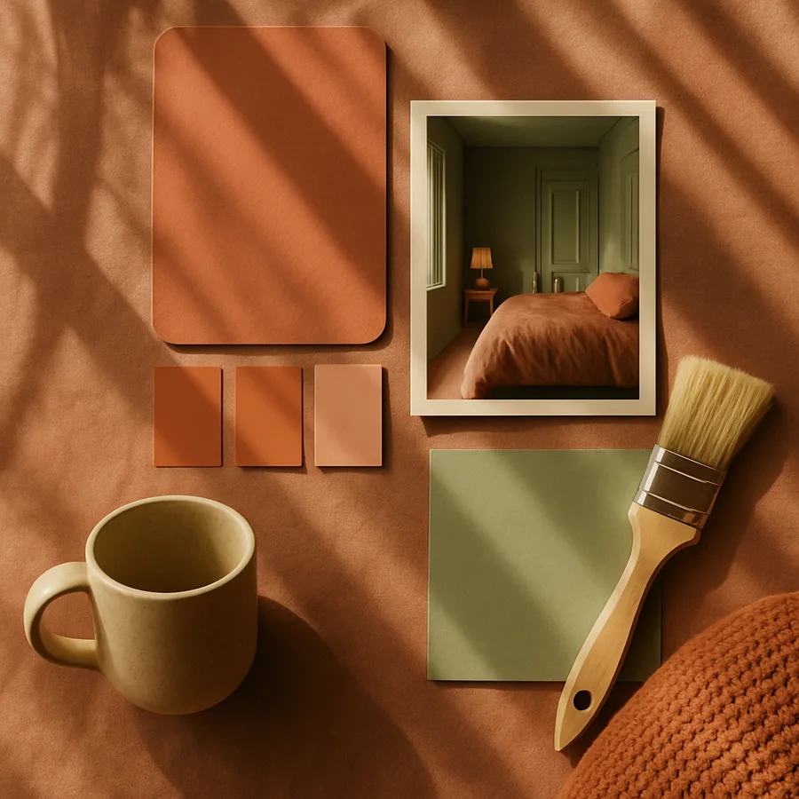
Not every color works for a drenched bedroom. The hue must read as restful when wrapped around you on all six surfaces, which rules out high-energy colors that look beautiful as accent walls but become exhausting at full coverage. Surveys cited by the Paint Quality Institute show that the most successful drenched bedrooms tend to use colors in the medium-to-deep range rather than pure light or pure dark, and lean toward earthy or muted hues rather than pure primaries.
Strong candidates include deep olive green, smoky teal, warm clay terracotta, soft chocolate brown, dusty plum, slate blue-gray, mushroom taupe, and the increasingly popular family of warm muted reds. Avoid bright primary blues, bright kelly greens, and pure orange; all overwhelm at full coverage. Pure white and pure black both work but require much more careful execution, since white drenching reveals every shadow and black drenching can feel oppressive without sufficient natural light.
Test extensively. Buy at least three sample pots of your top candidates and paint generous patches (two by three feet minimum) on multiple walls, including the wall opposite the window and a wall in shadow. Live with the samples for a full week, observing them at sunrise, midday, evening, and lamp-lit night. The single most common color regret in drenched bedrooms is choosing a hue based on how it looked in the morning when the room is actually used most often at night. The American Society of Interior Designers consistently emphasizes time-of-day evaluation for any committed color decision.
Sheen Strategy and the Question of Finish
Even within a single color, sheen variation does meaningful work in a drenched room. Most successful drenches use a matte or eggshell finish on walls and ceiling for visual softness, then a slightly higher sheen (satin or semigloss) on trim, doors, and built-ins. The color reads as identical, but the subtle reflection differences provide just enough plane definition to keep the room from feeling claustrophobic.
The traditional approach used pure flat paint on the ceiling, eggshell on walls, and semigloss on trim. Contemporary practice often softens this, using matte everywhere with semigloss confined to highly handled surfaces such as doors and window casings. The right balance depends on your color, the room's natural light, and your personal preference; experiment with sheens on your sample patches as well as colors.
Quality matters enormously in drenched rooms because the eye has nothing else to look at. Use a high-quality interior paint from a reputable manufacturer such as Sherwin-Williams, Benjamin Moore, Farrow and Ball, or similar premium lines. Better Homes & Gardens regularly tests interior paints and consistently finds that mid-tier and budget paints reveal application flaws far more visibly when used at full saturation across all surfaces. The cost difference between premium and budget paint is small relative to the labor; saving a few dollars per gallon is rarely worth the visible result.
Surface Preparation and Application Sequence
Color drenching multiplies the impact of any prep failure because the eye, freed from contrasting elements, focuses on every imperfection. Begin by repairing nail pops, drywall dings, and any seam imperfections, then sand smooth and dust thoroughly. Caulk gaps along trim and at corners; gaps that read as shadow in white-trim rooms become starkly visible cracks in drenched rooms.
Prime as needed, particularly if you are going from a light color to a deep one or covering stains. A tinted primer matched to your final color saves at least one finish coat and produces better depth in deep hues. The Master Painters Institute recommends two to three coats of finish paint over tinted primer for saturated colors to achieve full opacity and uniform sheen.
Sequence matters. Most professional painters drench in this order: ceiling first (cutting in carefully at wall joints), then walls (cutting in at trim and ceiling), then trim and doors last. Cutting in is more demanding in drenched rooms because there is no contrast to hide imperfect lines, but the absence of contrast also means small wobbles are far less visible than they would be against white trim. Use high-quality painter's tape and pull it before the paint fully cures to prevent peeling. Take your time; a drenched bedroom is a multi-day project even for professionals.
Lighting, Furniture, and the Living Room Experience
Lighting is the single most important consideration in a drenched bedroom because saturated color absorbs and reshapes light dramatically. Existing overhead fixtures often disappear visually against a dark drenched ceiling, which can feel intentional or jarring depending on execution. Most successful drenched bedrooms layer in warm-toned lamp light at multiple heights: a pair of bedside lamps, a floor lamp by a reading chair, and possibly a picture light over art or the bed.
Color temperature matters enormously. Cool LED bulbs (4000K and above) make warm drenched colors look muddy and cold drenched colors look harsh. Warm bulbs (2700K to 3000K) flatter nearly every drenched color and create the cocoon atmosphere that the technique aims for. Architectural Digest has profiled designers who specify candle-warm 2200K bulbs for drenched bedrooms to maximize the enveloping evening effect.
Furniture selection shifts in a drenched bedroom because the wall is no longer a neutral backdrop. Strong wood tones (walnut, oak, cherry) read beautifully against most drenched palettes; lighter naturals such as maple or birch can disappear. Upholstery in contrasting natural materials (linen, wool, leather) provides texture interest without breaking the color cocoon. White bedding remains the safest choice for most drenched bedrooms because it provides a clean visual rest within the saturated envelope. The National Association of Home Builders reports that bedroom textile spending has grown notably as homeowners invest in higher-quality bedding to complement upgraded paint and finish work.
Common Mistakes and How to Avoid Them
The most common drenching mistake is choosing a color that is too dark for the room's natural light. Saturated dark hues need either generous daylight or generous lamp light to read as intentional rather than gloomy. North-facing bedrooms with small windows are particularly challenging; consider lighter saturated hues (dusty rose, soft sage, warm olive) rather than the deep navies and chocolates that work better in brighter rooms.
The second common mistake is drenching only some surfaces. Painting walls and ceiling in the saturated color while keeping trim white preserves a contrast point that fights the cocoon effect. Either commit fully to the drench or use a more traditional contrast scheme; the in-between rarely satisfies. If full commitment feels too risky, start with a smaller room (a powder room, a guest bedroom, a small study) where the stakes are lower.
The third common mistake is matching every accessory to the wall color. A drenched room benefits from strategic contrast in art, bedding, lamp shades, or a single accent piece. The contrast should feel intentional and limited; one or two well-chosen contrasting elements anchor the eye and make the saturated envelope feel rich rather than monotonous. Have you ever walked into a drenched room and felt vaguely unsettled without knowing why? Often the issue is the absence of any rest point for the eye, and a single well-placed contrasting element solves it instantly.
Conclusion
A successfully color drenched bedroom is one of the most transformative interior design moves a homeowner can make. The technique is technically straightforward, the materials are inexpensive relative to most renovations, and the resulting atmosphere can completely reshape how the room functions emotionally. Where a traditionally decorated bedroom announces itself with framed walls and contrasting trim, a drenched bedroom envelops you in a single mood and lets the rest of the design fall quiet around it.
The keys to success are color choice, lighting consideration, and full commitment. A half-drenched room (walls only, walls and ceiling but contrasting trim) usually disappoints because it leaves the eye searching for completion that never arrives. Either go fully into the technique or stay with traditional contrast painting; the middle ground is the least satisfying option. Trust the experiment, paint generous samples, and let the room tell you what it wants over the course of a few quiet evenings before final commitment.
Are you weighing a bedroom drench but worried about the commitment? Try the technique in a smaller, lower-stakes room first. A guest bedroom, a home office, or a small study makes an ideal proving ground. Live with the result for a season. If the cocoon effect delights you (and for most homeowners it does), the primary bedroom becomes an obvious next step. If you find that you miss the visual energy of contrast, you have learned something important about your own preferences without committing your most-used room to an experiment.
Ready to begin? Choose three candidate colors from your favorite paint manufacturer, order sample pots, and paint generous patches across multiple walls and onto a section of ceiling. Live with them for a week, observing at every time of day. Pick the color that still appeals to you on day seven, then plan a long weekend for the project. Within a few days you can transform your bedroom from a decorated space into a saturated sanctuary, and the experience of waking up inside that envelope of color is one that few other design moves can match.
It is also worth considering the relationship between your drenched bedroom and the rest of your home's color story. A single drenched room can read as confident and intentional or as oddly disconnected, depending on how it relates to the spaces immediately adjacent. If your hallway is bright white and your drenched bedroom is deep olive, the threshold transition can feel abrupt; some designers address this by carrying a related but lighter version of the drench color into the hallway as a unifying gesture, or by drenching the connecting hallway as well in a closely related hue. Neither approach is mandatory, but a moment of consideration about how the drenched room fits into the larger circulation pattern of the home pays off in daily experience. Walking from a soft pale corridor into a saturated cocoon should feel intentional, like stepping from one mood into another, not jarring or disorienting.
Looking ahead at how drenched bedrooms age, the technique tends to be remarkably durable in the visual sense. Saturated colors paint over more easily than people fear, and a drenched bedroom can be returned to a more conventional palette in a single weekend if your taste evolves. The greater long-term consideration is that drenched rooms tend to develop strong emotional associations; many homeowners report that they form a particular attachment to a successfully drenched bedroom and find it hard to imagine the room any other way. This is not a problem so much as a feature, but it is worth knowing that the emotional weight of the technique extends beyond the simple visual transformation. The room becomes a place rather than just a space, and that quality of place-ness is exactly what the cocoon effect is designed to deliver. If you arrive at that experience, the drench has succeeded, and the modest commitment of paint and weekend labor will have produced one of the most satisfying design results available to a homeowner.
More Articles You May Like


Comments
Post a Comment