Art Deco Inspired Bathroom Tile Patterns and Black Trim Details
The Art Deco movement transformed how we think about ornament, geometry, and material luxury, and few rooms benefit from its principles more readily than the bathroom. Born in Paris in the 1920s and exported around the world through cinema, ocean liners, and skyscraper lobbies, the style fused machine-age precision with handcrafted opulence. When you bring Art Deco into a contemporary bathroom through tile patterns and crisp black trim, you tap into a vocabulary of sunbursts, fans, chevrons, and stepped silhouettes that still feels confident a century later. The bathroom is the perfect testing ground because tile is inherently graphic, water-friendly, and forgiving of bold pattern in a way few other surfaces are.
This is also a style that rewards restraint. Authentic Art Deco interiors, from the Chrysler Building elevators to the bathrooms of Miami Beach hotels, almost always pair pattern with negative space, and metallic shimmer with matte stone. Black trim acts as the punctuation that makes everything else legible. Without it, even the most beautiful tile arrangement can read as busy or floating. With it, the geometry snaps into focus and the room gains a tailored, almost couture quality. Have you ever wondered why a black pencil liner can completely change the personality of a tiled wall? The following sections walk through the tile patterns, color rules, fixture choices, and finishing touches that let you build an Art Deco bathroom that feels collected rather than themed.
The Geometric Vocabulary of Art Deco Tile
Art Deco tile is built on a small, repeatable kit of shapes: the fan, the sunburst, the chevron, the stepped pyramid, the lozenge, and the elongated hexagon. Each of these draws from a different cultural source. The fan came from Japonisme and the lacquer screens that flooded European markets after World War I. The sunburst echoed Egyptian motifs unleashed by the 1922 discovery of Tutankhamun's tomb. The stepped pyramid referenced Mesoamerican architecture and the new Manhattan skyline simultaneously. Knowing the source material helps you mix shapes without descending into pastiche.
For floors, fan-pattern tile in black, white, and a single accent like sage or oxblood is one of the most recognizable Deco moves and works beautifully in both small powder rooms and primary bathrooms. Hexagonal tile laid in a graduated color band, dark at the perimeter and lightening toward the center, recreates the cinema-marquee feeling without requiring custom fabrication. For walls, pair a field of large rectangular subway tile stacked vertically with a horizontal band of inlaid mosaic at chair-rail height. The vertical stack feels distinctly Deco because the era favored verticality, while horizontal subway feels Edwardian or mid-century by comparison.
The Victoria and Albert Museum holds one of the world's most thorough Art Deco collections, including ceramic and glass samples that still inform contemporary tile manufacturers. Studying these references is more useful than copying current Pinterest trends because it grounds your choices in the original geometry. A 2024 industry report from Tile Council of North America noted that geometric tile patterns grew 38 percent in residential specification over five years, with Art Deco motifs leading that category. The pattern itself is having a renaissance, but the difference between a project that ages well and one that feels dated will come down to proportion and color discipline.
Building a Black, White, and Metal Color Palette
The classic Art Deco bathroom palette is unapologetic: deep black, brilliant white, one saturated jewel tone, and a metallic. The metallic is doing more work than people realize. It is what separates the look from a graphic black-and-white interior in the Memphis or Bauhaus tradition and gives Art Deco its evening-wear shimmer. Polished brass, antique gold, and gunmetal nickel are the three most period-appropriate finishes, with brass being the most flexible because it warms cool palettes and reinforces warm ones.
When choosing your jewel tone, think of it as a single accent rather than a co-equal color. Emerald green appears in original Deco bathrooms in Manhattan apartments documented by the Architectural Digest archives. Oxblood, jade, and lapis blue are also defensible. The accent should appear in three places maximum, otherwise the palette flattens. A common arrangement is the accent as a tile inlay, again on a hand towel or vase, and a third time in artwork or a stained-glass detail. Avoid using the accent in cabinetry or large fixtures because it locks you in for fifteen years and dates the room the moment fashion shifts.
White selection matters more than most people expect. Deco interiors used a slightly creamy, warm white that flattered period lighting rather than the cool optical white pushed by modern minimalism. A warm white grout against black tile reads as elegant, while a cool white grout reads as clinical. What is the warmest white you have ever specified, and would you push it one shade warmer in a Deco bathroom? The answer almost always is yes.
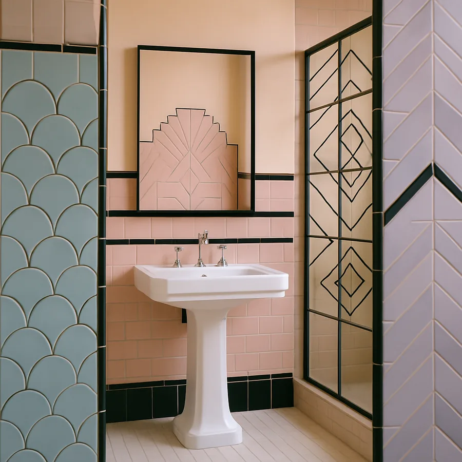
Mastering Black Trim Details
Black trim is the discipline that makes pattern legible. It defines the boundary between zones, frames mirrors and niches, and gives the eye somewhere to rest after navigating a fan-pattern floor. The trim can take many forms: a black pencil liner between field tile and a mosaic band, black grout in a small section to create a graphic block, a black painted baseboard at floor level, or black hardware that traces door and cabinet outlines. Each approach has a different intensity, and great Deco bathrooms typically deploy two or three working in concert.
Black pencil liners are the simplest entry point. Specify a matte black ceramic liner roughly half an inch wide and run it horizontally to delineate wainscoting from upper wall, or vertically to frame a shower niche. The liner should sit slightly proud of the surrounding tile to catch light and read as a true line rather than a gap. For showers, a black aluminum or stainless tile-edge profile from manufacturers documented by the American Institute of Architects in their detailing guides offers a cleaner termination than bullnose tile and reads as more period-appropriate.
Painted black trim on doors, baseboards, and window frames can transform a bathroom even before you change a single tile. Pair high-gloss black baseboards with creamy plaster walls and one panel of patterned tile, and the room reads as Deco even with humble materials. The American Society of Interior Designers, known as ASID, has published guidance on how trim color shifts perceived ceiling height. Black at the floor visually grounds the room and makes pale walls float, an effect Deco architects exploited deliberately to create the illusion of a taller ceiling in modest urban apartments.
Fixture Selection That Honors the Period
Plumbing fixtures are where many otherwise excellent Deco bathrooms go wrong. Period-correct fixtures had visible chrome or nickel plumbing, cross handles, exposed shower arms, and either pedestal sinks or legged console sinks. The contemporary instinct to box everything into a wall-hung vanity flattens the silhouette and removes the visual lift that defines the era. If you must use a vanity, choose one with tapered legs, fluted detail, or a stepped base that echoes the geometry of the tile.
Faucets should be polished brass or polished nickel with cross or lever handles and a defined collar at the base. Avoid waterfall spouts and most touchless designs because they read as 2010s rather than 1925. For tubs, a freestanding cast-iron clawfoot or a slipper tub painted black on the exterior with chrome feet is the gold standard. The Museum of Modern Art permanent collection includes industrial design from the period that demonstrates how plumbing fixtures functioned as sculpture, an idea worth carrying into your specification.
Lighting is the other fixture category that defines the room. Wall sconces with frosted glass shades in fan or fluted shapes are quintessentially Deco. Mount them at eye level flanking the mirror rather than above, which mimics theatrical dressing-room lighting and is technically superior for grooming because it eliminates under-eye shadows. A single statement pendant over a freestanding tub, in opaline glass with a brass cap, completes the composition without competing with the tile.
Mirror, Glass, and Mosaic Accents
Art Deco loved reflective surfaces. Beveled mirrors in stepped or arched frames, etched glass panels, and small format mosaic tile in metallic or pearlescent finishes all amplify light and reinforce the geometric vocabulary. A mirror with a stepped silhouette mounted above a console sink is the single highest-impact upgrade in most Deco bathroom projects because it draws the eye upward and ties the wall composition together. Smoked or bronze-tinted mirror is also period-appropriate and reads as more sophisticated than clear glass when surrounding tile is graphic.
Mosaic accents reward careful placement. A single mosaic medallion on the floor at the threshold, a horizontal band at chair-rail height, or a back panel inside a shower niche are all defensible locations. Avoid the temptation to mosaic an entire wall because the pattern density overwhelms the rest of the composition. Penny rounds in alternating black and white, micro-hex in a sunburst pattern, or small subway tile in a herringbone with a single contrasting line all work. The Smithsonian archives include photographs of original 1920s and 1930s American bathrooms that show how restrained these mosaic moments actually were in practice, despite the era's reputation for ornament.
Etched or sandblasted glass on shower enclosures, transoms, and even cabinet panels adds period authenticity. Custom etching with a fan or sunburst motif is surprisingly affordable from regional glass studios and elevates an otherwise standard shower into a defining feature. According to a 2025 specification survey by Houzz Pro, 27 percent of high-end bathroom remodels now include some form of decorative glass detail, up from 11 percent five years ago.
Bringing It All Together in Small Bathrooms
The smallest powder room is often the best place to commit fully to Art Deco because the scale forces editing and the room is experienced in short, punchy visits rather than long stays. In a five-by-six powder room, a single statement floor in fan-pattern tile, a black painted vanity with brass hardware, a stepped mirror, and two frosted sconces is a complete program. Walls can be a warm white plaster or a deep emerald lacquer, with no pattern competing for attention. The tile does the heavy lifting.
For larger primary bathrooms, the move is to designate one or two zones for pattern and let the rest stay calm. The tub alcove, the shower, or a single accent wall behind the vanity can carry the full Deco vocabulary, while flanking surfaces stay quiet. This treatment also helps with resale because the patterned zones can be updated more easily than full-room commitments. How comfortable are you committing to bold pattern when you know you might sell in seven years? Designating a zone rather than a whole room is the answer most professional designers offer their clients.
Storage is the unglamorous detail that determines whether the bathroom actually functions. Tall, shallow cabinetry with fluted glass doors, recessed niches with black liner trim, and a single drawer below the console sink are period-appropriate options that hold real life. Avoid open shelving in a Deco bathroom because the era favored concealed storage and exposed tile, the opposite of contemporary farmhouse and Scandinavian sensibilities. The result is a room that reads as composed even when the family has just left for the day.
Conclusion
Art Deco bathrooms succeed when the geometry is disciplined, the palette is restricted, and the black trim does its job of framing pattern without competing with it. The style has lasted a century because it balances ornament with engineering, and that balance is exactly what gives it staying power in a contemporary home. A well-executed Deco bathroom does not date the way mid-century or farmhouse bathrooms do because the underlying logic is mathematical rather than nostalgic. The fan, the sunburst, and the chevron will still feel confident in 2050.
The most common mistake is over-decorating, treating the bathroom like a stage set rather than a daily-use space. Resist the urge to add every motif you love. Pick one tile pattern, one metallic, one accent color, and one signature detail like a stepped mirror or fluted vanity, and let those four choices carry the room. Restraint is what separates a sophisticated Deco bathroom from a hotel-themed restaurant, and the difference is visible the moment you walk in.
Start with one zone, the floor or the shower, and let the rest of the room develop in dialogue with that anchor decision. Source authentic-looking materials from established tile suppliers, specify warm white grout, and invest in real metal hardware rather than coated alternatives that will tarnish unevenly. The cumulative effect of these small choices is a bathroom that feels collected over decades rather than purchased in a single weekend. If you are ready to begin, schedule a consultation with a tile specialist this month and ask them to lay out three pattern options in person before you commit. The right Art Deco bathroom is closer than you think, and the journey starts with one well-chosen tile.
More Articles You May Like


Comments
Post a Comment