Warm White vs Cool White Paint: How Undertones Change a Room
The Hidden Complexity Behind Every White Paint Chip
Walk into any paint store and ask for white, and you will be confronted with a fan deck containing anywhere from 50 to 150 variations that all claim to be white. This overwhelming selection is not a marketing ploy designed to confuse you. Each of those whites carries a distinct undertone, a subtle secondary hue blended into the base pigment that fundamentally alters how the paint interacts with light, furnishings, and the human eye. The difference between a warm white with yellow undertones and a cool white with blue undertones can transform the same room from cozy and inviting to crisp and expansive, or from serene and modern to dingy and cold, depending on how well the undertone aligns with the room's conditions.
The American Society of Interior Designers (ASID) identifies white paint selection as one of the top three sources of dissatisfaction in residential painting projects, with homeowners frequently reporting that the white they chose looks nothing on their walls like it did on the sample chip. This disconnect almost always traces back to undertones that the homeowner did not detect on the small chip but that become unmistakable when spread across 400 square feet of wall surface. A warm white that reads as pleasantly creamy on a two-inch square can look distinctly yellow on a full wall, while a cool white that seemed clean and neutral on the chip can turn icy and sterile at scale. Understanding undertones before you buy your first gallon is the single most effective way to avoid this expensive and frustrating outcome.
The physics behind undertones is straightforward even if the visual effects are complex. White paint is created by combining titanium dioxide, the primary whitening pigment, with small quantities of other pigments that shift the base toward warm or cool. Adding trace amounts of yellow oxide or raw umber produces warm whites that range from buttery cream to barely-there gold. Adding blue, green, or violet pigments creates cool whites that span from icy silver to soft dove gray. These additions are measured in fractions of a percent, yet they produce effects that dominate the character of an entire room because white surfaces reflect so much light that even minute tonal shifts become amplified across every surface they bounce off.
The practical question facing every homeowner is not whether warm or cool white is objectively better, because neither is. The question is which undertone family will serve the specific conditions of the room you are painting: its orientation, its light sources, the colors and materials already present in the space, and the emotional atmosphere you want to create. The sections that follow will give you a framework for making that assessment with confidence rather than relying on guesswork or the subjective recommendation of a paint store employee who has never seen your room.
How Natural Light Direction Dictates Undertone Performance
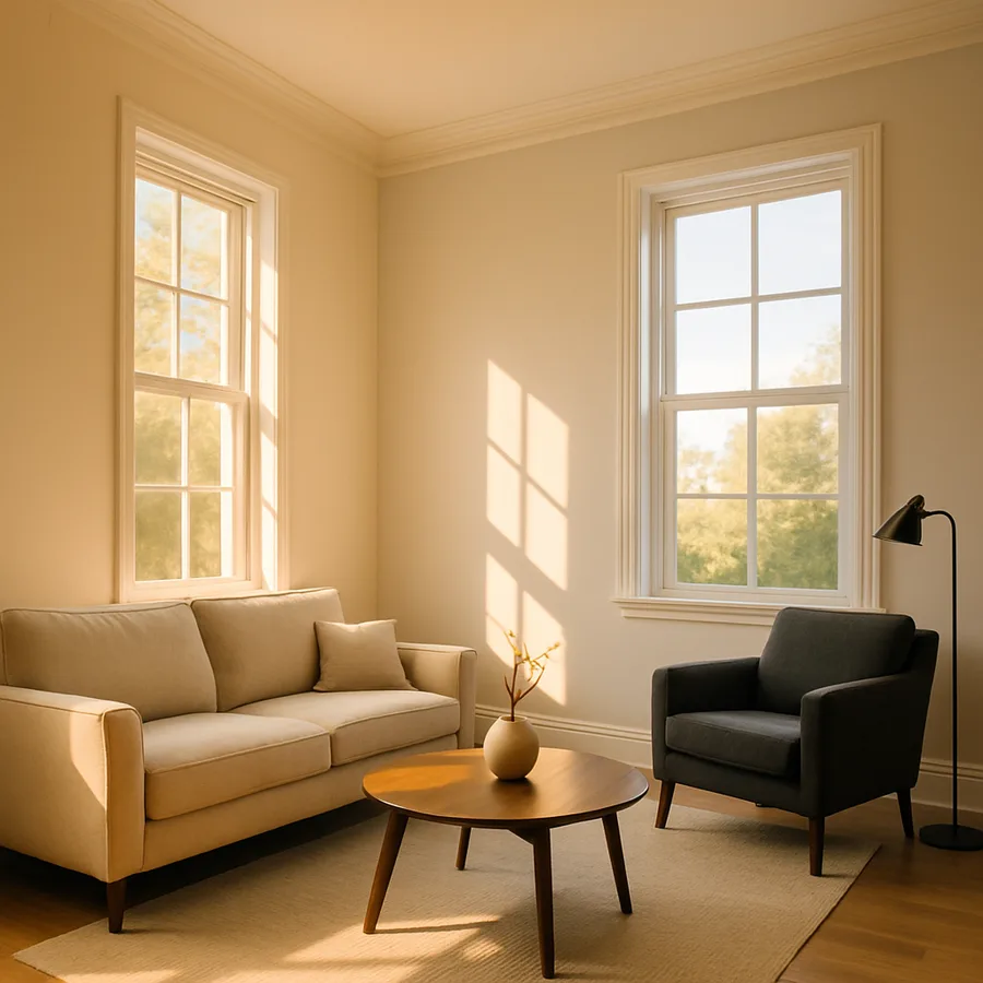
The compass orientation of a room's primary windows is the single most influential factor in how a white paint's undertone will perform, and it is the factor that paint chips viewed under fluorescent store lighting completely fail to communicate. North-facing rooms receive indirect, diffused light with a distinctly cool, blue-gray quality throughout the day. This cool ambient light intensifies the undertones of cool white paints, pushing them further toward blue or gray than they appear on the chip. A cool white that looked perfectly neutral in the store can read as chilly, almost blue, on the walls of a north-facing bedroom. Warm whites are generally the safer choice for north-facing rooms because the yellow or cream undertone counterbalances the blue cast of the natural light, producing a result that reads as a true, balanced white.
South-facing rooms receive the warmest, most abundant natural light of any orientation, with strong golden tones especially pronounced in the morning and late afternoon. This warm light amplifies the undertones of warm white paints, sometimes pushing them past the threshold from subtly creamy into visibly yellow. In south-facing rooms, a moderately warm white can look noticeably butterscotch during golden hour, which may or may not be the effect you want. Cool whites tend to perform exceptionally well in south-facing spaces because the warm natural light tempers their blue undertone, creating a balanced, luminous white that feels bright without being cold. The abundant light in these rooms also ensures that cool whites never look dingy or shadowy, which is a risk in rooms with less natural light.
East-facing rooms present a split personality that requires careful planning. Morning light in an east-facing room is warm and golden, making warm whites glow beautifully and cool whites feel clean and fresh. By afternoon, however, the direct light disappears and the room receives only reflected ambient light, which tends toward cool and flat. This shift means that a warm white will look quite different in the same room at 8 AM versus 4 PM, cycling between golden warmth and neutral calm. If you spend most of your time in an east-facing room during mornings, a cool white might provide the best all-day balance by preventing the space from looking overly warm during the sun-drenched hours. If evenings are your primary use time, a warm white will prevent the room from feeling lifeless after the direct light fades.
West-facing rooms reverse the east-facing pattern, starting cool and flat in the morning and flooding with intense amber light in the afternoon and evening. The Better Homes and Gardens paint selection guide notes that west-facing rooms require the most careful undertone testing because the dramatic swing in light temperature across the day means the paint will present two distinctly different characters. Test your paint samples in a west-facing room during both morning and late afternoon before committing. A versatile mid-tone white with a very slight warm undertone often performs best in west-facing rooms, offering enough warmth to prevent morning coolness without turning orange during the evening golden hour. Have you tested your paint sample at different times of day, or did you make your decision based on a single viewing?
Artificial Lighting and Its Power to Override Your Paint Choice
Natural light may set the baseline, but artificial lighting takes over for the many hours each day when windows are dark or curtains are drawn. The color temperature of your light bulbs, measured in Kelvin, interacts with paint undertones just as powerfully as sunlight does, and mismatches between bulb temperature and paint undertone are responsible for a large share of the "my white looks wrong at night" complaints that paint professionals hear constantly. Understanding this interaction puts you in control of how your room looks around the clock, not just during the handful of hours when natural light is favorable.
Bulbs rated at 2700 Kelvin, the standard warm white used in most residential settings, emit light with a pronounced amber cast that enhances warm paint undertones and suppresses cool ones. Under 2700K lighting, a warm white paint will look its richest and most inviting, with the cream or yellow undertone amplified into a cozy glow. A cool white paint under the same bulbs will have its blue or gray undertone masked, potentially looking flat, muddy, or strangely greenish depending on the specific pigment combination. If your home is lit primarily with 2700K bulbs and you want a cool white on the walls, you will either need to accept that the coolness will be invisible at night or switch your bulbs to a higher color temperature.
Daylight-temperature bulbs rated at 5000 Kelvin and above produce a blue-white light that reverses the dynamic. Cool whites look crisp and clean under daylight bulbs, while warm whites can appear slightly dirty or yellowed. The American Lighting Association reports that residential use of higher-Kelvin bulbs has increased by approximately 35 percent over the past five years, driven by the popularity of LED technology that makes a wide range of color temperatures easily available and affordable. If you have already invested in 5000K lighting or plan to, cool white paints will be your natural allies. The combination produces a bright, gallery-like atmosphere that suits modern and minimalist interiors particularly well.
The most versatile approach, and the one recommended by most interior designers, is to select bulbs in the 3000 to 3500 Kelvin range, which provides a neutral-warm light that neither dramatically enhances nor suppresses either undertone family. This middle ground gives you the widest latitude in paint selection because the light itself introduces less bias into the equation. It also produces the most accurate color rendering for furnishings, artwork, and skin tones, which matters for living spaces where people gather. If you have the flexibility to choose your lighting before or alongside your paint, aiming for this neutral-warm range simplifies every color decision that follows.
Reading Undertones Against Existing Furnishings and Finishes
Paint does not exist in isolation on your walls. It sits alongside wood floors, stone countertops, upholstered furniture, window trim, and cabinetry, all of which carry their own undertones that will either harmonize with or clash against your white. The principle at work is simultaneous contrast: when two colors sit adjacent to each other, the eye exaggerates their differences rather than blending them. A warm white wall next to a cool gray sofa will look warmer than it actually is because the eye pushes each color further from the other along the warm-cool spectrum. This means you cannot evaluate a white paint's undertone in isolation; you must assess it in context with the dominant colors and materials already present in the room.
Wood tones are among the most influential factors in undertone selection because floors and trim occupy so much visual real estate. Red-toned woods like cherry, mahogany, and certain stains of oak have warm undertones that pair naturally with warm white paints, creating a unified palette that feels cohesive and rich. Painting cool white walls above a warm cherry floor can create a dissonant boundary where the wall appears bluish and the floor appears overly orange because simultaneous contrast is amplifying the temperature difference between the two surfaces. If your wood elements lean warm, your whites should lean warm. If your floors are cool-toned, such as gray-washed oak, whitewashed pine, or dark walnut with its neutral-to-cool character, cool whites will integrate more seamlessly.
Kitchen and bathroom selections involve additional materials that complicate the undertone equation. Marble countertops with gray veining read cool and pair logically with cool whites, while granite or quartz with golden or beige veining calls for warm whites. Stainless steel appliances have a cool, blue-gray character that supports cool white walls, while brass and gold hardware pull the room toward warm whites. The National Kitchen and Bath Association (NKBA) advises designers to establish the undertone direction of a kitchen or bathroom based on the most expensive and permanent elements first, typically countertops and cabinetry, and then select wall colors that follow the same temperature. Painting against the established temperature of your fixed elements is the most common cause of kitchens that feel visually unresolved despite having individually beautiful components.
Fabric and upholstery are easier to change than floors and counters, but they still influence how your white walls perform in the short term. A linen sofa with ivory tones, jute rugs, and woven throw blankets create a warm material context that warm whites complete beautifully. A room anchored by charcoal upholstery, steel-legged furniture, and concrete or glass accessories establishes a cool context where cool whites feel appropriate and grounded. If your furnishings are a deliberate mix of warm and cool elements, a balanced white with minimal undertone in either direction, sometimes marketed as "true white" or "designer white," can serve as neutral ground that does not bias the room in either temperature direction. Does your room lean predominantly warm or cool when you mentally subtract the wall color from the equation?
Specific Paint Recommendations and Testing Protocols
Theory is essential, but at some point you need to stand in a paint aisle and choose a specific can. Among warm whites, the most consistently well-regarded options include Benjamin Moore White Dove OC-17, which carries a gentle yellow-cream undertone that works in virtually any warm context, and Sherwin-Williams Alabaster SW 7008, a slightly warmer option with a hint of amber that excels in north-facing rooms and alongside wood tones. For rooms that need warmth without any risk of yellowness, Benjamin Moore Simply White OC-117 offers one of the most balanced warm whites available, with just enough cream to avoid feeling cold while staying firmly in the white family rather than drifting into off-white territory.
Among cool whites, Benjamin Moore Chantilly Lace OC-65 is widely considered one of the cleanest, most neutral cool whites on the market, with an undertone so faint that it reads as pure white in most lighting conditions. Sherwin-Williams Extra White SW 7006 is slightly brighter and more definitively cool, performing well in south-facing rooms and under warm artificial light where its blue undertone gets softened into clean neutrality. For a cool white with a touch more complexity, Farrow and Ball Wevet No. 273 introduces a whisper of gray that prevents the wall from feeling stark while maintaining a distinctly cool temperature. The Painting and Decorating Contractors of America (PDCA) recommends testing at least three whites from your chosen temperature family before committing, because the differences between similar whites become clear only when compared side by side on the actual wall.
The testing protocol matters as much as the selection. Purchase sample pots or peel-and-stick swatches rather than relying on small chips, and apply them to at least two walls in the room, ideally one that receives direct light and one that stays in relative shadow. A 12-by-12-inch minimum swatch is necessary for your eye to register the undertone accurately; anything smaller and the surrounding wall color will overpower the sample. Observe each sample at four times: morning, midday, late afternoon, and evening under artificial light. Take photographs at each interval using your phone's camera with the flash off, which provides a more objective record than memory alone. This four-observation protocol takes 24 hours but saves weeks of regret and hundreds of dollars in repainting costs.
One advanced technique that professionals use is to paint the sample onto a piece of white foam board or poster board rather than directly on the wall. This portable sample can be moved around the room and held against different surfaces, flooring, countertops, fabric swatches, to test undertone compatibility before any paint touches the wall. It also allows you to carry the sample between rooms if you are selecting a single white for the entire home, checking how it performs under each room's unique lighting conditions. This approach is especially valuable in open concept homes where the same white will be seen under north-facing kitchen light and south-facing living room light simultaneously, a situation where a white that works in one zone might fail in the other.
Mixing Warm and Cool Whites Across Connected Spaces
The question of whether you can use different white temperatures in different rooms of the same home requires a nuanced answer. In homes with clearly separated rooms connected by hallways and doorways, using a warm white in the bedroom and a cool white in the bathroom is entirely feasible because you rarely see both surfaces simultaneously. The transition happens through a doorway that resets the eye, and each room's lighting conditions can be optimized independently. Where this strategy breaks down is at the threshold itself: if you can stand in the doorway and see both colors at once, the temperature difference will be visible, and the warmer white will look yellow while the cooler white will look blue by comparison.
In open concept layouts, mixing white temperatures is significantly riskier and generally inadvisable. Because multiple zones share the same sightlines, a warm white on the living room walls and a cool white on the kitchen walls will create a visible color break that reads as a mistake rather than a design choice. The eye is remarkably sensitive to temperature shifts in neutral colors, and what might seem like a subtle difference on paint chips becomes an obvious inconsistency when the two whites meet at a corner or compete across an open room. For open layouts, commit to a single white throughout and use accent walls, furnishings, and lighting to create zone differentiation rather than relying on competing white tones.
There is one exception to the single-white-in-open-plans rule that can work effectively. Using the same white on walls throughout but switching to a different temperature white on the ceiling creates a deliberate contrast that reads as a design decision because the horizontal and vertical planes are visually distinct. A warm white on the walls with a slightly cool white on the ceiling can make the ceiling feel higher and the room feel more spacious, while the reverse, cool walls and a warm ceiling, creates a cocooning effect that some people find comforting in living rooms and bedrooms. This wall-ceiling temperature split should be subtle, no more than two or three shades apart on the same brand's white spectrum, to avoid the ceiling looking like it belongs to a different room.
When selecting a single white for an entire home, the most practical approach is to identify the room with the most challenging lighting, typically the north-facing room or the room with the least natural light, and choose a white that performs well there. A white that looks good in difficult light will look even better in rooms with more generous natural illumination. This "design for the worst case" strategy prevents the common problem of selecting a white in your sunniest room and then discovering that it looks completely different in the hallway, the powder room, or the north-facing guest bedroom. The ASID residential design recommendations support this approach, noting that whole-home color continuity starts with testing in the most demanding conditions rather than the most flattering ones.
Conclusion: Choosing With Your Eyes Open to What Light Reveals
The difference between a warm white and a cool white is invisible on a paint chip under store lighting and unmistakable on your walls under real conditions. This gap between expectation and reality is what makes white paint selection so notoriously frustrating, and it is entirely bridgeable once you understand that undertones are not a property of the paint alone but an interaction between pigment, light, and surrounding materials. A warm white is not inherently better or worse than a cool white; each serves different rooms, different light conditions, and different aesthetic goals with equal effectiveness when chosen with awareness.
The practical framework is straightforward even if the variables are numerous. Assess your room's compass orientation and primary light sources first, as these set the baseline for how any undertone will perform. Inventory the fixed materials in the space, floors, counters, trim, and note whether they lean warm or cool. Match your white's undertone to the dominant temperature of these existing elements. Test your top three candidates with large samples observed at multiple times of day. This methodical approach replaces the anxiety of guessing with the confidence of informed decision-making.
White is the most popular wall color in residential interiors worldwide, yet it remains one of the most misunderstood. The homeowner who dismisses all whites as interchangeable will almost certainly end up with walls that feel slightly off without knowing why. The homeowner who takes the time to understand the warm-cool spectrum and test accordingly will achieve walls that feel effortlessly right, a background so perfectly calibrated to the room that it becomes invisible in the best possible way. That invisible rightness is the hallmark of a well-chosen white, and it begins with respecting the undertone.
More Articles You May Like


Comments
Post a Comment