The Psychology of Color in Office Interior Design: Boosting Creativity
The Science Behind Color and Cognitive Performance
Color is not decoration. It is a stimulus that directly affects the nervous system, influencing mood, energy levels, concentration, and creative thinking in measurable ways. Decades of research in environmental psychology have established that the colors surrounding us during work hours shape our cognitive performance whether we are conscious of their effects or not. A landmark study conducted at the University of British Columbia demonstrated that blue environments enhanced creative performance on brainstorming tasks by a significant margin compared to red environments, which instead improved performance on detail-oriented tasks requiring precision. This finding alone should give pause to any organization that treats office color as a purely aesthetic choice.
The physiological mechanisms behind color's effects are well documented. Warm colors like red and orange stimulate the sympathetic nervous system, increasing heart rate, blood pressure, and alertness. Cool colors like blue and green activate the parasympathetic system, promoting relaxation, open-mindedness, and contemplative thinking. These are not subtle effects detectable only in laboratory conditions; they manifest in real workplaces with real consequences for productivity and wellbeing. The American Psychological Association has published extensive reviews confirming that environmental color influences both cognitive task performance and subjective emotional states across diverse populations and settings.
Understanding these mechanisms reveals why the default all-white or all-gray office is such a poor choice for environments where creative work happens. Neutral environments fail to provide the chromatic stimulation that the brain needs to enter states of heightened creativity or focused concentration. They are, in a sense, sensory deprivation environments that leave the nervous system understimulated and the mind adrift. This does not mean that every surface should be painted in saturated primary colors, but it does mean that thoughtful, strategic color deployment is a legitimate performance-enhancement tool, not a frivolous indulgence.
The relationship between color and creativity specifically deserves closer examination. Creative cognition requires a particular mental state characterized by openness, associative thinking, and a willingness to explore unconventional ideas. Research consistently shows that this state is more accessible in environments that feel expansive, calm, and stimulating without being stressful. Cool tones, particularly blues and greens, create this exact psychological context. They lower arousal just enough to reduce anxiety and self-censorship while maintaining sufficient engagement to prevent mental drift. The result is a cognitive sweet spot where ideas flow more freely and connections form more readily.
Blue: The Foundation of Focused Creativity
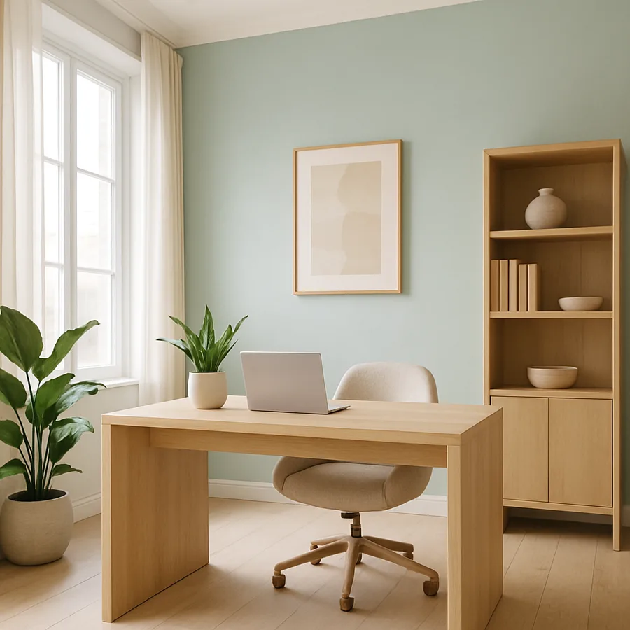
Blue is the workhorse of creative office design, and its versatility across the spectrum from pale sky to deep navy makes it adaptable to virtually any design context. At the lighter end, blue creates an atmosphere of openness and tranquility that supports brainstorming, ideation, and the kind of divergent thinking that generates novel solutions. Deeper blues convey authority, trust, and stability, making them effective in meeting rooms where important decisions are discussed and in spaces where clients form impressions of the organization. The American Society of Interior Designers identifies blue as the most universally appealing color in commercial interiors, with the broadest acceptance across age groups, genders, and cultural backgrounds.
The productivity benefits of blue environments have been documented across multiple studies and workplace contexts. Research from the University of Exeter found that workers in blue-enriched environments demonstrated improved memory recall and sustained attention compared to those in neutral environments. These cognitive benefits compound over the course of a workday, meaning that a blue-influenced office does not just feel better for a few minutes after entry but continues to support performance throughout sustained periods of work. For roles that require both creative thinking and sustained focus, such as design, writing, engineering, and strategic planning, blue provides the ideal chromatic foundation.
Implementing blue in an office does not require painting every wall from floor to ceiling in a single shade. The most sophisticated applications use blue as a recurring accent within a broader palette, creating visual rhythm and cohesion without monotony. A feature wall in a deep teal, upholstery in soft cerulean, carpet tiles with blue undertones, and artwork incorporating various blue hues all contribute to a blue-influenced environment while allowing other colors to play supporting roles. The goal is to establish blue as the dominant chromatic theme in spaces where focused creativity is the primary activity, not to create a monochromatic box.
Have you ever noticed how differently you feel working in a blue-toned room versus a warm-toned one? If you have not had the opportunity to compare, consider a simple experiment: spend a week working near a blue feature element, whether that is a painted wall, a large piece of art, or even a desktop accessory in a saturated blue, and observe any changes in your concentration and creative output. The effects are subtle enough to escape conscious notice during any given hour but significant enough to register over the course of several days. This personal observation can be more persuasive than any research paper in motivating meaningful color changes in your workspace.
Green: The Natural Catalyst for Innovation
Green occupies a unique position in the color spectrum as the hue most strongly associated with the natural world. This association is not merely cultural; it is rooted in human evolutionary history, during which green environments signaled the presence of water, food, and shelter. The contemporary office benefits from this deep biological programming when green is introduced thoughtfully. Research published in the journal Personality and Social Psychology Bulletin found that brief exposure to the color green, even in the form of a colored surface rather than actual vegetation, enhanced creative performance on subsequent tasks. The mechanism appears to involve a subconscious relaxation response triggered by the color's natural associations, which lowers the psychological barriers that inhibit creative risk-taking.
The practical application of green in office design takes multiple forms, from paint and textile choices to the integration of living plants. Living greenery provides the strongest biophilic impact because it delivers the color in its most natural and dynamic form, changing subtly with growth and light conditions in ways that painted surfaces cannot. However, painted green accents, green upholstery, and green accessories all contribute to the chromatic environment and can be deployed in spaces where living plants are impractical. The key is choosing greens that feel organic rather than synthetic: sage, olive, forest, and moss tones read as natural, while neon or electric greens can feel jarring and counterproductive.
Green works particularly well in transitional spaces and areas designed for recovery between periods of intense work. Break rooms, corridors, stairwells, and outdoor-adjacent zones all benefit from green's restorative qualities. The International Interior Design Association has highlighted the concept of "restorative design," which specifically addresses the need for environments that replenish cognitive resources depleted by sustained mental effort. Green is central to this concept, serving as a visual signal that tells the brain it is safe to relax, recover, and prepare for the next bout of focused work.
Combining green with blue creates a palette that maximizes both creative stimulation and cognitive restoration. These adjacent colors on the spectrum blend seamlessly, avoiding the visual conflict that complementary color pairings can produce. A workspace that transitions from blue-dominant focus areas to green-influenced recovery zones creates a natural rhythm that mirrors the brain's own cycles of effort and rest. This chromatic zoning does not need to be dramatic or abrupt; even subtle shifts in accent colors between zones can be enough to cue the appropriate mental state as people move through the office.
Warm Tones: Strategic Activation for Collaboration
While cool colors dominate the research on creative performance, warm tones have an essential role to play in the complete office color strategy. Yellow, orange, and their intermediate shades are activating colors that stimulate energy, enthusiasm, and social engagement. These qualities make them ideal for spaces dedicated to collaboration, brainstorming, and informal interaction, where the goal is not quiet contemplation but lively exchange. A team huddling around a whiteboard to map out a new project benefits from the energizing effects of warm accents in ways that a blue-toned room might not provide. The challenge is using warm colors purposefully and in measured quantities, because overexposure can tip from stimulating into agitating.
Yellow, specifically, has a complicated reputation in workplace design. Small doses of warm yellow are associated with optimism, energy, and intellectual stimulation. The Pantone Color Institute has noted that yellow environments tend to feel more welcoming and approachable than cooler alternatives, making them effective in reception areas and social spaces where first impressions matter. However, research also indicates that prolonged exposure to intense yellow can increase anxiety and irritability. The solution is restraint: use yellow as an accent rather than a dominant color, and opt for softer, warmer yellows (think golden or honey tones) rather than harsh, saturated primary yellows.
Orange bridges the gap between the warmth of red and the cheerfulness of yellow, and its associations with creativity, enthusiasm, and social interaction make it a natural choice for collaborative environments. Conference rooms, team workspaces, and creative studios all benefit from orange accents that encourage energetic participation without the intensity that red can bring. Orange upholstery on lounge seating, orange acoustic panels in brainstorming rooms, or an orange feature wall in a team kitchen all introduce warmth and energy in controlled, purposeful doses. The color works especially well when paired with neutral grays and whites that prevent the warmth from becoming overwhelming.
The strategic deployment of warm colors in an otherwise cool-toned office creates contrast that heightens the impact of both palettes. Moving from a blue-green focus area into an orange-accented collaboration zone provides a genuine sensory shift that signals a change in mode. This chromatic transition reinforces the behavioral expectations of each space: the cool zone says "concentrate here," while the warm zone says "engage and interact here." What would it mean for your team's daily experience if the physical environment actively supported these transitions rather than presenting a uniform visual experience regardless of the activity at hand?
The Role of Neutrals and the Danger of Colorlessness
Neutral colors, including whites, grays, beiges, and taupes, form the necessary background against which more expressive colors perform their psychological work. Without neutrals, a color-rich office would feel chaotic and visually exhausting. Neutrals provide visual rest, create contrast that makes accent colors pop, and lend a sense of professionalism and sophistication that pure color cannot achieve alone. The relationship between neutrals and accent colors is analogous to the relationship between silence and music: each gives the other meaning, and neither works as well in isolation.
However, there is a critical distinction between using neutrals strategically and defaulting to them out of indecision or fear. An office that is entirely neutral, all white walls, gray carpet, and beige furniture, is not a "safe" color choice; it is an abdication of color's potential. Research from the University of Texas at Austin by color researcher Nancy Kwallek found that workers in white and gray offices reported more errors and greater feelings of sadness and depression compared to those in colored environments. The all-neutral office is not calm; it is depriving occupants of the chromatic stimulation their brains need to function optimally. This finding should serve as a strong corrective to the widespread belief that "keeping it neutral" is a risk-free strategy.
The most effective use of neutrals involves selecting tones with deliberate undertones that harmonize with the accent palette. A warm gray with taupe undertones pairs beautifully with terracotta and gold accents. A cool gray with blue undertones provides the perfect backdrop for cobalt and teal. Pure white, while sometimes appropriate for its crisp, clean quality, can feel clinical and cold in large doses; off-whites with warm or cool undertones are almost always more successful in creating inviting environments. These subtle distinctions in neutral selection may seem minor, but they fundamentally affect how the accent colors are perceived and how the overall space feels.
Black deserves mention as a neutral that carries particularly strong psychological weight. Used sparingly, black adds sophistication, definition, and visual grounding to an interior. Black frames around doorways, black hardware on cabinetry, and black furniture legs create crisp lines that organize the visual field and prevent the softness that can result from an all-light palette. Used excessively, however, black absorbs light, reduces the perceived size of spaces, and can create an oppressive atmosphere. The rule of thumb for black in office environments is to treat it as seasoning rather than a main ingredient: present enough to add depth and definition, never so dominant that it darkens the mood.
Implementing a Color Strategy: Practical Steps
Translating color psychology research into a coherent office design requires a systematic approach that begins with understanding the specific activities, moods, and behaviors each zone of the office should support. Start by mapping your floor plan and labeling each area with its primary function: deep focus, collaboration, client meetings, social interaction, recovery, and so on. Then assign a primary color family to each function based on the research principles discussed above. Focus areas get cool blues and greens, collaboration spaces get warm accents, social zones get energizing yellows and oranges, and recovery areas get soft, natural greens and neutrals.
Testing colors before committing to them is essential, and the importance of seeing colors in situ cannot be overstated. Paint chips and digital renderings are useful starting points, but they are unreliable predictors of how a color will look on an actual wall under actual lighting conditions. Purchase sample pots and paint large test patches, at least two feet by two feet, on the walls of the intended space. Observe them at different times of day under both natural and artificial light. Live with them for several days before making a final decision. The color that looked perfect in the store can look entirely different in your specific space, and discovering this after the painters have finished is an expensive lesson to learn.
Material colors must be considered as part of the total chromatic environment, not just wall paint. The wood tone of your desks, the color of your carpet, the hue of your ceiling tiles, the shade of your furniture upholstery, and even the warmth or coolness of your lighting all contribute to the perceived color of the space. A careful designer accounts for all of these elements in the color strategy, ensuring that they work together harmoniously. Houzz commercial design professionals recommend creating a comprehensive materials palette board that includes physical samples of every finish in the project, viewed together under the actual lighting conditions of the space, to verify that the complete ensemble achieves the intended effect.
Finally, remember that color strategy is not permanent. One of the great advantages of using color as a performance tool is that it is relatively easy and inexpensive to change. If a particular color choice is not producing the desired effect, repainting a wall or replacing upholstery cushions is far simpler than reconfiguring a floor plan or replacing furniture systems. This low-commitment quality makes color experimentation accessible even to organizations with limited budgets. Start with one zone, measure the response through employee feedback and observation, and use that evidence to inform decisions about the next zone. Over time, this iterative approach produces a color environment that is precisely tuned to your organization's unique needs and culture.
Conclusion: Color as a Creative Performance Tool
The evidence is clear: color is not a superficial design element but a functional tool with measurable effects on creativity, concentration, mood, and interpersonal dynamics. Organizations that treat office color as an afterthought or default to safe neutrals are leaving significant performance potential on the table. The research from institutions like the University of British Columbia, the University of Texas, and the University of Exeter provides a robust scientific foundation for making color decisions that go beyond personal preference and into evidence-based design strategy.
The practical framework for applying this knowledge is straightforward. Map your workspace by function, assign color families based on the cognitive and emotional states each area should support, test your choices in situ before committing, and remain open to adjustment based on real-world feedback. Blue and green form the foundation for creative and focused work. Warm accents activate collaboration and social energy. Neutrals provide balance and professional polish. And the careful orchestration of these elements across the office creates a chromatic journey that supports the full range of human work experiences.
If your office currently operates in a monochrome environment and the idea of introducing color feels risky, start small. Commission a single feature wall in a thoughtfully chosen blue or green and observe the reaction over the following weeks. Add colored acoustic panels to a meeting room and ask participants whether the space feels different. Introduce plants as a source of natural green and note whether the area around them becomes more popular. These incremental experiments build confidence and evidence simultaneously, making the case for a more comprehensive color strategy with each successful intervention.
Your workspace speaks to the people inside it every day, through its colors, its materials, its light, and its spatial qualities. Make sure it is saying something that supports creativity, wellbeing, and the best thinking your team is capable of. The science is available, the tools are accessible, and the potential returns in human performance and satisfaction make color strategy one of the most compelling investments in workplace design. Speak with a qualified commercial interior designer about conducting a color audit of your current space, and take the first step toward an environment that does not just house your work but actively enhances it.
More Articles You May Like


Comments
Post a Comment