Color Psychology in Room Interior Design: How to Choose the Perfect Palette
Do you ever wonder why certain rooms make you feel instantly calm, while others seem to energize you? The answer often lies in color psychology, an essential aspect of interior design that can dramatically impact your mood and emotions. By understanding the psychology behind colors, you can create spaces that not only look beautiful but also evoke the exact feelings you desire. In this article, we'll explore foundational concepts of color psychology, delve into data-backed insights, and provide actionable strategies for choosing the perfect palette for your home. Whether you're redesigning a single room or your entire house, these expert tips will guide you every step of the way.
The Basics of Color Psychology in Interior Design
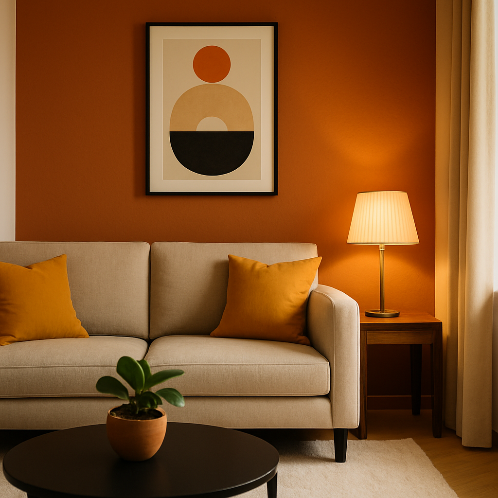
At its core, color psychology examines how different hues influence human behavior and perception. It's a field that has fascinated designers and psychologists alike, with studies suggesting that colors can significantly impact moods and even physiological responses. For example, warm colors like reds and oranges are known to stimulate and energize, making them ideal for social spaces like living rooms and dining areas. Conversely, cool colors such as blues and greens tend to have a calming effect, perfect for bedrooms or bathrooms where relaxation is key.
Understanding these basic principles can help you make informed choices about which colors to incorporate into different areas of your home. According to research by the American Psychological Association, color can affect cognitive performance, with certain shades enhancing focus and creativity. This could mean opting for soft yellows or greens in a home office to boost productivity. The key is to align your color choices with the function and desired atmosphere of each room.
It's also essential to consider the lighting conditions in your space, as they can alter the perception of color. Natural light tends to enhance colors, while artificial lighting can cast different hues, affecting how a color appears. Therefore, it's crucial to test color samples in the actual room and at different times of the day to see how they change. As we transition into a deeper analysis, you'll learn how data and studies further inform these foundational concepts.
Analyzing Data-Driven Insights on Color Choices
Delving into data can offer valuable insights into how color affects our spaces. According to a survey by Houzz, 62% of homeowners reported feeling happier and more relaxed in rooms painted in their favorite colors. This statistic underscores the importance of personal preference alongside psychological principles in color selection. While psychology offers general guidelines, your personal response to color is equally crucial.
Moreover, a study published by the Journal of Environmental Psychology highlighted the impact of color saturation and brightness on mood. It found that highly saturated colors tend to be more stimulating, while less saturated, softer tones promote relaxation. This suggests that vibrant hues might be best suited for activity-driven areas, while muted palettes are ideal for spaces designed for tranquility.
Experienced professionals often note that the context of color is as important as the color itself. For instance, pairing a bold accent wall with neutral tones can create a balanced and dynamic space without overwhelming the senses. The strategic use of accent colors can also draw attention to architectural features or artworks, enhancing the overall aesthetic. As we move forward, we'll explore actionable strategies for implementing these insights into your design projects.
Actionable Strategies for Choosing Your Perfect Palette
Creating a cohesive color palette for your home involves more than just picking shades you like. It requires a strategic approach that considers the mood, function, and interaction of colors. One effective method is to start with a base color that sets the tone for your room. This could be a neutral shade that provides flexibility or a bold hue that makes a statement. Once you have your base, select complementary colors that enhance and balance the primary shade.
Using a color wheel can help identify harmonious color combinations. Complementary colors, which are opposite each other on the wheel, can create vibrant contrasts, while analogous colors, which sit next to each other, offer subtle harmony. Another strategy is to follow the 60-30-10 rule: use 60% of a dominant color, 30% of a secondary color, and 10% of an accent color. This guideline ensures a balanced and visually appealing space.
Don't forget to consider texture and pattern in your color scheme. Mixing different materials and patterns can add depth and interest to monochromatic palettes. For example, pairing a soft, plush rug with sleek, metallic accents can create a sophisticated look. In the next section, we'll delve into expert insights that elevate these strategies to an advanced level, helping you achieve truly remarkable results.
Expert-Level Insights for Advanced Color Application
For those looking to elevate their interior design to a professional standard, incorporating expert insights can make a significant difference. Certified interior designers, such as those holding the NCIDQ (National Council for Interior Design Qualification) credential, often emphasize the importance of considering the psychological impact of color in conjunction with design principles. These designers understand that color can influence not only aesthetics but also the perceived size and shape of a room.
One advanced technique involves using color to manipulate spatial perception. Lighter colors can make a small space feel larger, while darker shades can create a cozy, intimate atmosphere. Designers often use this knowledge to enhance the architectural features of a home. For instance, painting the ceiling a lighter color than the walls can give the illusion of height, making a room feel more expansive.
Another expert tip is to use color to create focal points within a room. This could be achieved through a striking piece of furniture, a bold artwork, or a feature wall. By directing attention to these elements, you can guide the flow of a space and enhance its functionality. As we continue, we'll explore additional depth in color psychology to further refine your design skills.
In-Depth Exploration of Color Impact on Lifestyle
Understanding the deeper implications of color on lifestyle choices can enhance how you approach interior design. For instance, biophilic design, which incorporates natural elements and colors, is gaining popularity for its positive effects on well-being. Using earth tones and greens can create a sense of tranquility and connection to nature, which is particularly beneficial in urban settings where access to nature is limited.
Furthermore, the trend of quiet luxury emphasizes understated elegance through subtle color palettes. This approach focuses on quality over quantity, using a restrained color scheme to highlight craftsmanship and material integrity. Choosing colors that reflect personal values and lifestyle can lead to spaces that are not only beautiful but also meaningful and sustainable.
As you integrate these insights into your projects, consider how each color choice aligns with your lifestyle goals and personal aesthetic. The next section will offer final perspectives to ensure your color selections are both practical and inspiring.
Final Perspectives on Color Psychology in Design
As you embark on your journey to choose the perfect color palette, remember that the ultimate goal is to create spaces that resonate with you on a personal level. While psychological principles and expert insights offer valuable guidance, your intuition and personal preferences should always play a leading role. Ask yourself: Does this color make me feel the way I want to feel in this space?
It's also important to remain flexible and open to experimentation. Color trends may come and go, but timeless design is about creating environments that reflect who you are and how you live. Don't hesitate to test new ideas, and always seek feedback from trusted sources, whether they're professional designers or design-savvy friends.
In conclusion, color psychology is a powerful tool in interior design that can transform your home into a space that not only looks good but feels good. Start exploring color options today by creating mood boards or visiting showrooms to see colors in real-world settings. This practical approach will enhance your understanding and confidence as you make design decisions.
Conclusion
In summary, understanding color psychology in room interior design allows you to choose palettes that are both aesthetically pleasing and emotionally resonant. By considering foundational principles, analyzing data, and applying expert strategies, you can create spaces that truly reflect your personality and meet your needs. Are you ready to transform your home with the power of color? Start by browsing designer portfolios on platforms like Houzz or Pinterest. Even 20 minutes of research will sharpen your eye for what resonates with you.


Comments
Post a Comment