Color Psychology in Interior Design: 7 Ideas to Create the Perfect Mood
Have you ever walked into a room and felt instantly calm, or perhaps energized? This is the subtle power of color psychology in interior design. According to research, colors can influence mood, behavior, and even physiological reactions. For instance, a study from the University of Winnipeg found that color can impact up to 60-90% of a person's first impression. In this article, we'll explore how you can harness this power to create the perfect mood in your home, diving into foundational concepts, expert insights, and practical strategies. Whether you're looking to refresh a single room or undertake a whole-home redesign, understanding the nuances of color can transform your space. Let's explore how.
Understanding the Basics of Color Psychology
Before you start painting walls or buying new furniture, it's crucial to understand the fundamentals of color psychology. Colors are more than just visual stimuli; they evoke emotions and set the tone for a space. Warm colors like red, orange, and yellow tend to evoke warmth and comfort but can also stimulate feelings of anger or hostility if used excessively. Conversely, cool colors such as blue, green, and purple often promote calmness and relaxation but can feel cold or distant if not balanced properly.
One key aspect of color psychology is the cultural associations and personal experiences tied to specific colors. For instance, while red might symbolize passion and energy in some cultures, it can represent danger or warning in others. Experienced interior designers often note that understanding your personal and cultural associations with color can dramatically affect your satisfaction with a design. This is why consultations with professionals from organizations like the American Society of Interior Designers (ASID) can be invaluable.
Another foundational concept is the color wheel, which is divided into primary, secondary, and tertiary colors. This tool helps in understanding how colors relate to one another and how they can be combined to achieve harmony. Designers often use the color wheel to create complementary, analogous, or triadic color schemes that enhance the mood and functionality of a space. As we delve deeper, consider how these basic principles might apply to the rooms in your home.
Exploring the Psychological Impact of Colors
To effectively use color psychology in your design, it's essential to understand the specific emotional responses that different colors can elicit. Blue, often associated with stability and tranquility, is a popular choice for bedrooms and offices. According to a study published in the Journal of Environmental Psychology, blue environments can increase productivity and focus, making it a favorite for home offices. However, too much blue can lead to feelings of sadness or detachment, so it's important to balance it with warmer accents.
Yellow, on the other hand, is known for its cheerful and energizing effects. It's often used in kitchens and dining rooms to stimulate conversation and appetite. However, studies suggest that excessive yellow can lead to frustration and anxiety, especially in high-intensity hues. Choosing softer shades or using yellow as an accent can mitigate these effects while maintaining a lively atmosphere.
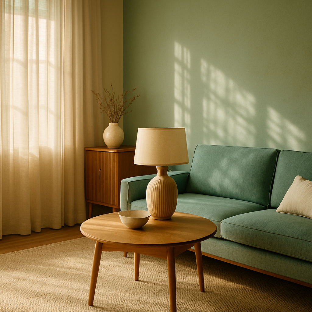
Another powerful color is green, which represents balance and rejuvenation. Its connection to nature makes it ideal for living rooms and bathrooms, fostering a sense of peace and renewal. The biophilic design trend, which emphasizes natural elements, often incorporates green to enhance indoor-outdoor flow. As you consider these psychological impacts, think about which moods you want to evoke in different areas of your home.
Strategies for Applying Color Psychology in Your Home
Now that you're familiar with the emotional impact of colors, how can you apply this knowledge in your home? Start by assessing the function of each room. Ask yourself: What activities take place here? Is it a space for relaxation, work, or socializing? Your answers will guide your color choices. For instance, a serene bedroom might benefit from calming blues or soft greens, while a vibrant kitchen could come alive with pops of yellow or red.
Another strategy is to use color to manipulate space. Light colors can make small rooms feel larger and more open, while dark colors can create a cozy, intimate atmosphere. Consider the use of accent walls or color-blocking techniques to add depth and interest without overwhelming the space. Tools like Pinterest and Houzz can provide endless inspiration and visual examples of successful color schemes.
Don't forget about the importance of lighting. Natural and artificial lighting can dramatically alter the appearance of colors. It's advisable to test paint samples in different lighting conditions before making a final decision. Many experienced designers use AR/VR room visualization tools to help clients see how colors will look in their space throughout the day. As you experiment, keep an open mind and be willing to adjust your plans based on what feels right.
Expert Tips for Mastering Color Psychology
Experienced professionals often note that the key to mastering color psychology is balance. Too much of one color can be overwhelming, while a lack of contrast can make a space feel flat. Consider using a neutral base and adding color through accessories and artwork. This approach allows for flexibility and easy changes if your preferences evolve over time.
Another expert tip is to consider the flow from room to room. While each space can have its distinct mood, there should be a cohesive thread that ties the entire home together. This might be a recurring color, texture, or pattern. The National Council for Interior Design Qualification (NCIDQ) suggests that maintaining this flow is crucial for creating a harmonious environment.
Finally, don't overlook the power of personal preference. While trends and psychological principles provide a solid foundation, your comfort and satisfaction are paramount. Incorporate colors that resonate with you and reflect your personality. After all, your home should be a reflection of who you are. As we explore further, consider how these expert tips can enhance your design process.
Diving Deeper into Color Theory
For those looking to dive deeper into color psychology, understanding advanced color theory concepts can offer additional insights. Concepts like saturation, value, and tint are vital in manipulating how colors are perceived. Saturation refers to the intensity of a color, with high saturation colors appearing more vivid and low saturation colors appearing more muted. Adjusting saturation can dramatically affect the mood of a space.
Value, or the lightness or darkness of a color, is another critical factor. Lighter values often create a sense of openness and airiness, while darker values can add drama and sophistication. This is particularly useful when trying to achieve a quiet luxury aesthetic, where understated elegance is key. Many designers use this approach to subtly guide the emotional response of a room without overwhelming it.
Finally, consider the role of complementary and contrasting colors. These can create dynamic visual interest and can be used strategically to draw attention to focal points in a room. The International Interior Design Association (IIDA) often emphasizes the importance of using these techniques to create balance and harmony in a design. As you experiment with these concepts, think about how they can be applied to your spaces to enhance both aesthetic appeal and emotional impact.
Final Thoughts on Color and Mood
As we conclude our exploration of color psychology in interior design, it's clear that colors hold incredible power in shaping the atmosphere of a home. By understanding the psychological effects of different colors and applying strategic techniques, you can create spaces that not only look beautiful but also feel right. Remember, the goal is to craft environments that support your lifestyle and emotional well-being.
It's also important to remain flexible and open to change. As your life evolves, so too might your preferences and needs. Regularly reassessing your color choices and being willing to make adjustments can ensure that your home continues to meet your emotional and functional needs. Consider how you might keep your design fresh and relevant over time.
As you embark on your next design project, ask yourself: What mood do I want to create? How can color help me achieve that? Your answers will guide you toward a design that truly resonates with you, creating a sanctuary you love coming home to.
Conclusion: Take the First Step Toward a Harmonious Home
In summary, color psychology offers a powerful toolkit for crafting emotionally resonant spaces. From understanding foundational concepts to applying expert strategies, the potential to transform your home is immense. Now that you're equipped with this knowledge, it's time to put it into practice. Start by browsing portfolios on platforms like Houzz to see how different colors might work in your space. Even 20 minutes of research can sharpen your eye for what you want.
Remember, the perfect mood is just a few brushstrokes away. Whether you're refreshing a single room or redesigning your entire home, let color guide you to a more harmonious living environment. What's the first room you'll tackle? The journey to your ideal home begins with a single, colorful step.


Comments
Post a Comment