Home Office Bookshelf Styling Tips for Video Call Backgrounds
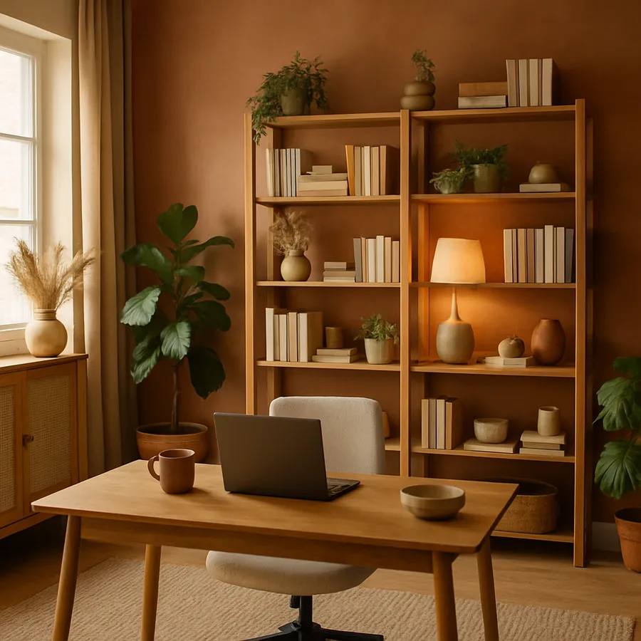
Your bookshelf has become the most publicly visible piece of furniture in your home. Every video call broadcasts that rectangular frame of shelves to colleagues, clients, and collaborators who consciously or unconsciously form impressions based on what they see behind you. A cluttered, chaotic bookshelf suggests disorganization. An empty, sterile one implies you moved in last week. The sweet spot is a curated arrangement that communicates competence, personality, and intentional taste without demanding attention away from the conversation itself. Research from the Princeton Neuroscience Institute demonstrated that visual clutter competes for attention and reduces the brain's ability to focus, which means your background affects not only how others perceive you but how effectively you communicate. This guide walks through the principles of bookshelf styling specifically optimized for the camera frame, covering object selection, color strategy, depth and layering, lighting, and the practical details that keep the shelf looking sharp with minimal ongoing effort.
Understanding What the Camera Actually Sees
Before you rearrange a single object, sit in your desk chair and open your video call application in preview mode. The rectangle of background visible in your camera frame is almost certainly smaller than you think. Most webcams and laptop cameras capture a frame roughly three to four feet wide and two to three feet tall at a typical sitting distance, which means you are styling a specific zone of your bookshelf rather than the entire unit. Mark the edges of the visible zone with small pieces of painter's tape on the shelf so you know exactly which sections will be on camera. Every styling decision should prioritize this zone, while areas outside it can remain functional storage without aesthetic pressure.
Camera compression changes how your shelves appear on screen compared to how they look in person. Webcams use wide-angle lenses that flatten depth and exaggerate the width of objects closest to the camera. This means that a shelf arrangement with beautiful layered depth in person can look surprisingly flat on screen, and objects placed at the very edges of the frame may appear distorted or stretched. Test your arrangement through the camera before finalizing it, and give slightly more visual weight to the center of the frame where the image is sharpest and most natural. Items at the periphery serve as a soft border and can be simpler in detail since the camera will not resolve them as crisply.
Vertical position within the frame matters enormously for visual impact. The shelf at your head height or just above it receives the most viewer attention because it sits in the natural gaze zone when someone looks at your face. Treat this shelf as your hero shelf and give it your most carefully curated objects. Shelves significantly above or below your head function as visual padding that frames the composition without drawing the eye. These supporting shelves can hold quieter items in neutral tones that provide structure without competing with the hero shelf. Have you tested what your background looks like when you lean back in your chair versus sitting upright? That shift changes which shelf sits at head height, so style based on your natural posture rather than an artificially upright position.
Resolution and bandwidth affect how much detail actually transmits to your viewers. On a high-quality connection with good lighting, book titles and small object details are legible and become part of your visual identity. On a compressed or low-bandwidth connection, those details blur into color blocks and shapes. This reality means your arrangement needs to work at two scales simultaneously: as a detailed vignette for close inspection and as a balanced composition of color and form that reads well even when reduced to a thumbnail. Designing for both scales is actually liberating because it means you do not need to obsess over small details that only a fraction of your audience will ever see clearly.
Building a Color Strategy That Reads Well on Screen
Color is the single most powerful tool in bookshelf styling for video calls because it is the first thing the viewer's brain processes, even before individual objects become recognizable. A shelf dominated by a random rainbow of book spines reads as cluttered regardless of how neatly the books are arranged. Grouping books and objects into color zones, clusters of two to five items in the same tonal family, creates visual order that the brain interprets as intentional and calm. You do not need to reorganize your entire library by color. Focus only on the books visible in your camera frame and group those by warm tones, cool tones, and neutrals.
Limit your background palette to three or four colors plus a neutral base. The neutral base is typically the shelf material itself, whether that is natural wood, white laminate, or painted color, and it occupies the most visual space as the backdrop behind all objects. Select two accent colors that complement each other and appear in your books, decorative objects, and any artwork on the shelves. A common effective palette for professional backgrounds is navy blue, warm cream, and brass or gold accents against a natural wood shelf. This combination reads as sophisticated and grounded on camera without being distracting. The American Society of Interior Designers recommends limiting decorative palettes to prevent visual fatigue, and this principle applies with extra force to a background that viewers stare at for the duration of every meeting.
Bright, saturated colors demand attention on camera and should be used sparingly if at all. A single red book spine or a bright yellow vase creates a focal point that can pull viewer attention away from your face, which is the opposite of what a good background should do. If you love colorful objects, place them outside the camera frame where you can enjoy them in person without broadcasting them. Within the frame, stick to muted, desaturated tones that register as color without shouting. Think sage green rather than Kelly green, dusty rose rather than hot pink, slate blue rather than royal blue. These softer tones photograph well under varied lighting conditions and recede naturally behind you rather than competing for dominance.
White and very light objects require special attention because they reflect the most light and can create hot spots on camera, especially under direct lighting. A row of white book spines or a white ceramic vase can bloom into a bright patch that distracts the eye and sometimes confuses your camera's auto-exposure, causing your face to darken as the camera compensates for the bright background element. If you include white objects, distribute them across the frame rather than clustering them, and pair them with darker neighbors to prevent any single area from becoming a light magnet. Testing this through your camera in your actual lighting conditions is the only reliable way to identify and correct hot spots before they appear in a live call.
Layering Objects for Depth and Visual Interest
Flat arrangements where every object sits at the front edge of the shelf look two-dimensional on camera and waste the depth available to you. Effective bookshelf styling uses three depth zones: back, middle, and front. The back zone, against the wall, holds taller items like upright books, framed artwork, or tall vases that establish the vertical structure of each shelf. The middle zone holds medium-height objects like horizontal book stacks, small boxes, or sculptural pieces. The front zone holds the smallest items, a candle, a small plant, a decorative object, that add detail and create a sense of looking into a composed space rather than at a flat wall.
Height variation within each shelf prevents the static, library-like uniformity that reads as institutional rather than personal. Alternate between tall and short elements across the shelf, creating a rhythm that the eye follows naturally. A useful formula is the mountain-valley pattern: tall object, medium object, short object, gap or open space, then repeat with variation. The open space between groupings is just as important as the objects themselves because it gives the eye a resting point and prevents the shelf from feeling overstuffed. On camera, a shelf with thirty percent open space looks curated and intentional, while a shelf with less than ten percent open space looks like storage regardless of how beautiful the individual items are.
Horizontal book stacks serve as pedestals that elevate smaller objects and create layered visual planes. Stack three to five books horizontally, place a small object on top, and you have manufactured a custom-height display platform that adds depth to the arrangement. Choose books with spine colors that support your palette, and position the stack so the spines face outward or the page edges face outward depending on which orientation produces the cleaner color. Some stylists prefer the uniform ivory of page edges because it creates a neutral block that supports any object placed on top, while others prefer visible spines for their color contribution. Either approach works as long as it is consistent within the camera frame.
Lean a piece of framed artwork or a photograph against the back wall of the hero shelf to create an anchor point that organizes the surrounding objects. The frame's rectangular shape provides geometric structure against the organic forms of plants, rounded vases, and irregular bookends. Choose artwork sized to occupy roughly one-third to one-half of the shelf's width, leaving room beside it for supporting objects. According to the Architectural Digest styling guides, a leaned frame reads as more casual and approachable than a hung frame because it suggests the owner is still curating rather than having finalized the arrangement. On a video call, this subtle informality communicates confidence and creativity without the rigidity of a perfectly symmetrical display.
Selecting Objects That Communicate the Right Message
Every object on your visible shelves sends a signal to your video call audience, whether you intend it to or not. Books are the safest and most universally positive background element because they signal curiosity and intellectual engagement. However, the specific books visible on camera become part of your professional identity, so be intentional about which titles face forward. Industry-relevant books demonstrate expertise. A mix of professional and cultural titles suggests a well-rounded person. Avoid displaying anything controversial or polarizing in the camera frame unless you specifically want to invite that conversation. The shelves outside your camera zone can hold whatever you like without any professional consideration.
Decorative objects fall into two categories for video call purposes: conversation starters and texture providers. Conversation starters are distinctive items that viewers notice and might ask about, such as a piece of travel memorabilia, an unusual sculpture, or a framed photograph from a meaningful experience. Limit these to one or two items within the camera frame so they add personality without overwhelming the composition. Texture providers are objects valued more for their material quality and form than their specific identity. A ceramic vase, a turned wooden bowl, a brass geometric form, or a woven basket adds visual richness without demanding narrative attention. These fill out the arrangement and create the layered, lived-in quality that makes a bookshelf feel genuine.
Plants deserve special mention because they are the single most effective element for making a bookshelf background feel alive and welcoming. Small potted plants, trailing vines draped over a shelf edge, or a single architectural succulent in a ceramic pot introduce organic form and green color that softens the geometric rigidity of books and boxes. A study by the University of Exeter found that the presence of plants in a workspace increases perceived attentiveness and productivity of the person in that space, which translates directly to the impressions formed during video calls. Choose low-maintenance species that tolerate the indirect light typical of bookshelves, such as pothos, snake plants, or ZZ plants, and use pots that match your color palette rather than the default plastic nursery containers.
What about awards, diplomas, and professional credentials? These are appropriate for certain professions, particularly in client-facing fields like law, medicine, and financial advising where visible credentials build trust. In other professional contexts, prominently displayed awards can read as self-promotional. If you include credentials, frame them consistently and position them at the edge of the camera frame rather than dead center, where they function as background information rather than the main message. A single, well-framed credential at the periphery says "qualified." Three awards lined up at head height says "look at me." Match the framing to your other decorative elements so the credential integrates into the composition rather than standing apart as a trophy wall.
Lighting Your Bookshelf for Camera-Ready Appearance
Lighting separates a flat, dull background from one that appears rich and dimensional on camera. The most common mistake is relying entirely on overhead room lighting, which casts shadows downward across your shelves and creates dark zones on every level below the top shelf. Adding a dedicated bookshelf light source transforms the background by filling those shadows and revealing the colors, textures, and depth of your arrangement. The simplest option is a plug-in LED strip light mounted along the underside of the shelf above your hero zone, which washes the most visible section with even, shadowless illumination.
Color temperature of your bookshelf lighting should match your key light, the primary light source illuminating your face. If you use a warm-toned desk lamp as your key light, cool white LEDs on your bookshelf will create a color mismatch that looks jarring on camera, with your face appearing warm and your background appearing blue. Most video call lighting guides recommend a color temperature between 4000K and 5000K for a neutral appearance that flatters skin tones and renders background colors accurately. If your room has warm incandescent overhead lighting, choose bookshelf LEDs in the same warm range to maintain consistency across the frame. The American Lighting Association notes that color temperature mismatches within a single camera frame are one of the most common causes of video backgrounds looking unprofessional.
Brightness balance between your face and your background determines whether the bookshelf enhances your presence or distracts from it. Your face should be the brightest element in the frame, with the background roughly one to two stops dimmer in photographic terms. If your bookshelf lighting is too bright, it pulls attention backward and can cause your camera to underexpose your face. If it is too dim, the shelves fall into muddy shadow and all your careful styling becomes invisible. Use dimmable LED strips or a smart plug with brightness control so you can adjust the background lighting to complement your key light rather than competing with it. Test the balance by starting a preview call and adjusting until your face is clearly the focal point while the bookshelf remains visible and attractive behind you.
Consider adding a small accent light within the bookshelf arrangement itself, such as a battery-operated puck light behind a translucent vase or a small clip light highlighting a specific object. These internal light sources create points of warmth and glow that add dimension to the composition on camera. They work particularly well during evening calls when natural light has faded and the overall illumination in the room tends to flatten. Position accent lights so they illuminate objects without being directly visible to the camera, and use warm-toned bulbs for these intimate touches even if your general shelf lighting is neutral. The small pools of warm light they create read as cozy and inviting, adding a layer of atmosphere that overhead lighting alone cannot achieve.
Maintaining the Arrangement With Minimal Effort
A bookshelf styled for daily video calls needs to maintain its appearance without becoming a time-consuming maintenance project. The most sustainable approach is to anchor heavy and stable objects in fixed positions and allow only a few lightweight items to rotate seasonally or as your mood changes. Books, framed art, and substantial ceramic pieces rarely shift on their own and form the permanent architecture of the arrangement. Small objects, plants, and candles are the rotating cast that keeps the shelf feeling fresh without requiring a complete restyle.
Dust is the invisible enemy of a camera-ready bookshelf because webcams and overhead lighting conspire to make dust visible as a hazy film on dark surfaces and as visible particles on light ones. A microfiber cloth wiped across the visible shelves once a week takes less than two minutes and prevents the gradual dulling that makes even a well-styled shelf look neglected. Have you noticed how a freshly dusted bookshelf seems to have richer colors? That is because dust scatters light across all surfaces uniformly, reducing the contrast between objects and diminishing the color saturation that makes individual items pop on camera. Two minutes of maintenance preserves hours of styling work.
Create a pre-call checklist that takes thirty seconds to execute before important meetings. Glance at the hero shelf and confirm no items have been moved, no plant has wilted visibly, and no stray items like mail, keys, or coffee mugs have landed on the visible shelves since your last call. Straighten any books that have leaned. Remove anything that does not belong. This quick scan becomes second nature within a week and prevents the slow entropy that turns a styled shelf into a catch-all surface. Keeping a small basket just outside the camera frame gives displaced items a temporary home during calls, and you can redistribute them afterward without disrupting the arrangement.
Seasonal refreshes keep the background from feeling stale to frequent meeting partners who see it multiple times per week. Swap one or two decorative objects every four to six weeks, changing a vase for a different one, rotating a piece of art, or replacing a spent plant with a fresh one. These minor changes are enough to prevent background fatigue without requiring a complete restyle. The National Kitchen and Bath Association applies a similar principle to showroom displays, refreshing accent elements on a regular cycle while keeping the structural arrangement constant. Your bookshelf operates on the same principle: permanent bones with variable dressing that keeps the composition alive.
Conclusion
Styling a bookshelf for video calls is an exercise in designing for a specific frame, a small rectangle of camera-visible space that represents you to the professional world every time you join a meeting. The principles are consistent with good interior styling generally, including color restraint, depth layering, height variation, and intentional object selection, but the camera adds constraints and opportunities that a shelf styled only for in-person viewing does not face. Understanding what the camera actually captures, how compression affects depth perception, and how lighting shapes the on-screen appearance gives you control over an element of your professional presentation that most people leave to chance.
The practical steps are approachable for anyone regardless of styling experience. Identify your camera frame with tape, build a three-color palette, arrange objects in three depth zones with the mountain-valley height pattern, and add dedicated lighting that matches your key light temperature. Select objects that balance professional credibility with personal warmth, and maintain the arrangement with a weekly dust and a thirty-second pre-call scan. These habits transform your background from a liability into an asset.
A well-styled bookshelf background does more than look good on camera. It creates an environment that supports your focus and confidence during calls, because knowing your background is handled removes one more source of self-consciousness from an already demanding communication format. When you can join a video call without adjusting anything, glancing over your shoulder, or wondering what your colleagues are noticing behind you, you are free to bring your full attention to the conversation itself.
Open your video app right now, turn on preview mode, and mark the visible zone on your bookshelf with tape. That five-minute exercise is the foundation for every improvement that follows, and you will be surprised how small the actual styling zone turns out to be.
More Articles You May Like


Comments
Post a Comment