Floating Shelf Art Ledges for Rotating Seasonal Displays
What Makes Art Ledges Different from Standard Shelving
Floating art ledges occupy a specific niche in the shelving world that distinguishes them from standard floating shelves, bookcases, and traditional picture rails. Their defining feature is a shallow depth, typically between three and four inches, combined with a raised front lip that prevents leaned items from sliding forward. This lip is usually no more than half an inch to three-quarters of an inch tall, just enough to catch the bottom edge of a frame without obstructing the view of whatever rests on the ledge. The result is a piece of hardware designed specifically for display rather than storage.
Standard floating shelves tend to be deeper, often eight to twelve inches, which encourages loading them with books, boxes, and functional items. Art ledges resist that temptation by their very proportions. You cannot stack anything meaningful on a three-inch-deep surface, which forces a curated, display-only mindset from the moment of installation. The American Society of Interior Designers (ASID) has noted that constraint-based design, where physical limitations guide aesthetic decisions, often produces more cohesive results than open-ended arrangements where anything goes.
The floating mount system is the other critical distinction. Quality art ledges attach to wall studs through a concealed bracket or French cleat, leaving no visible hardware once installed. The shelf appears to emerge directly from the wall surface, creating a clean horizontal line that doubles as an architectural detail. This seamless appearance makes ledges far more versatile than bracket-mounted shelving, which introduces additional visual elements that compete with the displayed objects. When the hardware disappears, the content takes center stage.
Material options range from solid hardwood and MDF with veneer to painted pine and powder-coated metal. Each material carries its own visual weight and stylistic association. A walnut ledge reads warm and mid-century, while a matte white painted ledge feels Scandinavian and minimal. Metal ledges in black or brass lean industrial or contemporary. Choosing the right material is not merely cosmetic; it establishes the tonal foundation for everything you will place on the shelf throughout the year. Does your room already have a dominant material palette? Let that answer guide your ledge selection.
How to Choose the Right Size and Placement
Length is the first dimension to settle. Art ledges commonly come in 24-inch, 36-inch, and 48-inch lengths, though custom sizes are available from most woodworking shops and several online retailers. A single long ledge spanning most of a wall creates a bold horizontal statement, while two or three shorter ledges stacked vertically at staggered heights offer layered depth. The Houzz platform reports that the 48-inch single ledge is their most frequently specified option in residential design projects, suggesting that homeowners prefer the impact of one strong line over multiple smaller installations.
Vertical placement depends on the ledge's relationship to surrounding furniture. A ledge above a sofa should sit eight to twelve inches above the top of the backrest, close enough to feel connected but far enough to avoid collisions when someone leans back. Ledges in hallways without furniture beneath them perform best at 57 to 60 inches from the floor to the center of the displayed content, which aligns with the standard museum hanging height used by institutions worldwide. This height places artwork and photographs at a comfortable eye level for the average adult.
If you are stacking multiple ledges vertically, maintain twelve to sixteen inches between them. This gap provides clearance for taller frames on the lower ledge while keeping the upper ledge accessible without stretching. Three vertically stacked ledges can accommodate an impressive amount of display content in a surprisingly compact wall footprint, making this configuration ideal for apartments and smaller rooms where horizontal wall space is limited. According to the National Association of Home Builders (NAHB), multi-ledge vertical arrangements have appeared with increasing frequency in model homes as builders respond to buyer demand for display-ready walls in compact floor plans.
Weight capacity matters more than most buyers realize. A 48-inch ledge holding six framed prints, a ceramic object, and a small plant can easily approach fifteen to twenty pounds. Verify that your chosen ledge is rated for the load you intend and that your mounting hardware enters wall studs rather than relying on drywall anchors alone. Hollow-wall anchors rated for fifty pounds may seem sufficient, but repeated small vibrations from closing doors or foot traffic can gradually loosen them. Stud mounting is always the safer and more permanent choice for ledges intended to hold rotating collections over many years.
Step-by-Step Guide to Building a Seasonal Display
Begin each seasonal refresh by clearing the ledge completely. Resist the urge to swap one or two items while leaving the rest in place, because piecemeal changes rarely achieve the cohesive shift that a full reset provides. Lay everything on a nearby table or the floor, wipe down the ledge surface with a damp cloth, and start with a blank canvas. This five-minute reset is what separates a thoughtfully rotated display from one that simply accumulates new items on top of old ones.
Next, select your anchor piece. This is the single largest item that will occupy the most visual weight on the ledge, typically a framed print or photograph measuring at least eleven by fourteen inches. Position it slightly off-center, roughly one-third of the way from either end, to avoid static symmetry. The anchor establishes the color palette and mood for the entire arrangement; a moody landscape in deep greens sets a very different tone than a bright abstract in coral and gold. Let this piece dictate the supporting cast.
Layer secondary frames in front of and beside the anchor, overlapping edges by an inch or two. This overlapping technique is what gives ledge displays their signature depth and casual sophistication. Place a medium frame, perhaps eight by ten inches, partially in front of the anchor and lean a smaller five-by-seven frame against that. The layering creates a sense of collected abundance without the rigid formality of a grid wall. How many layers can you stack before the display feels too dense? The answer is usually three; beyond that, items at the back become invisible and the arrangement starts to read as cluttered rather than curated.
Finish with accent objects placed at one or both ends of the ledge. A small potted succulent, a brass candleholder, a ceramic bud vase, or a short stack of design books all work well. These objects serve as visual bookends that contain the arrangement and prevent the display from feeling like it trails off into emptiness at the edges. Odd numbers work best for grouped objects, so a trio of small items at one end and the framed cluster at the other creates a natural visual balance that feels effortless.
Seasonal Theme Ideas and Color Palettes
Spring displays benefit from soft pastels, botanical prints, and fresh greenery. Swap in watercolor florals, garden photography, or abstract pieces in blush, sage, and butter yellow. Replace winter's heavy ceramic objects with lighter glass vases holding a single stem or two of dried lavender. A linen-textured mat in a warm off-white brightens the arrangement further. The overall impression should feel like opening a window after a long period indoors: airy, gentle, and quietly optimistic.
Summer calls for bolder saturation and natural textures. Think ocean photography in deep blues and teals, travel snapshots printed on matte paper, and woven basket textures in rattan or jute. A piece of driftwood laid horizontally across the back of the ledge adds organic dimension. The Better Homes and Gardens editorial team highlights that summer displays work best when they reference the outdoors without literally replicating a beach theme, so aim for tonal nods to nature rather than seashell collections.
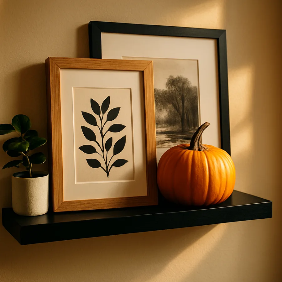
Autumn arrangements thrive on warmth and richness. Swap in prints featuring amber, rust, deep olive, and burgundy tones. Matte black frames feel especially appropriate against these warm colors, creating contrast that makes the rich hues pop. Dried eucalyptus stems, small gourd-shaped ceramics, and brass objects all reinforce the seasonal mood. A study by the Pantone Color Institute found that warm earth tones consistently rank among the most psychologically comforting color families, which explains why autumn-themed interiors often feel particularly inviting.
Winter displays can take two directions: festive holiday styling or a pared-back minimal approach. The festive route incorporates metallic accents, evergreen sprigs, and rich jewel tones like emerald and garnet. The minimal route strips the ledge down to fewer pieces in a restrained palette of white, charcoal, and natural wood, letting negative space become the dominant design element. Both approaches work, but committing fully to one direction produces a stronger result than splitting the difference. Which version resonates more with how you want your home to feel during the colder months?
Common Mistakes and How to Avoid Them
The most frequent error is overcrowding the ledge. Because adding items is so easy, art ledges invite accumulation. A useful rule of thumb is that at least twenty percent of the ledge surface should remain visibly empty. This negative space gives the displayed items room to breathe and prevents the arrangement from looking like a storage shelf. When every inch is occupied, individual pieces lose their impact and the display collapses into visual noise. Edit ruthlessly; a ledge with five well-chosen items always outperforms one with fifteen crammed together.
Ignoring scale relationships is another common pitfall. Placing items of similar height in a flat row eliminates the visual peaks and valleys that make a display interesting. Vary the height of your displayed objects deliberately, alternating tall frames with short ones and placing three-dimensional objects at different elevations. This variation creates a natural rhythm that the eye follows comfortably across the length of the ledge. The American Society of Interior Designers recommends a height ratio of roughly 3:2:1 among grouped display items to achieve pleasing proportions.
Neglecting the wall behind the ledge is a subtle but significant mistake. A busy wallpaper pattern or strongly colored paint can compete with the displayed items, diluting their visual presence. Art ledges perform best against neutral or muted wall surfaces that recede and let the content step forward. If your wall color is bold, consider limiting your ledge display to fewer items with strong graphic presence, such as high-contrast black-and-white photography, that can hold their own against the background. Alternatively, painting a single section of wall behind the ledge in a quieter tone creates a natural backdrop.
Finally, forgetting to secure frames against toppling is a practical oversight with real consequences. While the front lip catches the base, taller frames leaning at steep angles can tip forward if bumped or if the room experiences vibrations from foot traffic or closing doors. Museum putty or adhesive wax applied to the bottom edge of each frame provides invisible, removable grip that holds frames in place without damaging finishes. This is especially important in households with children, pets, or any room where a slamming door could send a domino chain of frames crashing forward.
Sourcing Quality Ledges and Display Materials
Mass-market retailers like IKEA offer the Mosslanda and Malevik picture ledges at accessible price points, and both models have earned loyal followings for their simplicity and clean lines. For a step up in material quality, brands like West Elm, Pottery Barn, and Room and Board offer hardwood and metal options with more refined detailing. Custom woodworkers can match the ledge material to existing trim, flooring, or furniture pieces in the room, creating a bespoke look that mass-produced options cannot replicate. The price difference between a twenty-dollar IKEA ledge and a two-hundred-dollar custom walnut piece is significant, but so is the visual and tactile quality gap.
For the displayed content itself, independent art print shops on platforms like Etsy and Society6 offer affordable seasonal prints that you can swap in and out without guilt about the investment. Purchasing prints in standard sizes, eight by ten or eleven by fourteen, lets you reuse the same frames across multiple seasonal rotations, which is both economical and environmentally conscious. The Architectural Digest shopping editors recommend building a small archive of prints organized by season, stored flat in a portfolio case, so that rotation day is a matter of pulling from a ready collection rather than shopping from scratch each time.
Framing does not need to be expensive to look polished. Slim profile frames from brands like Framebridge, Artifact Uprising, and even Target's Threshold line offer clean aesthetics at moderate prices. The key is consistency; five matching frames at fifteen dollars each will always look more intentional than five mismatched frames at fifty dollars each. Invest in quality where it matters most, which is the frame finish and the glass or acrylic glazing, and save on areas that are less visible, like the backing material. A survey conducted by the Professional Picture Framers Association found that 73 percent of consumers cannot distinguish between mid-range and premium frame materials at a distance of four feet, which is the typical viewing distance for wall-mounted displays.
Hardware and installation supplies deserve attention as well. A quality stud finder, a laser level, and a set of appropriate screws matched to your wall type will make installation straightforward and the result perfectly horizontal. Nothing undermines a carefully curated ledge display faster than a visible slant. If you are uncertain about your wall construction or your mounting skills, hiring a handyperson for a single-hour appointment is a worthwhile investment that prevents damage to both the wall and the ledge. Most professionals can install multiple ledges in under an hour, leaving you free to focus on the creative work of styling.
Conclusion: A Living Display That Reflects the Passing Seasons
Floating art ledges solve a persistent problem in residential decorating: the tension between wanting a curated display and wanting the freedom to change it. Unlike nail-dependent gallery walls that discourage rearrangement, ledges make rotation not just possible but genuinely easy. A five-minute swap of prints and objects transforms a room's personality without tools, without new holes, and without the decision fatigue that accompanies permanent installations. That low barrier to change is what makes ledges so effective for seasonal styling.
The discipline of seasonal rotation also keeps your interiors feeling intentional and alive. A home that looks the same in July as it does in January misses an opportunity to mirror the natural rhythms that shape daily life. Updating your ledge display four times a year, once per season, gives you regular creative moments that refresh both the room and your relationship with the space. Each rotation is a small act of design that compounds into a home that consistently feels considered and current.
Begin with a single ledge in a high-visibility area like the living room or the entryway, where you and your family will notice the seasonal changes most. Stock a small archive of prints and objects organized by season, and set a reminder on the first day of each new season to spend fifteen minutes refreshing the display. Over time, you will develop an instinct for what works on your particular ledge, and the process will become faster, more intuitive, and more rewarding. Pick up a ledge this weekend, mount it on your favorite wall, and let the first seasonal display tell the story of spring.
More Articles You May Like


Comments
Post a Comment