Dark Paint Colors in Powder Rooms That Feel Dramatic Not Cramped
The advice that small rooms need light colors is one of the most repeated and least accurate rules in residential design. It is true that white walls reflect more light and therefore expand a room's perceived brightness. But brightness and spaciousness are not the same thing. A tiny white powder room often feels like a closet with a toilet in it, because the walls are clearly visible and close. A tiny powder room in a deep, saturated color can feel boundary-less, because the dark surfaces recede and the corners visually dissolve. The room stops announcing its size and starts behaving like an atmosphere.
That said, "just paint it dark" is not a strategy. A dark powder room that feels cramped is almost always a sheen problem, a lighting problem, or a contrast problem, and often all three. This guide walks through the specific decisions that make a dark color work in a small powder room, from undertone through trim through bulb temperature. If you have been drawn to dark powder rooms in design magazines but worry yours will feel like a cave, this is the playbook.
Why Dark Colors Actually Expand Small Powder Rooms
There is a visual phenomenon designers call wall recession, where a dark surface, because it reflects less light, reads as "far away" rather than "right there." The effect is strongest in rooms with limited or no natural light, which describes most powder rooms. When you stand in a dark-painted powder room, your eyes struggle to register exactly where the corners meet, and the brain fills in the uncertainty by assuming the space is larger than it is. In a light room, the corners are obvious, so the brain registers the exact dimensions.
This is not pop psychology; it is how human depth perception works in low-light environments. The American Society of Interior Designers (ASID) has cited this effect in its residential color research as one reason saturated dark colors have become the majority choice for designer-specified powder rooms, surpassing white for the first time in a recent survey. The recession effect is most pronounced in colors with high saturation and low value, think oxblood, forest green, navy, or a true inky black, and least pronounced in mid-value grays and taupes, which can actually read as closing in.
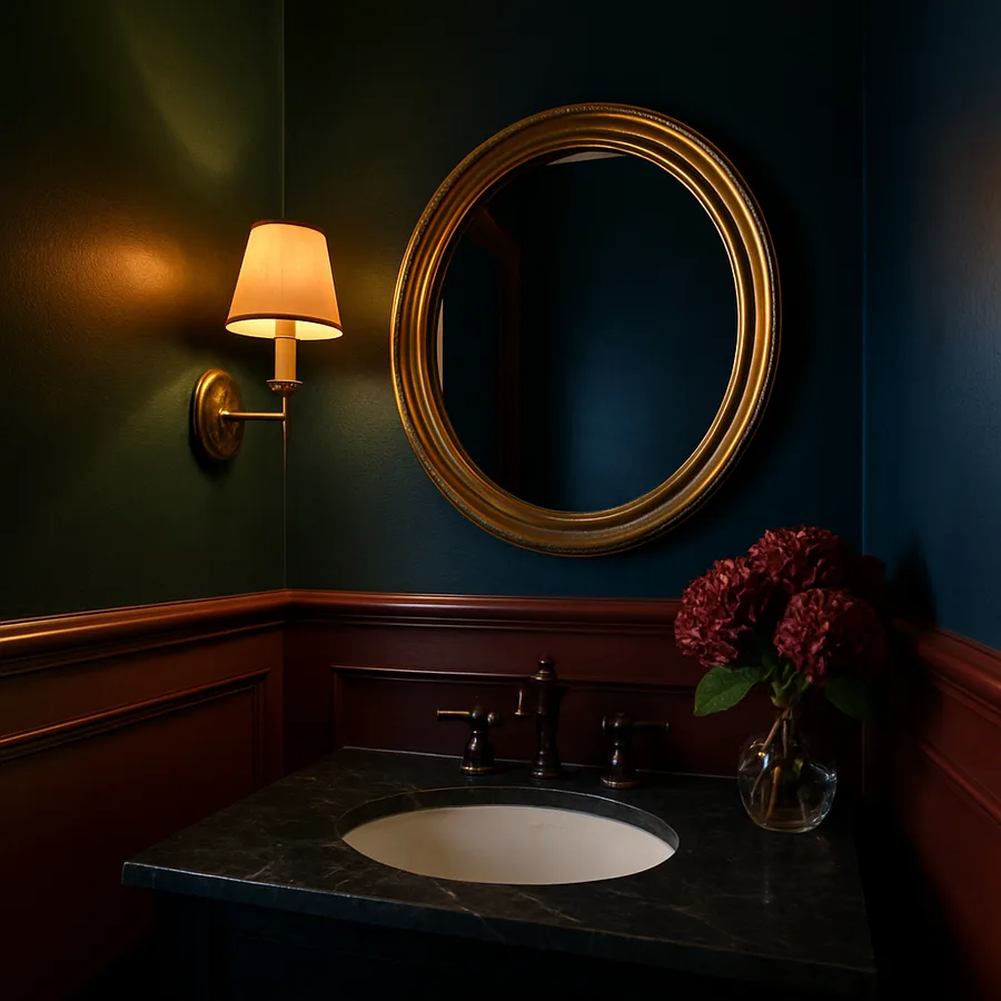
A second benefit is what happens to fixtures. A white sink and a chrome faucet against a dark wall become dramatically visible, almost jewelry-like, while the same fixtures against a beige wall barely register. In a room as small as a powder room, where you have only a few objects, making each one read clearly is a meaningful design goal. Dark walls do that work automatically.
Choosing the Right Dark Color: Undertone Matters More Than Hue
"Dark" is a family of hundreds of colors, and the differences between them are what separate a great dark powder room from a depressing one. The single most important factor is undertone, the underlying warm or cool bias of the color. A navy with a green undertone will feel markedly different from a navy with a violet undertone, even though both read as navy on the chip. Warm undertones, reds, yellows, oranges, make a room feel enveloping and intimate. Cool undertones, blues, greens, violets, make a room feel calm and atmospheric.
For most powder rooms, warm-undertoned darks work better, because powder rooms usually lack natural light and benefit from a color that reads as cozy rather than chilly. Deep browns with red undertones, oxbloods, aubergines, and ink-blacks with a touch of warmth consistently perform well. Cool-undertoned darks like true navy or forest green can work beautifully when the room has a window or when warm brass fixtures are used to balance the temperature. Avoid mid-tone grays almost universally; they tend to go flat in low light and can read as institutional rather than dramatic.
Test at scale. A 4-by-4-inch paint chip lies, because a small sample is surrounded by your current wall color, which visually pushes the chip's undertone in unexpected directions. Order a full quart, paint a 24-by-24-inch square on at least two walls, and look at it at morning, midday, and evening. Benjamin Moore and Farrow & Ball both publish guidance that color should be evaluated on a minimum of two walls, because the way light reflects between adjacent painted surfaces changes the perceived color by as much as two shades.
Sheen: The Decision Most People Get Wrong
Sheen is the single most misunderstood variable in dark-painted powder rooms. A high-gloss dark paint, lacquered or oil-based high-sheen, creates a mirror-like surface that bounces light dramatically and makes the room feel cinematic. A flat or matte dark paint absorbs light and makes the room feel cocooned. A satin or eggshell dark paint lands in the awkward middle, reflecting enough to show every imperfection in the wall but not enough to feel intentional.
For most small powder rooms, the two best sheen choices are either a true flat for a cocooning effect, or a high gloss for a cinematic effect. A good flat finish makes the walls dissolve into color, and the fixtures and lighting become the entire show. A high-gloss finish turns the walls into mirrors that reflect the mirror, the sconces, and the ceiling, multiplying light and visual interest. Both work; the awkward middle does not.
High gloss does require near-perfect wall prep. Any drywall imperfection will telegraph through a lacquered finish. House Beautiful has documented multiple powder-room case studies where a high-gloss dark paint transformed the room only after the walls were skim-coated and sanded to a Level 5 finish. In a room this small, that extra prep cost is minor, maybe $300 to $600, but it is non-negotiable for high-gloss results. A flat finish is far more forgiving and is the right choice for older homes with imperfect walls.
Trim, Ceiling, and Door: Where Contrast Becomes Critical
Once the wall color is chosen, the second most important decision is whether the trim, ceiling, and door match or contrast. High-contrast trim, white or cream against a dark wall, creates a crisp, traditional look. The eye reads every molding, every edge, and the room feels detailed and defined. Low-contrast trim, painted the same dark color as the walls, makes the room feel enveloping and modern. The edges disappear, and the room reads as a single color field.
For small powder rooms, low-contrast trim almost always expands the room more. When the door, the baseboard, the ceiling, and the walls are all the same color, the eye has no reference for where the room begins and ends. Corners disappear. The room feels larger than its floor plan suggests. This technique is sometimes called "color drenching" and has become a signature of designers working in small, dramatic spaces. A Zillow analysis of listing photos found that color-drenched powder rooms appear in 14% of homes selling above asking price in urban markets, compared to only 4% of the overall listings, suggesting buyers respond positively to the look.
The ceiling is where most homeowners hesitate. Painting a ceiling dark feels counterintuitive; the instinct is to keep the ceiling white to avoid "lowering" the room. But a white ceiling above dark walls creates a hard horizontal line that visually caps the space. Continuing the wall color onto the ceiling removes that line, and the room suddenly feels taller, not shorter. If full color drenching feels too bold, a ceiling painted in the same color at 50% tint is a softer compromise.
Lighting: Bulbs, Fixtures, and Placement for Dark Walls
A dark powder room lives or dies by its lighting. The same paint color can look sumptuous under warm 2700K sconces and depressing under cool 4000K cans, with nothing else changed. The baseline rule: dark rooms need warm, layered light. Warm color temperature flatters dark pigments; cool color temperature flattens them. Aim for 2700K across all fixtures, with a total lumen output that matches the room's size, roughly 400 to 600 lumens total for a small powder room.
Layering matters more here than in a bright room. A single overhead fixture in a dark powder room creates hard shadows under the eyes at the mirror and makes the room feel underlit even when the lumen count is correct. Add wall sconces flanking or above the mirror at eye level, because sconces light the face and bring the painted walls to life. If you can dim the overhead and leave the sconces at full, you get the most flattering light for both the user and the paint.
Fixture finish should contrast with the wall color. Brass and polished nickel sconces against deep green walls, matte black sconces against oxblood, unlacquered brass against charcoal, these pairings give the fixtures their own visual job. A fixture that disappears into the wall is a waste of a focal point. ASID guidance on residential bathroom lighting emphasizes that dark rooms specifically benefit from three-point lighting: ambient, task, and accent, even when the room is small.
Fixtures, Hardware, and Decor That Carry a Dark Room
A dark powder room needs a clear set of visual anchors, because the walls are no longer carrying the design load, the fixtures are. Start with the sink. A bright white pedestal or wall-mount sink against a dark wall becomes an almost graphic shape, and the cleaner the sink profile, the better. A fluted or detailed sink competes with the paint; a plain cylindrical or rectangular profile lets the paint win.
The mirror is the second anchor. A dark room benefits from a mirror with a strong frame, brass, black, or warm wood, because the frame gives the mirror its own presence rather than letting it float as just a reflective surface. The mirror's reflection of the opposite wall also brings more color into view, which amplifies the drama. Consider a larger-than-expected mirror; in a small dark room, a mirror that reaches close to the ceiling bounces light and multiplies the room's sense of depth.
Hardware should follow the brass-or-black rule in a dark powder room. Chrome and brushed nickel, which read beautifully in light rooms, tend to disappear against dark paint. Unlacquered brass develops a living patina that reads as warm and lived-in, and matte black reads as crisp and architectural. A reader's question: is your household temperament traditional or modern? That answer should drive the choice between brass (traditional) and black (modern), because the hardware finish is the single clearest style signal in a dark room. A second question: do you want this room to feel like a library or a jewel box? Library calls for matte paint and warm brass; jewel box calls for high-gloss paint and polished brass or chrome.
Conclusion
A small powder room in the right dark color is one of the most satisfying rooms in a house. It feels cinematic rather than cramped, intentional rather than constrained, and it costs less than almost any other design move that delivers the same visual impact. Two gallons of good paint, a weekend of prep, and a careful pass over the lighting can transform the smallest room in the home into its most memorable.
The playbook is straightforward. Pick a saturated color with a warm undertone if the room lacks natural light, or a cool undertone balanced by warm metals if it has a window. Commit to a sheen, flat for cocooning or high gloss for cinematic, and skip the awkward middle. Consider color-drenching the trim and ceiling for maximum recession, or keep them crisp white for a traditional contrast look. Layer warm light with sconces at eye level and a dimmable overhead.
Finally, choose fixtures that earn their place as anchors rather than blending in. A bright white sink, a well-framed mirror, and a set of brass or matte black sconces will carry a dark powder room with ease. A small powder room is often a home's most unexpected design win, and a well-executed dark color scheme is among the surest ways to achieve that win without a full renovation. Pick the color you keep coming back to in magazines, test it at scale, and commit. Start your dark-paint powder room transformation with our free color-and-sheen worksheet, available on Interior Bliss, to plan your palette before you buy a single gallon.
More Articles You May Like


Comments
Post a Comment