House Numbers Mounting Styles From Modern Vertical to Cottage Plaque
House numbers are the most-overlooked and most-underestimated detail on a residential exterior. They are functional, of course, helping guests, delivery drivers, and emergency responders find your address. But they are also typographic objects, design details, and often the only place on a home where the homeowner gets to choose a typeface. The way you mount them, where you place them, and what you place them on transforms them from a utility into a design statement that ties the entire facade together.
Most builders default to four small, plastic-coated digits screwed beside the front door at eye level. That arrangement reads as a bare-minimum compliance gesture, the equivalent of a sticker on a freshly built spec home. The good news is that house numbers are inexpensive to upgrade, easy to install, and capable of producing the kind of curb appeal lift that makes a home look as if it was photographed for a magazine. According to a National Association of Realtors (NAR) exterior-projects survey, 92% of agents recommend small visual upgrades like house numbers and lighting before listing, and 73% report measurable buyer-impression improvement when those upgrades are made.
Why House Number Style Matters More Than You Think
Anyone who has ever circled a block looking for the right address knows the experience of squinting at tiny, faded digits half-hidden behind shrubs. House numbers exist to be read, but they also exist to be styled. They sit at the intersection of legibility and identity, telling visitors what kind of household they are approaching before the front door even opens. A heavy slab-serif suggests historicism and weight. A clean modern sans-serif suggests minimalism and confidence. A handpainted plaque suggests warmth, craft, and hospitality.
Editors at House Beautiful have repeatedly highlighted house numbers as the most cost-efficient curb-appeal swap a homeowner can make. The reason is that the upgrade affects two senses at once: the visual proportion of the facade and the navigational ease of arriving guests. Done well, house numbers do not just inform, they punctuate. Done poorly, they undermine an otherwise considered home.
Consider this: have you ever watched a delivery driver park three houses down because your numbers were illegible at dusk? Or noticed that a new neighbor's house instantly looked more expensive after they swapped four cheap brass digits for a single mounted plaque? These small moments are the difference between a home that reads as anonymous and one that reads as cared-for.
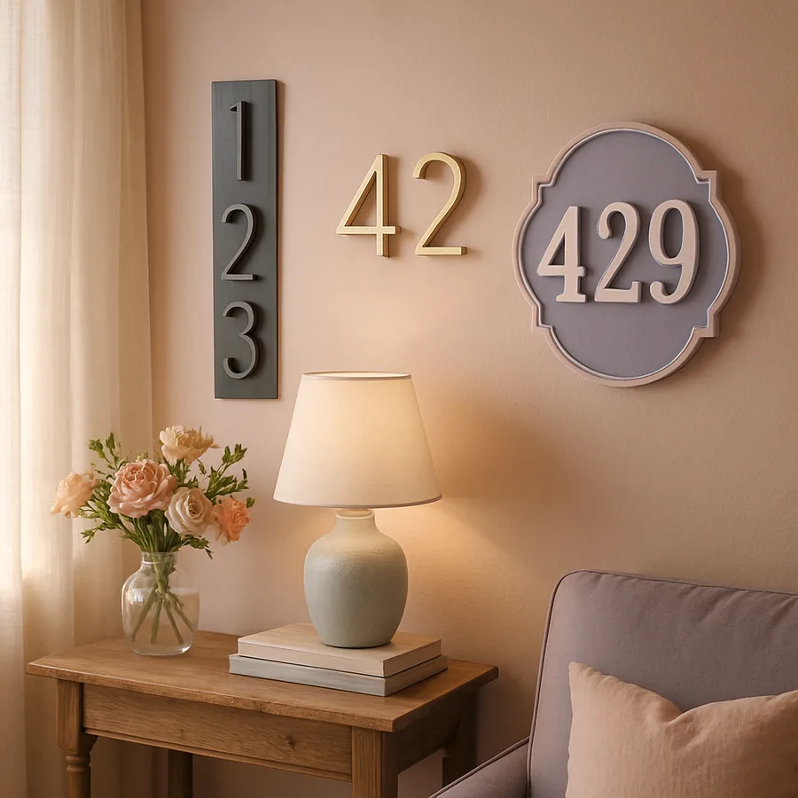
Modern Vertical Mounting: The Architectural Statement
Vertical mounting is a relatively new convention, popularized over the past decade by modern farmhouse, midcentury revival, and contemporary minimalist builds. The arrangement stacks the digits one above the other on a slim metal or wood strip beside the front door. The result is a column of typography that reads as architectural rather than purely functional. It is the kind of detail that magazine editors photograph close-up.
Vertical numbers work best on homes with clean, vertical lines, especially board-and-batten siding, vertical cedar planks, or contemporary stucco. They look most striking when mounted on a backing material that contrasts with the siding: a dark wood plank against light siding, a brass strip against dark cladding, or a piece of weathered steel against painted brick. The backing creates a frame that elevates the digits from utility to art.
Sizing matters enormously here. Designers recommend digits of 5 to 7 inches tall for most homes, scaled up to 8 or 10 inches for homes set far from the street or with grand entrances. Choose a clean, slightly geometric sans-serif (think Neutraface, Akzidenz, or similar) for a modern feel, or a heavier slab-serif for a more grounded, transitional look. Brands like Modern House Numbers, Heath Ceramics, and House Number Lab are well known for clean vertical kits.
Cottage Plaque Style: Tradition and Warmth
At the other end of the spectrum, the cottage plaque approaches house numbers as a small piece of folk craft. A single ceramic, painted wood, slate, or hand-cut metal plaque carries the address, often paired with a flourish: a small painted bird, a botanical motif, or a custom family monogram. The plaque sits like a hand-lettered sign beside the door, on a porch post, or beneath a porch light, lending the entire entry a sense of place and history.
This style works beautifully on homes with traditional, storybook, or English-cottage architecture. Brick exteriors, board-and-batten with painted trim, shingled cottages, and farmhouses all welcome the warmth of a plaque. Materials like glazed ceramic (think Heath Ceramics, Pewabic, or local potters), hand-cast bronze, oxidized copper, and milk-painted wood all read as artisan rather than off-the-shelf.
Plaques pair particularly well with painted door colors that lean traditional: deep red, sage green, navy, butter yellow, or cream. They invite a hand-touched detail at the threshold and signal to guests that the household values craft. The trade-off is legibility from the curb. A small ceramic plaque reads beautifully from ten feet away but can be hard to spot from a moving vehicle, so consider doubling up with a second, larger numeric mounted on the curbside mailbox or a fence post.
Horizontal Sans-Serif: The Reliable Classic
Between the two extremes sits the horizontal sans-serif arrangement, the most widely used and most consistently flattering style for the broadest range of homes. The digits are mounted side by side at eye level, on the door surround, beside the door, or on a dedicated address backplate. The horizontal arrangement reads quickly, scales easily to large or small homes, and adapts to almost any architectural style.
The trick to elevating a horizontal arrangement is the spacing and the typeface. Builder-grade horizontal numbers fail because they are crammed together with no kerning consideration, often in a generic Times Roman or Helvetica face that does nothing to flatter the architecture. A custom-spaced kit, with each digit separately mounted using a paper template to maintain even kerning, transforms the look. Designers often use a thin acrylic spacer behind each digit to lift it slightly from the wall, casting a subtle shadow that adds depth.
For traditional homes, choose a refined serif like Garamond, Caslon, or a custom Roman face. For transitional or modern homes, choose a clean sans like Futura, Avenir, or Helvetica Neue. Avoid italic, decorative, or hand-script faces unless you are explicitly going for a cottage feel, because at curb distance these become illegible. A single typeface, well-sized, well-kerned, and well-finished, almost always outperforms a busy or ornate alternative.
Backing Materials, Sizing, and Sightlines
The mounting surface is half the battle. House numbers float, in design terms, when they are mounted directly to siding without a defined frame. Adding a backing plate, a contrasting wood plank, a piece of metal, or a tile composition gives the numbers a stage. The backing should be chosen to contrast with both the siding and the digits themselves, creating two layers of separation that make the address pop.
For sizing, the rule of thumb among designers is that digits should be readable from 50 feet away. That generally means a minimum of 4 inches tall for close-set urban homes and 6 to 8 inches for suburban homes set back from the street. If your home is on a rural road or set far back, scale up to 10 or even 12 inches. Numbers that are too small are not just impractical, they look meek and undermine the visual weight of the entry.
Sightlines also matter. Walk across the street at dusk and look at where your numbers fall in the visual hierarchy. Are they competing with porch lights, mailboxes, or shutters? Are they hidden behind a hedge that has grown over the past two summers? The placement should be obvious, unobstructed, and at a natural reading height (typically 5 to 6 feet from the ground). The National Association of Home Builders (NAHB) has noted that homes with clearly visible address numbers report fewer delivery and emergency-response delays, which is one of those quiet quality-of-life details that adds up over years.
Lighting, Visibility, and the Night Test
House numbers exist to be read both at noon and at midnight. Many homeowners install beautiful numbers, photograph them in afternoon sun, and never check whether they are visible at 10 p.m. on a moonless evening. That oversight matters when emergency responders or unfamiliar visitors need to find the home in the dark.
The simplest fix is a dedicated address light, a small downward-facing fixture mounted directly above the numbers. These fixtures can be hardwired or solar, and they cast a warm pool of light that makes the address visible from a hundred feet away. For homes without an address light, position the numbers within the cone of an existing porch sconce, ideally one with a 2700K to 3000K warm-white bulb that flatters skin tones and architectural materials.
Reflective or backlit numbers offer another modern solution. Brass, copper, and stainless steel digits naturally catch ambient light and stay legible in low conditions. Backlit acrylic numbers, which use a small LED strip mounted behind the digits, glow softly at night and read as architectural sculpture. Both options trade up from utility to design feature, and they signal that the household has thought about how the home looks across all 24 hours rather than just the photogenic ones.
Conclusion: Choose Numbers That Match the Home's Voice
House numbers are typography you wear on your home. They are an invitation, a wayfinding tool, and a small but irreplaceable opportunity to express a point of view. The choice between modern vertical, cottage plaque, and horizontal sans-serif is not a question of trend but of voice. Modern vertical reads as architectural. Cottage plaque reads as warm and crafted. Horizontal sans-serif reads as classic and timeless. None is universally better, and the right answer depends on the home's bones, the household's personality, and the street's overall character.
Whatever style you choose, the principles remain consistent. Size for legibility. Mount on a defined backing rather than directly to siding. Match the hardware metal to your other exterior elements. Light the numbers so they read at night. Walk to the curb at noon and at dusk to verify the result. The American Society of Interior Designers (ASID) has framed exterior typography as one of the most underutilized opportunities in residential design, and the data from NAR backs up that claim.
This is a project that fits in a single afternoon. The materials cost between $40 for a basic upgrade and $300 for a custom plaque or premium kit. The visual return is disproportionate. Schedule the swap for this weekend, and treat your address as the small piece of typography it deserves to be. Walk outside tonight, photograph your current numbers from across the street, and ask yourself whether they say what you want them to say. If they do not, you now have everything you need to fix that in a single trip and a single afternoon of work.
Before you begin, consider one more practical detail: emergency response visibility. Local fire departments and emergency medical services across the country regularly publish guidance on house number visibility, recommending digits at least 4 inches tall, in a contrasting color from the background, and visible from the street in both day and night conditions. Some municipalities have ordinances requiring specific minimum sizes or reflective materials. Before committing to a particular style, check your local building code or municipal website to confirm there are no restrictions you should be aware of. A beautifully styled cottage plaque can still meet those requirements if you pair it with a secondary, larger curbside number on the mailbox or fence post.
The final detail is mounting hardware. Many house number kits ship with stainless steel screws or studs, which can rust or stain wood siding over time. Choose marine-grade stainless or solid brass mounting hardware to match your chosen metal family, and seal the holes with a small dab of clear silicone before driving the screws. This prevents water intrusion behind the siding, which is one of the most common causes of long-term damage from exterior mounted hardware. Take a moment to drill carefully, level each digit individually with a small bubble level, and verify alignment from across the street before tightening any screw fully. The fifteen extra minutes of careful installation make the difference between numbers that look professionally mounted and numbers that look slightly off in a way that bothers you every time you walk to the door.
More Articles You May Like


Comments
Post a Comment