The Ultimate Guide to Choosing the Perfect Color Palette for Your Home Interior
Color is the most powerful and immediate tool available to any interior designer, professional or amateur alike. The moment you step into a room, color communicates mood, energy, personality, and spatial dimension before you consciously register a single piece of furniture. According to the American Society of Interior Designers (ASID), color selection is the number one concern homeowners express when beginning an interior design project, and for good reason -- a well-chosen palette can make a modest space feel luxurious, while a poorly considered one can undermine even the most expensive furnishings. Understanding how to select and coordinate colors for your home interior is not merely an aesthetic exercise; it is a foundational skill that influences your daily mood, productivity, and overall wellbeing.
The science of color psychology has been extensively studied by organizations including the International Interior Design Association (IIDA), which has published research demonstrating that interior color choices measurably affect occupant behavior, stress levels, and perceived room temperature. Warm tones like red, orange, and yellow stimulate energy and appetite, making them popular choices for kitchens and dining areas. Cool tones like blue, green, and violet promote calm and concentration, suiting bedrooms and home offices. Neutrals provide the essential backdrop that allows accent colors to shine without competing for attention. These psychological effects are not merely subjective preferences -- they are grounded in decades of environmental psychology research.
This comprehensive guide will walk you through every aspect of choosing a home color palette, from understanding basic color theory to applying professional techniques room by room. Whether you are starting with a blank canvas in a new home or refreshing the palette of a space you have lived in for decades, the principles outlined here will give you the confidence to make color decisions you will love for years. Have you ever repainted a room and immediately regretted the choice? By the end of this guide, you will have the knowledge to prevent that experience permanently.
Foundations of Color Theory for Interior Spaces
Color theory provides the structural framework for all successful palette decisions, and a basic understanding of its principles eliminates much of the guesswork that leads to design regret. The color wheel, first developed by Sir Isaac Newton and refined over centuries, organizes colors into primary (red, blue, yellow), secondary (green, orange, purple), and tertiary categories based on their relationships. For interior design purposes, the most useful relationships are complementary (opposite on the wheel), analogous (adjacent on the wheel), and triadic (evenly spaced around the wheel). Each relationship creates a different visual effect -- complementary schemes are bold and energetic, analogous schemes are harmonious and soothing, and triadic schemes are vibrant yet balanced.
The concept of undertones is perhaps the most critical and least understood aspect of interior color selection. Every paint color, fabric, and material carries an undertone -- a subtle secondary hue that becomes apparent when placed next to other colors. A white wall might carry pink, yellow, blue, or green undertones, and these hidden hues determine whether colors placed nearby will harmonize or clash. The NCIDQ certification exam dedicates significant attention to undertone identification because it is the skill that separates competent color specification from amateur guesswork. To identify undertones, compare your chosen color against a pure white sample in natural daylight; the secondary hue that becomes visible is the undertone that will interact with everything else in the room.
Value and saturation are two additional dimensions of color that significantly impact how a palette feels in a real room. Value refers to lightness or darkness -- a pale sage green and a deep forest green are the same hue at different values. Saturation describes intensity -- a muted dusty rose versus a vivid fuchsia. For most residential interiors, the ASID recommends building palettes with varied values but consistent saturation levels, as mixing highly saturated colors with very muted ones creates visual discord. A palette of all muted tones feels sophisticated and restful, while a palette of all saturated tones feels energetic and playful. The key is consistency within your chosen intensity range.
Developing Your Personal Color Identity
Before reaching for paint swatches, take time to identify the colors that genuinely resonate with you on a personal level. Your wardrobe is one of the most reliable indicators of your true color preferences -- the colors you consistently choose to wear are typically the colors that make you feel most confident and comfortable, and those same hues often translate beautifully into interior spaces. Scroll through photographs of rooms you have saved on design platforms like Houzz, which reports that its users save an average of 200 room images before beginning a design project, and look for the common color threads that connect your favorites. These recurring hues form the foundation of your personal color identity.
Consider also the architectural features and fixed elements that will remain constant in your space. Flooring, countertops, fireplace surrounds, exposed brick, and built-in cabinetry all carry color and undertone information that your palette must acknowledge. Fighting against these fixed elements -- choosing warm wall colors in a room with cool-toned marble counters, for example -- creates a persistent sense of visual tension that no amount of accessorizing can resolve. Instead, identify the dominant undertone in your fixed elements and build your palette in harmony with it. This approach does not limit your options; it simply provides a reliable starting point that ensures cohesion.
Lifestyle factors should inform your color choices as practically as aesthetic preferences do. Homes with young children or pets may benefit from slightly deeper or more forgiving wall colors that do not show every fingerprint and scuff mark. Rooms with abundant natural light can handle deeper, more saturated colors without feeling dark, while rooms with limited natural light typically benefit from lighter values that maximize the available illumination. How much time do you spend in each room, and what activities occur there? A home office where you spend eight hours daily warrants different color consideration than a guest bedroom used a few weekends each year.
The Professional 60-30-10 Rule and Beyond
Professional interior designers consistently rely on the 60-30-10 rule as a starting framework for color distribution, and its effectiveness across virtually every design style makes it worth understanding thoroughly. The rule allocates 60% of a room's visible color to a dominant shade (typically walls, large rugs, and major furniture), 30% to a secondary shade (upholstery, curtains, bedding, and accent furniture), and 10% to an accent color (throw pillows, artwork, decorative objects, and small accessories). This distribution creates visual hierarchy and prevents the eye from becoming overwhelmed by competing colors. IIDA design educators teach this rule as foundational because it works reliably in rooms of any size, style, or function.
The dominant 60% color should be the most neutral and livable shade in your palette, as it will occupy the largest visual area and establish the room's overall atmosphere. This does not mean it must be white or beige -- a deep navy, a warm clay, or a soft sage green can all serve as beautiful dominant colors when paired with appropriate secondary and accent shades. The secondary 30% color provides contrast and interest, bridging the gap between the subtle dominant and the bold accent. It should be noticeably different from the dominant color while sharing compatible undertones. The accent 10% is where you introduce your most vibrant, personality-driven colors in small but impactful doses.
While the 60-30-10 rule provides an excellent starting point, experienced designers know when and how to bend it for specific effects. Monochromatic schemes might use a 70-20-10 distribution with very subtle color variation. Maximalist interiors might push toward a more even distribution of multiple bold colors. The key insight is that some form of intentional hierarchy must exist -- rooms where every color demands equal attention feel chaotic and exhausting, while rooms with clear dominant, secondary, and accent roles feel composed and restful. Use the rule as your guide, but trust your eye when minor adjustments feel right for your particular space.
Room-by-Room Color Strategy
Each room in your home serves a distinct function and demands its own color considerations, though all rooms should share enough common thread to create a cohesive whole-house palette. Living rooms, as the primary gathering and entertaining spaces, benefit from warm, welcoming palettes that encourage conversation and relaxation. The ASID recommends warm neutrals with earthy accent colors for living rooms, as these combinations test well across the widest range of visitor preferences. Consider how your living room connects visually to adjacent spaces -- hallways, dining rooms, and kitchens that are visible from the living room should share at least one palette color to maintain visual flow.
Bedrooms demand the most careful color consideration because they directly influence sleep quality and relaxation. Research published through interior design organizations including the NCIDQ has demonstrated that blue bedrooms are associated with the longest average sleep duration, followed by earth tones and soft greens. Highly stimulating colors like bright red, vibrant orange, and electric yellow are consistently correlated with shorter, less restful sleep. This does not mean bedrooms must be bland -- a muted dusty blue, a soft warm gray, or a gentle sage green can be deeply beautiful while promoting the restful atmosphere a bedroom requires. Reserve bolder colors for accent pillows, artwork, and accessories that do not dominate the field of vision when lying in bed.
Kitchens and bathrooms present unique challenges because they contain more fixed color elements than any other rooms -- countertops, tile, fixtures, appliances, and cabinetry all contribute permanent colors that your palette must accommodate. In these rooms, treat the fixed elements as your starting palette and select wall colors, linens, and accessories that complement rather than compete. White and light-toned kitchens remain popular because they pair flexibly with virtually any countertop material and appliance finish. However, deeper tones like hunter green, midnight blue, and charcoal are gaining traction for kitchen cabinetry, creating dramatic statements that elevate the space from purely functional to genuinely beautiful. What does your kitchen's current color story communicate to anyone who walks in?
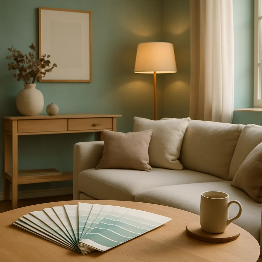
Testing and Refining Your Palette Before Committing
The difference between a palette that looks perfect on a screen or swatch and one that actually works in your space can be enormous, which is why testing is a non-negotiable step in the professional design process. Houzz survey data indicates that 42% of homeowners who skip the testing phase report dissatisfaction with their final color choices, compared to only 12% who test extensively before committing. Purchase sample pots of your top paint contenders and apply large swatches -- at least two feet square -- on multiple walls in each room. Colors appear dramatically different on north-facing versus south-facing walls, in morning versus evening light, and against different adjacent surfaces.
Live with your test swatches for a minimum of 48 hours before making any decisions, observing how they appear at different times of day and under different lighting conditions. The color that looked perfect under the warm glow of evening lamps may look washed out and cold in harsh morning light, or vice versa. Place fabric swatches, furniture samples, and decorative objects near your painted test areas to evaluate how the entire palette works together in three dimensions. This investment of a few days and a few dollars in sample pots can save hundreds of dollars and countless hours of repainting regret.
Digital tools have made preliminary palette exploration faster and more accessible than ever before, though they should supplement rather than replace physical testing. Applications and websites allow you to upload photographs of your rooms and virtually apply different paint colors, providing a rough preview of how various options might look in your specific space. ASID-certified designers increasingly use these tools in client presentations to narrow options before purchasing physical samples. While digital previews cannot perfectly replicate how paint will look on textured walls under variable lighting, they excel at eliminating clearly wrong choices early in the process, saving time and money on sample purchases.
Creating Whole-House Palette Cohesion
A cohesive whole-house palette does not mean every room must be the same color -- it means every room shares a common color language that creates a sense of flow and intentionality as you move through the home. The most effective approach is to select a core palette of five to seven colors: two to three neutrals of varying values, two secondary colors, and one to two accent colors. These core colors appear in different proportions and combinations throughout the house, with each room emphasizing different selections from the shared palette. The IIDA describes this approach as "theme and variation," and it is the technique most professional designers use to create homes that feel both diverse and unified.
Transitional spaces -- hallways, staircases, foyers, and open sightlines between rooms -- are the connective tissue that either unifies or fragments your whole-house palette. These areas should feature your most neutral core palette colors, serving as visual bridges between the more characterful rooms they connect. If your living room features warm taupe walls with terracotta accents and your kitchen displays sage green cabinetry, the hallway between them might use a warm white that shares undertones with both spaces. This threading technique creates smooth visual transitions that make the entire home feel thoughtfully designed rather than assembled room by room without a master plan.
Revisiting and refining your palette over time is a natural and healthy part of living with color in your home. As seasons change, as your family grows or shrinks, and as your tastes evolve, your relationship with your home's colors will shift. The advantage of a well-structured core palette is that individual elements can be updated -- new throw pillows, repainted accent walls, different artwork -- without disrupting the overall harmony. Think of your home palette as a living document rather than a permanent decree. The goal is not perfection but a coherent, comfortable color environment that supports your daily life and brings you genuine pleasure every time you look around your rooms.
Conclusion
Choosing the perfect color palette for your home interior is equal parts art, science, and self-knowledge. The principles of color theory provide the structural foundation, while your personal preferences, lifestyle needs, and architectural context supply the creative direction. By understanding undertones, applying the 60-30-10 rule, considering room-specific requirements, testing rigorously before committing, and building whole-house cohesion through shared core colors, you can create a home that feels harmonious, personal, and endlessly inviting. The guidance from organizations like ASID, IIDA, NCIDQ, and Houzz consistently confirms that successful color design is accessible to anyone willing to invest the time to learn and apply these fundamental principles.
Start your color journey today by collecting images of spaces that move you, identifying the common colors that connect them, and purchasing a few sample pots to begin testing in your home. Remember that color decisions are among the most reversible in all of interior design -- a room can always be repainted, pillows can always be swapped, and curtains can always be changed. This reversibility should free you to be bolder and more expressive than you might otherwise dare. Take the first step this weekend: pick one room, choose three colors, and begin the transformation that will make your entire home a more beautiful, more personal, and more joyful place to live.
More Articles You May Like


Comments
Post a Comment