The Ultimate Guide to Choosing the Perfect Color Palette for Kitchen Interiors
Color is the first thing a person registers when stepping into a room, and in the kitchen, where families gather and meals take shape, the palette sets an emotional tone that influences everything from appetite to conversation. A 2024 survey by Houzz revealed that 67 percent of homeowners who renovated their kitchen cited color selection as the most stressful decision in the entire project, outranking countertop materials, appliance brands, and even budget management. That statistic underscores a real tension: color feels deeply personal, yet the consequences of a poor choice are visible every single day for years. The American Society of Interior Designers (ASID) teaches that color confidence comes from understanding a few foundational principles rather than chasing fleeting trends. This guide walks through those principles systematically, covering color theory, the psychology of kitchen hues, trending palettes, material coordination, lighting interactions, and practical application strategies. By the end, you will possess a framework for making color decisions that feel both timely and timeless, grounded in professional knowledge rather than guesswork.
Understanding Color Theory for Interior Applications
Color theory provides the structural logic behind every successful palette, and understanding its basics eliminates the randomness that leads to regret. The color wheel, organized into primary, secondary, and tertiary hues, maps the relationships between colors in a way that predicts visual harmony. Complementary colors sit opposite each other on the wheel (blue and orange, for example) and produce high-contrast combinations that energize a space. Analogous colors sit side by side (such as green, teal, and blue) and create calmer, more unified schemes. Triadic schemes use three evenly spaced hues for balanced vibrancy. Interior designers certified through the NCIDQ examination study these relationships extensively because they form the grammar of every design language, from minimalism to maximalism. Knowing which relationship governs your palette tells you instantly whether the result will feel dynamic, serene, or somewhere between.
Beyond the wheel, three properties define every color: hue, saturation, and value. Hue is the color family (red, blue, green). Saturation describes its intensity, from muted to vivid. Value measures lightness or darkness. In kitchen design, value does the heaviest lifting because it determines how spacious and bright the room feels. A low-value (dark) cabinet against a high-value (light) wall creates contrast that sharpens architectural lines. A tonal scheme where cabinet and wall share similar values produces a seamless, enveloping feel that many designers associate with quiet luxury. Saturation controls the energy of the room: a sage green at low saturation reads as sophisticated and restful, while the same hue at full saturation becomes assertive and potentially overwhelming in an enclosed kitchen. The IIDA's residential design guidelines recommend limiting high-saturation colors to accent elements, typically no more than ten percent of the total visible surface area.
Temperature is the final dimension that separates competent color choices from inspired ones. Warm colors (reds, oranges, yellows, and warm neutrals) advance visually, making surfaces feel closer. Cool colors (blues, greens, purples, and cool grays) recede, pushing surfaces away. In a small kitchen, cool-toned walls and warm-toned accents create a spatial illusion where the boundaries feel distant while the focal points feel intimate. The reverse works in a large kitchen where too much cool tone can feel cavernous and uninviting. Mastering temperature lets you modulate the perceived volume of any room without moving a wall. How does the dominant light source in your kitchen, whether north-facing daylight or warm incandescent fixtures, shift the temperature of colors on your walls and cabinets? That interplay is the subject of a later section, but understanding it starts here, with the foundational recognition that a color swatch under store fluorescents will look entirely different in your home. With theory in hand, the next step is exploring how specific colors influence mood and behavior in the kitchen environment.
The Psychology of Color in Kitchen Spaces
Color psychology examines how hues influence human emotion, cognition, and behavior, and its applications in kitchen design are both practical and profound. Red and orange stimulate appetite and energize conversation, which is why restaurants have used them for decades. In a residential kitchen, full-wall red can feel aggressive, but a terracotta backsplash or a burnt orange pendant light introduces the same psychological warmth at a comfortable intensity. Blue suppresses appetite, a quality that may sound undesirable in a kitchen but actually serves well in households focused on mindful eating. More importantly, blue promotes calm focus, making it an excellent choice for kitchens that double as homework stations or remote work spaces. The ASID's color psychology resources note that blue kitchens consistently score highest in homeowner satisfaction surveys focused on emotional comfort, even though they appear less frequently in design magazines than their warmer counterparts.
Green occupies a unique position in the kitchen because it bridges the natural world and the built environment, resonating with the biophilic design movement that has dominated residential interiors since 2022. Sage, olive, and eucalyptus greens evoke vegetation and growth, subtly reinforcing the kitchen's connection to food and nourishment. These hues pair naturally with wood tones, stone countertops, and ceramic accessories, making them versatile anchors for both traditional and contemporary schemes. Yellow, historically the most popular kitchen color in the Western world, signals cheerfulness and sociability. However, its warmth and brightness must be carefully calibrated: a buttery pale yellow on walls feels welcoming, while a saturated lemon yellow on cabinetry can overwhelm a small space and tire the eye over time. Architectural Digest's AD PRO trend reports have tracked a steady migration from bright yellows toward warmer, earthier golds and ochres, reflecting a broader cultural shift toward sophistication and understatement.
Neutral colors, including whites, grays, beiges, and their hybrid "greige" variations, form the backbone of most kitchen palettes because they accommodate changing tastes and seasonal updates with minimal disruption. A neutral kitchen is not a colorless kitchen; it is a strategically restrained one that derives richness from texture, tone, and material rather than hue. The quiet luxury movement, championed by high-end design firms and widely covered in Architectural Digest, leans heavily on neutral palettes executed with premium materials: honed marble, unlacquered brass, hand-glazed ceramic tile. These surfaces carry inherent color variation that prevents monotony without introducing competing hues. Does your lifestyle favor bold statements that define a room's personality for years, or do you prefer a neutral canvas that adapts as your tastes evolve? The honest answer to that question should drive your palette strategy before any swatch is purchased. Understanding psychology prepares the ground, but current trends provide the specific hue families that define this moment in kitchen design.
Trending Kitchen Color Palettes for 2024 and Beyond
The trend landscape shifts continuously, but certain palettes have demonstrated staying power that suggests they are movements rather than fads. The Japandi palette, blending Japanese restraint with Scandinavian warmth, continues to dominate searches on Houzz and Pinterest, anchored by warm whites, pale woods, charcoal accents, and muted greens. This palette succeeds because it is inherently flexible: a Japandi kitchen in Portland might lean cooler with ash wood and slate gray, while the same concept in Austin might warm up with honey oak and sand. The flexibility comes from the underlying principle of contrast between light and dark, warm and cool, natural and manufactured, rather than from any specific color. Designers associated with IIDA have noted that Japandi's longevity reflects a deeper cultural desire for simplicity and intentionality, qualities that outlast any single color forecast.
Earthy palettes rooted in terracotta, clay, rust, and sienna have surged as homeowners reject the all-gray kitchens that dominated the 2015-2020 period. These warm mineral tones ground a kitchen in a sense of place and history, evoking hand-built ceramics and sun-baked landscapes. Pairing terracotta lower cabinets with creamy upper cabinets and a zellige tile backsplash creates a kitchen that feels collected over time rather than assembled from a catalog. At the opposite end of the spectrum, moody dark palettes built on deep navy, forest green, or charcoal black are gaining traction in larger kitchens where light is abundant enough to prevent the scheme from feeling oppressive. According to the NKBA's 2024 trend survey, 22 percent of designers reported specifying dark-toned cabinetry in at least half of their projects, up from 11 percent in 2021. The two-tone kitchen, with one color on base cabinets and another on uppers or the island, provides a middle path that introduces depth without full commitment to a single bold hue.
Emerging palettes for 2025 and beyond suggest a continued embrace of warmth, with mushroom, taupe, and warm putty tones replacing cooler grays across cabinetry and wall finishes. Subtle color drenching, where walls, trim, cabinetry, and ceiling share one hue at varying values, creates an immersive cocoon effect that has gained enthusiastic coverage in Architectural Digest and Elle Decor. This technique works best with mid-tone colors that avoid the starkness of white or the heaviness of black, and it rewards matte or eggshell finishes that absorb rather than bounce light. The accent color within a drenched room typically comes from a complementary metallic, a textured stone, or a single piece of art. With trend awareness established, the practical challenge becomes coordinating your chosen palette across the many materials that compose a kitchen surface.
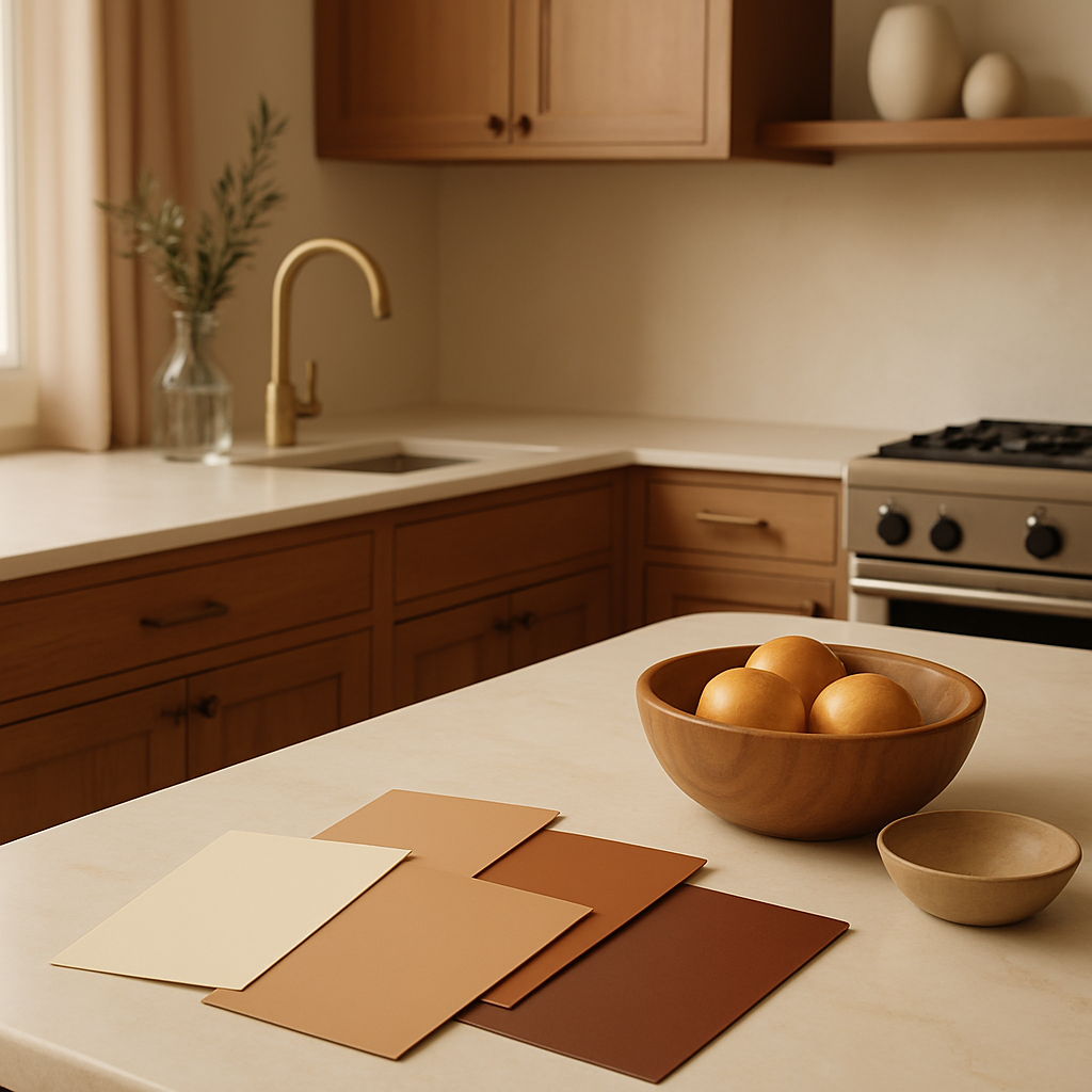
Coordinating Color Across Cabinetry, Countertops, and Backsplashes
A kitchen palette does not live on a single surface; it plays out across cabinets, countertops, backsplashes, flooring, hardware, and appliances, each with its own material constraints and optical behavior. Cabinetry dominates the visual field, typically covering 40 to 60 percent of the wall area in a standard kitchen, which makes it the anchor tone around which everything else orbits. Painted cabinets offer unlimited color freedom but require periodic repainting to address wear, while stained wood cabinets introduce the natural grain pattern as a textural element that interacts with color in complex ways. An NCIDQ-certified designer can help navigate these tradeoffs, often recommending painted finishes for contemporary and transitional schemes and stained finishes for rustic and traditional ones. The cabinet color establishes the room's overall brightness and temperature, so it should be the first decision locked in.
Countertops introduce the second major color element and, because they are horizontal surfaces viewed at close range, their color interacts with both the cabinet face and the backsplash behind them. Natural stone countertops, whether marble, granite, quartzite, or soapstone, carry veining and mineral patterns that contain multiple colors, effectively connecting the palette's dominant and accent hues in a single material. Engineered quartz offers more chromatic consistency but can appear monotonous if not offset by visual interest elsewhere. A countertop with cool gray veining bridges a white cabinet to a charcoal backsplash, for instance, while a countertop with gold and sienna veining connects cream cabinets to a terracotta floor. Budget context matters here: natural stone countertops for a typical small kitchen (25 to 40 square feet of surface) run $3,000 to $8,000 installed, while quartz falls in the $2,500 to $6,000 range. These are significant investments that you will live with daily, warranting careful color matching under real lighting conditions.
The backsplash is the palette's punctuation mark, the element where you can afford to take a slightly bolder risk because it occupies less area and is easier to replace than cabinetry or countertops. Subway tile in a contrasting grout color, hand-glazed zellige in an irregular finish, or large-format porcelain in a veined pattern each introduce texture and color variation that enliven an otherwise restrained scheme. The relationship between backsplash and countertop is particularly critical: placing sample tiles directly on the counter material, under the kitchen's actual lighting, reveals whether the combination harmonizes or clashes. Hardware and fixtures, though small in area, carry disproportionate visual weight because they are three-dimensional objects that catch light and shadow. Brushed brass hardware warms a cool palette; matte black hardware sharpens a neutral one; polished nickel maintains a clean, contemporary feel. Selecting hardware after the major surfaces are confirmed ensures it functions as a deliberate accent rather than an afterthought. With surfaces coordinated, the final variable that can make or break the palette is the lighting that illuminates it.
How Lighting Transforms Your Chosen Color Palette
A color that looks perfect on a swatch under daylight can appear entirely different under the warm glow of incandescent bulbs or the blue cast of unfiltered LEDs, and ignoring this reality is the most common source of color disappointment in kitchen renovations. Light has its own color temperature, measured in Kelvin (K), and it shifts every surface it touches. A 2700K warm white bulb adds a yellow-amber wash that makes cool grays appear warmer and can push blues toward green. A 5000K daylight bulb strips away warmth, revealing the blue undertones in a white that looked creamy under incandescent light. The ASID recommends evaluating all color samples under the specific light sources you intend to install, at multiple times of day, before making final selections. This single practice prevents more renovation regret than any other color-related precaution.
Natural light introduces additional complexity because its color temperature changes throughout the day and varies by orientation. North-facing kitchens receive cool, diffused light that can make warm colors look muted and cool colors look colder. South-facing kitchens enjoy warm, direct light that flatters warm palettes but can push reds and oranges into overwhelming intensity. East-facing kitchens are bright and warm in the morning but shift to cooler tones by afternoon, while west-facing kitchens reverse that pattern. Understanding your kitchen's orientation and its impact on color perception allows you to compensate strategically: a slightly warmer paint shade in a north-facing kitchen, a slightly cooler one in a south-facing kitchen. Designers using AR visualization tools can simulate lighting conditions at different times of day, giving clients a realistic preview that static swatches cannot provide. These tools, increasingly standard in consultations priced between $200 and $450 per hour, eliminate much of the guesswork that historically plagued color selection.
Artificial lighting design also influences color perception through placement and intensity. Under-cabinet task lights positioned close to the backsplash will intensify the backsplash color and reveal texture details that overhead lighting flattens. Recessed ceiling lights aimed straight down create even illumination that preserves color accuracy across the room. Pendant lights with tinted glass or warm-metal shades cast colored light of their own, adding a secondary hue to every surface they reach. Dimming capability is essential because it allows you to lower the light output in the evening, which shifts the color temperature warmer and transforms the palette from a daytime working mode to an evening gathering mode. Have you tested your preferred colors under dimmed conditions to confirm they still please you at lower light levels? That test often reveals that certain mid-tone greens or blues become uncomfortably dark when dimmed, prompting a value adjustment that improves the palette's versatility. With lighting's influence understood, the final section provides a practical workflow for applying all of these principles to your specific kitchen project.
A Practical Workflow for Finalizing Your Kitchen Color Palette
Theory, psychology, trends, material coordination, and lighting awareness all converge into a practical process that you can follow step by step to arrive at a palette you love and will continue to love years from now. Step one is gathering inspiration broadly, pulling images from Houzz, Architectural Digest, and design books without filtering for feasibility. At this stage, volume matters more than precision: save fifty images, then sort them into groups that share a common feeling. The grouping exercise reveals your subconscious preferences more reliably than any color quiz. Step two is extracting the dominant colors from your largest inspiration group and identifying the hue family (warm, cool, or neutral), the value range (light, mid, or dark), and the saturation level (muted or vivid). This extraction gives you a palette direction that is rooted in genuine preference rather than trend pressure.
Step three is testing physical samples in the actual kitchen space. Order large swatches of paint (at least 12 by 12 inches), cabinet door samples, stone or quartz chips, and tile samples. Tape or prop them against the surfaces they will occupy and observe them at morning, midday, and evening under both natural and artificial light. Live with them for at least three days before deciding. Step four is consulting a professional. Even a single session with an NCIDQ-certified or ASID-affiliated designer, typically running $150 to $400 per hour, provides expert eyes that catch undertone conflicts, value imbalances, and coordination gaps that untrained observers miss. The designer can also introduce options you may not have considered, such as a slightly warmer white or a countertop with veining that ties two otherwise disconnected elements together. This professional check is particularly valuable for budget-conscious renovations where every material choice is permanent and mistakes are expensive, a typical single-room kitchen redesign runs $5,000 to $15,000 in materials alone.
Step five is finalizing the palette in a physical or digital mood board that shows every material in proportion to its actual coverage in the room. Cabinet color should occupy the largest area, followed by countertop, backsplash, flooring, and accent elements. This proportional view prevents the common mistake of falling in love with a bold backsplash tile and giving it visual dominance it cannot sustain across four to six square feet of actual surface. Step six is purchasing materials with a contingency plan: order ten percent extra tile, confirm paint color codes for future touch-ups, and save countertop sample chips for matching hardware or accessories later. The discipline of this workflow transforms color selection from an anxiety-inducing guessing game into a confident, evidence-based process that respects both your personal taste and the physical realities of your kitchen environment.
Conclusion
Choosing a kitchen color palette is a decision that shapes your daily experience of one of the most important rooms in your home, and it deserves the same rigor and care that you would apply to any significant investment. This guide has equipped you with a framework that spans color theory fundamentals, psychological impacts of specific hues, current and emerging trend palettes, material coordination strategies, the critical role of lighting, and a step-by-step practical workflow. The knowledge base of organizations like ASID, IIDA, NCIDQ, and the NKBA stands behind these principles, and their certified professionals are available to guide you through the process with expertise honed across thousands of kitchen projects. Begin today by photographing your kitchen at three different times of day and noting how the existing colors shift under changing light. That simple observation will sharpen your eye and prepare you for the swatching, sampling, and consulting that follow. A kitchen palette chosen with intention and tested with patience becomes invisible in the best possible way: it simply feels right, every time you walk through the door.


Comments
Post a Comment