How to Choose the Perfect Color Palette for Your Interior Walls
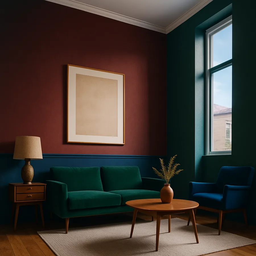
Color is the single most influential element in interior design, capable of altering mood, perception of space, and the overall emotional experience of a room within seconds of entering. Yet choosing the right color palette for interior walls remains one of the most intimidating decisions homeowners face. The sheer volume of options, with major paint manufacturers offering thousands of individual shades, transforms what should be an exciting creative opportunity into a paralyzing exercise in indecision. A study published by the Colour Association of the United States found that 62 percent of homeowners who painted a room expressed regret about their initial color choice within six months, suggesting that intuition alone is an unreliable guide. The American Society of Interior Designers (ASID) emphasizes that successful color selection is not a matter of taste alone but rather a disciplined process grounded in color theory, spatial awareness, and an understanding of how light, materials, and human psychology interact within built environments. This guide provides a structured framework for choosing wall colors that you will love not just on the day the paint dries, but for years to come.
Understanding Color Theory Fundamentals
Color theory is the intellectual framework that transforms color selection from guesswork into informed decision-making. At its core, the color wheel, developed from Isaac Newton's original experiments with light refraction, organizes colors into primary (red, blue, yellow), secondary (green, orange, purple), and tertiary categories based on their mixing relationships. These relationships generate predictable harmonies that designers leverage to create visually coherent spaces. Complementary colors, which sit opposite each other on the wheel, create vibrant, energetic contrasts. Analogous colors, which sit adjacent to each other, produce harmonious, soothing combinations. Triadic arrangements, using three equally spaced colors, offer balanced variety within a single scheme.
Beyond these basic relationships, understanding the three dimensions of color, specifically hue, saturation, and value, is essential for making nuanced wall color decisions. Hue refers to the color family itself, such as blue, green, or red. Saturation describes the intensity or purity of the color, ranging from vivid and fully saturated to muted and grayed. Value indicates lightness or darkness, spanning from nearly white tints to nearly black shades. Most successful interior wall colors occupy the low-to-moderate saturation range, where colors feel sophisticated and livable rather than aggressive or juvenile. The International Interior Design Association (IIDA) recommends that homeowners focus first on value and saturation before selecting specific hues, as these dimensions have a greater impact on the overall feeling of a room than hue alone.
The concept of color temperature adds another layer of consideration. Warm colors, including reds, oranges, yellows, and their derivatives, advance visually and create feelings of energy, intimacy, and coziness. Cool colors, including blues, greens, and violets, recede visually and evoke calm, spaciousness, and tranquility. Neutral colors such as whites, grays, beiges, and taupes serve as the foundation of most interior palettes, providing rest for the eye and flexibility for changing accessories and art over time. Understanding temperature helps you align your color choices with the functional and emotional purpose of each room, ensuring that your bedroom feels restful, your kitchen feels energizing, and your living room strikes the right balance between warmth and sophistication.
How Light Transforms Wall Color
Light is the invisible partner in every color decision, fundamentally altering how paint colors appear on your walls throughout the day and under different illumination conditions. A color that looks perfectly warm and inviting under the incandescent bulbs in the paint store can appear sickly green under fluorescent lighting or washed out in a north-facing room with limited natural light. Understanding how light affects color perception is arguably the most important practical skill in the entire color selection process. The NCIDQ examination includes substantial content on lighting and color interaction, reflecting the profession's recognition that these two elements are inseparable in practice.
Natural light varies dramatically based on the orientation of your windows. North-facing rooms receive cool, diffused, bluish light throughout the day, which can make warm colors appear muted and cool colors feel even cooler. South-facing rooms enjoy abundant warm, golden light that intensifies warm tones and can make cool colors feel more balanced and inviting. East-facing rooms receive warm morning light and cooler afternoon light, while west-facing rooms experience the reverse pattern. Before committing to any wall color, observe how your room's natural light changes from morning through evening and test your paint samples during each phase. This single step prevents more color regrets than any other technique in the selection process.
Artificial lighting introduces its own color biases. Traditional incandescent bulbs emit warm, yellowish light with a color temperature around 2,700 Kelvin, flattering warm paint colors while dulling cool tones. LED bulbs are available in a wide range of color temperatures, from warm (2,700K) to daylight (5,000K-6,500K), allowing you to match your lighting to your color palette or vice versa. Houzz survey data reveals that 47 percent of homeowners who expressed dissatisfaction with their wall color ultimately resolved the issue by changing their light bulbs rather than repainting, demonstrating the decisive influence that lighting has on color perception. Have you tested how your favorite color looks under the actual lighting conditions in your room?
The Psychology of Color in Interior Spaces
Color psychology, the study of how colors influence human emotion and behavior, provides a scientific basis for making wall color decisions that support the intended function and atmosphere of each room. Research in environmental psychology, including studies conducted at the University of British Columbia and published in the journal Science, has demonstrated that blue environments enhance creative thinking while red environments improve attention to detail. These findings have direct implications for choosing wall colors in home offices, studios, and study spaces where cognitive performance matters. Interior designers affiliated with ASID regularly incorporate color psychology principles into their practice, using evidence-based color strategies to create environments that actively support their clients' well-being and daily routines.
In residential applications, certain color associations are remarkably consistent across cultures and demographics. Blues and greens consistently rank as the most popular colors for bedrooms, reflecting their documented ability to lower heart rate and blood pressure and promote relaxation. Warm neutrals, including taupes, warm grays, and creamy whites, dominate living room and common area palettes because they create welcoming, flexible backdrops that accommodate diverse furnishing styles and frequent entertaining. Kitchens and dining rooms often benefit from warm, appetite-stimulating colors such as terracotta, warm yellow, and rich cream, while bathrooms increasingly embrace spa-inspired palettes of soft sage, pale blue, and warm white that evoke cleanliness and tranquility.
The quiet luxury trend, currently one of the most influential movements in residential design, has elevated a specific color sensibility characterized by complex, understated neutrals with subtle warm undertones. Colors like greige (gray-beige), mushroom, warm putty, and soft clay have displaced both stark white minimalism and bold accent colors in many upscale residential projects. These colors achieve their sophisticated quality through complex pigment formulations that shift subtly in different lighting conditions, appearing warmer or cooler depending on the time of day and the quality of light in the room. Major paint manufacturers including Benjamin Moore, Sherwin-Williams, and Farrow and Ball have expanded their offerings in this category in response to designer and consumer demand, making these nuanced colors more accessible than ever.
Building a Cohesive Whole-Home Palette
While individual room colors are important, the most successful interior color schemes function as a cohesive whole-home palette that creates visual flow and harmony as you move from space to space. A whole-home palette typically consists of a dominant neutral that appears on the majority of walls throughout the home, two to three supporting colors that appear in specific rooms or as accent walls, and one or two accent colors reserved for smaller applications such as powder rooms, alcoves, or interior doors. This hierarchical approach ensures visual coherence while allowing individual rooms to express distinct moods and functions.
The 60-30-10 rule, a foundational principle taught in IIDA and ASID accredited design programs, provides a reliable framework for distributing colors within each room and across the home. Approximately 60 percent of a room's visible surface area should be devoted to the dominant color, typically the wall color itself. Thirty percent should feature the secondary color, usually expressed through larger furnishings, window treatments, and area rugs. The remaining 10 percent is reserved for accent colors that appear in accessories, artwork, and decorative objects. This ratio creates a balanced composition that feels intentional and curated rather than chaotic or monotonous, and it ensures that even bold accent colors remain visually manageable within the overall scheme.
When selecting colors for adjacent rooms and open floor plans, pay close attention to sightlines and transitions. Standing in one room, you should be able to see into the adjoining rooms without experiencing jarring color contrasts that disrupt visual flow. Colors do not need to match exactly across rooms, but they should share a compatible undertone family, whether warm, cool, or neutral. Open-concept floor plans present particular challenges because multiple functional zones share a single continuous visual field. In these spaces, subtle value shifts within the same color family, such as progressing from a lighter tint in the living area to a slightly deeper shade in the dining zone, create definition between areas without the visual fragmentation that contrasting colors would produce. What is the dominant sightline in your home, and how do your current wall colors look along that visual path?
Practical Testing and Selection Methods
The gap between how a color looks on a small paint chip in a store and how it looks covering an entire wall in your home is enormous, and bridging that gap requires disciplined testing before committing to a final selection. Professional interior designers never select wall colors from a fan deck alone. The standard industry practice, endorsed by both ASID and NCIDQ-certified professionals, involves purchasing sample pots and painting large test patches, ideally 24 inches by 24 inches or larger, on the actual walls where the color will be applied. Multiple patches in different locations within the same room account for variations in light exposure across the wall surface.
Peel-and-stick paint samples, offered by companies like Samplize and backed by major paint brands including Benjamin Moore and Sherwin-Williams, provide a convenient and mess-free alternative to traditional brush-on samples. These large-format, removable samples can be moved around the room and observed at different times of day without the commitment or cleanup of wet paint. Regardless of the testing method you choose, evaluate your samples over a minimum of 48 hours, observing them in morning light, afternoon light, evening artificial light, and dimmed ambient conditions. Colors that look appealing across all lighting conditions are far more likely to satisfy you long-term than colors that look stunning at one time of day but disappointing at others.
Digital color visualization tools, while improving in accuracy, should be used with caution. Apps from paint manufacturers that allow you to photograph your room and digitally apply different colors provide a useful starting point for narrowing your options but cannot replicate the nuanced interaction between actual paint pigments, real-world lighting, and adjacent surfaces. The colors displayed on phone and computer screens are inherently limited by the color gamut of the display and the accuracy of the camera's color capture. Use digital tools for initial exploration and shortlisting, then transition to physical samples for final evaluation. This two-stage process maximizes efficiency while ensuring that your ultimate decision is based on real-world visual evidence rather than digital approximation.
Working with Undertones and Finish Selection
Undertones are the subtle secondary colors embedded within every paint shade, and they are the most common source of color selection disappointment among homeowners. A white paint that appears perfectly neutral on the chip may reveal yellow, pink, blue, or green undertones when applied to a large wall surface, particularly when influenced by adjacent flooring, countertops, or furnishings that pull out specific undertones through reflected color. Learning to identify undertones before purchasing requires training your eye to compare multiple shades side by side. Place three or four whites next to each other, and the warm and cool biases within each become immediately apparent. The same technique works across all color families.
Paint finish, or sheen level, influences both the appearance and the practical performance of your wall color. Flat and matte finishes absorb light, hiding wall imperfections and creating a velvety, sophisticated surface quality favored by designers. However, flat finishes are less resistant to scuffing and more difficult to clean, making them best suited for low-traffic rooms like bedrooms and formal living areas. Eggshell and satin finishes offer a subtle luster that improves durability and washability while still maintaining a refined appearance appropriate for most residential applications. Semi-gloss and gloss finishes reflect significant light, making them practical for trim, doors, and moisture-prone areas like bathrooms and kitchens, but they reveal every wall imperfection and are rarely appropriate for large wall surfaces in living spaces.
The same color mixed in different finishes will appear noticeably different on the wall. Higher sheen levels make colors appear slightly lighter and more vivid due to increased light reflection, while flat finishes make the same color appear slightly deeper and more muted. Professional designers frequently specify a flat or matte finish on walls with a semi-gloss finish on trim and millwork in a matching or slightly lighter shade, creating a subtle textural contrast that adds dimension and architectural definition without introducing additional colors. This technique is a hallmark of polished, professionally designed interiors and is achievable by any homeowner willing to invest in a second finish of their chosen palette.
Conclusion
Choosing the perfect color palette for your interior walls is a process that rewards patience, knowledge, and systematic testing. By grounding your decisions in color theory fundamentals, understanding how light transforms color throughout the day, considering the psychological impact of your choices, and building a cohesive whole-home palette, you elevate color selection from anxious guesswork to confident, informed design. The techniques outlined in this guide, from the 60-30-10 distribution rule to the discipline of testing physical samples over 48 hours, are the same methods used by ASID- and NCIDQ-certified professionals in their daily practice.
Remember that color is not permanent. Paint is one of the most affordable and reversible design interventions available, so while a methodical approach dramatically increases your chances of satisfaction, the stakes are lower than they might feel in the moment of decision. Begin with your most-used room, test thoroughly, trust the process, and enjoy the transformation that thoughtfully chosen color brings to your daily experience of home. The right palette does not simply decorate your walls; it shapes how you feel every time you walk through your door.
Take the first step today: select three to five colors that appeal to you, order peel-and-stick samples, and observe them on your walls across two full days of changing light before making your final decision.
More Articles You May Like


Comments
Post a Comment