How to Choose the Perfect Color Palette for Your Home Interior
Have you ever walked into a room and felt instantly at ease without being able to pinpoint exactly why? More often than not, the answer lies in color. The palette of a room influences mood, perception of space, and even physiological responses like heart rate and appetite. Choosing the right colors for your home interior is one of the most consequential decisions you will make during any design project, yet it is also one of the most intimidating. The sheer volume of available shades, finishes, and combinations can paralyze even confident homeowners. The American Society of Interior Designers (ASID) recommends approaching color selection as a structured process rather than an impulsive one, beginning with an understanding of how color functions psychologically and spatially before committing to specific hues. In this comprehensive guide, you will learn a proven framework for building cohesive color palettes that reflect your personality, complement your architecture, and create the atmosphere you have always envisioned for your home.
Understanding Color Psychology in Interior Spaces
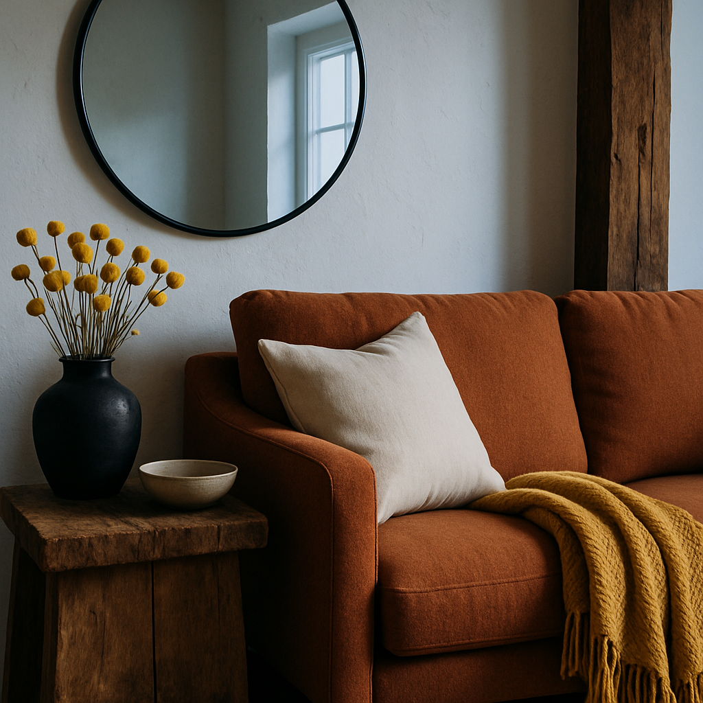
Color psychology is the study of how different hues influence human emotion, behavior, and perception, and it forms the scientific foundation of every successful interior color palette. Warm tones like terracotta, amber, and soft coral stimulate energy and social connection, making them ideal for kitchens, dining rooms, and gathering spaces. Cool tones such as sage green, slate blue, and lavender promote calm and concentration, which explains their popularity in bedrooms, bathrooms, and home offices. The International Interior Design Association (IIDA) has published extensive research demonstrating that occupants rate their satisfaction with a space significantly higher when colors align with the intended function of the room. Understanding these associations gives you a rational starting point before personal preference enters the equation.
Neutral colors occupy a unique position in the psychological spectrum. Warm whites, soft grays, and natural beiges create a sense of openness and versatility without triggering strong emotional responses. This neutrality makes them excellent foundation colors that support bolder accent choices. However, neutrals are not created equal. A cool gray with blue undertones will feel dramatically different from a warm gray with taupe undertones, even when the two shades appear nearly identical on a paint chip. Designers holding NCIDQ certification are trained to identify these subtle undertone variations and predict how they will interact with natural and artificial light sources throughout the day. Paying attention to undertones is the single most impactful skill you can develop when building a color palette for your home.
Beyond individual hue psychology, the relationships between colors in a room affect how occupants perceive proportion, temperature, and formality. A monochromatic scheme using varying saturations of a single color creates depth and sophistication without visual tension. Complementary schemes, which pair colors from opposite sides of the color wheel, generate energy and contrast that can enliven a static space. Analogous schemes, using three adjacent colors on the wheel, produce harmonious transitions that feel natural and effortless. Whichever approach you choose, consistency in undertone family, whether warm, cool, or true neutral, is the thread that holds the entire palette together and prevents the jarring clashes that undermine even the most carefully selected individual colors.
Evaluating Your Existing Architecture and Lighting
Before selecting a single paint swatch, take a thorough inventory of the fixed elements in your home that will influence how colors appear and interact. Flooring, countertops, cabinetry, fireplace surrounds, and exterior views all carry inherent color properties that your palette must accommodate rather than fight. A kitchen with warm honey-toned oak cabinets, for example, will clash with cool blue-gray walls because the undertones compete rather than complement each other. Houzz designers consistently advise starting with these immovable elements and building the color palette outward from them, treating architectural features as the anchors around which everything else revolves.
Natural light is arguably the most powerful variable affecting color perception in any interior. The direction your windows face determines the quality and color temperature of the sunlight entering each room throughout the day. North-facing rooms receive cool, indirect light that can make warm colors appear muted and cool colors appear even colder. South-facing rooms are bathed in warm, golden light that intensifies warm tones and softens cool ones. East-facing rooms experience bright morning light that shifts to shadow in the afternoon, while west-facing rooms reverse this pattern. A color that looks perfect in the showroom under fluorescent lighting may transform entirely once it is applied to your walls and exposed to the specific light conditions of your home. Have you tested your top color choices in each room at different times of day before committing?
Artificial lighting adds another layer of complexity. Incandescent bulbs cast a warm amber glow that flatters reds, oranges, and yellows but can distort blues and greens. LED bulbs are available across a wide range of color temperatures, from warm (2700K) to daylight (5000K), and selecting the right LED temperature for each room is just as important as selecting the wall color itself. Interior designers billing between $150 and $500 per hour typically conduct on-site lighting assessments as part of their color consultation process, using large-scale samples applied directly to walls and evaluated under both natural and artificial conditions before any final decisions are made. This methodical approach prevents costly repainting and ensures that the finished palette performs beautifully around the clock.
Building a Cohesive Whole-Home Palette
A whole-home color palette creates visual continuity as you move from room to room, establishing a sense of flow and intentionality that elevates the entire living experience. The most effective approach begins with selecting a dominant neutral that will appear in some form throughout the home, whether as a wall color, trim shade, or upholstery tone. This dominant neutral acts as the connective tissue of your palette, linking spaces that may otherwise feel disjointed. From there, choose two to three secondary colors that will be used in specific rooms or zones, always ensuring that they share a compatible undertone family with the dominant neutral. ASID guidelines recommend limiting a whole-home palette to five or six total colors, including neutrals, to maintain coherence without monotony.
Transition spaces such as hallways, staircases, and open-plan sightlines deserve special attention when building a whole-home palette. These areas serve as visual bridges between rooms, and the colors used in them should mediate smoothly between adjacent palettes. A hallway connecting a warm-toned living room to a cool-toned bedroom, for instance, might be painted in a balanced greige that contains both warm and cool undertones. Open floor plans present an even greater challenge, since the kitchen, dining area, and living room are all visible simultaneously. In these environments, using a single wall color throughout and differentiating zones through furniture, textiles, and accent colors is often more successful than attempting to paint each area a different shade.
The 60-30-10 rule remains one of the most reliable frameworks for distributing color within any room. Approximately 60 percent of the visual field should be occupied by the dominant color, typically the walls and large furniture pieces. Thirty percent goes to the secondary color, expressed through upholstery, curtains, and rugs. The remaining 10 percent is reserved for accent colors in accessories, artwork, and decorative objects. This ratio creates a balanced composition that feels intentional and layered without overwhelming the eye. Architectural Digest (AD PRO) features consistently demonstrate this principle in action, proving that even the most dramatic color choices feel sophisticated when distributed according to a disciplined framework.
Incorporating Trending Colors Without Losing Timelessness
Design media constantly promotes new color trends, and it can be tempting to saturate your home in the latest shade the moment it gains popularity. However, repainting an entire house every time a trend shifts is neither practical nor sustainable. The smartest approach is to reserve trending colors for easily changeable elements while keeping permanent and semi-permanent surfaces in timeless tones. Throw pillows, artwork, table accessories, and seasonal botanicals can all be swapped out with minimal cost and effort, allowing you to experiment with fashionable colors without long-term commitment. This strategy keeps your home feeling current and dynamic while preserving the foundational palette that gives it enduring character.
Quiet luxury, one of the dominant movements in contemporary interior design, offers a compelling framework for integrating trends tastefully. Rather than selecting the boldest iteration of a trending color, choose a muted, sophisticated version that blends more naturally with your existing palette. If a vibrant emerald green is trending, consider a soft sage or a deep forest tone that carries the same spirit without dominating the room. If terracotta is gaining momentum, a dusty clay or warm sand might offer a subtler nod that ages gracefully. NCIDQ-certified designers often describe this approach as interpreting rather than copying a trend, applying professional judgment to translate a broad cultural direction into a solution that serves a specific home and client.
The materials you choose also influence how trending colors are perceived. A matte finish softens bold colors and gives them an organic, handcrafted quality, while a glossy finish amplifies intensity and creates a more contemporary feel. Textured surfaces like linen, bouclé, or raw plaster break up color into subtle tonal variations that add depth and interest. When you introduce a trending color through a textured material rather than a flat painted surface, the result is layered and nuanced rather than one-dimensional. This material-conscious approach to color is central to the artisan materiality trend that continues to shape high-end residential interiors across the globe.
Testing and Sampling Colors Effectively
The difference between a color palette that looks perfect on a mood board and one that actually works in your home often comes down to the testing process. Small paint chips and digital screen representations are notoriously unreliable indicators of how a color will perform on a full-scale wall. Colors appear darker and more saturated when applied to large surfaces, and they are profoundly affected by adjacent colors, flooring materials, and the specific light conditions of each room. The IIDA recommends painting test patches no smaller than two feet by two feet on at least two different walls in each room, then living with them for a minimum of 48 hours to observe how they shift under changing light conditions throughout full day-and-night cycles.
Peel-and-stick paint samples have made the testing process significantly more convenient and less messy. These large-format adhesive swatches can be moved from wall to wall and room to room, allowing direct comparison without the commitment of opening a full paint can. Place samples next to fixed elements like flooring, countertops, and existing furniture to evaluate compatibility in context rather than in isolation. Evaluate the samples in morning light, afternoon light, and evening artificial light before narrowing your choices. Studies referenced by Houzz suggest that homeowners who invest time in thorough sampling are 40 percent less likely to repaint within the first year, saving both money and the environmental cost of wasted materials.
Beyond wall colors, test your fabric and textile selections with the same rigor. Request large cuttings from fabric suppliers rather than relying on the tiny swatches typically found in showroom binders. Drape fabric samples over your existing furniture, hold them against curtain rods, and place them on the floor beside your chosen flooring material. Observe how different fabrics absorb or reflect light, and how their colors shift relative to the wall paint samples you are considering. This holistic testing approach ensures that your final palette is not just a collection of individually beautiful colors but a coordinated system where every element enhances every other element in the room.
Working With Professional Color Consultants
While many homeowners feel confident selecting colors independently, there are situations where the expertise of a professional color consultant or interior designer can save significant time, money, and frustration. Homes with complex architectural features, unusual light conditions, open floor plans with multiple sightlines, or extensive collections of existing furnishings that must be integrated all benefit from trained eyes that can navigate competing variables simultaneously. ASID reports that professional color consultations rank among the most cost-effective design services available, since the relatively modest fee prevents expensive mistakes that would otherwise require correction through repainting, returning furniture, or replacing textiles.
A skilled color consultant brings tools and techniques that go beyond personal taste. They use physical color fans organized by undertone family, large-format sample boards that simulate real-world conditions, and digital rendering software that can preview multiple palettes within a photographic model of your actual space. Many consultants also carry spectrophotometers, devices that measure the exact color properties of existing materials so that new selections can be precisely coordinated. This scientific approach removes guesswork and ensures that the final palette performs as intended under all conditions. When you consider that professional designers charge between $150 and $500 per hour and a focused color consultation typically requires only two to four hours, the investment is modest compared to the value it delivers.
Communication is the key to a successful collaboration with a color professional. Before your consultation, gather images of rooms, palettes, and atmospheres that appeal to you, even if you cannot articulate exactly why. Share your lifestyle details: how you use each room, what time of day you spend there, and how you want the space to make you feel. Mention any colors you strongly dislike, since knowing what to avoid is often as valuable as knowing what to pursue. The more context you provide, the more accurately the consultant can translate your vision into a palette that feels authentically yours. What feelings do you want your home to evoke when you step through the door at the end of a long day? That question, more than any color theory principle, is the starting point for your perfect palette.
Adapting Your Palette to Different Rooms and Functions
A cohesive whole-home palette does not mean every room looks identical. Instead, it means each room draws from a shared family of colors while adjusting emphasis, saturation, and accent choices to match the specific function and mood of that space. Kitchens, for example, benefit from clean, appetizing colors that promote energy and sociability. Warm whites, soft yellows, and fresh greens all work well in culinary environments, particularly when paired with natural materials like wood and stone that ground the palette in an organic context. Bedrooms, in contrast, should prioritize restful, cocooning tones: deep blues, muted lavenders, and warm charcoals create the sense of retreat that supports quality sleep and relaxation.
Bathrooms offer a unique opportunity to experiment with bolder color choices precisely because they are smaller, enclosed spaces where a strong color makes a dramatic impact without overwhelming the senses. A powder room painted in deep navy or rich emerald green can feel jewel-box-like and luxurious, creating a memorable experience for guests without requiring a large investment in paint or materials. Home offices benefit from colors that promote focus without inducing sterility: soft sage green, warm gray, and muted blue all score highly in studies of cognitive performance and task engagement conducted by organizations like the IIDA. The key in every case is to ask what the room needs to do and then select colors that support that function at a psychological level.
Children's rooms and playrooms deserve special consideration because they serve dual purposes: stimulating creativity and imagination during waking hours while also supporting restful sleep at night. Rather than defaulting to primary colors, consider a sophisticated palette of soft pastels, warm neutrals, and one or two carefully chosen accent colors that can evolve as the child grows. A room painted in warm white with sage green accents and natural wood furniture will feel fresh and joyful for a toddler and still appropriate for a teenager, whereas a room themed entirely in bright red and blue may need complete repainting within a few seasons. Designing with adaptability in mind ensures that your color investment continues to pay dividends for many stages of your family's life.
Conclusion
Choosing the perfect color palette for your home interior is both an art and a science, requiring equal measures of personal intuition and disciplined methodology. The framework outlined in this guide, from understanding color psychology and evaluating architectural context to building whole-home cohesion and testing rigorously, gives you a reliable roadmap for making decisions that will stand the test of time. Professional resources from organizations like ASID, NCIDQ, and IIDA offer additional depth for homeowners who want to deepen their understanding of color theory and its practical applications. Remember that the most successful palettes are not the most complex or the most trendy; they are the ones that feel inevitable, as though the colors and the space were always meant for each other. Start by identifying the mood you want to create, test your choices thoroughly in real-world conditions, and do not hesitate to seek professional guidance when the stakes are high. Your home deserves a palette that makes every room feel like exactly the right place to be, and with patience and intention, that palette is well within your reach.
More Articles You May Like


Comments
Post a Comment