Gallery Wall Grid Layouts vs Salon-Style Arrangements Compared
Two Approaches to Filling a Wall with Art
A blank wall presents one of the most exciting and intimidating opportunities in interior design. Hanging a single piece of art is straightforward enough, but assembling a collection of frames into a cohesive gallery wall requires deliberate planning and a clear sense of the visual effect you want to achieve. The two dominant approaches, grid layouts and salon-style arrangements, produce dramatically different aesthetic results and suit different spaces, personalities, and art collections. Understanding the strengths and limitations of each method before you start hammering nails saves time, wall damage, and frustration.
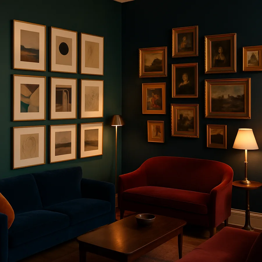
Grid layouts arrange frames in strict rows and columns with uniform spacing, creating an orderly, contemporary look that emphasizes precision and consistency. Salon-style arrangements, named after the densely hung exhibitions of 18th-century Parisian art salons, group frames of varying sizes and orientations in an organic, asymmetrical composition that fills the wall more completely. Both approaches have deep roots in art display history, and both can look stunning or terrible depending on execution. The choice between them depends on your room's existing aesthetic, the nature of your art collection, and your personal comfort with either structure or creative spontaneity.
The American Society of Interior Designers (ASID) has noted in its annual trend reports that gallery walls remain one of the most requested design elements in residential projects. Their enduring popularity stems from their ability to personalize a space instantly while solving the common problem of what to do with a large expanse of empty wall. A well-executed gallery wall transforms a room from generic to distinctive, telling a visual story through the curated combination of artworks, photographs, and decorative objects. Whether that story reads as structured and minimal or eclectic and expressive depends on which layout approach you choose.
This comparison walks through the defining characteristics, ideal use cases, planning methods, and common mistakes for both grid and salon-style gallery walls. By the end, you will have the knowledge to select the right approach for your space and the practical guidance to execute it with confidence. Which style resonates more with your personal taste: the satisfying order of a perfect grid, or the dynamic energy of an artfully composed salon arrangement?
The Grid Layout: Structure, Symmetry, and Clean Lines
A grid gallery wall is defined by its regularity. Every frame is the same size, oriented the same direction, and spaced at identical intervals both horizontally and vertically. The result is a geometric pattern that reads as a single unified installation rather than a collection of individual pieces. This uniformity creates a strong visual impact through repetition, a principle that designers call the power of the series. A grid of twelve matching frames makes a bolder statement than any single piece of the same total size, because the repeated element creates rhythm and order that the eye finds deeply satisfying.
Grid layouts pair naturally with modern, minimalist, and transitional interiors where clean lines and intentional simplicity define the design language. They work especially well above furniture with straight edges, such as a long console table, a bench, or a sectional sofa, where the grid's horizontal and vertical lines echo the furniture's geometry. The National Kitchen and Bath Association (NKBA) has featured grid gallery walls in kitchens and dining areas where the structured layout complements the room's functional, organized character without introducing visual chaos. For curated examples of grid walls in different room settings, Houzz's gallery wall collections offer thousands of photographed installations.
The primary limitation of a grid layout is its inflexibility. Because every frame must be identical, your art or photograph collection needs to conform to a single format. This works beautifully for a series of related photographs, a set of botanical prints, or a collection of similarly sized abstract pieces, but it excludes the mix of sizes and orientations that many personal collections naturally accumulate. The grid also demands precise execution: even small misalignments in frame spacing or levelness are immediately visible because the eye uses the grid pattern as a reference and catches any deviation. A grid that is even slightly off-square looks like a mistake rather than an intentional design choice.
Standard spacing for grid gallery walls runs between 2 and 3 inches between frames, measured edge to edge. Tighter spacing at 1.5 to 2 inches creates a denser, more dramatic grouping, while wider spacing at 3 to 4 inches produces a lighter, more airy feel. Whichever spacing you choose, consistency is non-negotiable. Use a level, a measuring tape, and painter's tape or paper templates on the wall before committing to nail holes. The time invested in precise layout pays for itself in a finished result that looks professional and intentional.
The Salon-Style Arrangement: Controlled Chaos and Personal Expression
Salon-style gallery walls embrace variety. Frames of different sizes, orientations, colors, and styles cluster together in an asymmetrical composition that fills a wall area without adhering to a rigid grid. The look draws directly from the tradition of European exhibition salons where paintings were hung floor to ceiling, stacked edge to edge, with the most important works at eye level and smaller pieces filling the surrounding space. Modern residential salon walls are less extreme than their historical predecessors, but they retain the defining characteristic of organic, visually dynamic arrangement.
The appeal of salon-style hanging lies in its inclusivity and expressiveness. A salon arrangement accommodates the vintage mirror you found at a flea market alongside your wedding photograph, your child's framed artwork, a small oil painting from a local artist, and a decorative plate or textile. This mix of sizes, mediums, and frame styles creates visual richness and tells a personal story that a uniform grid cannot match. The Smithsonian American Art Museum has noted that salon-style hanging was the primary method of displaying art in American homes throughout the 19th century, and its current resurgence reflects a broader cultural movement toward individuality and collected-over-time aesthetics in interior design.
Despite its organic appearance, a successful salon arrangement requires more planning than a grid, not less. The key is achieving visual balance without symmetry, which means distributing visual weight evenly across the composition so that no single area feels too heavy or too sparse. Large frames should be balanced by clusters of smaller frames on the opposite side. Dark or colorful pieces need counterpoints to prevent the eye from fixating on a single point. Horizontal and vertical orientations should intermix rather than cluster. The overall shape of the arrangement, its outer boundary, should fill its wall area in a roughly symmetrical silhouette even though the internal composition is asymmetrical.
Common spacing for salon arrangements ranges from 1.5 to 3 inches between frames, but unlike a grid, the spacing does not need to be perfectly uniform. Some variation in gaps adds to the organic feel, though maintaining a general consistency prevents the arrangement from looking random or sloppy. Experienced designers often describe salon-style hanging as creating "intentional randomness," which captures the paradox that the most natural-looking arrangements are actually the most carefully planned. How comfortable are you with asymmetry in your living spaces, and does your art collection include enough variety in size and format to support a salon arrangement?
Planning Your Layout: Templates, Tools, and Testing Methods
Regardless of which style you choose, planning the arrangement before putting holes in the wall is essential. The most reliable method is the paper template technique. Trace each frame onto kraft paper or newspaper, cut out the templates, and label each one. Then arrange the paper pieces on the wall using painter's tape, adjusting positions until the composition looks right. This method lets you experiment freely, step back to evaluate from across the room, and make adjustments without any wall damage. Professional designers at firms affiliated with ASID routinely use this approach even for high-end installations, because it eliminates guesswork.
For grid layouts, the planning process is mathematical. Measure the total wall area you want to fill, determine your frame size and desired spacing, then calculate how many frames fit in each row and column. A common formula starts with the wall width, subtracts the desired margin on each side, and divides the remaining space by the frame width plus one spacing unit. The resulting number, rounded down to a whole integer, gives you the number of frames per row. Repeat the calculation vertically for the number of rows. Mark the center of the wall and build outward from the center to ensure the grid is symmetrically placed.
Salon-style layouts benefit from a different planning approach. Start by selecting your anchor piece, the largest or most visually prominent frame in the collection. Position this piece slightly above or at eye level, offset from the geometric center of the wall area. Then build outward from the anchor, placing the next-largest pieces first and filling in with smaller frames. Maintain a consistent inner spacing while allowing the outer boundary of the arrangement to develop organically. Step back frequently to assess overall balance, and do not hesitate to rearrange templates that create unwanted visual clusters or dead zones.
Digital tools can supplement the physical template method. Apps like iArtView and GalleryPopper allow you to photograph your wall and digitally place frame mockups to preview the result. These tools are especially helpful for salon arrangements where visualizing the final composition from templates alone can be challenging. Some even provide augmented reality features that overlay frame images onto a live camera view of your wall. While digital tools are convenient for initial planning, always confirm your layout with physical measurements and a level before drilling, as lens distortion and perspective differences between a phone screen and reality can introduce errors.
Matching the Layout to Your Space and Design Style
The architecture and existing furnishings of your room should guide your gallery wall decision. Grid layouts complement rooms with strong geometric elements: square-edged furniture, rectangular windows, linear shelving, and crisp architectural moldings. The grid's regularity reinforces these existing patterns, creating a harmonious visual environment where everything aligns. Contemporary and mid-century modern interiors are natural homes for grid gallery walls, as are spaces with a Scandinavian or Japanese-influenced aesthetic where restraint and order are valued.
Salon-style arrangements thrive in rooms with eclectic, traditional, or bohemian character. If your space already features a mix of furniture styles, collected objects from travels, layered textiles, and organic materials, a salon wall extends that curated-over-time personality onto the vertical surfaces. Period homes with crown moldings, picture rails, and plaster walls historically used salon-style hanging, and the approach still feels native in these settings. The arrangement also works well in transitional spaces that blend modern and traditional elements, serving as a bridge between the two sensibilities. For additional guidance on matching wall art to room style, Better Homes & Gardens publishes seasonal decorating guides with practical examples.
Room scale affects which approach works better. In a small room or narrow hallway, a tight grid of small frames creates visual interest without overwhelming the space, while a salon arrangement in the same area can feel cluttered and busy. Conversely, a large wall in an open-concept living area may need the visual density of a salon arrangement to fill the space adequately; a small grid on a vast wall can look lost and insignificant. The International Interior Design Association (IIDA) recommends that gallery walls fill approximately two-thirds to three-quarters of the available wall width and roughly two-thirds of the height between the furniture and ceiling for optimal visual proportion.
Consider the practical aspects of your daily life in the space as well. Grid walls with glass-fronted frames in high-traffic areas like hallways need frequent cleaning to maintain their pristine appearance, because the uniform frames make every fingerprint and dust accumulation equally visible. Salon walls, with their variety of frame styles and finishes, are more forgiving of imperfect maintenance because the visual complexity draws attention away from minor blemishes. If your household includes children or pets whose activities might jostle the wall, a salon arrangement also tolerates occasional frame misalignment better than a grid, where one crooked frame disrupts the entire pattern.
Common Mistakes and How to Avoid Them
The most frequent grid layout mistake is hanging the grid too high. Gallery walls, like individual artworks, should center at approximately 57 to 60 inches from the floor, which corresponds to average eye level. Many homeowners instinctively hang their grid higher, creating an awkward gap between the furniture below and the bottom of the frames. When a grid hangs above a sofa or console, the bottom edge of the lowest frame row should sit 6 to 8 inches above the top of the furniture. Measure this gap before committing to your layout, and err on the side of closer rather than farther from the furniture.
For salon-style arrangements, the primary mistake is insufficient pre-planning. The organic look of a salon wall tricks people into thinking they can wing it, hanging pieces one at a time and making it up as they go. This approach almost always produces an unbalanced result with too much weight on one side, inconsistent spacing, and an irregular outer boundary that looks accidental rather than intentional. Take the time to lay out your entire arrangement on the floor or use paper templates on the wall before driving a single nail. The "effortless" salon look is always the result of deliberate effort behind the scenes.
Both styles suffer when the frame collection lacks cohesion. For grids, this means identical frames are essential; mixing frame styles in a grid destroys the visual logic. For salon walls, cohesion comes not from matching frames but from a unifying thread that connects the diverse elements. This thread might be a shared color palette across the art and frames, a consistent mat width, a common subject matter, or a limited range of frame finishes like all wood tones or all metallic. Without some connecting element, a salon wall devolves from curated eclecticism into visual noise. The Art Dealers Association of America advises collectors to consider how new acquisitions will relate visually to existing pieces before purchasing, a principle that applies directly to gallery wall planning.
Lighting is another commonly overlooked element that affects both gallery wall types. A grid wall benefits from even, consistent illumination that treats every frame equally, such as a linear picture light or recessed ceiling fixtures with uniform spacing. A salon wall can tolerate and even benefit from more dramatic lighting that highlights the anchor pieces and lets smaller frames recede into supporting roles. In either case, avoid placing gallery walls on surfaces that receive direct sunlight for extended periods, as UV exposure will fade artwork and photographs over time. If your chosen wall gets significant sun, use UV-filtering glass in your frames to protect your pieces. For expert advice on art lighting and display, Architectural Digest's decorating guides feature detailed recommendations from professional designers.
Conclusion: Choosing the Right Gallery Wall for Your Home
Grid and salon-style gallery walls each offer distinctive strengths that suit different spaces, collections, and personal aesthetics. The grid provides order, symmetry, and contemporary sophistication, demanding precision in execution but rewarding the effort with a polished, professional result. The salon arrangement offers warmth, personality, and visual richness, requiring more planning than its casual appearance suggests but delivering a wall display that feels uniquely yours and impossible to replicate from a catalog.
Your decision should balance three factors: the character of your room, the nature of your art and photograph collection, and your willingness to invest time in precise execution. If your collection features uniform pieces and your room favors clean lines, the grid is your natural choice. If your collection is diverse and your space welcomes eclecticism, the salon approach will showcase your pieces to their best advantage. There is no wrong answer, only the answer that best serves your specific combination of space and art.
Begin your gallery wall project this weekend by gathering your frames, measuring your wall, and creating paper templates for your preferred layout style. Arrange the templates, step back, evaluate, rearrange, and step back again until the composition feels right. Only then should you reach for the hammer. The patience invested in planning transforms a potentially stressful project into a creative exercise whose result you will enjoy every time you walk into the room.
More Articles You May Like


Comments
Post a Comment