Design Like a Pro: How Free Interior Design Apps Can Elevate Your Home Decor
There was a time when professional-quality interior design required either years of formal training or a significant budget to hire someone who had it. That era is over. The explosion of free interior design applications has given ordinary homeowners access to tools, techniques, and visualization capabilities that rival what NCIDQ-certified professionals use in their daily practice. According to the American Society of Interior Designers (ASID), the gap between consumer design tools and professional software has narrowed by approximately 60% in the past five years alone, a convergence that is reshaping the entire industry. You no longer need to be a professional to design like one. You just need the right tools and the knowledge to use them effectively.
The impact of this democratization extends far beyond convenience. It is fundamentally changing the economics of home decor. A study commissioned by the International Interior Design Association (IIDA) found that homeowners who use digital design tools before making purchasing decisions spend 35% less overall on their projects while reporting higher satisfaction with the results. This counterintuitive finding, spending less but liking the outcome more, makes perfect sense when you consider what design tools actually do: they replace expensive trial-and-error with informed, pre-validated choices. Every sofa you do not have to return, every paint color you do not have to repaint, and every layout you do not have to rearrange represents both money saved and frustration avoided.
But owning a powerful tool is not the same as knowing how to wield it effectively. The difference between a homeowner who casually plays with a design app and one who uses it to achieve professional-caliber results lies in methodology. Professional designers do not simply drag furniture around a screen until something looks nice. They follow structured processes that address spatial relationships, color theory, proportion, balance, lighting, and traffic flow in a deliberate sequence. This guide will teach you to apply those same professional methodologies using free tools, elevating your home decor from amateur experimentation to informed, intentional design that looks and feels professionally executed.
Understanding the Professional Design Process and Replicating It at Home
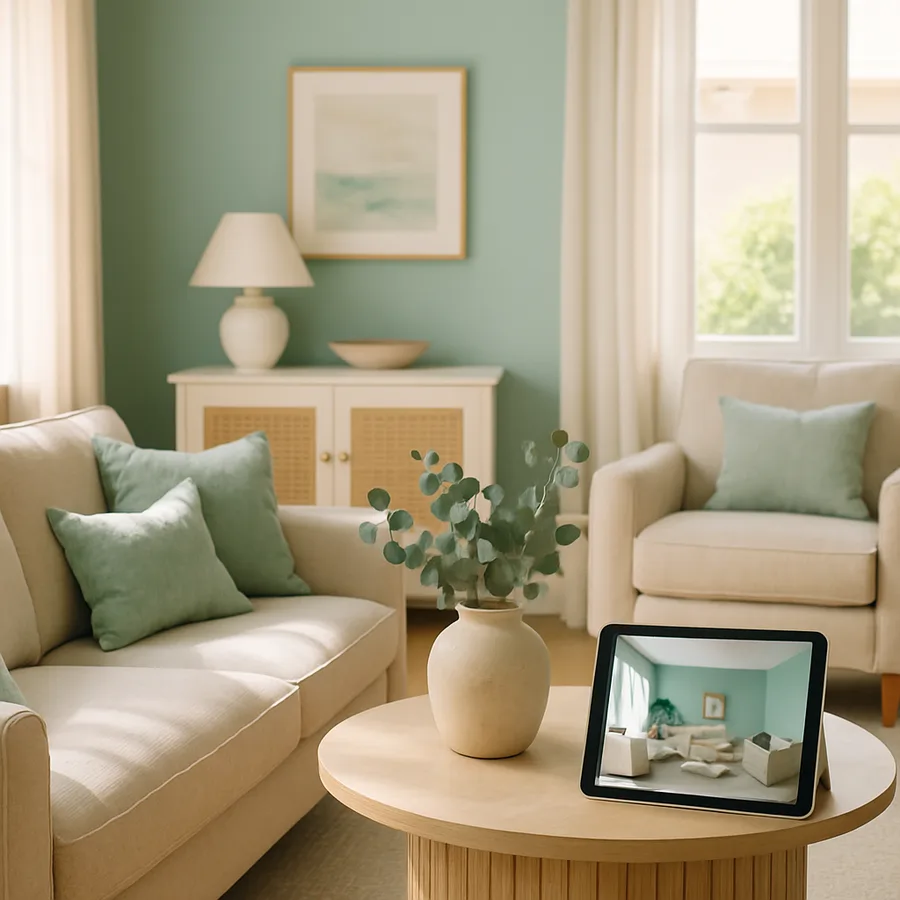
Professional interior designers follow a structured methodology that has been refined over decades of practice and formalized by organizations like the NCIDQ and IIDA. This process typically begins with a comprehensive site analysis, where the designer documents existing conditions including room dimensions, architectural features, natural light patterns, fixed elements like fireplaces or built-ins, and the client's lifestyle requirements. Free design apps with room-scanning capabilities now allow homeowners to conduct this same analysis with remarkable accuracy. What a professional might accomplish with a laser measure and architectural drawing skills, you can achieve with a smartphone equipped with LiDAR or even standard AR-based measurement tools.
The next phase in professional practice is concept development, where the designer synthesizes client needs, site conditions, and aesthetic preferences into a coherent design direction. This is where mood boards, material palettes, and initial spatial concepts take shape. Houzz's ideabook feature and similar tools in other apps replicate this concept development phase perfectly. By curating collections of images that resonate with you, you naturally develop the visual vocabulary and aesthetic clarity that designers build through years of training. The ASID recommends saving at least 50 to 100 inspiration images before attempting to identify patterns in your preferences, which is far more reliable than trying to articulate your style verbally.
Space planning follows concept development and is perhaps the phase where free apps provide the most dramatic value. Creating accurate, to-scale floor plans and testing furniture arrangements digitally eliminates the physical labor of pushing heavy furniture around rooms to test configurations. Professional designers use scaled drawings and 3D modeling for this work, and consumer apps now offer equivalent functionality. The critical professional insight to apply here is the concept of circulation paths: the routes people naturally travel through a room. Houzz research shows that rooms with clear, unobstructed circulation paths feel 25% larger than identically sized rooms with cluttered pathways, regardless of the amount of furniture present. Map your circulation paths first, then arrange furniture around them, never blocking the natural flow of movement.
Mastering Color Theory With Digital Tools
Color is the most emotionally powerful element in interior design, and it is also the one where homeowners most frequently make regrettable decisions. Professional designers study color theory extensively, learning how hues, values, and saturations interact to create specific moods and visual effects. Free design apps democratize this knowledge by providing visual feedback that teaches color theory through experience rather than textbook study. When you apply a cool blue-gray to digital walls and see how it makes warm wood tones pop while pushing cool-toned furniture into the background, you are learning the same color interaction principles that design students study in classrooms. The learning is simply experiential rather than theoretical.
The 60-30-10 rule is a fundamental color distribution principle used by professionals and easily applied using design apps. This rule suggests that 60% of a room's color should come from the dominant hue, typically walls and large furniture pieces; 30% from a secondary hue, found in upholstery, curtains, and area rugs; and 10% from accent colors in pillows, artwork, and decorative objects. The IIDA considers this ratio a reliable starting point for creating visually balanced interiors, and digital design tools let you test different 60-30-10 distributions instantly. You can experiment with dozens of color schemes in the time it would take to paint a single accent wall, learning through rapid iteration what combinations create the effects you desire.
What most homeowners do not realize is that the same color can look dramatically different depending on the room's lighting conditions. A color that appears warm and inviting under incandescent bulbs can look washed out and clinical under cool-white LEDs or harsh north-facing natural light. Professional designers from ASID-member firms always evaluate colors under the specific lighting conditions of the intended room, and free design apps with lighting simulation capabilities let you do the same. Test your color choices under morning light, afternoon light, and evening artificial light configurations before committing to a purchase. This single habit, evaluating color under multiple lighting conditions, will prevent more design regret than any other technique in your toolkit.
Scale, Proportion, and the Art of Furniture Arrangement
Scale and proportion are the invisible framework that separates professionally designed rooms from amateur ones. When a room feels "off" but you cannot articulate why, the problem is almost always one of scale: furniture that is too large or too small for the space, artwork hung at the wrong height, or lighting fixtures that overpower or underserve the room they occupy. Professional designers develop an intuitive sense of scale through years of practice, but free design apps provide a shortcut by letting you see scaled furniture in context before purchasing. NCIDQ standards emphasize that furniture should be selected based on the room's dimensions, not on showroom appeal, and digital tools make this room-first approach practical for everyone.
The golden ratio, approximately 1:1.618, appears throughout nature and art and provides a reliable guide for interior design proportions. A coffee table should be roughly two-thirds the length of the sofa it accompanies. A dining table should fill approximately one-third of the room's floor area. Area rugs should extend at least 18 to 24 inches beyond the furniture they anchor. These proportional relationships create visual harmony that the eye perceives even when the mind cannot articulate the principle at work. Design apps with accurate scaling let you test these proportional relationships virtually, adjusting sizes and positions until the visual weight of each element feels balanced and intentional.
Furniture arrangement is not merely about aesthetics. It is about creating functional zones that support how you actually use each room. A living room might need zones for conversation, television viewing, and reading, each with appropriate seating, lighting, and surface space. The IIDA recommends maintaining at least 36 inches of clearance in primary circulation paths and 18 inches between a coffee table and a sofa for comfortable movement. These professional spacing standards are easy to apply in design apps where measurements are displayed in real time. Have you ever noticed how some rooms feel effortlessly comfortable while others feel cramped despite being objectively spacious? The difference almost always comes down to these invisible spatial relationships between furniture pieces.
Lighting Design: The Element That Transforms Everything
Lighting is often called the most underappreciated element in interior design, and with good reason. A room with perfect furniture, beautiful colors, and thoughtful accessories will still fall flat if the lighting is wrong. Professional designers approach lighting as a layered system with three distinct components: ambient lighting that provides overall illumination, task lighting that serves specific functional needs like reading or cooking, and accent lighting that highlights architectural features, artwork, or decorative elements. The ASID recommends that every room include all three layers to create depth, dimension, and the ability to adjust the atmosphere for different activities and times of day.
Free design apps with lighting simulation capabilities let you experiment with this layered approach virtually. You can add, remove, and reposition light sources within your room design, observing how each change affects the overall atmosphere. This experiential learning is invaluable because lighting effects are notoriously difficult to predict from fixture photographs or specification sheets. A pendant light that looks modest in a product photo might overwhelm a small dining area, while a floor lamp that seems elegant in a showroom might disappear in a large living room. Digital visualization helps you avoid these scale mismatches by showing fixtures in the context of your specific room, at the correct proportions, with realistic light output simulation.
Natural light deserves equal attention in your design planning. The direction your windows face, north, south, east, or west, dramatically affects both the quality and quantity of natural light throughout the day. North-facing rooms receive cool, consistent, indirect light. South-facing rooms get warm, bright light for most of the day. East-facing rooms are bright in the morning and shadowed in the afternoon, while west-facing rooms reverse this pattern. Houzz design professionals emphasize that understanding your room's natural light profile should inform every subsequent design decision, from wall color to furniture placement to window treatment selection. Free design apps that let you simulate different times of day help you understand and design around your specific natural light conditions, ensuring that your room looks its best not just at one moment but throughout the entire day.
Texture, Pattern, and Material Mixing for Visual Depth
A room composed entirely of smooth, flat surfaces in a single color would feel sterile regardless of how beautiful that color might be. Texture and pattern are the elements that give interiors depth, warmth, and visual interest. Professional designers from IIDA-member firms approach texture as a deliberate design layer, mixing rough and smooth, matte and glossy, soft and hard surfaces to create tactile richness that engages multiple senses. A linen sofa against a brick wall, complemented by a polished marble side table and a plush wool rug, creates a sensory experience that goes far beyond visual appeal. Each surface interacts differently with light, creating subtle variations that make the room feel alive and dynamic.
Pattern mixing is one of the most intimidating aspects of interior design for non-professionals, but it follows learnable rules that free design tools can help you practice. The classic approach, endorsed by NCIDQ-certified designers, involves combining patterns at three different scales: a large-scale pattern such as a dramatic floral or geometric on a major piece like curtains or an accent chair, a medium-scale pattern on secondary elements like throw pillows, and a small-scale pattern on accessories like lamp shades or picture frame mats. Connecting these patterns through a shared color palette creates cohesion, while the scale variation provides visual rhythm. Design apps that let you preview different textiles and patterns on virtual furniture give you a risk-free environment to practice this skill.
Material selection ties together color, texture, and pattern into a coherent material palette. The ASID recommends limiting a room's material palette to three to five primary materials to maintain visual cohesion. For example, a living room might feature walnut wood, brushed brass, natural linen, leather, and marble as its five primary materials. Every furniture piece, fixture, and accessory in the room should incorporate at least one of these materials, creating a thread of consistency that ties diverse elements together. This material palette approach is easy to develop and test using design apps that allow you to swap materials on virtual furniture. Experiment freely until you find a combination that creates the mood and visual richness you are seeking, then use that palette as a filter for all subsequent purchasing decisions.
From Digital Design to Physical Reality: Executing Your Plan
The bridge between a beautiful digital design and a successfully executed physical room requires careful planning and disciplined execution. Professional designers create detailed specification documents that list every item, material, color code, dimension, and vendor source needed to bring their designs to life. You should do the same using the documentation features built into your design apps. Save screenshots of your finalized designs from multiple angles. Export product lists with exact model numbers, dimensions, and prices. Note the specific paint colors, including manufacturer and color code, that you have selected through your digital testing. This documentation is your execution blueprint, and its completeness will determine how closely your physical room matches your digital vision.
Sequencing your execution properly is critical and follows the same order that professional contractors use. Start with any structural or surface changes: painting walls, installing flooring, updating lighting fixtures. These foundational changes must be completed before furniture arrives because they affect how the room looks and feels, which in turn affects whether your furniture choices still work as planned. Next, position major furniture pieces according to your digital floor plan, measuring carefully to ensure placement matches your design. Finally, layer in accessories, textiles, and decorative elements, stepping back frequently to compare the emerging physical room against your saved digital designs. NCIDQ practice guidelines recommend photographing the room at each stage of execution and comparing those photographs against the corresponding digital views to catch deviations early.
Expect the physical result to differ slightly from your digital design, and prepare to make adjustments. No rendering engine perfectly replicates the complex interplay of real-world light, texture, and color perception. Professional designers account for this gap through experience, and you will develop the same intuition through practice. The important thing is that your digital design provides a strong direction, even if the final execution involves some on-site refinement. With each project you complete, your ability to predict how digital designs will translate to physical spaces will improve, and the gap between screen and reality will narrow. That growing design confidence is perhaps the most valuable outcome of working with free interior design tools, not just a better-looking room, but a deeper understanding of design principles that you will carry into every future project.
Conclusion: The Professional Advantage Is Now Free
The tools, techniques, and design methodologies that once justified thousands of dollars in professional fees are now available to any homeowner willing to invest time in learning and experimentation. Free interior design apps provide the visualization capability, accurate measurement tools, color and material testing environments, and community feedback systems that constitute the practical toolkit of professional interior design. Combined with the structured methodology outlined in this guide, from site analysis through concept development, space planning, material selection, and disciplined execution, these tools enable results that are genuinely indistinguishable from professional work.
The professional designers at ASID, IIDA, and NCIDQ-certified firms have largely embraced this democratization rather than resisting it. They recognize that informed homeowners make better clients, that shared visual language improves collaboration, and that digital tools handle routine visualization tasks efficiently while leaving the more nuanced work of creating emotionally resonant spaces to human expertise. Whether you use free tools to execute your entire design independently or to prepare more effectively for a professional consultation, the outcome is the same: better-designed living spaces achieved more efficiently and with greater confidence.
Your home is not a static backdrop to your life. It is an active participant in your daily experience, affecting your mood, productivity, relationships, and well-being with every hour you spend within its walls. It deserves the same thoughtful, informed approach that professionals bring to their work, and for the first time in the history of interior design, achieving that level of intentionality requires nothing more than the free tools on your phone and the willingness to use them deliberately. Start today. Pick the room that matters most to you, open an app, and begin the process of designing like the professional you never knew you could be.
More Articles You May Like


Comments
Post a Comment