The Psychology of Color: How to Choose Interior Design Palettes That Inspire
Color is one of the most immediate and visceral forces in any interior space. Before we consciously register furniture placement, material quality, or spatial proportions, our nervous system has already responded to the colors surrounding us. Research published through the American Society of Interior Designers (ASID) indicates that color decisions account for roughly 60% of an occupant's initial emotional response to a room. With full-room design projects typically costing between $5,000 and $15,000 per room and professional consultation fees ranging from $150 to $500 per hour, choosing a color palette that genuinely supports your intended mood is one of the highest-value decisions you can make. Why do certain rooms feel energizing while others feel oppressive, even when their dimensions are identical? The answer, more often than not, lives in the paint on the walls and the textiles draped across the furniture.
How Color Affects the Brain and Body
The relationship between color and human physiology is not subjective folklore; it is measurable science. Studies coordinated by the IIDA have demonstrated that exposure to specific wavelengths of light, which we perceive as color, triggers distinct neurochemical responses. Blue wavelengths, for instance, suppress melatonin production and promote alertness, while warmer tones in the red and amber spectrum support relaxation by encouraging parasympathetic nervous system activation. These responses occur below the threshold of conscious awareness, meaning a room's color scheme influences your state of mind whether or not you are paying attention to it.
The Munsell color system, widely used by NCIDQ-certified professionals, breaks color into three dimensions: hue (the color family), value (lightness or darkness), and chroma (saturation or intensity). Each dimension carries independent psychological weight. A pale, desaturated blue creates a different emotional effect than a vivid cobalt, even though both belong to the same hue family. High-chroma colors command attention and stimulate arousal, while low-chroma variants recede and calm. Understanding this three-dimensional nature of color allows you to fine-tune a palette with far greater precision than simply choosing "blue" or "green."
Temperature perception offers another striking example of color's physiological influence. Researchers have documented that occupants in rooms painted warm red or orange estimate the ambient temperature to be 3 to 4 degrees Fahrenheit higher than occupants in rooms painted cool blue, even when the thermostat reading is identical. Houzz featured this finding in its design psychology series, noting practical implications for energy costs: a warm-toned living room may allow you to lower the heating setting slightly during winter months without sacrificing comfort. Color, in this sense, is not merely decorative but functional. What temperature does your home's current palette suggest?
Understanding Color Relationships: Building a Cohesive Palette
Choosing individual colors is only half the challenge; arranging them into a coherent palette that flows across rooms requires an understanding of color relationships. The ASID teaches the 60-30-10 rule as a foundational framework: 60% of a room's color comes from the dominant hue (walls, large rugs, major upholstery), 30% from a secondary color (curtains, accent chairs, bedding), and 10% from an accent (throw pillows, artwork, decorative objects). This ratio creates visual hierarchy, giving the eye a clear primary resting point while providing enough variety to sustain interest.
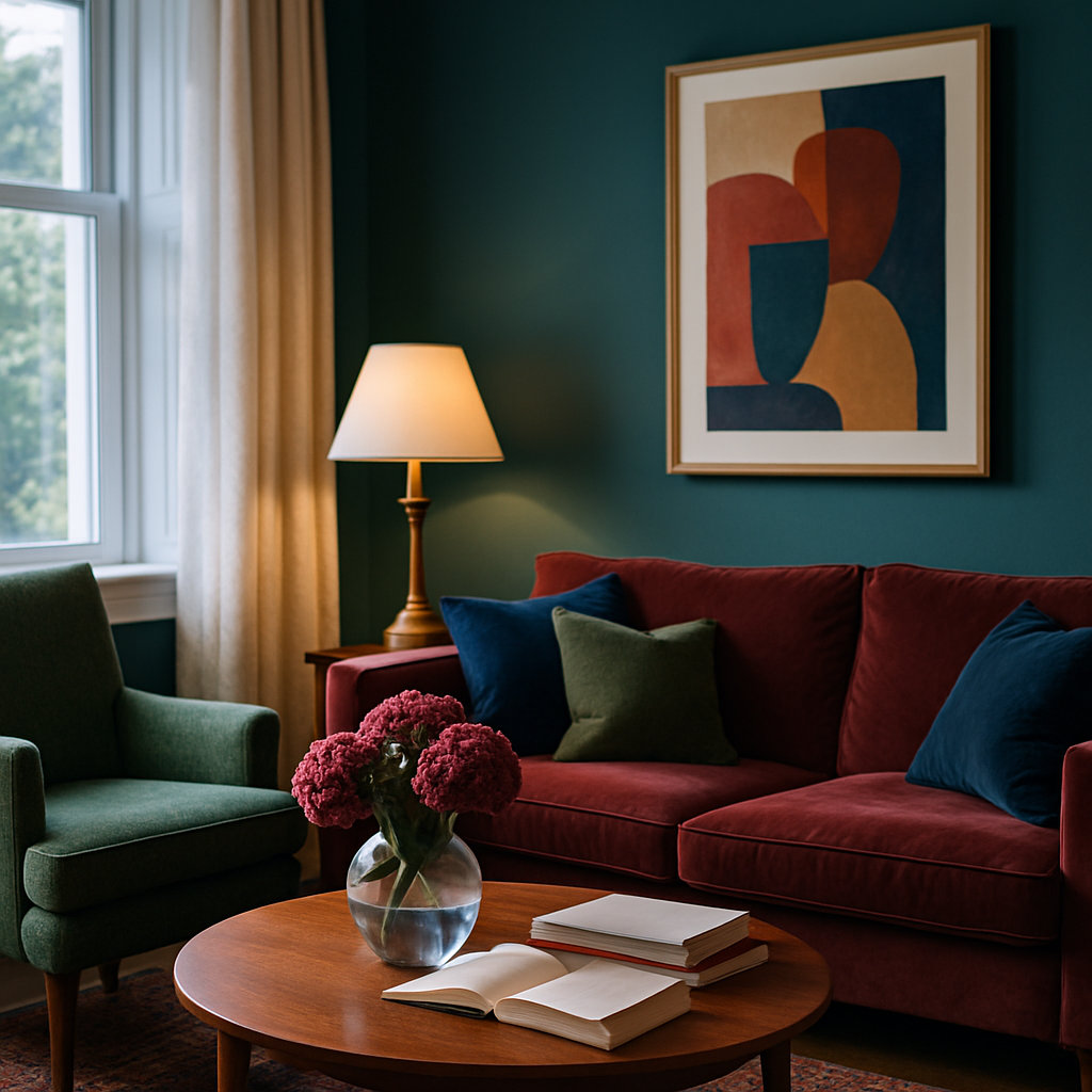
Analogous palettes, which draw from adjacent positions on the color wheel, produce harmonious and calming environments. A living room featuring sage green walls, a teal sofa, and blue-gray cushions exemplifies this approach. Because the colors share underlying pigment relationships, they blend without clashing, creating a sense of cohesion that feels almost organic. Complementary palettes, by contrast, pair colors from opposite sides of the wheel, such as navy and burnt orange, generating dynamic tension and visual energy. The IIDA recommends analogous schemes for bedrooms and restorative spaces, reserving complementary or split-complementary palettes for social zones where stimulation is welcome.
Transitional colors serve as bridges between rooms with different palettes. If your living room is anchored by warm neutrals and your kitchen features cool grays, the hallway connecting them benefits from a color that contains elements of both, perhaps a greige (gray-beige hybrid) that eases the eye from one environment to the next. NCIDQ professionals plan these transitions deliberately during the schematic design phase, ensuring that moving through the home feels like a continuous experience rather than a series of disconnected stage sets. A well-orchestrated whole-home palette can contain significant color variety while still reading as unified.
Room-by-Room Color Strategies
Different rooms serve different purposes, and their color palettes should reflect those functional distinctions. The bedroom, as the space most directly associated with rest and recovery, benefits from low-stimulation colors. The ASID's residential design guidelines recommend soft blues, muted lavenders, warm grays, and desaturated greens for bedrooms, all of which have been shown to lower heart rate and encourage melatonin production as evening approaches. Avoid high-chroma reds and bright yellows in sleeping environments; while they may photograph well, they activate the sympathetic nervous system in ways that interfere with sleep onset.
Home offices and workspaces demand a different chromatic strategy. Here, moderate saturation in cool-to-neutral tones supports sustained concentration without inducing drowsiness. Sage green, soft teal, and warm white with blue undertones have all performed well in productivity studies. AD PRO's workplace design editor noted that adding a single accent wall in a slightly more saturated version of the room's dominant color can provide enough visual stimulation to prevent monotony during long work sessions. The accent wall should face the desk, placing it within the occupant's primary field of vision.
Kitchens and dining areas tolerate and often benefit from warmer, more saturated palettes. Terracotta, mustard, warm cream, and even deep reds have long histories in culinary spaces because warm hues stimulate appetite and promote social interaction. Houzz's kitchen color trend data for 2024 shows earthy greens and rich blues rising rapidly, reflecting a broader interest in colors that feel grounded and connected to nature. Regardless of the specific hues you choose, ensure that task lighting in food preparation areas renders color accurately; a beautiful terracotta wall loses its warmth under cool fluorescent tubes that shift its appearance toward muddy brown.
The Role of Neutrals: Far More Than Background
Neutrals are the unsung workhorses of interior color design, providing the visual breathing room that allows accent colors to resonate. Far from boring, a well-chosen neutral carries its own character and warmth. The difference between a stark, blue-tinted white and a creamy, yellow-tinted white is substantial: the first feels clinical and modern, the second traditional and inviting. The IIDA classifies neutrals into warm (cream, beige, taupe, greige), cool (gray, blue-white, silver), and true (pure white, pure black, charcoal), and recommends that designers select neutrals whose undertones align with the room's accent palette.
One common mistake in residential design is treating all whites as interchangeable. A room with warm wooden floors and brass fixtures will clash with a blue-based white on the walls because the undertones fight each other. Swapping that white for one with yellow or pink undertones creates immediate harmony. Designers at the ASID recommend testing at least three neutral samples on the wall, observing them at different times of day under both natural and artificial light. Colors shift dramatically depending on light source and angle; a swatch that looks perfect at noon may read as entirely different by lamplight at nine in the evening.
Neutrals also serve a critical practical function in small homes and rental properties where bold color commitments carry more risk. A warm gray or soft taupe on the walls creates a sophisticated foundation that can be reinvented seasonally through textiles, art, and accessories. Swap out cushions from terracotta to teal, change a throw blanket from blush to charcoal, and the room's personality shifts without a single brushstroke. This flexibility makes neutrals the most strategically versatile choice for homeowners who enjoy evolving their interiors over time. Have you examined the undertones of the whites and grays currently on your walls?
Testing and Committing: From Swatch to Full Room
The gap between a paint swatch and a fully realized room is enormous, and it accounts for a significant portion of color-related renovation regret. A 2-by-2-inch chip viewed under showroom lighting bears almost no relationship to how that color will behave across 200 square feet of wall surface under your specific light conditions. NCIDQ-certified designers universally recommend painting large sample patches, at least 2 feet by 2 feet, on multiple walls of the room and observing them over 48 to 72 hours before committing. This allows you to see the color at dawn, midday, dusk, and under evening lighting.
Digital visualization tools have improved dramatically and now offer a useful preliminary filter. Several major paint manufacturers provide augmented reality applications that superimpose colors onto photographs of your actual rooms, giving you a reasonable approximation before purchasing any paint. Houzz's AR room visualization feature has been used in over 10 million design sessions. However, no digital tool fully replicates the interaction between physical pigment and real-world light. Digital previews should narrow your shortlist, but physical samples should make the final decision. The investment in two or three sample pots is trivial compared to the cost of repainting an entire room.
Once committed, paint application technique influences how color reads on the wall. Two coats applied with a high-quality roller in consistent vertical strokes produce a uniform finish that lets the color speak for itself. Inconsistent coverage creates visible patches that distort the hue and make the surface appear cheaper than it is. For high-impact accent walls, consider consulting a professional painter, often available at reasonable day rates, whose skill ensures crisp edges, even coverage, and clean transitions at corners and trim. The ASID notes that professional application is particularly important for dark or saturated colors, which show imperfections more readily than lighter tones.
Cultural and Personal Dimensions of Color
Color associations are not universal. While research identifies certain broad physiological responses to wavelengths, the emotional and symbolic meanings attached to specific colors vary significantly across cultures and personal histories. White connotes purity and simplicity in many Western design traditions but is associated with mourning in parts of East Asia. Red signifies luck and prosperity in Chinese culture, danger in Western contexts, and sacred femininity in Hindu traditions. The IIDA's diversity guidelines emphasize that designers must engage with clients about their cultural relationships to color rather than assuming a standardized emotional response.
Personal history adds another layer of complexity. A shade of green that reminds one person of a beloved childhood garden may trigger discomfort in someone who associates it with an institutional waiting room. These individual associations cannot be predicted by theory alone; they emerge through conversation and reflection. Before finalizing a palette, spend time with your shortlisted colors and notice what memories, emotions, and associations arise. This self-awareness transforms color selection from a theoretical exercise into a deeply personal act of self-expression.
Trends influence color choices powerfully, and understanding that influence helps you distinguish between genuine personal preference and social momentum. The ASID publishes an annual color forecast, and its predictions shape millions of residential design decisions. There is nothing wrong with embracing a trending color you genuinely love, but purchasing three gallons of a hue solely because an algorithm featured it on your feed invites regret. The most enduring palettes tend to blend a few trend-responsive accents with a core of personally meaningful colors that resonate regardless of the current design cycle. What colors make you feel most like yourself, independent of what is appearing in magazine spreads this season?
Conclusion: Designing with Chromatic Intention
Color is the most accessible and transformative tool in your interior design arsenal. It requires no structural modifications, no permits, and no specialized equipment beyond brushes, rollers, and a thoughtful plan. The research is clear: the colors surrounding you shape your mood, your energy, your productivity, and your sense of home. Approaching color selection with the same rigor you would apply to furniture investment or spatial planning ensures that every room in your home actively supports the life you want to lead within it.
Begin with a single room, the one where you spend the most waking hours, and audit its current palette against the psychological principles outlined above. Does the color scheme support the room's primary function? Do the neutrals harmonize with the accents? Does the palette transition smoothly into adjacent spaces? Small adjustments, repainting an accent wall, swapping textile colors, changing lampshade tones, can produce meaningful shifts in how a room feels without requiring a full renovation budget.
For homeowners ready to undertake a comprehensive palette overhaul, consider engaging an ASID- or NCIDQ-certified designer for a color consultation. These sessions, typically one to two hours at standard hourly rates, produce whole-home color plans that account for light conditions, architectural details, existing furnishings, and your personal chromatic preferences. The result is a coordinated palette document you can execute at your own pace, room by room, confident that each step moves the whole home toward a more cohesive and emotionally resonant environment. Pick up a few sample pots this weekend and start observing how color transforms not just your walls, but your experience of being home.


Comments
Post a Comment