How to Choose the Perfect Color Palette for Your Interior Design Project
Imagine walking into a room that instantly makes you feel at ease. The colors seem to speak to you, creating a perfect harmony that is both inviting and refreshing. According to a study by the American Society of Interior Designers (ASID), 68% of people believe that their mood is greatly affected by the colors in their home. Choosing the perfect color palette for your interior design project is not just about aesthetics; it's about creating an environment that enhances your well-being and reflects your personality. In this article, we will explore foundational concepts of color theory, analyze current trends with data, provide actionable strategies for selecting a palette, and delve into expert-level details to ensure your project is a resounding success. Whether you're redesigning a single room or your entire home, these insights will guide you in making informed decisions.
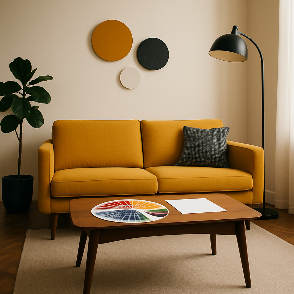
Understanding the Basics of Color Theory
Before diving into the selection process, it's crucial to understand the foundational concepts of color theory. At its core, color theory involves the use of a color wheel, which helps in identifying relationships between colors. The wheel typically includes primary colors (red, blue, yellow), secondary colors (green, orange, purple), and tertiary colors, each created by mixing primary and secondary hues. Understanding these relationships is key to creating a balanced and harmonious color palette.
Complementary colors, which are located opposite each other on the color wheel, can create high contrast and vibrant looks. For example, pairing blue with orange can add a dynamic energy to a space. In contrast, analogous colors, which are next to each other on the wheel, like blue, blue-green, and green, tend to be more harmonious and soothing. These combinations are often used to create a serene and cohesive look.
Furthermore, the concept of color temperature-warm colors (reds, oranges, yellows) versus cool colors (blues, greens, purples)-plays a critical role in setting the mood of a space. Warm colors are typically invigorating and cozy, while cool colors are calming and spacious. By strategically using these elements, you can influence the emotional response of a room's occupants. With these basics in mind, we can delve deeper into how these theories apply to real-world design projects.
Analyzing Trends and Data in Color Selection
Current design trends are heavily influenced by cultural shifts and advancements in technology. According to Houzz's recent survey, natural and earthy tones are making a strong comeback, with 45% of respondents opting for colors that emulate nature. This aligns with the rise in biophilic design, which emphasizes a connection to the natural world through materials, textures, and colors.
Another trend gaining traction is the concept of "quiet luxury" or understated elegance, where muted tones and minimalist palettes take center stage. This approach often uses a monochromatic scheme, incorporating various shades of a single hue to create depth and sophistication without overwhelming the senses. Such palettes are particularly appealing in spaces where relaxation and tranquility are desired, like bedrooms or meditation rooms.
In terms of technology, the integration of smart home devices is influencing color choices as well. With the ability to change lighting tones and hues through apps, designers are opting for adaptable palettes that can shift with the room's ambiance. This flexibility is crucial as homeowners seek to personalize their spaces in innovative ways. As we continue, we will explore actionable strategies to help you select the perfect palette for your needs.
Actionable Strategies for Selecting Your Palette
When starting your interior design project, it's important to consider how you use each space. Begin by mapping out your daily activities-where do you unwind, work, or entertain guests? This practical approach helps in identifying the mood you want to evoke in each room. For instance, if your living room is a social hub, you might choose vibrant, welcoming colors that encourage conversation and warmth.
Another effective strategy is to use inspiration boards, leveraging platforms like Pinterest and Instagram. Experienced professionals often note that visual aids can significantly clarify your aesthetic preferences. Compile images of spaces you love, noting recurring colors and styles. This process can guide your palette selection by highlighting the colors that consistently resonate with you.
Additionally, consider conducting a paint test. Purchase sample pots of your shortlisted colors and apply them to small areas of your walls. Observe how they look at different times of the day under varying light conditions. This step is crucial because colors can shift dramatically under artificial versus natural light. Once satisfied, you're ready to commit to your chosen palette. This hands-on approach ensures that your final decision is both informed and personal.
Expert-Level Insights on Color Coordination
Engaging with certified interior designers, such as those holding NCIDQ (National Council for Interior Design Qualification) credentials, can provide invaluable insights into advanced color coordination. These professionals have a deep understanding of how color interacts with other elements in the room, such as textures and furniture. According to the International Interior Design Association (IIDA), professional guidance can help achieve a cohesive look that amateur attempts might miss.
One advanced technique involves the 60-30-10 rule. This rule suggests that 60% of the room should be a dominant color, 30% a secondary color, and 10% an accent color. This proportion helps maintain balance while adding visual interest. For example, in a Japandi-inspired room, you might use a soft beige as the dominant color, a rich navy for the secondary color, and subtle gold accents.
Moreover, consider the psychological impact of color. A well-chosen palette can enhance productivity and creativity in home offices or create a calming sanctuary in bathrooms. Experienced professionals emphasize the importance of aligning your color choices with the room's function to maximize its effectiveness. Next, we'll delve into additional dimensions that can further refine your choices.
Diving Deeper into Color Application
When applying your color palette, the finish is just as important as the hue itself. For instance, matte finishes can create a cozy, understated atmosphere, while glossy finishes can make a space feel more vibrant and expansive. This distinction is particularly important in small spaces where light reflection can make a significant difference in perceived size.
Furthermore, sustainable and reclaimed materials are becoming increasingly popular in interior design. When choosing paints and finishes, consider eco-friendly options that reduce environmental impact. Many paint brands now offer low-VOC (volatile organic compounds) formulations that are better for both indoor air quality and the environment.
Finally, technology like AR/VR room visualization tools is revolutionizing the way designers and homeowners plan their projects. These tools allow you to visualize different color schemes in a virtual model of your space, providing a realistic preview of the final outcome. This innovation not only aids in decision-making but also in ensuring satisfaction with the end result. As we conclude, consider how these insights can be integrated into your project planning.
Final Perspectives on Color Selection
As you embark on your interior design journey, remember that choosing the perfect color palette is an iterative process. It's about finding that sweet spot between personal preference, current trends, and functional requirements. By leveraging the insights shared in this article, you can approach your project with confidence and creativity.
Do you feel ready to transform your space with a new color palette? Have you considered how different colors might reflect your personality and lifestyle? Engaging with these questions can help clarify your vision and steer your project in a direction that truly resonates with you.
Ultimately, the goal is to create a space that not only looks beautiful but also improves your quality of life. By taking a thoughtful and informed approach, you can achieve a design that is both timeless and uniquely yours. In our conclusion, we will summarize key points and offer a clear next step to take.
Conclusion: Bringing Your Color Vision to Life
In summary, selecting the perfect color palette for your interior design project involves a blend of art and science. By understanding color theory, analyzing trends, and applying actionable strategies, you can create a space that is both aesthetically pleasing and emotionally resonant. Engaging with experts and using innovative tools can further enhance your decision-making process.
Are you ready to take the next step? Start by browsing designer portfolios on platforms like Houzz and Instagram this week. Even dedicating just 20 minutes to this task can sharpen your eye for what you want. Remember, a well-chosen color palette is the foundation of a successful design project, and with the right approach, you can achieve stunning results that reflect your personal style and enhance your living environment.


Comments
Post a Comment