Color Psychology in Home Interior Design: How to Choose the Right Palette
Imagine walking into a room and feeling an immediate sense of calm or energy. This isn't magic-it's the power of color psychology in home interior design. Colors can profoundly influence our mood, emotions, and even our behaviors, making them a critical component in creating spaces that reflect our personalities and meet our needs. In this article, we'll delve into the foundational concepts of color psychology, examine data-driven insights, and provide actionable strategies for selecting the right color palette for your home. Whether you're redesigning a single room or your entire home, understanding how colors work can transform your living environment from the mundane to the extraordinary.
Understanding the Basics of Color Psychology
Color psychology is the study of how colors affect perceptions and behaviors. In the realm of interior design, it's a tool that can tailor a room's atmosphere to suit its intended purpose. For instance, blue is often associated with calmness and serenity, making it a popular choice for bedrooms and bathrooms. On the other hand, red is linked to energy and passion, which can be advantageous in spaces meant for socializing, such as dining rooms.
Experienced designers frequently emphasize the importance of understanding the emotional and psychological impacts of colors. According to the American Society of Interior Designers (ASID), color can influence up to 60% of our response to a place or an object. This statistic underscores the critical nature of color selection in crafting spaces that are not only beautiful but also functional and emotionally resonant.
Furthermore, cultural differences can affect color perceptions. In some cultures, white is seen as a symbol of purity, while in others, it may represent mourning. Therefore, it's essential to consider the cultural context of color usage when designing spaces, ensuring that the chosen palette aligns with the cultural values and expectations of the inhabitants. This foundational understanding sets the stage for a more in-depth exploration of how to effectively apply these concepts in your home.
The next section will delve deeper into how data and research back these psychological insights, providing a more structured framework for choosing colors.
The Impact of Color Choices Supported by Research
Color psychology isn't just theoretical; it's supported by extensive research and data. A study by the International Association of Color Consultants (IACC) found that specific colors can have measurable effects on human physiology, including heart rate and blood pressure. For example, cool colors like blue and green can lower heart rates, promoting relaxation and calmness-ideal for spaces meant for unwinding.
Moreover, a survey conducted by Houzz revealed that homeowners who chose vibrant colors for their living spaces reported higher satisfaction with their interior environments. This finding highlights the importance of selecting colors that not only appeal to aesthetic senses but also contribute to overall well-being and happiness within the home.
Beyond individual preference, understanding these insights can aid in making informed decisions that enhance the functionality of a space. For instance, using a warm color palette in a home office can help stimulate productivity and creativity. As we move forward, we will discuss practical strategies to apply these insights effectively in your own home.
Armed with this research-backed knowledge, we can now explore actionable strategies for incorporating these insights into your home design.
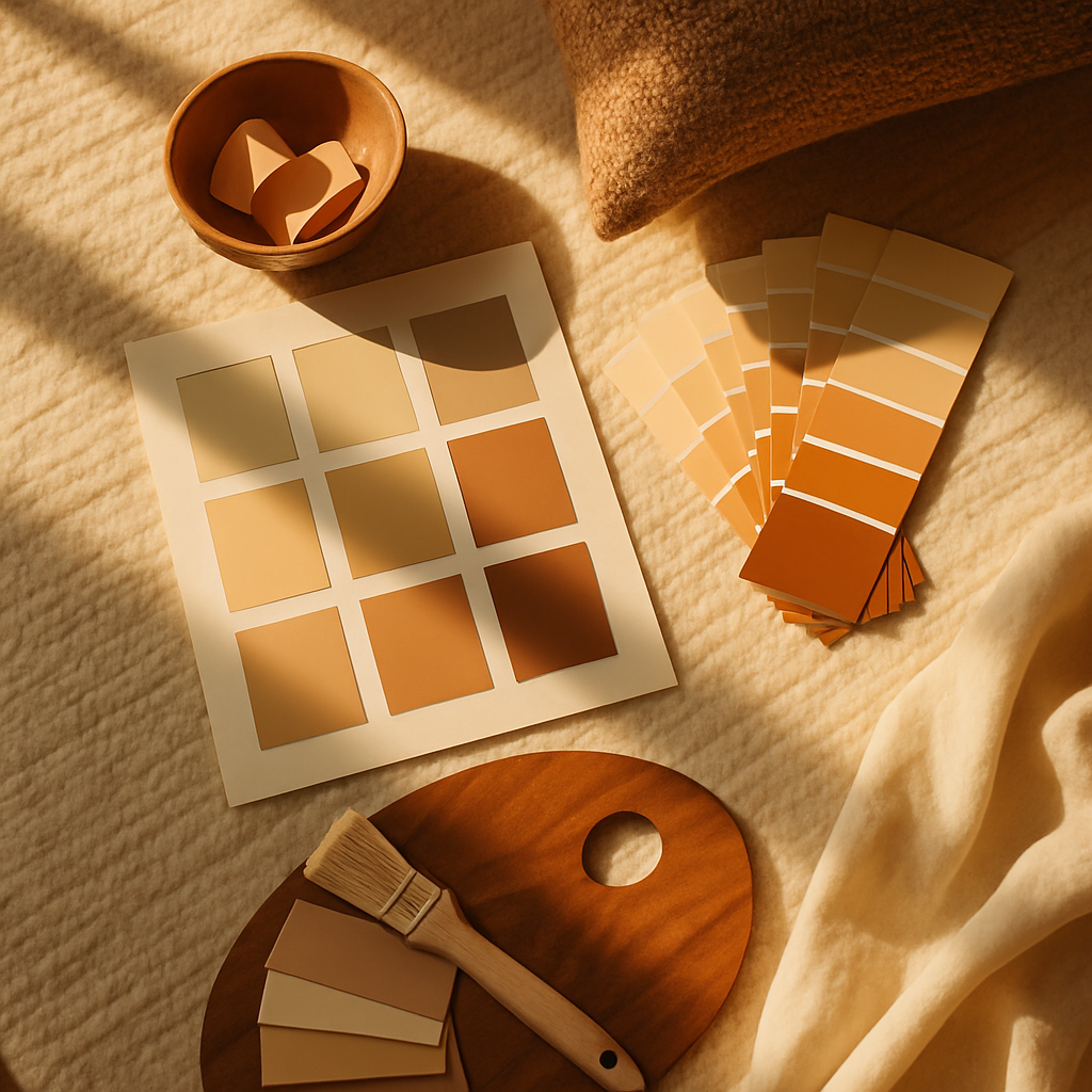
Actionable Strategies for Choosing Your Color Palette
When selecting a color palette for your home, it's essential to consider the purpose of each space. Start by mapping out how you use each room. Do you need a calming retreat in your bedroom or an invigorating atmosphere in your home gym? Understanding the function of each space will guide your color choices. For instance, biophilic design, which integrates natural elements, often employs shades of green to evoke tranquility and a connection to nature.
Next, create a mood board using platforms like Pinterest or Houzz to gather inspiration and visualize how different colors work together. This step is crucial for seeing how various hues interact and ensuring they align with your vision. Consider experimenting with AR/VR room visualization tools to see how colors look in your actual space before committing. These technologies can be invaluable in avoiding costly mistakes.
Finally, test colors with samples on your walls. Paint swatches are essential to observe how colors change under different lighting conditions throughout the day. Experienced professionals often note that lighting can dramatically alter a color's appearance, making it a critical factor in your decision-making process. As we proceed, we'll dive into expert-level insights for refining your color choices even further.
Implementing these strategies will set a solid foundation, but to truly excel, consider the nuances offered by industry experts in the next section.
Expert Insights into Refining Your Palette
Professional interior designers bring a wealth of experience to color selection, often suggesting sophisticated techniques to elevate your palette. For instance, the concept of quiet luxury-an understated elegance-can be achieved through a palette of muted tones like soft grays, creamy whites, and gentle taupes. These colors, when layered with textures and accents, create a refined and timeless look.
According to the National Council for Interior Design Qualification (NCIDQ), the gold-standard credential for designers, advanced techniques such as color zoning can enhance the functionality of open-plan spaces. By using different colors to demarcate areas within a room, you can create distinct zones for various activities without the need for physical barriers. This approach is particularly popular in modern homes with open layouts.
Additionally, incorporating sustainable and reclaimed materials in your color scheme can add depth and character while supporting environmental responsibility. Using materials like reclaimed wood with warm, earthy hues can enhance the natural aesthetic and promote a sense of sustainability. These expert tips allow you to customize your palette to reflect both personal style and broader design trends.
Armed with these expert insights, you're now prepared to delve deeper into additional resources and considerations for fine-tuning your color choices.
Additional Considerations for Perfecting Your Design
When finalizing your color palette, it's crucial to consider the entire design ecosystem, including furniture, fabrics, and fixtures. Each element should harmonize with your chosen colors, creating a cohesive and aesthetically pleasing environment. Experienced designers often recommend a mix of three primary colors: a dominant color for walls, a secondary color for larger accents, and a third color for smaller, vibrant touches.
Budget is another critical factor. According to Houzz's annual survey, the average cost of a single-room redesign ranges from $5,000 to $15,000, with color selection playing a significant role in the overall expense. Opting for high-quality paints and finishes can prevent future maintenance costs and enhance the longevity of your design.
Finally, remember that trends come and go. While it's tempting to chase the latest design fads, incorporating timeless elements ensures your space remains stylish for years to come. Japandi, a blend of Japanese minimalism and Scandinavian warmth, exemplifies a trend that balances modernity with classic appeal. This thoughtful approach ensures your design maintains its charm over time.
As we wrap up our discussion, let's consider how to bring all these elements together into a cohesive design plan.
Final Perspectives on Color Psychology in Interior Design
Choosing the right color palette for your home is as much an art as it is a science. By understanding the psychological impacts of colors and applying expert insights, you can create a home that not only looks stunning but also enhances your quality of life. Remember that your home should reflect your personality and lifestyle-colors are an extension of that expression.
A well-thought-out color scheme can yield significant benefits, from boosting mood to increasing property value. In fact, industry surveys suggest that well-designed interiors can lead to a 5-15% higher resale value. Are you ready to let color transform your space?
Conclusion: Bringing Your Color Vision to Life
In summary, the power of color psychology in home interior design cannot be overstated. From influencing mood and productivity to enhancing the aesthetic appeal of your space, the right color palette is an essential component of effective design. As you embark on your design journey, leverage the strategies and insights discussed here to make informed choices that reflect your personal style and meet your functional needs.
Now, take the next step. Start by browsing portfolios on platforms like Houzz or Instagram this week. Even dedicating 20 minutes to research will sharpen your eye for what you want in your home. With a clear vision in mind, you'll be well-prepared to create a living space that truly resonates with you. The right colors can make all the difference.


Comments
Post a Comment